AUDCAD - NEW BREAKOUT!Hello traders,
The AUDCAD failed to create a new lower low, and the previous lower high has been broken!
This indicates a potential bullish reversal in play. 🚀
📈 Expectation: Bullish move
🎯 Target: 0.92050
Contains image

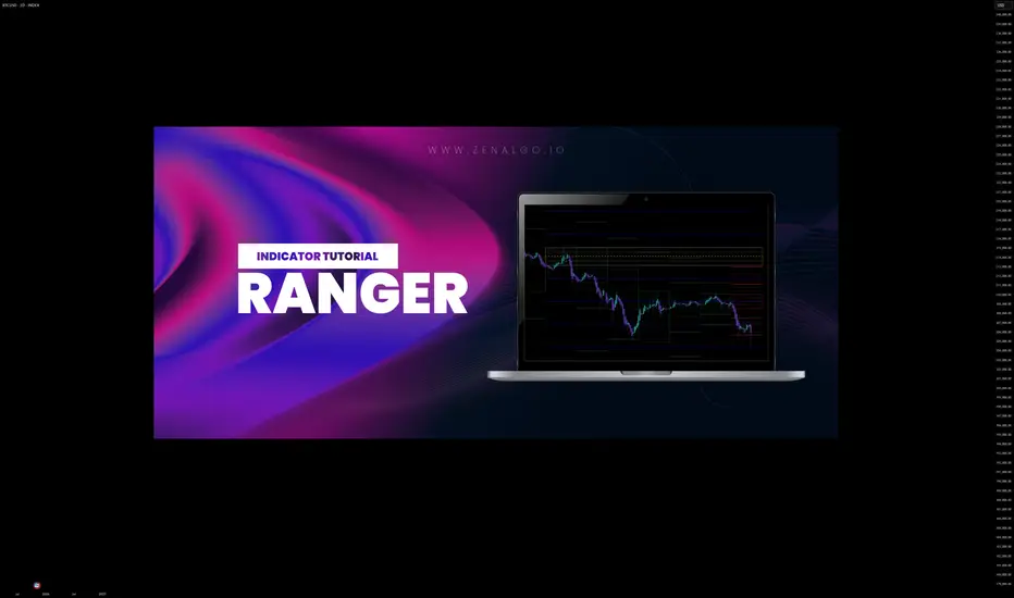
HOW-TO: Ranger in TradingViewChart patterns and ranges are essential in technical analysis, helping traders identify potential support/resistance zones, volatility expansions, and reversal points. However, manually detecting daily or weekly ranges can be time-consuming and subjective. In this post, we describe how to effectively use the Automatic Range Detection feature inside the ZenAlgo - Ranger indicator, which calculates VWAP-based ranges and standard deviation lines automatically to save time and improve accuracy.
Using the Range Detection Feature
Add the Indicator : Access the ZenAlgo - Ranger and add it to your chart. It works on any timeframe up to 4H for optimal performance.
Key Settings :
Show Today's VWAP Range : Enabled by default. This displays the current day's range based on VWAP ±2.0 standard deviations (core range).
Show Previous Day's Range : Toggle to view historical daily ranges (up to 70 days back).
Show Monday Range : Activates weekly-like ranges derived from Monday's data (shiftable forward for projection).
Standard Deviation Lines : Customize visibility for ±3.0 to ±10.0 (and halves like ±0.5, ±1.5). Highlighted lines (e.g., ±5.0, ±10.0) use solid styles for emphasis.
Monday Range StdDev Lines : Extended up to ±40.0 for advanced volatility analysis.
Box Transparency : Adjust for visual clarity (0-100%).
Tip : Start with defaults – today's range in teal, previous in gray, Monday in yellow/blue – and tweak based on your asset's volatility.
The indicator uses a locked 1-min VWAP calculation for precision, incorporating buy/sell volume delta from 4H data to color ranges dynamically.
Range Detection Overview
ZenAlgo - Ranger detects and plots:
Daily Ranges : VWAP-centered core (±2.0 std) with extensions via std dev lines. Supports up to 50 previous days.
Monday (Weekly Projection) Ranges : Special ranges from Tuesday's data (representing Monday's VWAP), extendable up to 30 weeks. Includes core levels (25%, 50%, 75%) and extreme std devs (±40.0).
Half StdDev Lines : For finer granularity (e.g., ±2.5, ±3.5).
Volume Delta : Integrated buy/sell volume calculation for each range, helping identify bullish/bearish bias.
Return Labels : Automatically labels entries back into the range (e.g., "dS" for daily short return above RH).
Detection relies on VWAP and std dev thresholds – higher std lines indicate potential overextensions.
Examples
Here are some practical examples on BTCUSD (see chart snapshots below):
Daily Range in Action : The red box shows today's VWAP range (±2.0 std). Notice how price bounces off the midrange (MID) acting as resistance.
Previous Ranges for Context : Gray boxes overlay past days. In a trending market, price often respects these as dynamic S/R – e.g., breaking below a previous RL signals strength.
Monday Range Projection : Yellow core with blue borders. Shift forward to project weekly volatility. The 50% midline often acts as equilibrium.
StdDev Extensions : ±5.0 (solid) and ±10.0 lines for extreme targets. Useful in high-vol assets like crypto.
Tips
Validate ranges with volume delta for bias confirmation.
Use on intraday charts; combine with other indicators for entries.
For volatile markets, enable higher STDs on Monday ranges.
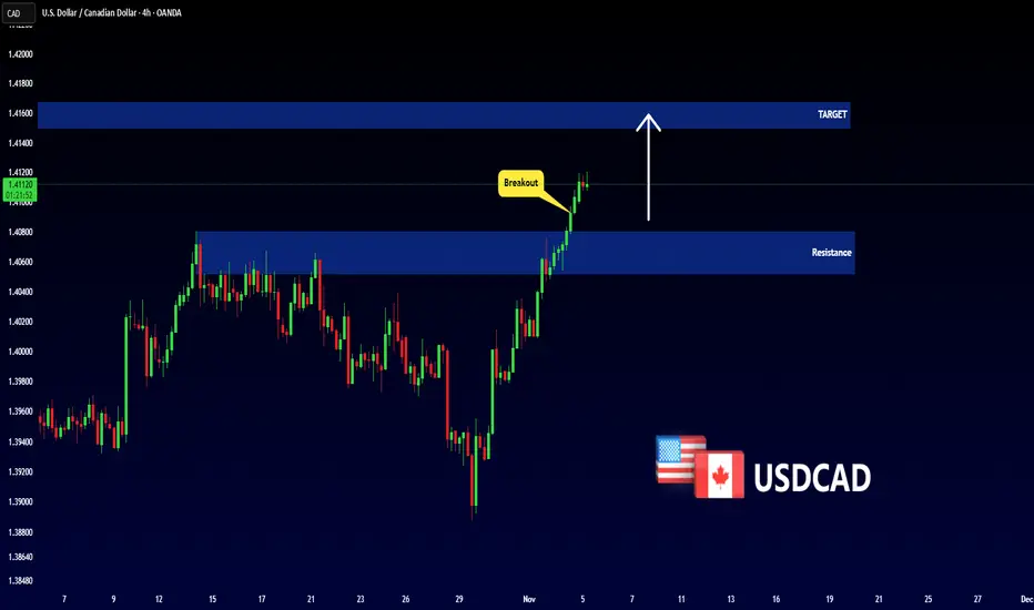
USDCAD - Important Breakout!Hello traders,
The USDCAD price has broken above the resistance zone (1.40518 – 1.40802), confirming a bullish breakout.
This key level is now acting as new support, indicating potential for further upside momentum 🚀
🎯 Target: 1.41500
THE KOG REPORT - UpdateEnd of day update from us here at KOG:
The move from yesterday worked well giving a nice capture early session with price hitting the resistance and then the lower red box. Earlier today, although we got a long indication we only managed to get scalps for it before closing at BE.
We then activated on the boxes and subsequently completed all the red box targets in one swoop.
Now, we have support here at the 3930 level while resistance is at 3970-75 which gives us the levels that need to hold. It's looks like we may break on the box so we'll stick with the original plan from the KOG report on Sunday.
Price: 3994
RED BOXES:
Break above 4001 for 4010, 4016 and 4030 in extension of the move
Break below 3985 for 3979, 3970 and 3958 in extension of the move
As always, trade safe.
KOG

Is Rivian about to tumble into Bankruptcy? <EV market adoption is saturating, in my opinion. And don’t get me started on environmental benefits with which this whole debacle began. If demand for electric vehicles drop before the environmental “payback” period (when EV use starts offsetting the emissions from production), then:
The upfront emissions from mining and refining critical minerals would still have occurred.
The long-term climate benefits from cleaner driving wouldn’t materialise.
Which means the net effect could actually worsen global warming in the short to medium term, since we’d have massive energy use and emissions from mining and manufacturing,
That's better, get the rant over with sooner than late.
The background
The net zero drive has been incredibly frustrating to watch unfold, a forced movement, without being fully thought through.
The race to the bottom further emphasised as Chinese firms like BYD who are able to undercut almost every other manufacturer, regardless of the production environmental impact. The hypocrisy knows no bounds. Especially as you consider a net zero initiative requires a mass scale solution. How is niche purchasers of mass off road SUVs to contribute to this change?
If you ignore the environmental gesture owners convince themselves on purchase, what would you rather use off-road in a snow covered mountainside? Yeah..
Recently I had an opportunity to share a ride in a 4-5 year old Tesla. It was notable how quickly tech has dated, like last year’s iPhone. It's still good but Meahh. The interior cabin looked like a lost 1990's Starbucks corner where hope went to die and the vacuum cleaner on strike. Do serious coffee drinkers still use Starbucks? Anyway…
The technical
A while back the unpopular idea “ eVTOL manufacturer Lilium on the verge of 80% collapse? ” was published. This annoyed fanboys convinced the Jetsons future would be here any moment.
And collapse it did. The business was drowning in debt, technically weak, spending energy on a product no one wanted. Who on earth wants a flying battery with all the complications that includes when the proven technology of the helicopter and safety record continues to succeed? If it works, don’t fix it. Unfortunately Rivian and their investors din’t get that memo.
On the above 2 week chart, Rivian’s technical setup and fundamentals appear to be converging in a way that suggests significant downside risk. From a chart perspective, the descending triangle pattern, coupled with multiple bearish engulfing candles and a series of lower highs, highlights persistent selling pressure. These are classic hallmarks of a weakening structure. A decisive breakdown from the triangle could, based on prior measured moves, imply a potential ~60% decline from current levels. On the fundamental side, the headwinds are equally stark:
$5 billion in debt,
Negative P/E ratio (~–4.17),
$11 million in monthly interest obligations,
Continued margin pressure in a slowing EV market.
If consumer demand plateaus before Rivian reaches cost efficiency and scale, the company could face liquidity stress or even solvency risk. This risk is amplified by rising competition, particularly from BYD and other cost efficient Chinese EV producers. In short, Rivian’s position in the premium EV niche looks precarious, both technically and structurally.
Conclusions
Rivian, oh, here we go. The electric SUV company that was gonna save the planet. I got those emails periodically in the spam filter. I doubt bankruptcy will stop them from arriving.
Yeah, apparently the world’s going green, right? We’ll all be driving electric trucks up mountains while saving polar bears. Brilliant. Except now they’ve got five billion dollars of debt and owe eleven million a month just in interest. That’s not a company, that’s a bloke with too many credit cards pretending he’s fine.
So yeah, technically, fundamentally, whatever you want to call it, it’s a mess. The chart says ‘down,’ the balance sheet says ‘help,’ and the investors are probably saying, ‘Where’s the exit?’
The only bullish thing left is the optimism of the shareholders. And that’s fading faster than a Tesla interior ;-)
Ww
====================================================
Disclaimer
This analysis is provided for educational and informational purposes only, whilst being a lot more environmentally friendlier than a new Rivian SUV. It represents personal opinions based on publicly available data and technical chart interpretation, not financial advice.
Trading and investing in financial markets involves substantial risk, including the potential loss of capital. Always conduct your own due diligence and consult a qualified financial advisor before making investment decisions.

Bitcoin: The ATH Was a Trap. Here's the Real Roadmap.Since mid-July, Bitcoin has been in a global range. The "breakout" to a new ATH on Oct 5-6, which the majority expected to continue, was actually a liquidity sweep . This has confirmed the global range and a high probability of a high-timeframe correction.
After the sharp drop on the Oct 10 news, a local range has formed. I expect a breakdown from this local range, with the minimum target being a sweep of the Previous Month's Low (PML) .
After that, the plan is to look for long-term long setups at three key global support levels.
SCENARIO 1: 50% Monthly Fib Level
The first major support is the 50% Monthly Fibonacci retracement level . If price reaches this level and also performs a liquidity sweep of the June 22 low , the probability of a long setup will be much higher.
Confirmation: Price must find acceptance above this level, confirmed by Daily or Weekly candle bodies .
Target: Mitigation of the global and local ranges.
SCENARIO 2: 78.6% Monthly Fib + Weekly OB
If the 50% level is broken, the next major support is the 78.6% Monthly Fib level in conjunction with a Weekly Order Block .
Confirmation: The interaction must be analyzed with D1/W1 candles. Acceptance above this level confirms the long setup.
SCENARIO 3: The "Make-or-Break" Level
A break of the 78.6% level opens the door to the April 7 low at $74,500 . The market's reaction to this final level will determine whether the bull cycle has a chance to continue, or if a new bear cycle will begin.
~~~~~~~~~~~~~~~~~~~~~~~~~~~~~~~~~~~~~~~~~~~~~~~~~~~~~~~~~~~~~~~~~
The principles and conditions for forming the manipulation zones I show in this trade idea are detailed in my educational publication, which was chosen by TradingView for the "Editor's Picks" category and received a huge amount of positive feedback from this insightful trading community. To better understand the logic I've used here and the general principles of price movement in most markets from the perspective of institutional capital, I highly recommend checking out this guide if you haven't already. 👇
P.S. This is not a prediction of the exact price direction. It is a description of high-probability setups that become valid only if specific conditions are met when the price reaches the marked POI. If the conditions are not met, the setups are invalid. No setup has a 100% success rate, so if you decide to use this trade idea, always apply a stop-loss and proper risk management. Trade smart.
~~~~~~~~~~~~~~~~~~~~~~~~~~~~~~~~~~~~~~~~~~~~~~~~~~~~~~~~~~~~~~~~~
If you found this analysis helpful, support it with a Boost! 🚀
Have a question or your own view on this idea? Share it in the comments. 💬
► Follow me on TradingView for timely updates on THIS idea (entry, targets & live trade management) and not to miss my next detailed breakdown.
~~~~~~~~~~~~~~~~~~~~~~~~~~~~~~~~~~~~~~~~~~~~~~~~~~~~~~~~~~~~~~~~~

$XRP in a major accumulation area.CRYPTOCAP:XRP in a major accumulation area.
Wyckoff Method Scenario Repeating.
XRP is trading in a classic Accumulation Phase according to the Wyckoff method.
Technically, this structure is leading to a strong bullish cycle.
Following a similar accumulation period in 2017, XRP began a parabolic run and rose to the Distribution zone.

Bitcoin Vs Gold.Bitcoin Vs Gold.
You would expect a bounce here.
If not, watch out below. A close below that RED line could make it get really bad.
Target would then be 17 ounces of gold to buy 1 bitcoin, instead of the current 26. At its peak it was 39.

EUR/USD: What the Data Sees That You Don'tWhat happens when you mine millions of data points from actual market structure?
You stop guessing and start seeing what's statistically likely to happen next.
Most traders never see this.
Today on EUR/USD, the probabilities are stacking up—let me show you exactly what I'm seeing.
Let's dive in.
-----------------------------------------------------
More probability-based setups dropping every week—follow if you're serious about trading with data.
Quick question: what's more valuable to you—directional bias or detailed entry?
Comment below.
Want to make sure I'm giving you what actually helps.

GBP-AUD Will Keep Falling! Sell!
Hello,Traders!
GBPAUD is forming a clear bearish wedge, showing distribution inside a premium zone. Once liquidity above internal highs is swept, expect a displacement toward the downside. Time Frame 4H.
Sell!
Comment and subscribe to help us grow!
Check out other forecasts below too!
Disclosure: I am part of Trade Nation's Influencer program and receive a monthly fee for using their TradingView charts in my analysis.

Ethereum Bear Market Is StartingHello everyone, I hope you're all doing well.
Today I'll share my long-term outlook for Ethereum's price. I expect the price has peaked and will enter a downward trend towards the targets I've listed below
This is not investment advice; please take full responsibility for your buying and selling decisions.
Warning: Be careful not to use this idea with leverage, as you could lose all your money

GOLD Free Signal! Buy!
Hello,Traders!
GOLD Price has tapped into a strong horizontal demand area, showing early signs of bullish rejection. Buyers may aim toward 3,970$ as the next liquidity target.
-------------------
Stop Loss: 3,915$
Take Profit: 3,970$
Entry: 3,940$
Time Frame: 2H
-------------------
Buy!
Comment and subscribe to help us grow!
Check out other forecasts below too!
Disclosure: I am part of Trade Nation's Influencer program and receive a monthly fee for using their TradingView charts in my analysis.

The Empty Feeling After A WinA trader messaged me recently after closing a big win.
He said, “I should’ve felt great but I just felt… flat.”
That sudden emptiness after the high it’s more common than you think.
Follow along. I hope this helps.
BUT FIRST
NOTE – This is a post on mindset and emotion. It’s not a trade idea or system designed to make you money.
My intention is to help you preserve your capital, focus, and composure — so you can trade your own system with calm and confidence.
HERE’S WHAT HAPPENS
You execute beautifully.
Plan followed. Risk managed.
Trade hits target. Account up.
You should feel satisfied.
But instead… there’s a drop.
The charts look dull.
The mind goes searching.
“Maybe one more setup.”
“Just check the next pair.”
That’s not greed.
That’s chemistry.
When you’re in a trade, your brain is flooded with dopamine the chemical of pursuit, anticipation and drive.
When you exit, that hit disappears almost instantly.
To the nervous system, that chemical drop feels like loss .
And loss, even after a win, triggers the instinct to get it back.
WHAT’S REALLY GOING ON UNDERNEATH
You’re not chasing profit.
You’re chasing stimulation, the feeling of being alive in the action.
The mind interprets that feeling as boredom or missed opportunity.
But really, it’s your biology craving more.
The subconscious has learned to equate stillness with emptiness.
So it pushes for movement to escape the come-down.
That’s why so many traders give back profits after doing everything right.
They’re not making bad decisions.
They’re trying to fix a feeling.
HOW TO CATCH IT BEFORE IT CATCHES YOU
1️⃣ Notice your come-down cue.
After closing a trade, does your body feel restless?
Do you scroll, check charts, or reopen the platform out of habit?
That’s the withdrawal in motion.
2️⃣ Name it, don’t fight it.
Say it internally: “This is dopamine dropping.”
It takes the mystery out of the urge.
3️⃣ Breathe through the drop.
A long exhale through the mouth… six seconds out tells the body it’s safe.
Let your eyes rest on something still.
4️⃣ Reframe the pause.
That quiet space after a win isn’t emptiness.
It’s integration.
It’s the moment your nervous system resets for the next run.
Trading mastery isn’t just execution.
It’s emotional regulation before, during and after execution.
I put a lot of time and thought into every post that goes out here so I appreciate your support.
Thank you

Lingrid | XRPUSDT Downside Pressure AcceleratingBINANCE:XRPUSDT trades below the descending trendline inside a clearly defined downward channel, keeping the broader structure bearish. Price action has recently tested the $2.44 zone but failed to sustain a breakout, signaling continued weakness. As long as the pair stays under $2.50 resistance, a retest toward $2.00 support remains the likely path. Momentum indicators align with a slow drift lower, reinforcing short-term bearish control.
⚠️ Risks:
A sudden Bitcoin rally could lift altcoins and negate the bearish setup.
Positive regulatory news around XRP may trigger unexpected volatility.
U.S. macro data or risk sentiment shifts could strengthen USD demand dynamics.
If this idea resonates with you or you have your own opinion, traders, hit the comments. I’m excited to read your thoughts!

GOLD 1H CHART ROUTE MAP UPDATE & TRADING PLAN FOR THE WEEKHey Everyone,
Please see our updated 1h chart levels and targets for the coming week.
We are seeing price play between two weighted levels with a gap above at 4042 and a gap below at 3992. We will need to see ema5 cross and lock on either weighted level to determine the next range.
We will see levels tested side by side until one of the weighted levels break and lock to confirm direction for the next range.
We will keep the above in mind when taking buys from dips. Our updated levels and weighted levels will allow us to track the movement down and then catch bounces up.
We will continue to buy dips using our support levels taking 20 to 40 pips. As stated before each of our level structures give 20 to 40 pip bounces, which is enough for a nice entry and exit. If you back test the levels we shared every week for the past 24 months, you can see how effectively they were used to trade with or against short/mid term swings and trends.
The swing range give bigger bounces then our weighted levels that's the difference between weighted levels and swing ranges.
BULLISH TARGET
4042
EMA5 CROSS AND LOCK ABOVE 4042 WILL OPEN THE FOLLOWING BULLISH TARGETS
4089
EMA5 CROSS AND LOCK ABOVE 4089 WILL OPEN THE FOLLOWING BULLISH TARGET
4136
EMA5 CROSS AND LOCK ABOVE 4136 WILL OPEN THE FOLLOWING BULLISH TARGET
4194
BEARISH TARGETS
3992
EMA5 CROSS AND LOCK BELOW 3992 WILL OPEN THE FOLLOWING BEARISH TARGET
3956
EMA5 CROSS AND LOCK BELOW 3956 WILL OPEN THE FOLLOWING BEARISH TARGET
3922
EMA5 CROSS AND LOCK BELOW 3922 WILL OPEN THE SWING RANGE
3866
3820
As always, we will keep you all updated with regular updates throughout the week and how we manage the active ideas and setups. Thank you all for your likes, comments and follows, we really appreciate it!
Mr Gold
GoldViewFX

CryptosCryptos.
Continuation breakdown confirmed.
Whether this was the top, or simply another correction along the way, using charts would help you stay clear of all the pain.
Charts can also let you know when it is time to get back in.

November Alts Request Window Now OpenFamily, November isn’t just another month, it’s decision time. We’re standing at the edge of the 4-year cycle’s final act, where altcoins will either explode into new expansions or vanish in liquidity drains. Every choice from here carries weight this selection window could decide the next cycle’s biggest winners.
📌 Submission Deadline: November 5th, 2025
📌 Target Coins: 30 slots only
📌 Requirements:
1. Must display solid liquidity and a clear technical structure
2. Should reflect sustainable narratives or active ecosystem growth
3. Avoid dead or illiquid tokens only serious and relevant projects
As always, every suggested coin will be carefully screened, but only those that align with both the broader cycle context and our technical framework will be considered for full analysis. The objective remains unchanged to position ourselves where the next rotation wave is most likely to ignite as BTC completes its dominance move and liquidity begins rotating into alts.
Remember: These late-cycle months often decide the real winners heading into the next expansion phase. Let’s keep our list sharp, high quality, and cycle aligned.
Drop your suggestions below November isn’t the month to hesitate.
If this resonates with your outlook for the month ahead, hit the like button, share it with your circle, and let’s build this month’s list together.
AUD/NZD Nearing Peak: Expect Controlled PullbackAUD/NZD has completed a clean 5-wave impulsive move to the upside, finishing Wave (1)/(A) near the recent peak. From here, the price looks ready to start a deeper correction in the form of Wave (2)/(B), which may pull back toward the lower support zone inside the rising channel. This corrective move could unfold in multiple legs before turning bullish again. Once Wave (2)/(B) completes, the chart expects a strong rally into Wave (3)/(C), aiming for new highs. In simple terms: a healthy pullback first, then a powerful upside continuation.
Stay tuned!
@Money_Dictators
Thank you :)

Need to see if it can rise above 104463.99
Hello, fellow traders!
Please "Follow" to always get the latest information quickly.
Have a great day.
-------------------------------------
(BTCUSDT 1D chart)
The price declined from the DOM(-60) indicator level of 106431.68, but the DOM(-60) indicator is still forming at 106431.68.
Therefore, the 106431.68 level can be considered a low point.
Therefore, we need to observe how the price moves during this volatile period, around November 4th-9th (maximum November 3rd-10th).
Since it fell below the critical 104463.99-108353.0 level, if it fails to rise above this level, we should check for support near the next critical level of 89294.25.
At this point, the M-Siganl indicator on the 1M chart is passing through a critical zone, so it's expected to re-establish the trend once it meets the M-Siganl indicator on the 1M chart.
If the OBV indicator falls below the Low Line and fails to rise again, it's likely to touch EMA 3.
For the price to break above a critical point or zone and continue the uptrend,
1. The StochRSI indicator must be rising. Ideally, it should not be in an overbought zone.
2. The TC (Trend Check) indicator must be rising. Ideally, it should remain above the zero level.
3. The OBV indicator must be rising. Ideally, it should remain above the High Line.
If the above conditions are met, the upward trend is likely to continue after breaking above a critical point or zone.
Currently, the price is moving against the above conditions, so there's a possibility of further decline. However, given the volatility, it's better to wait and see rather than assume a decline.
-------------------------------------
I'm curious about what will happen next, but there's no way to know for sure.
However, as I've repeatedly mentioned, if you're trading according to a basic trading strategy that suits your investment style, I believe you'll be able to trade according to your strategy, whether the current decline continues or rebounds and rises.
As I mentioned in a previous idea,
- If a daily decline exceeds -10%, a rebound is highly likely,
- If a daily increase exceeds +10%, a reversal is highly likely.
Therefore, if you're familiar with scalping or day trading, you can profit from trading.
However, you must sell at that profit to lock in your profits.
The basic trading strategy I mentioned is to buy in the DOM(-60) ~ HA-Low range and sell in the HA-High ~ DOM(60) range.
Furthermore, we can respond based on the support and resistance levels identified on the 1M, 1W, and 1D charts, which are important areas.
Therefore, the current available support levels are the 104463.99-108.353.0 and 87814.27-93570.28 levels.
The remaining support and resistance levels can be used as trading opportunities.
In other words, these are points for securing profits.
-
Due to this decline, the HA-High indicator on the 1M chart is showing signs of forming at the 110105.69 level.
Therefore, if there is a rebound, the 110105.69 level could potentially serve as resistance.
However, as the price rises, the HA-High indicator on the 1M chart could return to its previous HA-High level.
Therefore, we need to determine if support is found in the 104463.99-108353.0 range and consider a response plan accordingly.
-
If the price falls below the M-Signal indicator on the 1M chart and remains there, there's a possibility of a downtrend, so we should also consider a response plan.
The coin market operates in decimals, allowing for more flexible trading than the stock market.
This means that by trading at a buy price, you can profit even if you're losing money and increase your coin (token) holdings.
For example, if you bought $100 at $101,000, you could sell $100 (including transaction fees) when the price rises, increasing your profit.
By increasing your profit, you can quickly turn a loss into a profit.
If you bought $100 at 101,000 and only had 0.1 coins (tokens), you could sell those 0.1 coins and generate a cash profit if the price rises and you're making a profit.
However, this method is only applicable if you won't be trading that coin (token) again.
In other words, if you sell 100% of your holdings, you'll need to wait until the next price fluctuation, or you could end up making a worse trade.
Therefore, if possible, it's best to trade with the same amount you bought, increasing the number of coins (tokens) that represent your profit.
Don't think you should just leave the coin (token) you're losing and trade another coin (token) to make a profit.
This could actually lead to further losses.
-
Thank you for reading to the end.
I wish you successful trading.
--------------------------------------------------
- This explains the big picture.
(3-year bull market, 1-year bear market pattern)
I will explain in more detail when the bear market begins.
------------------------------------------------------

GBPUSD: Massive Breakout 🇬🇧🇺🇸
GBPUSD continues declining.
The market broke and closed below a significant daily support cluster.
That violation opens a potential a further bearish movement at least to 1.29 level.
Get ready for a downtrend continuation and look for an entry signal after a pullback.
❤️Please, support my work with like, thank you!❤️
I am part of Trade Nation's Influencer program and receive a monthly fee for using their TradingView charts in my analysis.

EURUSD: Liquidity Above — Watch for a Risky Long Setup!EURUSD Analysis – Monday, November 4
Welcome traders! 👋
I’m glad to have you here — we’re all learning and growing together in this amazing trading journey.
Let’s dive into today’s analysis on EURUSD 👇
Despite the strong bearish momentum that continues to dominate EURUSD, we could see a short-term risky long opportunity for the upcoming trading day.
Price has recently performed a stop hunt on sell-side liquidity, sweeping below previous lows and confirming potential intent to grab the equal-high liquidity that aligns with Monday’s daily high.
If price retraces and provides a confirmation entry on lower timeframes, traders may look for a short-term long setup targeting that liquidity zone above.
However, this is a counter-trend setup, so managing risk and securing profits quickly is essential.
Stay cautious — as the broader structure remains bearish, this move could simply be a liquidity grab before further continuation to the downside.
📘 Educational Note:
This analysis is for educational and illustrative purposes only.
Always follow your own plan, confirm with your strategy, and manage risk carefully.
Success in trading comes from discipline, patience, and consistency. 💪
🚀 Empowering traders through clarity, confidence & clean charts.
Follow 👉 parisa_tl for more SMC setups and weekly insights 💙.
EURUSD #forexanalysis #smartmoneyconcepts #SMC #forexsetup #liquiditygrab #orderblock #fairvaluegap #POI #priceaction #forexeducation #forextrading #eurusdanalysis #forexcommunity #forexlife #marketstructure #daytrading #forexstrategy #riskmanagement #tradewithconfirmation #fxtrader #technicalanalysis #tradingview #forexinsights

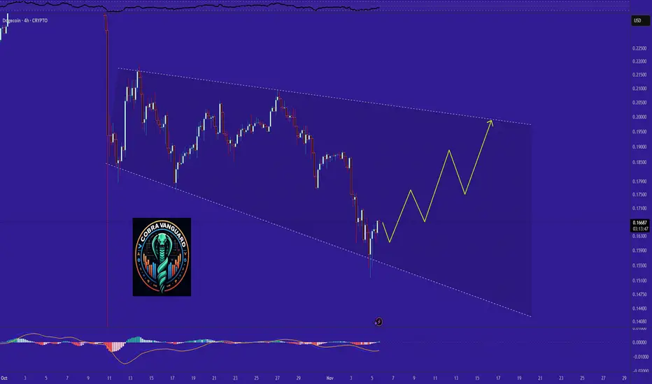
DOGE Outlook after the Dip. What to expect NOW?The price could rise from here to the top of the wedge, potentially reaching around $0.20.
What Rising Indices Mean for Global Investors1. Understanding Market Indices
A stock market index represents the performance of a group of selected stocks. These stocks are often chosen based on their market capitalization, sector, or regional importance. For example:
S&P 500 (U.S.) tracks 500 large American companies.
Nikkei 225 (Japan) represents 225 top companies listed on the Tokyo Stock Exchange.
FTSE 100 (U.K.) measures the top 100 companies listed on the London Stock Exchange.
When these indices rise, it usually indicates that the collective value of their constituent companies’ stocks is increasing. This upward trend is often interpreted as a sign of economic strength and investor confidence.
2. A Reflection of Economic Growth
Rising indices are generally viewed as a positive indicator of economic growth. Companies listed on major indices tend to perform well when the economy expands. Increased consumer spending, strong corporate earnings, and stable employment levels all contribute to higher profits, which in turn push stock prices higher.
For instance, during periods of economic recovery—such as after a recession or global crisis—indices tend to climb as investors anticipate future growth. This optimism encourages further investment, creating a feedback loop of confidence and capital inflows.
3. Investor Sentiment and Confidence
Stock indices also serve as a psychological measure of investor confidence. When indices are on an upward trend, it signals that investors believe in the long-term stability of the economy. Positive sentiment often leads to increased demand for equities, pushing prices higher.
Conversely, rising indices can also attract new participants who don’t want to “miss out” on market gains. This phenomenon, known as “herd behavior,” can drive short-term rallies, especially when accompanied by strong media coverage or positive macroeconomic data.
4. Attraction for Global Capital Inflows
When indices in a particular country or region rise consistently, foreign investors often take notice. A bullish stock market suggests economic stability, policy consistency, and profitable opportunities. As a result, global funds and institutional investors may increase their exposure to that market.
For example:
A rising Nifty 50 in India attracts foreign portfolio investment (FPI) due to India’s growth potential.
An uptrend in the S&P 500 may lure global investors seeking safety and steady returns in the world’s largest economy.
Such capital inflows further fuel index growth and can strengthen the host country’s currency, creating a reinforcing cycle of financial optimism.
5. Wealth Effect and Consumer Behavior
Rising indices create what economists call the “wealth effect.” As investors see the value of their portfolios grow, they feel wealthier and more confident about spending. Increased consumer spending boosts company revenues, reinforcing the positive cycle of growth and higher earnings.
This effect is particularly pronounced in countries where household wealth is significantly tied to stock ownership, such as the United States. Higher consumer confidence leads to robust retail activity, real estate investment, and broader economic expansion.
6. Portfolio Valuations and Institutional Impact
For mutual funds, pension funds, and exchange-traded funds (ETFs), rising indices directly enhance portfolio valuations. Higher index levels mean better fund performance, which attracts new investors and capital.
Institutional investors often use benchmarks like the MSCI World Index or S&P 500 to measure their own performance. When these benchmarks rise, fund managers may adjust strategies to maintain parity or outperform the market, increasing trading volumes and market liquidity.
7. Sectoral Insights and Rotations
Rising indices often conceal complex movements within sectors. For instance, while the overall market may be rising, certain industries—like technology or healthcare—may be outperforming others.
Global investors closely monitor sectoral rotations, where capital shifts from one sector to another. During times of optimism, growth sectors such as technology and consumer discretionary lead gains. In contrast, when the market matures, investors may rotate to defensive sectors like utilities or consumer staples to protect profits.
Understanding these rotations helps investors position themselves strategically within the larger trend of a rising index.
8. Currency Implications
A strong and rising stock market often leads to currency appreciation. As foreign investors pour capital into equities, demand for the local currency rises. For instance, a rally in the Japanese Nikkei could strengthen the yen if international investors buy Japanese assets.
However, there’s also a balancing act—if a country’s currency strengthens too much, its exports may become less competitive, potentially slowing corporate earnings growth in export-driven economies. Hence, central banks closely monitor these interactions to maintain economic stability.
9. Rising Indices and Inflation Expectations
While rising indices often indicate prosperity, they can also signal growing inflationary pressures. Strong corporate profits and consumer spending can lead to higher demand for goods and services, pushing up prices.
Central banks, such as the U.S. Federal Reserve or the European Central Bank, may respond by raising interest rates to control inflation. Higher interest rates, in turn, can slow down future market gains as borrowing becomes more expensive for companies and consumers.
Thus, investors must evaluate whether rising indices reflect sustainable growth or overheating markets.
10. Risk of Overvaluation
One of the main concerns during a period of sustained index growth is overvaluation. When stock prices rise faster than corporate earnings, price-to-earnings (P/E) ratios expand, suggesting that stocks may be overpriced.
Historically, overvaluation has preceded market corrections. The dot-com bubble of the late 1990s is a classic example where excessive optimism led to inflated valuations, followed by a sharp downturn.
Prudent investors monitor valuation metrics, earnings growth, and macroeconomic indicators to distinguish healthy rallies from speculative bubbles.
11. Diversification and Global Portfolio Strategy
For global investors, rising indices in one region can influence asset allocation strategies across markets. Investors may rebalance portfolios by:
Taking profits in overvalued markets.
Allocating funds to underperforming or emerging regions.
Hedging currency and geopolitical risks.
For example, if the U.S. market is surging while Asian markets are lagging, investors might diversify into Asia for potential future gains once valuation gaps narrow.
Diversification remains a key principle—no matter how promising a market appears, concentration risk can magnify losses if conditions suddenly change.
12. Long-Term vs Short-Term Interpretations
Rising indices must be viewed through different time horizons:
Short-term investors see rising indices as trading opportunities driven by momentum.
Long-term investors interpret them as reflections of structural economic progress, technological innovation, or policy stability.
Therefore, understanding the context behind index movements—earnings growth, fiscal policy, interest rates, or geopolitical developments—is essential for making informed investment decisions.
Conclusion
Rising indices symbolize confidence, economic vitality, and investor optimism in global markets. They indicate strong corporate earnings, robust demand, and capital inflows. However, they also come with risks—such as overvaluation, inflationary pressures, and the potential for sharp corrections.
For global investors, rising indices should not be seen merely as a signal to buy, but as a prompt to analyze fundamentals, monitor macroeconomic trends, and rebalance portfolios wisely. A disciplined, informed approach allows investors to harness the opportunities of a bullish market while remaining prepared for inevitable market cycles.
