(STC) with Buy/Sell
PS! This is ment to be used as compliment and confirmation for indicator "UT Bot + LinReg Candles (Dual Sensitivity) by PDK1977
Schaff Trend Cycle (STC) Oscillator with Buy/Sell Signals
The Schaff Trend Cycle (STC) is a fast and reliable oscillator developed by Doug Schaff, designed to improve on traditional cycle indicators like MACD and Stochastic. The STC indicator helps you identify trend direction, potential reversals, and entry/exit points with greater speed and accuracy.
Key Features:
Clear, Color-Coded Line: The STC line turns green when rising and red when falling, making trend changes easy to spot.
Buy/Sell Signals:
Buy: When the STC line crosses up over the 25 level, a green triangle appears, suggesting bullish momentum.
Sell: When the STC line crosses down under the 75 level, a red triangle appears, highlighting potential bearish momentum.
Levels: 25 and 75 are highlighted to mark overbought and oversold regions.
Separate Pane: Designed to be displayed in its own subwindow below the main chart, keeping your price action clean and uncluttered.
How to Use:
Buy Signal: Watch for the STC to cross above 25 for possible long entries.
Sell Signal: Watch for the STC to cross below 75 for possible short entries.
The indicator works on all timeframes and is suitable for trending markets, swing trading, and scalping strategies.
Tip: Combine STC signals with other trend or volume indicators for added confirmation and more robust trading decisions.
Oscillators

Price × Volume Momentum (FSTO / RSI / Avg)decided to combine my PXVS and PXVR in to one script. user has the option to use FSTO, RSI, or the average between the two oscillators.
the oscillator components have been modified to range from -100 to +100 to express directional magnitude.
volume remains 0 to 100, so it can function as a direction-neutral amplifier.
The result is a bi-directional composite oscillator that:
>> Emphasizes congruent signals (e.g., strong price direction with strong volume).
>> Minimizes misleading or incongruent signals from high volume paired with neutral or conflicting price movement.
Ideal for identifying high-conviction breakouts and momentum divergences with volume support.

Smart RSI Divergence PRO | Auto Lines + Alerts
**Smart RSI Divergence PRO**
This indicator automatically finds RSI divergences on price charts:
🔹 Regular & Hidden divergences
🔹 Auto trendlines connecting swing highs & lows
🔹 Clear triangle labels on the chart
🔹 Ready-to-use alerts for your strategy
Use it to spot potential trend reversals and hidden continuation signals.
---
**How it works**
- **Regular Divergence**: Price makes a higher high (or lower low) while RSI does not → possible reversal.
- **Hidden Divergence**: Price makes a lower high (or higher low) while RSI makes a higher high (or lower low) → possible trend continuation.
---
**Signal colors**
🔻 Red triangle — Regular Bearish Divergence (potential short)
🔻 Orange triangle — Hidden Bearish Divergence (possible trend continuation down)
🔺 Green triangle — Regular Bullish Divergence (potential long)
🔺 Blue triangle — Hidden Bullish Divergence (possible trend continuation up)
Works on any timeframe and market (crypto, forex, indices, stocks).
---
**💡 Want a custom version?**
I can build private Pine Script indicators & strategies **made just for you** — scalping tools, trend or reversal signals, custom filters for crypto, forex, stocks, or any pairs you trade.
I can also improve or fix your existing scripts.
If you want a unique, clean, and profitable setup — contact me anytime!
📩 Telegram 👉 t.me

Divergences HeatmapWhen the price is around a support or resistance zone, look for any divergences. Ignore any signals if the price is ranging.

Crypto Narratives: Relative Strength V2Simple Indicator that displays the relative strength of 8 Key narratives against BTC as "Spaghetti" chart. The chart plots an aggregated RSI value for the 5 highest Market Cap cryopto's within each relevant narrative. The chart plots a 14 period SMA RSI for each narrative.
Functionality:
The indicator calculates the average RSI values for the current leading tokens associated with ten different crypto narratives:
- AI (Artificial Intelligence)
- DeFi (Decentralized Finance)
- Memes
- Gaming
- Level 1 (Layer 1 Protocols)
- AI Agents
- Storage/DePin
- RWA (Real-World Assets)
- BTC
Usage Notes:
The 5 crypto coins should be regularly checked and updated (in the script) by overtyping the current values from Rows 24 - 92 to ensure that you are using the up to date list of highest marketcap coins (or coins of your choosing).
The 14 period SMA can be changed in the indicator settings.
The indicator resets every 24 hours and is set to UTC+10. This can be changed by editing the script line 19 and changing the value of "resetHour = 1" to whatever value works for your timezone.
There is also a Rate of Change table that details the % rate of change of each narrative against BTC
Horizontal lines have been included to provide an indication of overbought and oversold levels.
The upper and lower horizontal line (overbought and oversold) can be adjusted through the settings.
The line width, and label offset can be customised through the input options.
Alerts can be set to triggered when a narrative's RSI crosses above the overbought level or below the oversold level. The alerts include the narrative name, RSI value, and the RSI level.

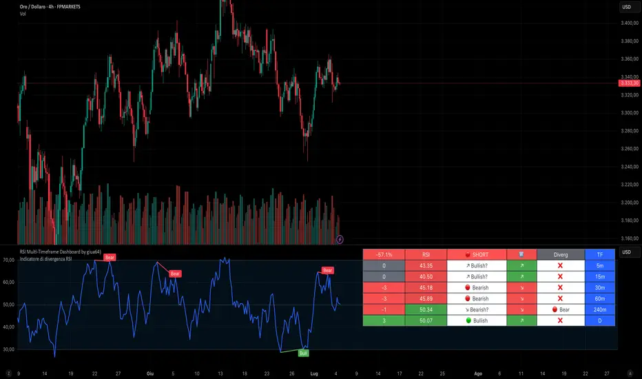
RSI Multi-Timeframe Dashboard by giua64)### Summary
This is an advanced dashboard that provides a comprehensive overview of market strength and momentum, based on the Relative Strength Index (RSI) analyzed across 6 different timeframes simultaneously (from 5 minutes to the daily chart).
The purpose of this script is to offer traders an immediate and easy-to-read summary of market conditions, helping to identify the prevailing trend direction, overbought/oversold levels, and potential reversals through divergence detection. All of this is available in a single panel, eliminating the need to switch timeframes on your main chart.
### Key Features
* **Multi-Timeframe Analysis:** Simultaneously monitors the 5m, 15m, 30m, 1H, 4H, and Daily timeframes.
* **Scoring System:** Each timeframe is assigned a score based on multiple RSI conditions (e.g., above/below 50, overbought/oversold status, direction) to quantify bullish or bearish strength.
* **Aggregated Signal:** The dashboard calculates a total percentage score and provides a clear summary signal: **LONG**, **SHORT**, or **WAIT**.
* **Divergence Detection:** Automatically identifies Bullish and Bearish divergences between price and RSI for each timeframe.
* **Non-Repainting Option:** In the settings, you can choose to base calculations on the close of the previous candle (`Use RSI on Closed Candle`). This ensures that past signals (like status and score) do not change, providing more reliable data for analysis.
* **Fully Customizable:** Users can modify the RSI period, overbought/oversold thresholds, divergence detection settings, and the appearance of the table.
### How to Read the Dashboard
The table consists of 6 columns, each providing specific information:
* **% (Total Score):**
* **Header:** Shows the overall strength as a percentage. A positive value indicates bullish momentum, while a negative value indicates bearish momentum. The background color changes based on intensity.
* **Rows:** Displays the numerical score for the individual timeframe.
* **RSI:**
* **Header:** The background color indicates the average of all RSI values. Green if the average is > 50, Red if < 50.
* **Rows:** Shows the real-time RSI value for that timeframe.
* **Signal (Status):**
* **Header:** This is the final operational signal. It turns **🟢 LONG** when bullish strength is high, **🔴 SHORT** when bearish strength is high, and **⚪ WAIT** in neutral conditions.
* **Rows:** Describes the RSI status for that timeframe (e.g., Bullish, Bearish, Overbought, Oversold).
* **Dir (Direction):**
* **Header:** Displays an arrow representing the majority direction across all timeframes.
* **Rows:** Shows the instantaneous direction of the RSI (↗️ for rising, ↘️ for falling).
* **Diverg (Divergence):**
* Indicates if a bullish (`🟢 Bull`) or bearish (`🔴 Bear`) divergence has been detected on that timeframe.
* **TF (Timeframe):**
* Indicates the reference timeframe for that row.
### Advantages and Practical Use
This tool was created to solve a common problem: the need to analyze multiple charts to understand the bigger picture. With this dashboard, you can:
1. **Confirm a Trend:** A predominance of green and a "LONG" signal provides strong confirmation of bullish sentiment.
2. **Identify Weakness:** Red signals on higher timeframes can warn of an impending loss of momentum.
3. **Spot Turning Points:** A divergence on a major timeframe can signal an excellent reversal opportunity.
### Originality and Acknowledgements
This script is an original work, written from scratch by giua64. The idea was to create a comprehensive and visually intuitive tool for RSI analysis.
Any feedback, comments, or suggestions to improve the script are welcome!
**Disclaimer:** This is a technical analysis tool and should not be considered financial advice. Always do your own research and backtest any tool before using it in a live trading environment.
Script open-source
In pieno spirito TradingView, il creatore di questo script lo ha reso open-source, in modo che i trader possano esaminarlo e verificarne la funzionalità. Complimenti all'autore! Sebbene sia possibile utilizzarlo gratuitamente, ricorda che la ripubblicazione del codice è soggetta al nostro Regolamento.
giua64
borsamercati.it – Educational tools by giua64
Anche su:
Declinazione di responsabilità
Le informazioni ed i contenuti pubblicati non costituiscono in alcun modo una sollecitazione ad investire o ad operare nei mercati finanziari. Non sono inoltre fornite o supportate da TradingView. Maggiori dettagli nelle Condizioni d'uso.
Simple ## User Guide for the Simple
I. Indicator Philosophy
This indicator is not a simple system that provides only one type of signal. It is an advanced tool that analyzes the market using three independent "engines," each specializing in detecting a different type of trading opportunity. Its goal is to identify high-probability setups by filtering out market noise.
II. Legend – What You See on the Chart
Before we proceed to the signals, you need to understand what each visual element represents:
Orange Line (200 EMA): This is the main, long-term trend indicator. It acts like a river – if the price flows above it, we look for buying opportunities (LONG). If it's below, we look for selling opportunities (SHORT).
The Ribbon (green/red): Represents short-term momentum and acts as a dynamic support/resistance zone. A green ribbon suggests buying strength, while a red one suggests selling pressure.
Kijun-sen Line (blue/red): This is the medium-term "center of gravity" of the market. It shows the price equilibrium. Its position relative to the price and the ribbon is crucial for many signals.
Gray Background: This is a "NO-TRADE ZONE." It appears when the ADX indicator shows that the market is in consolidation and lacks a clear trend. Most signals are ignored in these areas.
## III. The Three Signal Engines – When to Consider a Position
The indicator generates three different types of signals, each with its own characteristics and risk profile.
1. LONG / SHORT Labels (The Pullback Engine - Conservative)
Character: Safe, conservative, trend-following. Appears the least frequently.
How it works: It looks for ideal, "textbook" conditions. For a LONG signal, all indicators must be in full alignment (price > ribbon > Kijun > orange line), the trend must be strong (high ADX), AND the price must make a pullback to the ribbon and then bounce off it.
When to consider a position: When you see this signal, you are entering a well-developed, healthy trend. It's a high-probability entry, but often not at the very beginning of the move. Ideal for traders who value safety.
2. 🔵 / 🟣 Circles (The Squeeze Engine - Moderate)
Character: Moderately aggressive, looks for the beginning of a new, dynamic move.
How it works: It searches for periods of consolidation and low volatility (when the market is "gathering energy"). The signal (a circle) appears at the moment the price breaks out of this consolidation, and the direction of the breakout is confirmed by the Kijun-sen line.
When to consider a position: When you see the price has been moving sideways for a while, and then a circle appears. This is a sign that the consolidation phase has likely ended and a new impulse is beginning. Ideal for catching "fresh" moves.
3. ⚡ Lightning Bolt (The Reversal Engine - Aggressive)
Character: Aggressive, contrarian, attempts to catch sharp reversals. This is the riskiest signal.
How it works: It ignores most of the trend filters. Its sole purpose is to find a moment where the price, after a sharp and overextended move in one direction, suddenly reverses on a strong candle with high volume.
When to consider a position: When you want to take a risk to catch the very bottom (V-bottom) or top (V-top). This signal requires the most experience. It is recommended to only take it when it appears near a significant, horizontal support or resistance level. Never take it "in a vacuum."
IV. Summary and Practical Strategy
Signal
Signal Type
Character
Ideal Market Conditions
LONG/SHORT
Pullback Entry
Conservative
A strong, developed, and healthy trend.
🔵/🟣
Squeeze Breakout
Moderate
The end of a sideways move, the beginning of a new impulse.
⚡
Sharp Reversal
Aggressive
Market panic, oversold/overbought conditions at a key S/R level.
Eksportuj do Arkuszy

Smart Price Divergence (MACD Filter) + EMA
Smart MACD Price Divergence + EMA
This indicator automatically spots price divergences filtered by MACD momentum and trend direction with EMA:
🔹 Finds regular bullish & bearish divergences
🔹 Filters signals using a simple EMA trend filter
🔹 Clear triangle labels on the chart
🔹 Ready-to-use alerts for your strategy
Use it to catch potential reversal points when the trend may be losing strength.
How it works
Bearish Divergence: Price makes a higher high above the EMA while MACD makes a lower high → possible reversal down.
Bullish Divergence: Price makes a lower low below the EMA while MACD makes a higher low → possible reversal up.
The EMA filter helps spot extreme areas where the trend may be overextended.
Signal colors
🔻 Red triangle — Bearish Price Divergence (potential short)
🔺 Green triangle — Bullish Price Divergence (potential long)
Works on any timeframe and market (crypto, forex, indices, stocks).
✅ Subscribe to my profile to get new useful Pine Script tools soon!
💡 Want a custom version?
I can build private Pine Script indicators & strategies tailored exactly for you — scalping signals, trend or reversal strategies, custom filters for crypto, forex, stocks, or any pairs you trade.
I can also improve or fix your existing scripts.
If you want a unique, high-quality and profitable tool — contact me anytime!
📩 Telegram 👉 t.me

Relative Strength Suite [BLC]📊 Relative Strength Suite
A powerful, all-in-one relative strength toolkit for traders and analysts. Whether you're a trend follower, momentum trader, or sector rotator, this script gives you the flexibility to analyze and screen assets using three distinct RS methodologies—all in one clean interface.
🔍 What It Does
Flexible Relative Strength allows you to compare any asset to a benchmark (like SP:SPX , NASDAQ:QQQ , AMEX:IWM , etc.) using one of four modes:
📈 Relative Strength – Classic price ratio comparison
📘 Dorsey Relative Strength – Smoothed trend-based RS using EMA
📒 Mansfield Relative Strength – Momentum-based RS normalized to its own average
🧮 Screener Mode – Load Indicator into Pine Screener to see all 3 values.
🛠️ Key Features & Settings
🧩 Relative Strength
Comparison Symbol: Select the ticker you want to use as a benchmark.
Highlights new highs/lows in Relative Strength with dynamic line coloring:
🟢 Green = New high (outperformance)
🔴 Red = New low (underperformance)
Optional moving average overlay (SMA, EMA, WMA, HMA) for trend smoothing.
✅ Use Case: Identify when a stock is gaining strength relative to the market or sector.
📘 2. Dorsey RS (Smoothed Trend)
Uses an EMA of the RS ratio to smooth out noise.
Rising Dorsey RS = consistent outperformance.
Falling Dorsey RS = consistent underperformance.
✅ Use Case: Spot long-term relative trends regardless of price volatility.
📒 3. Mansfield RS (Performance Momentum)
Compares RS ratio to its own long-term SMA (default 200).
Values above 0 = outperforming the benchmark.
Values below 0 = underperforming.
✅ Use Case: Ideal for momentum traders and Stan Weinstein-style stage analysis.
🧮 4. Screener Mode
Not for use on your chart. This is only to use in TradingView's Pine Screener.
Displays all three RS lines simultaneously.
Includes all 3 modes to act as screener signals
🛠️How to Use Screener Mode
Add this indicator to your favorites list.
Open Pine Screener and select this indicator.
Select your timeframe.
Click Settings & Change Strength Type to Screener > Click Apply
Hit Scan!
New High Low Signal: Finds stocks making a new RS high (1) or low (-1) over your lookback period.
Dorsey Trend Signal: Finds stocks where the smoothed RS trend is rising (1) or falling (-1).
Mansfield Zone Signal: Finds stocks where momentum is in the positive zone (1) or negative zone (-1)
✅ Use Case: Quickly scan multiple assets for relative strength breakouts, trend shifts, or momentum zones.
🧪 Pro Tip
Combine this indicator with volume, price structure, or moving averages to confirm breakouts and trend strength. Use Screener Mode on a watchlist to identify top RS candidates in seconds.
To clean up your screener table, click the column settings icon ( ⋮ ) and uncheck any columns you don't need to see. You can still filter by them even if they are hidden.
📝 Credits & Notes
Inspired by classic RS methods (including Dorsey and Mansfield).
Final, production-ready version with tooltips, labels, and screener outputs.
For educational and informational purposes—always test before live trading!
Let me know if you see any bugs, miscalculations, or any features you'd like to see added to it!

Siyonacci-CheapResult:
Single line %K → colors change depending on the signal
Overbought and oversold zones are indicated by levels 80–20
Orange color appears in indecisive signals

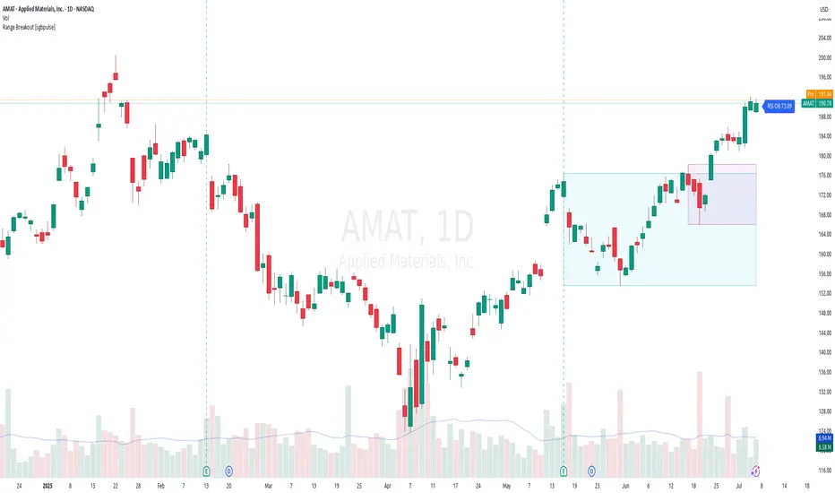
Range Breakout [sgbpulse]Range Breakout
1. Overview
The "Range Breakout " indicator is a powerful tool designed to identify and visually display price ranges on your chart using pivot points. It dynamically draws two distinct boxes – an External Range and an Internal Range – helping traders pinpoint potential support and resistance zones. Beyond its visual representation, the indicator offers a comprehensive set of 12 unique breakout alerts, providing real-time notifications for significant price movements outside these defined ranges. Additionally, it integrates RSI and MFI metrics for momentum confirmation.
2. How It Works
The indicator operates by identifying pivot points based on user-defined "left" and "right" bar lengths. A high pivot is a bar with a specified number of lower highs both to its left and right, and similarly for a low pivot.
External Range: Calculated using longer pivot lengths (default: 15 bars left, 6 bars right). This range represents broader, more significant price consolidation areas.
Internal Range: Calculated using shorter pivot lengths (default: 4 bars left, 3 bars right). This range captures tighter, more immediate price consolidations within the broader trend.
The External Range will always be greater than or equal to the Internal Range, as it's based on a wider historical context. Both ranges are displayed as transparent boxes on your chart, dynamically adjusting as new pivots are formed.
3. Key Features and Settings
Customizable Pivot Lengths:
External Range (Left/Right Bars): Adjust sensitivity for identifying the broader price range. Longer lengths lead to more stable, but less frequent, range updates.
Internal Range (Left/Right Bars): Adjust sensitivity for the tighter, more immediate price range.
Tool Tips: Minimum 6 bars for the External Range, and minimum 2 bars for the Internal Range.
Customizable Range Colors: Easily change the background colors of the External and Internal Range boxes to match your chart's aesthetic.
Dynamic Range Display: The indicator automatically updates the range boxes as new pivot highs and lows are formed, always presenting the most current valid ranges.
RSI / MFI Settings:
Timeframe Source: Select the timeframe for RSI and MFI calculation.
- Chart: Calculation based on the current chart timeframe.
- Daily: Always calculated based on the daily ("D") timeframe, even if the chart is on a lower timeframe.
RSI Length: Period length for RSI calculation (default: 14).
RSI Overbought Level: Overbought level for RSI (default: 70.0).
RSI Oversold Level: Oversold level for RSI (default: 30.0).
MFI Length: Period length for MFI calculation (default: 14).
MFI Overbought Level: Overbought level for MFI (default: 80.0).
MFI Oversold Level: Oversold level for MFI (default: 20.0).
4. Synergy of Ranges & Breakout Strength
The interaction between the External and Internal Ranges provides deep insights into price movement and breakout strength:
Immediate Direction: The movement of the Internal Range (up or down) indicates the short-term directional bias within the broader framework of the External Range.
Strength Confirmation: A breakout of the External Range, followed by a breakout of the Internal Range, confirms the strength of the move and increases confidence in the breakout.
Strong Momentum ("Leaving" Ranges Behind): When price breaks out with exceptionally strong momentum, it continues to move aggressively and does not immediately form new pivots. In such situations, the existing ranges (External and Internal) remain in place while the candles "leave them behind." A "Full Candle" breakout, where the entire candle moves past both ranges, indicates a particularly powerful and decisive move.
Momentum (RSI / MFI) as Confirmation:
- RSI (Relative Strength Index): Measures the speed and change of price movements. Extreme values (above 70 or below 30) indicate overbought/oversold conditions respectively, confirming strong momentum in a breakout.
- MFI (Money Flow Index): Similar to RSI but incorporates volume. Extreme values (above 80 or below 20) indicate strong money flow in/out, reinforcing breakout confirmation.
- Importance of Confirmation: If a breakout occurs but momentum indicators do not confirm it (for example, an upside breakout while RSI is declining), this could signal weakness in the move and the risk of a false breakout (Fakeout).
5. Visuals
The indicator provides clear visual representations on the chart:
Range Boxes:
Two dynamic boxes are drawn on the chart: one for the External Range and one for the Internal Range.
These boxes update continuously, displaying the current range boundaries based on the latest pivots. They provide an immediate visual indication of support and resistance levels.
RSI/MFI Status Labels:
Small text labels appear to the right of the current bar, vertically centered.
They display the status of RSI and MFI: RSI OB (Overbought), RSI OS (Oversold), MFI OB, MFI OS, along with the exact value.
Important: The labels remain on the chart as long as the condition holds (indicator is above/below the level), unlike alerts which mark a singular crossover event.
Plotting of Key Values:
The indicator plots six invisible series on the chart, primarily to allow the user to view the exact numerical values of:
- The upper and lower bounds of the External Range (External High, External Low).
- The upper and lower bounds of the Internal Range (Internal High, Internal Low).
- The calculated RSI and MFI values (RSI, MFI).
These values are accessible for viewing through TradingView's Data Window and also via the Status Line when hovering over the relevant candle. This enables more precise quantitative analysis of range levels and momentum.
6. Comprehensive Breakout Alerts
The "Range Breakout " indicator provides 12 distinct alert conditions for breakouts, allowing you to select the required level of confirmation for each alert. All alerts are triggered only upon a fully confirmed bar close (barstate.isconfirmed) to minimize false signals and ensure reliability.
All breakout alerts are configured to detect a Crossover/Crossunder of the levels, meaning a specific event where the price moves from one side of the range to the other.
External Range Breakout UP
- Close: Price closes above the External Range.
- Real Body: The entire "real body" of the candle (min of open/close prices) closes above the External Range.
- Full Candle: The entire candle (the lowest point of the candle) closes above the External Range.
External Range Breakout DOWN
- Close: Price closes below the External Range.
- Real Body: The entire "real body" of the candle (max of open/close prices) closes below the External Range.
- Full Candle: The entire candle (the highest point of the candle) closes below the External Range.
Internal Range Breakout UP
- Close: Price closes above the Internal Range.
- Real Body: The "real body" of the candle closes above the Internal Range.
- Full Candle: The entire candle closes above the Internal Range.
Internal Range Breakout DOWN
- Close: Price closes below the Internal Range.
- Real Body: The "real body" of the candle closes below the Internal Range.
- Full Candle: The entire candle closes below the Internal Range.
7. Ideal Use Cases
This indicator is ideal for traders who:
Want to clearly identify and monitor price consolidation zones.
Seek confirmation for breakout strategies across various timeframes.
Require reliable and automated alerts for potential entry or exit points based on range expansion.
8. Complementary Indicator
For even more comprehensive market analysis, we highly recommend using this indicator in conjunction with Market Structure Support & Resistance External/Internal & BoS .
This powerful complementary indicator automatically and accurately identifies significant support and resistance levels by locating high and low pivot points, as well as key Pre-Market High/Low levels. Its strength lies in its dynamic adaptability to any timeframe and asset, providing precise and relevant real-time levels while maintaining a clean chart. It also identifies Break of Structure (BoS) to signal potential trend changes or continuations.
Using both indicators together provides a robust framework for identifying defined ranges and potential trend shifts, enabling more informed trading decisions.
View Market Structure Support & Resistance External/Internal & BoS Indicator
9. Important Note: Trading Risk
This indicator is intended for educational and informational purposes only and does not constitute investment advice or a recommendation for trading in any form whatsoever.
Trading in financial markets involves significant risk of capital loss. It is important to remember that past performance is not indicative of future results. All trading decisions are your sole responsibility. Never trade with money you cannot afford to lose.
Volatility Zones (STDEV %)This indicator calculates and visualizes the relative price volatility of any asset, expressed as a percentage of standard deviation over a rolling window.
🧠 How it works:
- Calculates rolling standard deviation of price (close) as a percentage of the current price.
- Classifies market into three volatility regimes :
• Low Volatility (≤2%) → Blue zone
• Medium Volatility (2–4%) → Orange zone
• High Volatility (>4%) → Red zone
📊 Why it matters:
Volatility structure reflects the underlying regime of the market — ranging, expanding, or trending. This tool helps traders:
- Spot optimal low-risk entry conditions
- Avoid chop zones or highly erratic moves
- Time breakouts or trend initiations
🛠 Usage:
- Works on any timeframe and instrument
- Adjustable lookback period
- Best used alongside trend filters or entry signals (e.g., SuperTrend, EMAs, etc.)

MOD_CM_MacD_Ult_MTF_V2.1Basato su “CM_MacD_Ult_MTF_V2.1” di @chadmaurice (CM)
Aggiunto timeframe 2g,3g,4g

Reverscope 5M🚀 Reverscope 5M – Precision Reversal Engine for BTC Futures
Reverscope 5M is a high-frequency trend reversal strategy, purpose-built for BTC/USDT futures trading on the 5-minute chart.
Rather than following the trend, this system specializes in identifying turning points using a combination of WMA crossovers, 3-bar ATR decline filtering, and a dynamic trailing stop mechanism. It’s designed for traders seeking to exploit short-term overextensions and reversal setups — especially in high-volatility conditions.
⚙️ Technical Features:
WMA8 crossing WMA21: Primary entry trigger
Trigger Threshold: 1.2%: Activates trailing logic after initial profit
Pullback Ratio: 0.6%: Defines trailing stop distance after trigger
Max Loss: 5%: Capital protection on each trade
ATR 3-bar decline filter: Blocks signals during weak or collapsing price structures
Supports both Long and Short positions (with reversal bias)
Compatible with TradingView alerts
(📌 Note: Alert logic and messages will be updated in future versions.)
⚠️ Critical Warnings:
This is a reversal-based strategy, not a trend-following one.
It is optimized to enter against the prevailing trend, so using it in strong trend conditions may lead to consecutive losses.
Designed for futures and leveraged instruments — significant risk is involved.
Always backtest thoroughly with Strategy Tester before using in live markets.
Understand the signal logic, trailing mechanism, and filtering behavior before deploying.

FFI-Trend Rider Pro✅ Benefits of the FFI Trend Rider Pro Indicator
“Designed for Traders Who Want Consistent Results, Not Confusion.”
1. 📈 Pinpoint Buy & Sell Signals
No more guesswork. Get clear entry and exit signals based on proven strategies, helping you avoid emotional decisions and increase confidence in every trade.
2. ⛔ Eliminates Low-Quality Trades with Smart Filters
Built-in RSI and trend filters ensure you only take high-probability trades. Avoid choppy, sideways markets and reduce losses significantly.
3. 🔔 Real-Time Alerts – Never Miss an Opportunity
Get instant alerts directly on your phone, email, or TradingView — so you can catch the best trades even when you're away from the screen.
4. 🎯 Auto-Displayed Stop Loss & Target Levels
Every trade comes with visual SL and target lines, so you know the exact risk-reward ratio. This simplifies your decision-making and helps manage your capital like a pro.
5. 🧠 Backtested & Battle-Tested
FFI Indicator is built on strategies that have been tested over thousands of trades across multiple market conditions — offering trust and consistency.
6. ⚡ Beginner-Friendly Yet Powerful
No need to understand complex technical analysis. Just plug in the indicator and start using it, whether you're a beginner or experienced trader.
7. 🔄 Works on All Timeframes & Instruments
Use it for intraday, swing, or positional trading — whether it’s NIFTY, BANK NIFTY, stocks, or commodities. Adaptable to your trading style.
8. 💬 Support + Community Access
Get access to Telegram support or exclusive community groups where you can ask questions, share trades, and grow with other traders.
9. 🔐 Lifetime Access Option
Pay once and use it forever — no monthly fees if you go for the Lifetime Plan.
Would you like me to turn this into a social media post, landing page section, or product video script as well?

LUCEO RSI(USDT/BTC pair)It shows the RSI on the USDT pair or USDT.P pair and the RSI on the BTC pair simultaneously, allowing you to detect divergence signals through the disparity.
Note)
- Instruments that are not listed on Binance Exchange's BTC pair will not be displayed (New Listings, Low Market Capitalization Alt, etc.)
- If the futures of a specific asset are prefixed with a number such as 1,000, BTCPair will not display correctly. Example) 1,000pepeusdt not applied/PEPEUSDT applied

HBD.2025.BOZ AYIThis indicator is designed for financial market analysis. The code generates trading signals using various **technical oscillators** such as **moving averages (EMA)**, **RSI, MACD** and **Stochastic**, as well as the **ADX trend filter**. It also offers additional visualization and analysis tools such as **bear market alerts** based on historical **price action**, **channel plots** and **MA50 cloud**. It includes a range of **input settings** that allow users to customize their strategies by **turning on and off** various filters and indicators. Finally, it also features a simple charting feature for potential **profit/loss (PnL) tracking**.

RSI Extreme Hit Tracker (Visual Enhanced + Stats)📊 Indicator Overview
🔥 RSI Extreme Hit Tracker – Visual Enhanced + Stats Edition
A high-precision momentum tracker designed for traders who want maximum insight into RSI behavior at extreme thresholds.
🧠 What It Tracks
This indicator doesn’t just alert you when RSI enters ultra-overbought or ultra-oversold zones—it actively logs, analyzes, and visualizes how price reacts during those periods.
It tracks:
- OB/OS HOLD Events: When RSI enters and stays in extreme zones for a customizable bar count
- OB/OS EXIT Events: When RSI retreats from extremes via hysteresis logic for adaptive confirmation
- Entry Alerts: Based on four modes (Basic, Cool-down, Confirmed, or Hysteresis)
- Tier Markers: Emoji-based tier tags to classify signal impact instantly on chart
- Background Tints: When OB/OS zones are active, for clear visual context
📈 Statistical Table
On every final bar, a clean table appears in the top-right corner showing:
- Count of OB/OS events (Hold & Exit)
- Total % move across all signals
- Average % move per signal
- Easy-to-skim P&L performance stats
🎛️ Configurable Features
🔄 Cool-down Periods: Prevent rapid-fire alerts after consecutive hits
🔍 Confirmed Entries: Require two-bar RSI zone confirmation before firing
🧪 Hysteresis Logic: Avoid false exits by confirming RSI decay before logging
📏 Custom Thresholds: Adjust OB/OS entry levels, exit hysteresis, and hold duration
🎨 Visual Feedback: Triangle, X-cross, and circle shapes with color-coded tier labels (🟩 🟨 🟦 🟥)
💡 Ideal Use Cases
- Reversal traders looking to time exhaustion and RSI flips
- Scalpers and momentum riders wanting sharp entry/exit maps
- Coders refining algorithms using historical signal behavior
- Analysts exploring data-driven signal statistics over time

Hamster DynamicHamster Dynamic – Precision Scalping in Key Zones
Hamster Dynamic is a high-performance scalping strategy designed for traders who value speed, precision, and clarity. This script focuses on executing trades around key support and resistance levels, helping traders capitalize on high-probability setups in volatile markets.
The system combines real-time price action analysis with adaptive trend and volatility filters, making it a powerful tool for fast-paced trading environments.
Key Features
Automatic detection of major support and resistance zones
Rapid-entry scalping engine with precise timing
Built-in trend and momentum filters to avoid false signals
Fully customizable for different trading styles
Compatible with Forex, Crypto, Gold, and major indices
Who is it for
Traders who rely on zone-based entries and exits
Scalpers who need fast, accurate signals
Beginners seeking structure and confidence
Experienced traders looking to add a lightweight tactical edge
Let your strategy move with purpose. Hamster Dynamic is built for those who trade with intention.

[Top] 🦙 LHAMA Bands🦙 LHAMA Bands — Adaptive Bollinger Bands with RSI Heatmap Fill
This indicator combines adaptive Bollinger Bands and a dynamic RSI-based heatmap fill to help traders assess price volatility and momentum extremes at a glance. Unlike standard Bollinger Bands that use a fixed SMA basis, this version includes a Low-High Adaptive Moving Average (LHAMA) option that adjusts responsiveness based on recent price action, reducing lag during trend shifts.
How It Works
1. Basis Calculation (SMA or LHAMA)
SMA Basis:
Uses a traditional simple moving average of the selected source over the Bollinger Band length.
LHAMA Basis:
Computes an adaptive moving average that reacts faster when the highest high or lowest low changes over the LHAMA length. The adaptive coefficient increases during volatility, making the bands tighten or expand more responsively.
2. Bollinger Bands
Upper and lower bands are calculated by adding/subtracting a multiple of standard deviation from the basis. The multiplier (e.g., 2) controls the sensitivity to volatility.
3. RSI Heatmap Fill
The fill between the bands is dynamically colored based on the RSI value.
Colors range from:
Deep purple for very oversold (RSI ≤10)
Gradient purples and oranges through neutral
Bright yellow for very overbought (RSI ≥90)
This makes it easy to see whether price is consolidating at oversold/overbought extremes within the bands.
4. Optional RSI Table
Displays a floating table showing the current RSI value. Text color changes depending on RSI level for instant reference.
Inputs & Customization
You can adjust:
Bollinger Band Settings
Line Type
SMA or LHAMA
LHAMA length (if selected)
RSI Settings
Heatmap Colors
RSI Table:
Toggle table visibility and select its screen position.
How to Use
Volatility & Trend Context:
Use the adaptive bands to gauge when price is expanding or contracting.
The LHAMA basis can help identify faster-moving trends than an SMA.
Momentum Confirmation:
Observe the RSI heatmap fill color to confirm whether price is in overbought or oversold territory.
Dynamic Entry/Exit Zones:
Look for confluence between price touching bands and RSI extremes.
For example, if price is near the lower band with a deep purple fill (RSI ≤10), it could signal exhaustion.
Visual Clarity:
The optional table allows quick reference to the RSI value without opening separate indicators.
What Makes It Unique
This indicator enhances classic Bollinger Bands by:
Providing adaptive smoothing (LHAMA) for improved reactivity.
Embedding a color-coded RSI heatmap fill that instantly shows momentum context.
Offering extensive customization of colors, styles, and display options to fit any charting workflow.


[Top] 🦙 LHAMA-MACD🦙 LHAMA-MACD — Low-High Adaptive MACD Oscillator
This indicator is a custom MACD-style oscillator that uses LHAMA (Low-High Adaptive Moving Average) smoothing instead of conventional EMAs. LHAMA dynamically adapts its responsiveness based on recent high/low price activity, aiming to reduce lag and improve sensitivity to trend shifts compared to standard MACD.
How It Works
LHAMA Calculation:
For both fast and slow components, the indicator evaluates whether the highest high or lowest low over the lookback length is changing. When new extremes are detected, an adaptive tracking coefficient increases, making the moving average respond faster. This results in a moving average that adapts more quickly during volatility and smooths out during consolidation.
MACD Line:
The difference between the fast LHAMA and slow LHAMA.
Signal Line:
An EMA of the MACD line over a user-defined period.
Histogram:
The difference between the MACD Line and the Signal Line.
Crossover Labels:
Green star ✳️ appears below price when the MACD crosses above the Signal Line (potential bullish momentum).
Orange star ✴️ appears above price when the MACD crosses below the Signal Line (potential bearish momentum).
Inputs
Price Source: The price data to analyze (default: close).
Fast LHAMA Length: Period for the faster adaptive average.
Slow LHAMA Length: Period for the slower adaptive average.
Signal EMA Length: Smoothing period for the Signal Line.
Show Histogram: Toggle histogram display.
Show Oscillator Lines: Toggle MACD and Signal Lines display.
How to Use
Trend Confirmation: Use histogram and line crossovers to gauge trend strength and potential reversals.
Momentum Shifts: Bullish crossovers may indicate increasing upside momentum, while bearish crossovers can signal weakening price action.
Subpane Visualization: The oscillator plots in a separate pane below your chart.
Price Markers: Labels appear directly on the price chart for clearer visual signals.
This tool can complement price action strategies by providing early warnings of trend changes and momentum shifts, thanks to its adaptive smoothing approach.

Linearity IndexThe Linearity Index (LI) indicator helps traders identify trending and choppy markets by measuring price movement efficiency. It calculates LI using a user-defined lookback period (default: 61 days), dividing the net price change by the sum of absolute daily changes. LI ranges from -1 to 1:
Positive LI: Upward trend
Negative LI: Downward trend
Near 0: Choppy or flat market
Key FeaturesTable Display:
Summarizes data over three periods (1st Year, 2nd Year and 3rd Year)
Linear Days: LI > 0.2 (strong linearity)
Trend Days: Close > 50 SMA and LI > 0.05 (upward trend)
Linearity Index Ratio (LIR): Linear Days / Trend Days,
color-coded:Red (< 0.25)
Yellow (0.25–0.50)
Green (> 0.50)
Total LIR : average of every year's LIR and color coded based on overall LI color
View modes: Full (detailed), Compact (abbreviated), Mini (Yr & LIR only)
Visuals:Horizontal lines at 0.20 ("Linearity Level") and 0.05 ("Choppiness Level")
Background color: Green (LI > 0.2), Red (LI < 0.05)
LI plotted as a dark gray histogram
Customization:Adjustable lookback period
Selectable table view mode (Full, Compact, Mini)
Purpose : The LI indicator provides a quick way to assess market trends and linearity over time, with visual cues and a customizable table for deeper analysis. Ideal for traders seeking to gauge trend strength and market efficiency.
Took inspiration from @OmkarBanne 's Trend vs Chop Detector

Dynamic Momentum Oscillator ProThis indicator is called "Dynamic Momentum Oscillator Pro" (DMO PrO) and is a modified oscillator that analyzes the difference between two moving averages (fast and slow) across different timeframes. Its primary purpose is to identify trend strength and direction, as well as potential reversal points.
This indicator detects early momentum shifts in assets approaching key reversal zones by tracking:
- Convergence of the smoothed moving average (SMMA)
- Trend confirmation across multiple timeframes
- Visual assessment of momentum intensity
### Key Features:
1. Dual Smoothed Moving Averages (SMMA)
- Uses two modified moving averages (SMMA — Smoothed Moving Average) with different periods:
- `fast_length` (default: 4) — fast MA.
- `slow_length` (default: 12) — slow MA.
- The difference between them (`ma_diff = fast_ma - slow_ma`) generates the primary signal.
2. Higher Timeframe Analysis
- The indicator automatically calculates the moving average difference (`ma_diff`) on a higher timeframe (`res_multi` times larger than the current one) to determine the global trend.
- Example: If the current timeframe is 1H and `res_multi = 3`, the higher timeframe will be 3H.
3. Visualization:
- Histogram (bars) — displays the current `ma_diff` value. Color depends on the direction and position relative to zero.
- Lines — duplicates the histogram as a line.
- Background — shaded red/green based on the higher timeframe trend direction.
4. Color Scheme:
- Above zero and rising: Light green (`#81C784`).
- Below zero and rising: Deep green (`#26A69A`).
- Above zero and falling: Bright red (`#EF5350`).
- Below zero and falling: Light pink (`#FFCDD2`).
Signal Interpretation:
- Green bars: Increasing bullish momentum.
- Red bars: Growing bearish pressure.
- Background color: Trend bias on the higher timeframe (red = bearish, green = bullish).
### Logic:
- A rising `ma_diff` indicates strengthening momentum.
- Zero-line crossovers may signal a trend reversal.
- Divergence between current and higher timeframes (e.g., uptrend on lower TF vs. downtrend on higher TF) can warn of trend weakness.
### Applications:
- Trend strategies: Buy when the histogram rises above zero; sell when it falls below.
- Trend filter: Alignment of directions across timeframes strengthens signals.
- Divergences: Discrepancies between price and indicator may hint at reversals.
This indicator combines features of MACD (MA difference) and Momentum.
