How to use Session Profiles for Day TradingHey whats up traders, in reveal cheat code for day trading by using session profiles. It's powerful concept. If correctly applied with HTF trend it will allows you to join running train path the right time.
Dont forget to follow me. I release such articles every Monday.
🧠 What Are Session Profiles?
A session profile describes the typical price structure and narrative during a market session — from open → high/low → close.
In Forex, we focus on:
• Asian Session
• London Session
• New York Session
Each session can act as either a reversal or continuation of the previous session(s).
📈 Why They Work
Markets are engineered to:
• Run stops (above highs or below lows)
• Fill inefficiencies (fair value gaps or imbalances)
CLS prefer to move price during specific times — the active hours around session opens. This is where liquidity is high and slippage is minimal, making it ideal for executing large orders.
So, session profiles help us map out when and where these manipulations are most likely to happen.
✅ Why You Should Use Them
Session profiles help you:
• Avoid low-probability trades in dead sessions
• Focus on high-probability narratives
• Anchor your execution models to context
But remember: they are not an entry model. You still need:
• A higher timeframe bias
• A mechanical entry model
• A system for risk and trade management
🔁 How to Use Session Profiles
Use the previous session(s) to anticipate the next one.
• For London session → analyze the Asian session
• For New York session → analyze Asian + London sessions
You’re looking for:
1. Manipulations into key levels
2. Displacement (price moves away strongly)
3. Change in order flow (e.g. OB,on M5 ,15 or H1)
4. Remaining liquidity targets (draw on liquidity)
📊 Session Profile Types with Chart Logic
1. 🔄 London Continuation Profile
Conditions:
• Asia session already made a manipulation into a key level
• Price displaced away from that level
• CIOD / OB on M15 or H1 before London open
Example:
• H1: Asia runs stops above H1 high into a fair value gap (key level)
• Displacement confirms intent
• At London open, price retraces into M15 premium (PD array) and continues in the same direction
Invalidation: the manipulation high/low from Asia session
Narrative: Asia did the manipulation → London does the continuation.
2. 🔁 London Reversal Profile
Conditions:
• Asia session consolidates near a higher timeframe key level
• London open initiates the manipulation into the key level
• Displacement + M15 BOS after manipulation
Example:
• H1: Asia consolidates under daily FVG
• London opens, price runs Asia high into that FVG
• M15 breaks down → clean short setup
• Target: higher timeframe draw on liquidity (e.g., previous day low)
Invalidation: the London session high (manipulation point)
Narrative: London performs the manipulation → price reverses.
3. 🔄 New York Continuation Profile
Conditions:
• Asia + London already created a clear manipulation and displacement
• London has not reached the final draw on liquidity
• London is not overextended (e.g., <70 pips move)
• New York opens with structure intact for continuation
Example:
• H1: London makes a reversal from a key level and displaces lower
• Draw on liquidity (e.g., previous day low) still untouched
• NY opens and continues the sell-off, retracing briefly into M15 imbalance before expanding lower
Invalidation: manipulation level from London
Narrative: London set the direction → NY finishes the move.
4. 🔁 New York Reversal Profile
Conditions:
• No clear London profile (no key level touched, no strong CHoCH)
• NY opens and manipulates into a key level (e.g., daily OB, FVG)
• Clear M15 or H1 CHoCH or BOS confirming reversal
• Asia + London lows still intact (liquidity available below)
Example:
• H1: No strong setup in London
• NY opens, price spikes into daily OB and takes out London highs
• M15 structure shifts → sell targeting London + Asia lows
Invalidation: NY session manipulation high
Narrative: London was noise → NY takes control and reverses.
🔁 Visual Structure Flow
Before applying any session profile, confirm:
1. High-probability trading conditions (e.g., key level proximity, market open, liquidity available, Red News)
2. Bias in place (HTF (D1 and Weekly direction must be known)
Then:
→ Check for valid session narrative
→ Select the correct session profile
→ Wait for the stop run of H1 / H4
→ Is there enough room for the move to key level
→ If we are still in first half of session you can enter. If its close the end of session skip it.
→ Apply your entry and risk model.
→ Dont be greedy look for 2:1 RR trade and get out.
🔁 How to enter ?
if bearish - You always want enter above H1 I H4 candle after LTF CIOD
If bullish - You always want to enter bellow H1/ H4 after LTF CIOD.
Use Order block to enter the market here is how to identify it correctly
Remember:
Never sell low / Never buy High... wait for stop run / Liquidity sweeps. If you dont know where is the liquidity - you will be liquidity.
Hope this brings clarity to your trading.
Done on the Tradenation Charts
Disclosure: I am part of Trade Nation's Influencer program and receive a monthly fee for using their TradingView charts in my analysis.
"Adapt what is useful, reject what is useless, and add what is specifically your own."
— David Perk aka Dave FX Hunter ⚔️
Community ideas

AMP Futures - How to enable the floating data window.In this idea we will demonstrate how to access the new floating data window using TradingView.

Quantum Computing - Why BTC isn't the biggest worryYou’ve probably heard that quantum computing could break Bitcoin’s encryption—and that’s true. But here’s the thing: Bitcoin might not even be the biggest target.
The real risks? Financial systems, national security, healthcare, and even the internet itself. These areas rely on the same encryption methods that quantum computers could crack, and the fallout could be far worse than a Bitcoin hack.
Let’s break it down.
1️⃣ Financial Systems: A Global Crisis Waiting to Happen
Imagine if hackers could:
Drain bank accounts at will.
Manipulate stock markets.
Fake trillion-dollar transactions.
This isn’t just about stolen crypto—it’s about economic chaos. Banks, stock exchanges, and payment systems all depend on encryption. If quantum computers break it, we’re looking at a meltdown way bigger than Bitcoin’s $3 trillion market.
2️⃣ National Security & Internet Privacy: A Hacker’s Dream
Governments and militaries use encryption to:
Protect classified intelligence.
Secure communications between leaders.
Guard critical infrastructure (power grids, water supplies).
If quantum computers crack these codes, entire nations could be exposed to cyberwarfare. Your private data? At risk too—email, messaging, even your online banking could be decrypted years later.
3️⃣ Healthcare, Supply Chains & IoT: The Hidden Vulnerabilities
Medical records could be leaked, exposing sensitive health data.
Smart devices (like home security systems) could be hacked.
Supply chains might collapse if logistics networks are breached.
These systems weren’t built with quantum threats in mind—and upgrading them won’t be easy.
🔴 The Bigger Picture: A "Civilizational Upgrade"
Switching to quantum-resistant encryption is like rebuilding the internet’s foundation. It’s necessary, but messy. Some experts compare it to the Y2K bug—but way harder.
🔷 So, Is Bitcoin Safe?
Not entirely—about 25% of all Bitcoin could be stolen if quantum computers advance fast enough. But compared to the risks facing banks, governments, and hospitals? Bitcoin might be the least of our worries.
🔷 What’s Next?
Governments & companies are already working on fixes (like NIST’s post-quantum cryptography standards).
The transition will take years—and hackers might exploit weak spots along the way.
Staying informed is key. If you’re in tech, finance, or security, this affects you.
ℹ️ Want to Dive Deeper?
Deloitte’s take on quantum computing & Bitcoin
Forbes on quantum risks beyond crypto
🤷♂️ Bottom line?
Quantum computing is coming—and while Bitcoin has risks, the real danger lies in the systems we all depend on every day.
❔What do you think? Will we be ready in time? Let me know in the comments! 🚀

Navigating the Complexities of Forex Swap RatesNavigating the Complexities of Forex Swap Rates
Forex swap rates, pivotal in currency trading, reflect the cost of holding a position overnight. This article unpacks swaps, offering clarity on their calculation and impact. Even seasoned traders may be confused with the complexity of swaps. It’s vital to learn about how these costs relate to effective strategy and fee management. Dive into the complexities of forex swaps and learn how they can influence decisions and overall performance in the ever-evolving trading world.
Understanding Forex Swap Rates
For traders, understanding forex market swap rates is crucial. A swap is essentially the interest differential paid or charged to a trader when they hold a position overnight. The concept hinges on the idea that when you trade currencies, you are effectively borrowing one currency to buy another. Hence, these rates come into play, reflecting the cost of the process.
The swap rate definition boils down to the interest rate difference between the two currencies involved in a trade. For instance, if you are going long in a pair like EUR/USD, the swap rate would be determined by the difference in interest rates set by the European Central Bank and the Federal Reserve. If the borrowing cost of the euro is lower than that of the dollar, holding the EUR/USD pair overnight would typically result in a charge. Conversely, if the euro has a higher borrowing cost, you might see your balance credited.
Calculating swaps involves a straightforward formula:
Swap rate = (Contract size × Interest differential) ÷ 365
This calculation takes into account the size of your position and the interest rate difference, providing a daily cost or gain for holding the position. Understanding these costs is vital when it comes to managing trading expenses and strategy in the forex market.
Key Elements Influencing Swap Rates
Several factors play pivotal roles in determining overnight swap rates in the forex market.
1. Interest Rate Differentials: The primary driver of overnight rates, interest differentials stem from the varying monetary policies of central banks. For example, if the Bank of England has a higher lending rate than the Federal Reserve, a buy trade in GBP/USD could mean earning for maintaining the position overnight.
2. Market Conditions: Economic stability, political events, and financial market volatility can significantly impact overnight charges. During periods of high volatility or geopolitical uncertainty, rates may fluctuate more dramatically, reflecting the increased market risk.
3. Liquidity: The level of liquidity in the market often influences overnight costs. In less liquid markets and less commonly traded pairs, higher swaps might be charged due to the increased cost of facilitating these trades.
4. Broker Policies: Different forex brokers might have varying policies and calculations for their own swaps. These differences usually arise from the brokers' own pricing structures, risk management strategies, and competitive positioning in the market. As such, traders should be aware that overnight charges vary from broker to broker.
Types of Forex Swaps
There are primarily two types of swaps that traders may encounter, each serving distinct purposes and offering unique implications for trading strategies.
1. Interest Swaps: These involve the exchange of interest payments between parties. In forex, it typically manifests as the fee a trader pays or receives for holding a position overnight. They directly impact the cost of maintaining open positions in different pairs.
2. Currency Swaps (Cross-Currency Swaps): Also known as a currency rate swap, this involves exchanging principal and interest payments in two different currencies. While less common in everyday retail forex activities, they are important in managing currency exposure and risk, particularly in hedging strategies. Currency swaps are used to secure a predetermined exchange rate for a specified currency amount while incorporating a benchmarked or fixed interest rate. This type is usually used by corporations or brokers.
Regarding fixed swap rates, they are less common in the forex market compared to the more prevalent floating swap rates. They’re often used in less volatile financial environments and typically find their application in long-term financial instruments or corporate finance rather than in the day-to-day trading of currencies.
Strategies for Managing Swap Rates
Management of swaps in forex involves several key strategies:
- Short-term Trading: By closing positions before the end of the trading day, traders can avoid incurring overnight fees altogether. It’s a so-called day trading since positions are typically closed by the end of the day.
- Hedging: Implementing hedging strategies may mitigate overnight fees. This involves opening opposite positions in correlated pairs, thus potentially balancing the amounts paid and received.
- Economic Calendar Awareness: Staying informed about major economic announcements and central bank decisions often helps traders anticipate changes in borrowing costs.
- Broker Selection: Choosing the right broker is critical. Selecting a broker with favourable rates might significantly reduce trading fees, especially for those holding long-term positions.
Practical Implications for Traders
Understanding and managing these charges has direct implications for traders' strategies and overall performance. Key considerations include:
- Carry Trading: A carry trade strategy entails borrowing in a currency with a lower interest rate and investing in another with a higher yield. Traders take advantage of the interest differential but must be mindful of potential fees.
- Rollover Costs: Traders holding positions overnight need to account for rollover costs, which can either erode or enhance returns, depending on the direction of the trade and the prevailing swap rates.
- Currency Exposure Management: Swap rates affect the overall cost of maintaining a position. Traders need to balance the potential advantages of holding a position against the charges incurred.
The Bottom Line
Mastering swap rates is a cornerstone of trade management. A thorough understanding may empower traders to navigate these costs and potentially improve their strategies. By carefully considering factors like interest differentials and broker policies, traders may manage their trades and overall performance more effectively.
This article represents the opinion of the Companies operating under the FXOpen brand only. It is not to be construed as an offer, solicitation, or recommendation with respect to products and services provided by the Companies operating under the FXOpen brand, nor is it to be considered financial advice.

How to mark your charts Lightning fast!One of the things I didn't like was marking my charts. I would take so much time marking my charts and adding the prices on the side. My mentor showed me the fastest way. Just use the FIB tool and use "0" and "1". Now you can focus on other important things. I want to thank my mentor for showing me this. Good luck to everyone

What is the key that makes you start trading?
Hello, traders.
If you "Follow", you can always get new information quickly.
Have a nice day today.
-------------------------------------
HA-Low, HA-High indicators are indicators created for trading on Heikin-Ashi charts.
Therefore, they are determined by Heikin-Ashi's Open, Close, and RSI values.
If the RSI indicator value is above 70 when the candle starts to rise and then falls on the Heikin-Ashi chart, the HA-High indicator is generated.
If the RSI indicator value is below 30 when the candle starts to rise and then falls on the Heikin-Ashi chart, the HA-Low indicator is generated.
Therefore, rather than judging the rise and fall with your eyes, you can judge the rise and fall transitions with more specific criteria.
If you look at a regular chart, you can see that there are many rise and fall transition points, unlike the Heikin-Ashi chart.
The Heikin-Ashi chart has the effect of reducing fakes.
Therefore, it has a higher reliability than judging with a regular chart.
The biggest disadvantage of the Heikin-Ashi chart is that it is difficult to know the exact values of the Open and Close values.
Therefore, the HA-Low, HA-High indicators are used to accurately and quickly identify the Open and Close values by indicating the rising and falling transition points of the Heikin-Ashi chart on a general chart.
-
The Heikin-Ashi chart uses the median.
Therefore, the HA-Low indicator corresponds to the median when it leaves the low range, and the HA-High indicator corresponds to the median when it leaves the high range.
If the HA-Low indicator is generated and then receives support, there is a high possibility that an upward trend will begin, and if the HA-High indicator is generated and then receives resistance, there is a high possibility that a downward trend will begin.
Therefore, the HA-Low, HA-High indicators are used in basic trading strategies.
However, since the HA-Low and HA-High indicators are intermediate values, if the HA-Low indicator resists and falls, there is a possibility of a stepwise decline, and if the HA-High indicator supports and rises, there is a possibility of a stepwise rise.
Therefore, to compensate for this, the DOM (60) and DOM (-60) indicators were used.
The DOM indicator is an indicator that comprehensively evaluates the DMI + OBV + MOMENTUM indicators.
When these indicators are above 60 or below -60, the DOM (60) and DOM (-60) indicators are created.
In other words, the DOM (60) indicator corresponds to the overbought range and indicates the end of the high point.
The DOM (-60) indicator corresponds to the oversold range and indicates the end of the low point.
Therefore, when the HA-Low indicator resists and falls, the actual stepwise decline is likely to start when it falls below DOM (-60).
On the other hand, when the HA-High indicator is supported and rises, the actual step-up trend is likely to start by rising above DOM (60).
This compensates for the shortcomings of the HA-Low and HA-High indicators.
-
There is no way to be 100% sure in all transactions.
Therefore, if the motivation to start a transaction is clear, it is only worth challenging the transaction.
Finding that motivation and deciding how to start a transaction that suits your investment style is the trading strategy and the core of trading.
-
Thank you for reading to the end.
I wish you successful trading.
--------------------------------------------------

Are You Really Analyzing Or Just Defending your imagination? You might think you're analyzing every time you open a chart.
But what if you're just looking for reasons to justify a bad trade?
Real analysis is data-based. Justification is emotion-based.
Let’s figure out if you're really trading smart or just lying to yourself.
Hello✌
Spend 3 minutes ⏰ reading this educational material.
🎯 Analytical Insight on Bitcoin:
BINANCE:BTCUSDT is currently testing a strong resistance near the upper boundary of its parallel channel. A breakout to the upside looks likely soon. From this level, I expect at least a 5% gain, with a main target around $114,500. 📈🚀
Now , let's dive into the educational section,
🎯 Analysis or Mental Justification?
Many traders, once they’re in a position, stop looking for truth and start looking for confirmation.
Instead of reading what the chart actually says, they twist every line and indicator to make it look like their trade still makes sense even when it doesn’t.
🛠 TradingView Tools That Kill Self-Deception
TradingView is way more than just a place to slap on some EMAs and MACDs. If used right, it can literally stop you from fooling yourself:
Replay Tool – Use this to backtest without future data bias. It trains your brain to analyze based only on the present moment.
Multi-Timeframe Layouts – View your idea across multiple timeframes. Confirmation bias collapses fast when you see the same chart from different angles.
Volume Profile – This shows where real trading happens, not where you wish it would happen.
Community Scripts & Public Indicators – Looking at someone else's logic helps you catch your own blind spots.
Idea Journal & Posts – Publish your analysis and compare it with what actually happened. You’ll quickly see how often emotion was driving your trade.
😵💫 What Does Justification Even Look Like?
It’s when you’re deep in the red but instead of managing your loss, you draw a new trendline… or add a reversed Fibonacci… or tell yourself, “It’s just a correction.”
That’s not analysis. That’s emotional defense.
💡 Know the Real Difference
Analysis = data-driven, emotion-free.
Justification = emotion-driven, data-twisted.
🔂 Why Do You Keep Making the Same Mistake?
Because your brain loves to feel right even when it's wrong.
Instead of accepting reality, it tries to bend it.
So you dig for signals to support your bad position, not question it.
🧠 The Psychology Behind the Trap
What you’re feeling is cognitive dissonance. Two thoughts fighting in your head:
“This position is failing.”
“I don’t want to be wrong.”
So your brain builds fake reasons to stay in it. Welcome to the mental loop that kills portfolios.
🎯 How To Break the Cycle
Write down why you’re entering any trade before you open it.
Only trade what you can explain, not what you hope.
Decide your stop-loss level before you enter.
If you’re “hoping” for something to turn around, it probably won’t.
🪞Be Brutally Honest With Yourself
The real question isn’t “Can you analyze?”
It’s “Can you admit you were wrong when it matters?”
Every losing trade you hold onto out of ego is a reminder that you chose comfort over skill.
⚠️ What Makes a Pro Trader?
A pro doesn’t just win trades. They cut losses fast.
They don’t “marry” a position just because they drew a trendline.
They survive by respecting truth, not bending it.
🧪 Train Your Brain To See Reality
To break the habit of self-justification, you need to rewire your analysis process. Here's how:
Before analyzing a chart, review your previous trade honestly.
Ask: What made me enter? Strategy or emotion?
Replay the chart with TradingView’s tool. If you didn’t know the future, would you still take that trade?
Answer those questions and you'll start separating real analysis from self-defense.
👁 Look at the Chart Without Bias
If you’re holding a position while analyzing, you’re probably just looking for evidence to stay in.
Try this instead: Pick a timeframe where you have no position, and do a clean analysis.
No hope. No fear. No money on the line.
That’s when real analysis happens.
🔚 Final Note
Real analysis hurts because it forces you to face mistakes. But it's also the path to real consistency.
Next time you open a chart, ask yourself:
“Am I seeking the truth or just a reason to hold on?”
One moment of honesty can change your entire trading journey.
✨ Need a little love!
We put so much love and time into bringing you useful content & your support truly keeps us going. don’t be shy—drop a comment below. We’d love to hear from you! 💛
Big thanks , Mad Whale 🐋
📜Please remember to do your own research before making any investment decisions. Also, don’t forget to check the disclaimer at the bottom of each post for more details.

Breakout vs Fakeout: How to Spot the DifferenceHello, Traders! 🖖🏻
There’s probably no phrase that triggers more mixed emotions in crypto trading than: “Looks like we’re breaking out!”. Because let’s be honest…For every clean breakout that follows through with momentum…
…there’s a fakeout waiting to trap overconfident entries.
So, how do you tell the difference? Let’s break it down!
🧱 What Is a Breakout?
A breakout occurs when the price moves decisively beyond a key level, such as support, resistance, a trendline, or a range boundary, and holds.
What makes it a REAL breakout?
Volume Expansion: More participants step in as the price moves through the level.
Strong Candle Closes: Especially on higher timeframes like 4H or 1D.
Follow-Through: The market doesn’t just poke above the level. It builds on it.
No Immediate Rejection: You don’t see a sharp wick straight back below.
Example from BTC (2021):
Look back at January to February 2021. BTC had been stuck under the $42K–$43K resistance for weeks. Every push got sold off, until it didn’t.
When the breakout finally came, it was clean. The massive daily candle closed right through the level. Volume exploded. And there wasn’t even a polite little retest, price just launched straight toward $58K, leaving anyone waiting for a pullback completely behind.
Pure trend breakout energy. Everything lined up: the context, the volume, the structure — textbook 🤌🏻
🪤 What Is a Fakeout?
A fakeout, on the other hand, looks like a breakout… until it isn’t. The price briefly moves beyond a key level, but then snaps back inside the range, often trapping late buyers (or sellers) and triggering stop-losses.
Common Signs of a FAKEOUT:
Low or Declining Volume (at the breakout moment).
Quick Rejection with a Long Wick (especially on intraday charts).
Failure to Hold Above the Level on Retest.
Divergence Between Timeframes: For example, a 15M breakout that looks strong while the 4H still shows consolidation.
Classic BTC example:
This one was sneaky! After BTC hit its all-time high around $65K, the market started looking shaky. Price tried to recover by pushing back into the $58K–$60K zone, a pretty critical level at the time. It looked like a breakout attempt… but something was off. No real volume. No strong candle closes. And then, BOOM, hard rejection. The price popped just enough above resistance to lure in breakout traders (and probably clear out some stop-losses)… then completely reversed. And not just a minor pullback, this fakeout basically triggered the entire leg down toward $30K. Classic liquidity grab. The kind of move that looks like strength for a second… until it absolutely isn’t.
🕵️♂️ Key Differences: Breakout vs Fakeout (Checklist)
🧠 What Causes Fakeouts in Crypto?
Honestly, fakeouts aren’t some kind of accident. They’re almost baked into how crypto markets work.
Part of it comes down to simple liquidity hunting. The market knows exactly where traders tend to place their stop losses, right above resistance or just below support. Price often spikes into those zones, triggers stops, fills larger orders for bigger players… and then reverses completely.
Another reason? A lack of real conviction. Sometimes, it’s mostly retail traders chasing a move. Price pokes above a key level, but there just isn’t enough momentum to sustain it. Without bigger buyers or sellers stepping in, the move collapses right back.
And let’s be honest. When everyone on Crypto Twitter is watching the exact same level, fakeouts become almost inevitable. The more obvious the setup, the more likely it gets front-run, faded, or manipulated.
Plus, a huge mistake? People ignore the higher timeframe context. A breakout on the 15-minute chart might feel exciting… but if the 1D or 4H is still clearly in a downtrend, that breakout is fighting against the bigger picture. No surprise it fails. Fakeouts happen because the market’s job is to make most people wrong, at least for a moment.
🧭 Final Thought
Breakouts and fakeouts are part of the same game: they involve both liquidity and psychology. The market rewards patience, context, and waiting for confirmation. Sometimes, missing the first candle can save you from being a liability to someone else. So, next time an asset “breaks out,” take a second look. Is it really moving with force? Or is it just another trap waiting to be sprung?
What’s the last fakeout that caught you off guard? Drop your story in the comments. Let’s compare lessons learned!

Why Traders Freeze: The Psychology Behind Not Cutting LossesFirst up: let’s address the elephant in the room. Loss aversion — that great human flaw. From the moment your ancient ancestor decided to poke a saber-toothed tiger to see what happens, the brain has been hard-coded to avoid pain at all costs.
Loss aversion is literally in your DNA — studies show people feel the sting of a loss twice as intensely as the pleasure of an equivalent gain.
When you see that trade slip into the red, your rational brain may say, “Cut it, the setup is invalid, live to trade another day.” But your emotional brain — the one still grunting in a cave — is screaming, “It might come back! Hold! HOOOLD!” So you sit, frozen.
🌱 Hope: The Most Expensive Four-Letter Word
Hope is the silent killer of trading accounts. You think you’re being patient as you decide to give the trade “room to breathe.”
But what you’re really doing is outsourcing your exit strategy to technical tools, news headlines, and anything that’s not your own choice, hoping something will rescue your losing position.
This is how tiny losses can turn into portfolio ruin. Just ask anyone who’s held a small-cap memecoin down 90% because the “team has potential.”
🧊 Analysis Paralysis: When the Chart Becomes a Maze
Another reason traders freeze? Overanalysis. One bad candle and suddenly you’re toggling between the 1-minute, 5-minute, and daily chart like you’re hacking into the Pentagon. And your trendlines? You’re probably drawing them wrong .
More data rarely leads to more decisive action. It just feeds your brain conflicting signals until you’re convinced you see a bounce that isn’t there. Meanwhile, the loss grows. And grows. And then you’re back to hope. Rinse, repeat.
😬 The Ego Monster: Admitting You’re Wrong
Here’s the harsh truth: cutting a loss means admitting you were wrong. For traders, whose entire identity can hinge on being “smart money,” that feels like public humiliation. The ego monster wants you to be right more than it wants you to be profitable.
So instead of taking the small L, you’ll cling to the trade because closing it out would force you to look in the mirror and say, “I was wrong and I need to do better.”
🏴☠️ From Risk Management to Revenge Trading
Once you’ve frozen long enough, you reach the next stage of the bad-losing cycle: revenge trading . Now you’re not just trying to recover your loss; you’re out to punish the market for “taking” your money.
Spoiler alert: the market doesn’t know you exist, and it certainly doesn’t care. Maybe this is the gambler’s mindset disguised as a “strategy?”
📉 Blame the Tools? Not So Fast
Some traders love to blame outside factors like the Economic calendar or their indicators when they freeze. “My RSI didn’t signal this! The MACD betrayed me!” Indicators are just tools — they don’t make decisions for you. You do.
Hiding behind tools means you refuse to take accountability. It’s a convenient excuse that can keep you stuck in the same losing habits. Better to master the one tool that matters: your discipline .
✂️ The Beauty of the Hard Stop
All hail the hard stop — the trader’s seatbelt. It’s not attractive, it’s mechanical, but it’s often the only thing standing between you and a potentially blown-up account.
The reason some traders can survive the market for decades isn’t because they’re never wrong — it’s because they’ve learned to make their stops non-negotiable.
A stop-loss is you telling your brain, “Hey, I’m not smarter than the market, so I’ll automate the decision before I get emotional.” It takes the agony out of cutting a loss because you’ve already decided on the outcome before your lizard brain can intervene.
⚖️ Small Losses Are the Cost of Doing Business
Want to feel better about cutting that loss? Think of it as your tuition fee. Every trader pays a certain cost to the market — it’s the cost of playing the game. No one gets every trade right. The pros just get better at losing small.
Those big-shot money spinners you look up to? They didn’t build their empire by never losing. They’re pros at getting out when they’re wrong. The difference between a pro and a blow-up isn’t the winning trade — it’s the ruthless discipline on the losing ones.
🧘♂️ Finding Comfort in Discomfort
There’s no magic trick to make loss-cutting feel good. It always stings. But you can train your brain to see a small loss as a win for your long-term survival. Write it down. Journal the trade . Log the emotion. Over time you’ll realize that the trades you exit early rarely haunt you.
🏁 Face the Fear, Keep the Account
And finally, freezing in front of a loss doesn’t protect you — it likely means you’ll pay more than you should. Next time your gut says, “Maybe it’ll come back…” ask yourself: “Do I want to be right, or do I want to trade another day?”
Your job is to trade well and stay in the game for as long as possible.
Your turn, traders : what’s your biggest “should’ve cut it sooner” horror story? Drop it below — we promise not to say we told you so.

Negative Risk/Reward: Hidden Edge or Hidden Danger?It’s a topic that sparks plenty of debate.
👉 Can a negative risk/reward ratio actually be part of a winning strategy?
Here’s our take, split between intraday trading and swing trading:
📉 Intraday Trading
☑️ Pros:
• Can work in high‑probability setups (mean‑reversion, range scalps)
• Quick targets often get hit before stops
• Stops can sit beyond liquidity grabs to protect the trade
⚠️ Cons:
• Needs a consistently high win rate
• Prone to slippage and fast spikes
• Can lead to over‑trading if discipline slips
If used, risk must always be pre‑defined — not adjusted mid‑trade.
⏳ Swing Trading
☑️ Pros:
• Occasionally helps avoid being stopped on deeper pullbacks
• Gives breathing room in trending markets
⚠️ Cons:
• Smaller targets vs bigger stops rarely pay off over time
• Lower win rate on higher timeframes makes it hard to sustain
• Exposed to news gaps & weekend risk
Overall, swing trading works best with positive R/R setups (e.g., 2:1 or higher).
☑️ Summary:
Negative R/R can work — but only if:
• The setup is statistically proven & high probability
• You keep risk strictly pre‑defined
• It fits the pair, timeframe & volatility
Most traders are better off sticking to positive R/R — but for experienced scalpers, negative R/R can be a tool rather than a trap.
💭 Do you use negative risk/reward in your strategy?
Only intraday, or do you apply it to swing trades too?
Drop your thoughts below —we're curious to hear how others approach it! 👇
Thanks again for the likes, boosts, and follows — really appreciate the support!
Trade safe and all the best for the week ahead!
BluetonaFX

How Sell Side Institutions Move Price: BuybacksThere are Buy Side Institutions, aka Dark Pools, and there are Sell Side Institutions, the Money Center Banks and Giant Financial Services companies. These two groups dominate the market activity and move price in entirely different ways and for entirely different reasons.
Sell Side Institutions are short-term TRADERS. They are not allowed, nor do they wish, to hold stocks for the long term. The Sell Side trades stocks and has the most experienced, most talented, and most sophisticated floor traders in the world.
Buy Side Dark Pools have floor traders as well but they are strictly long-term investment companies managing the 401ks, pension funds, ETF long-term investments on behalf of the Middle Class of America and, in some instances, other nations.
Sell Side Institutions may buy a stock and hold for a few weeks or months but strictly for the short-term profits.
The Sell Side are also the Banks of Record who do the BUYBACKS on behalf of the Corporation which has made the decision by the Corporation's Board of Directors to do a buyback program, which tend to last many months or longer. Corporations do not have stock traders on staff. So the Bank of Record does the actual buying of the shares of stock.
The reasons for doing a Buyback:
To lower the outstanding shares which can create some momentum runs during high buying demand from retail groups and other investors.
Buybacks are intended to move price UPWARD in runs. The price range is established by the corporation. The runs are created by the Bank of Record.
Buybacks also increase dividend yields for long term investors, including pension fund investors.
NASDAQ:AAPL has a mega buyback that was approved in May but has just started now.
Buybacks can be a great strategy for trading stocks this year as many corporations will be doing buybacks due to the reduction of their taxes and more benefits to corporations.
Now is the time to start watching for buyback runs.

Timeframes: Why They’re Fundamentally Flawed (And What To Do)When analyzing price action, timeframes serve as a convenient lens through which traders attempt to make sense of the market. They help us categorize price movement — bullish , bearish , ranging , trending , and so on — within a structured framework. But here’s the reality: candlesticks themselves aren’t real . Much like clocks or calendars, they’re simply man-made constructs — tools we've invented to measure and scale something intangible: time . I know that might sound a bit abstract, but stay with me.
While traders commonly rely on standard timeframes like the Daily, 4H, 1H, 15M , etc., it’s important to recognize that price doesn’t conform to these rigid intervals. The market moves continuously, and the “spaces between” those timeframes — like a 27-minute or 3-hour chart — are just as real . These non-standard timeframes often offer better clarity depending on the speed and rhythm of the market at any given moment.
This begs the question: How do we keep up with this ever-shifting pace? Do we constantly toggle between similar timeframes to recalibrate our analysis? Do we measure volatility? Amplitude? Period length? There’s no clear consensus, which leads to inefficiency — and in trading, inefficiency costs.
In my view, the solution lies in blending multiple nearby timeframes into a single, adaptive framework . We need a representation of price action that adjusts automatically with the speed of the market. And the answer is surprisingly simple — literally . It’s called the Simple Moving Average (SMA) .
Think an SMA is just a line representing past highs, lows, or closes? It’s much more than that. When used creatively, the SMA becomes a dynamic lens that filters noise, reveals trend clarity, and smooths out irregularities in price behavior. Rather than relying on a single metric, we can combine multiple SMA variations — highs, lows, opens, closes — into one composite view of the market . This gives us a continuously adjusting snapshot of average price action.
Once we adopt this approach, everything starts to click.
• Engulfing patterns become more reliable
• Liquidity sweeps occur less frequently
• Supply and demand zones become more precise
• Market structure begins to make consistent sense
With SMA-based price action , our strategies don’t just become clearer — they become smarter .
Want to See It in Action?
If you’re interested in applying this concept to your own trading strategy, check out my TradingView profile: The_Forex_Steward . There, you’ll find the SMA Price Action indicator used in the examples shown, as well as tools that apply this methodology to:
• Supply and Demand
• Market Structure
• Market Balance Levels
• Velocity & Momentum
• And more to come!
If you found this idea helpful, be sure to follow the page. I’ll be releasing more exclusive indicators and trading concepts soon — so stay tuned!
The Market Rewards the PatientLast week was probably one of the slowest weeks I’ve ever had. I found two setups, but neither one truly materialized. They just didn’t meet all the conditions in my plan. It was tough. I won’t pretend it wasn’t tempting to drop my rules and chase other strategies just so I could be in the market.
But deep down, I knew exactly what I wanted. I want to be consistent . I want to trade like a professional . So I held back. All week, I watched and waited. No trades taken. It was boring, honestly . But that boredom protected my capital.
Instead of forcing trades, I spent the entire weekend backtesting , drilling into my strategy even more. I wanted to be sure that when my moment came, I’d recognize it without hesitation.
Then this week started. I didn’t know if it would be any different, but I trusted my process and stayed ready. Eventually, one clean setup appeared. I shared it here on TradingView. I managed my risk properly , took half my usual size at just 0.5%, and let the trade run. It almost hit my stop, but I didn’t touch it. It was simple: either TP or SL .
And this time, it hit TP. A clean 1:4.
This was a powerful lesson. Following my plan didn’t just lead to a winning trade. It protected my capital all of last week when the market wasn’t offering quality setups. That patience and discipline paid off.
That’s how you build consistency. That’s how you survive long enough to catch the trades that truly matter.

Bollinger Bands: How to Stop Being a Slave to the Markets.Bollinger Bands are a technical analysis indicator widely used in trading to assess the volatility of a financial asset and anticipate price movements. Created in the 1980s by John Bollinger, they consist of three lines superimposed on the price chart:
The middle band: a simple moving average, generally calculated over 20 periods.
The upper band: the moving average to which two standard deviations are added.
The lower band: the moving average to which two standard deviations are subtracted.
These bands form a dynamic channel around the price, which widens during periods of high volatility and narrows when the market is calm. When a price touches or exceeds a band, it can signal an overbought or oversold situation, or a potential trend reversal or continuation, depending on the market context.
What are Bollinger Bands used for?
Measuring volatility: The wider the bands, the higher the volatility.
Identify dynamic support and resistance zones.
Detect market excesses: A price touching the upper or lower band may indicate a temporary excess.
Anticipate reversals or consolidations: A tightening of the bands often heralds an upcoming burst of volatility.
Why is the 2-hour time frame so widely used and relevant?
The 2-hour (H2) time frame (TU) is particularly popular with many traders for several reasons:
Perfect balance between noise and relevance: The H2 offers a compromise between very short time frames (often too noisy, generating many false signals) and long time frames (slower to react). This allows you to capture significant movements without being overwhelmed by minor fluctuations.
Suitable for swing trading and intraday trading: This TU allows you to hold a position for several hours or days, while maintaining good responsiveness to take advantage of intermediate trends.
Clearer reading of chart patterns: Technical patterns (triangles, double tops, Wolfe waves, etc.) are often clearer and more reliable on H2 than on shorter time frames, making decision-making easier.
Less stress, better time management: On H2, there's no need to constantly monitor screens. Monitoring every two hours is sufficient, which is ideal for active traders who don't want to be slaves to the market.
Statistical relevance: Numerous backtests show that technical signals (such as those from Bollinger Bands) are more robust and less prone to false signals on this intermediate time frame.
In summary, the 2-hour time frame is often considered "amazing" because it combines the precision of intraday trading with the reliability of swing trading, thus providing superior signals for most technical strategies, particularly those using Bollinger Bands.
To summarize
Bollinger Bands measure volatility and help identify overbought/oversold areas or potential reversals.
The 2-hour timeframe is highly valued because it filters out market noise while remaining sufficiently responsive, making it particularly useful for technical analysis and trading decision-making.

Trading at the market topHello,
The stock market is back at an all-time high. This often brings excitement for existing investors—and a sense of anxiety or even FOMO (fear of missing out) for those who stayed on the sidelines when prices were lower.
It’s tempting to jump in, especially with headlines filled with optimism and portfolios showing green across the board. But this is also a time for caution and patience.
After a sustained rally, price levels often outpace fundamentals like earnings growth, economic stability, or interest rate trends. In such moments, valuations can become stretched, and investor sentiment overly euphoric conditions that typically precede short-term pullbacks or corrections.
Buying at the top locks in risk, not value.
If you're feeling late to the party, remember that good investors don’t chase prices—they wait for prices to come to them.
The best opportunities often come in moments of fear, not euphoria. And while this market high may go higher still, history shows that eventually, corrections come—and those prepared for them are the ones who win in the end.
Disclosure: I am part of Trade Nation's Influencer program and receive a monthly fee for using their TradingView charts in my analysis.

A Very Basic Explanation Of The Trading ProcessIn this video, I make it as simple as possible to explain to future students what the process of trading could look like.

Your Biggest Trading Enemy Isn’t the Market It’s YouWhy do traders get liquidated right at the peak of confidence?
Is capital safety defined by charts or by our inner world?
Let’s dig deeper. The real threat doesn’t come from the market. It comes from within.
Hello✌
Spend 3 minutes ⏰ reading this educational material.
🎯 Analytical Insight on Litecoin:
BINANCE:LTCUSDT has recently formed a reliable inverse head and shoulders pattern near a strong support zone 📉. This technical setup indicates a potential upside of approximately 9%, targeting $95 in the near future 🚀. Traders should watch for confirmation and manage risk accordingly.
Now , let's dive into the educational section,
🧠 The Mind: The Most Dangerous Indicator in the Market
Before the market empties your wallet, it hijacks your mind.
You may think you’re entering a trade using your indicators, but more often than not, it’s your emotions pushing the buttons. Tools are just the excuse.
When you feel absolutely certain and think this time is different, that’s when you’ve probably entered the danger zone. The market thrives on exploiting emotional certainty.
Truth is, many losses come not from poor analysis but from repeating bad decisions out of anger, revenge, or stubbornness. If you don’t protect yourself from your own behavior, no strategy can protect your capital.
🧨 Overconfidence: The Greatest Liquidator
One of the most destructive feelings in trading is confidence without validation
After a few consecutive wins, your brain flips the switch and you feel invincible
Overconfidence tricks you into skipping stop-losses, overleveraging, ignoring timeframes, or ditching your strategy altogether. The end result is all your hard-earned profits vanish in a single emotionally-driven trade.
Confidence should be earned trade by trade, not assumed after a few lucky runs.
📉 TradingView Tools: Real Support or Mental Trap?
Let’s be real. Tools are powerful only if used with clarity
Try the Bar Replay feature to stress-test your setups without live risk
Use the Long Short Position tool to visualize your actual risk reward, not the one your ego wants to see
Set Alerts so that your entries are data driven, not emotion driven
These tools are your allies. But just like a sharp knife, they can cut the cook too. The problem isn’t the tool. It’s always the hand using it.
🪤 If It Feels Right, It’s Probably a Trap
One of the most common cognitive biases traders face is mistaking emotions for data
You might see price touch support, but deep down, you’re still haunted by that last failed bounce, so this time, you enter out of revenge. Or maybe everyone online is screaming pump and FOMO kicks in
At that moment, you’re not thinking. You’re gambling
The market doesn’t care how you feel. It only cares whether you’re reacting emotionally because that’s the easiest liquidity
🧩 Not Trading Is a Trade
Especially in crypto, traders with patience often outperform those who force constant action
Someone who watches charts for three days without entering may end up ahead of the one jumping into five trades a day
Discipline in waiting is a skill. Sometimes, the most profitable decision is simply doing nothing
Pro traders strike rarely but with precision. The rest is surveillance, not execution
🧠 Good Trading Means Being Rational in the Moment
Here’s what separates losers from winners
Losers make a decision and then look for justification
Winners seek solid logic then make a decision
If your mind is unstable, even the best setup can lead to chaos
But a clear mind can extract gold from even the simplest charts
🧬 Final Thought
If you're serious about protecting capital, start with protecting your mindset
Open positions, stop losses, and chart entries matter, but without internal stability, none of them will save you
In truth, the riskiest place for your capital is not the market. It’s you
✨ Need a little love!
We pour love into every post your support keeps us inspired! 💛 Don’t be shy, we’d love to hear from you on comments. Big thanks , Mad Whale 🐋
📜Please make sure to do your own research before investing, and review the disclaimer provided at the end of each post.

Institutional Adoption of Cryptocurrencies and Regulatory ReformIn 2025, the cryptocurrency market entered a new phase of maturity, driven by the active participation of institutional players and global regulatory reforms. Just a few years ago, cryptocurrencies were associated with decentralized anarchism, but today they are being integrated by major banks, investment funds, and even governments.
The U.S. and the Digital Dollar
A pivotal moment came when the U.S. passed a law establishing the legal status of stablecoins, especially those backed by fiat currency and regulated at the federal level. Some of these are now regarded as digital versions of the U.S. dollar and have received support from the Federal Reserve. This enabled banks to use such tokens for settlements, cross-border transfers, and liquidity storage.
With the growing legitimacy of cryptocurrencies like Ethereum and Bitcoin, large-scale investments from institutional players became feasible. Funds such as BlackRock and Fidelity not only launched their own Bitcoin-based ETFs but also began offering tokenized bonds and other hybrid financial instruments built on blockchain.
Europe and MiCA 2.0
The European Union is not lagging behind. In 2025, the updated MiCA 2.0 (Markets in Crypto-Assets) regulation came into force, expanding the scope of oversight to include DeFi, NFTs, and AI smart contracts. Exchanges and wallets are now required to comply with strict KYC/AML standards and provide proof of reserves. This significantly reduced fraudulent activity and increased trust in the industry.
The digital euro, though limited in circulation, has become part of the EU's economic ecosystem. It is actively used for distributing social benefits, paying for government services, and piloting smart city projects.
Consequences and Outlook
New regulatory frameworks have spurred the emergence of unique hybrid solutions — for example, the tokenization of real estate and government bonds. Institutional investors are eager to acquire such assets, valuing their transparency, liquidity, and diversification potential.
This has also changed the behavior of retail investors: trust has increased, more educational platforms have appeared, and safer investment tools have become available.
Looking ahead, we can expect even deeper integration of cryptocurrencies with traditional finance. In the next two years, the launch of international CBDC platforms, new cryptobanks, and decentralized exchanges with institutional support is anticipated.

How to Track Your Trades Like a ProThere are plenty of apps, platforms, and trading tools available for tracking your trades — but personally, I believe in creating your own solution. It’s simply more effective and, most importantly, more impactful.
Create your own spreadsheet in Excel, Google Sheets, or any tool of your choice.
The key columns to include are:
Trade date
Instrument
Position size (in number of contracts/shares and in monetary value)
Entry and exit prices
Result in % and absolute value
Stop-loss and take-profit levels
Risk-reward ratio (potential profit divided by potential loss)
Margin size (useful for trade planning)
Broker and exchange commissions
Comments (include reasons for entry/exit, emotional state, expectations, etc.)
Next, calculate and analyze the following performance metrics:
Win rate (% of profitable trades)
Average profit per trade
Loss rate (% of losing trades)
Average loss per trade
Once you’ve collected some data, you’ll begin to understand where you are and where you’re headed. Review your stats weekly, bi-weekly, or monthly depending on your trading style.
Statistics help you analyze your stop-loss efficiency (are they too tight or too wide, constantly getting hit by volatility?), and whether you're exiting too early (post-trade analysis is extremely valuable here — observe what the price does after you’ve exited the trade).
Focus on improving your stats.
As a rule of thumb, your win/loss ratio should be around 70/30 or better. Average profit vs. average loss varies by style, but aim for a 3:1 profit-to-loss ratio at minimum — for example, a 3% average profit vs. a 1% average loss. Ideally, you want 5:1. It’s absolutely achievable.
You can also analyze the extremes in your stats: your biggest winner, your worst loss — study them closely.
Trading is a tough business — but it is a business. There’s no magic here. It’s all about working on your stats and on yourself, just like in any other serious profession.
Wishing you success and continuous improvement in your trading performance.

The sources of returns investing in the financial marketsThere are two ways to make profits in the financial markets:
Entering and exiting the market at the most appropriate times. This is called Market Timing.
Selecting the best assets for our investment strategy. This is called Security Selection.
Our thoughts on Market Timing
For an inexperienced investor, even for advanced or professional investors, it is difficult to know when is the best time to enter the market to buy and even more difficult to know when is the best time to sell, especially when there is a lot of uncertainty in the financial markets.
Trying to seek short term profits from our investments only through Market Timing is very complicated even for a professional investor.
The opposite strategy of buying and selling securities seeking short term profits based on the movements in its price, is to buy financial assets and hold them and analyse the results of our asset selection strategy after a certain period of time (buy and hold).
Our thoughts on Security Selection
Selecting the best assets for our investment is the most important task and the one that brings the most value.
What to consider:
Asset selection should follow a defined strategy.
You should have to identify the level of risk that you are able and willing to carry and match your portfolio of assets to those risk limits.
You should have to build your portfolio considering the individual risks and how the assets behave with each other to know the overall risk of the portfolio. Remember that you cannot value anything for which you don’t have metrics. Quantification in these cases is necessary. Intuitive or qualitative criteria are useless. There are tools to measure the overall risk of a portfolio.
What you should not do:
Buying assets solely on the basis of their expected return.
This way of constructing a portfolio, common among inexperienced investors, can lead you to have an aggregate of assets and not a portfolio. More worrisome is not knowing the overall risk you are bearing in your investments and that the resulting risk is one you are unable or unwilling to assume.
Did you like it? Share with your friends.
by HollyMontt

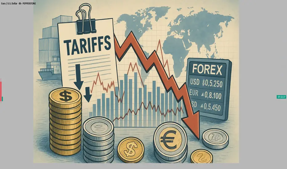
#AN016: Markets Brace for Tariffs, Forex Reaction
Markets have taken a cautious tone this week, as investors digest new developments on global trade and central bank prospects. A mix of US tariff threats, higher OPEC+ oil production and surprisingly strong eurozone investor sentiment is shaping currency flows.
I'm Forex Trader Andrea Russo, and I want to thank our Official Broker Partner PEPPERSTONE in advance for helping me put this article together.
Investor confidence in the eurozone surged to a three-year high in July. This positive sentiment is reducing the European Central Bank's room to cut rates further, even as inflation remains subdued.
Meanwhile, US President Trump has ordered letters threatening tariffs of up to 70% for nations that fail to conclude trade deals by August 1, creating fresh uncertainty in diplomatic and trade circles.
Asian markets and BRICS currencies have already shown signs of weakness, while US futures have weakened on the threat.
Oil markets have also reacted sharply to OPEC+’s announcement of a higher-than-expected production increase of around 550,000 barrels per day from August, which has pushed Brent below $68 and US crude below $66.
On the European inflation front, the ECB is opting to postpone further rate cuts. Estonian Minister Madis Müller confirmed that the ECB can afford to put monetary easing on hold, given stable inflation and solid growth.
reuters.com
Forex Impact – What Traders Should Watch
The combination of strong eurozone sentiment and looming trade tensions is driving significant currency dynamics this week:
EUR/USD: The euro has room to strengthen further. Optimistic sentiment and a pause from the ECB reinforce the bullish bias, but tariff uncertainty could trigger safe-haven demand for USD.
USD/JPY and CHF: The dollar could find support amid global risk aversion, pushing JPY and CHF higher.
Commodity currencies (CAD, AUD, NOK): Under double pressure: higher oil supply and rising trade risks could weigh on crude-related currencies.
Emerging market currencies: BRICS currencies could remain under pressure due to threats of additional US tariffs; Indian rupee and other currencies could depreciate further.
How to Trade Smart Money Concepts (SMC)\ How to Trade Smart Money Concepts (SMC)\
\ This article explores the foundation, key tools, and practical insights of Smart Money Concepts — and why it’s worth your attention.\
In today's fast-changing financial landscape, Smart Money Concepts (SMC) has become a popular strategy among modern traders. But what is SMC exactly, and how can it improve your trading decisions? This article breaks it down in a simple, professional way for traders at all levels.
---
\ What Are Smart Money Concepts?\
SMC is a trading approach based on the belief that large institutions ("smart money") like banks and hedge funds control most of the market's movements. These institutions often move the market in ways that confuse or trap retail traders. The goal of SMC is to understand and follow the footsteps of these big players.
Instead of relying on simple patterns or indicators, SMC focuses on:
\ - Market structure\
\ - Supply and demand zones\
\ - Liquidity pools\
By aligning your trades with the behavior of smart money, you can position yourself more strategically in the market.
---
\ Key SMC Concepts Explained\
\ Order Blocks\
Order blocks are zones on the chart where large institutions have placed significant buy or sell orders. These zones often lead to strong price reactions and act as hidden support or resistance levels. Order blocks are considered more precise than traditional supply and demand areas.
Example: ()
\ Fair Value Gap (FVG)\
A Fair Value Gap occurs when price moves sharply in one direction, leaving a gap or imbalance in the price action. These areas often get filled later and can act as magnets for price.
In a bearish move, the FVG is the gap between the low of the previous candle and the high of the next one. In a bullish move, it's the reverse.
Example: ()
\ Timeframe Consideration\
If you can’t monitor charts during the day, avoid relying on 5–30 minute setups. Consider 4H or daily timeframes for clearer signals and more manageable trading decisions.
\ Liquidity\
Liquidity refers to price zones where lots of pending orders exist. These are usually at obvious highs, lows, or trendlines. Smart money often targets these areas to trigger stop-losses and generate movement.
One common tool to identify liquidity is a "pivot point," which is a candle with a lower low or higher high than its neighbors.
Example: ()
\ Break of Structure (BOS)\
BOS occurs when price breaks above or below a previous high or low, signaling a possible trend continuation.
Example: ()
\ Change of Character (ChoCH)\
ChoCH happens when the market changes direction. For example, if price breaks a higher low in an uptrend, it may signal a reversal.
Example: ()
Combined with BOS: ()
---
\ How SMC Compares to Wyckoff\
The idea of "smart money" isn't new. Richard D. Wyckoff, a pioneer in technical analysis, laid the foundation for understanding market cycles driven by institutions. His price cycle theory includes four phases:
\ 1. Accumulation\
Smart money buys while the public is unaware.
\ 2. Markup\
Price rises as smart money pushes the market.
\ 3. Distribution\
Smart money sells into public buying.
\ 4. Markdown\
Price falls as the cycle completes.
SMC borrows from this logic but focuses more on structure and liquidity zones. Still, the core idea is the same: understand what big players are doing, and follow them.
\ For deeper insights into Wyckoff, explore additional resources focused on accumulation/distribution cycles.\
---
\ Summary\
Smart Money Concepts give traders a deeper look into market mechanics. By focusing on order blocks, fair value gaps, liquidity, and structure breaks, SMC helps identify high-probability trade setups based on institutional behavior.
It may seem complex at first, but once you understand the basics, SMC can become a powerful tool in your trading strategy. Whether you’re new or experienced, aligning with smart money can improve your edge in the market.

Rain or Ruin? Analyzing Wheat Prices During Precip Extremes1. Introduction: When Rain Means Risk for Wheat Traders
Rain is life for wheat crops—until it isn’t. In the world of agriculture, water is essential, but extremes in precipitation can cause just as much harm as droughts. For traders in the wheat futures market, understanding this relationship between rainfall and price action is not just useful—it’s essential.
Wheat is a crop with a long growth cycle, grown across diverse geographies like the U.S. Plains, the Canadian Prairies, Russia, and Ukraine. Each region has its own precipitation rhythm, and any disruption can ripple through the global supply chain. The question is: can weather signals—especially rainfall—be used to predict market behavior?
This article dives into that question using a data-driven lens. We categorized precipitation data and measured how wheat futures returns responded to different rainfall environments. The results? Revealing, and at times, counterintuitive.
2. The Role of Rainfall in Wheat Production
Wheat, especially spring and winter varieties, is particularly sensitive to soil moisture levels at key phases like germination, tillering, and heading. Too little rain in early development and the crop can fail to establish. Too much rain close to harvest? Risk of disease, sprouting, and quality degradation.
Traders have long known that unexpected wet or dry weeks can trigger speculative surges or hedging activity. But how do these events influence actual futures returns?
Before answering that, we need to translate rain into something traders can use: categories based on historical norms.
3. Methodology: Categorizing Rainfall and Measuring Market Response
To understand how wheat prices respond to different levels of rainfall, we analyzed weekly precipitation data across global wheat-producing regions. We normalized the data using percentiles:
Low Precipitation: Below the 25th percentile
Normal Precipitation: Between the 25th and 75th percentiles
High Precipitation: Above the 75th percentile
We then matched this categorized weather data with weekly returns from wheat futures (symbol: ZW) to explore if price behavior systematically varied depending on how wet or dry a week had been.
To test significance, we used a simple t-test comparing the mean returns of low-precip and high-precip weeks. The p-value (6.995E-06) revealed a compelling result: yes, there is a statistically significant difference.
4. Results: High Rainfall, Higher Price Volatility
The data confirms that weeks with extreme rainfall—especially those with high precipitation—often align with more volatile wheat price movements.
But here’s the twist: while low-precip weeks didn’t consistently show bullish returns, high-precip weeks correlated with negative or erratic returns. That makes sense when you think about harvest delays, rot, and declining grain quality.
Traders watching forecasts for excessive rainfall should consider the implications for grain availability and price stabilization mechanisms. This is where speculative plays or hedging via options and standard or micro futures contracts can become especially useful.
5. Interpreting the Volatility: Why the Market Reacts to Rain
Why does excessive rain lead to such uneven price behavior?
The answer lies in uncertainty. Heavy rainfall often introduces multiple variables into the equation: planting delays, logistical bottlenecks, and downgraded wheat quality due to fungal infections. For example, a wet harvest can reduce protein content, pushing millers to seek alternatives—altering both demand and supply expectations simultaneously.
This dual-sided pressure—reduced high-quality yield and uncertain export capability—tends to shake market confidence. Traders respond not just to the supply data but also to how much trust they place in the supply pipeline itself.
6. Futures Contracts: Navigating Risk with Position Size Control
Traders looking to participate in wheat price action have two main CME-listed options:
Standard Wheat Futures (ZW)
Contract Size: 5,000 bushels
Tick Size: 1/4 cent per bushel (0.0025) has a $12.50 per tick impact
Margin Requirement: Approx. $1,700 (subject to change)
Micro Wheat Futures (MZW)
Contract Size: 500 bushels (1/10th the size of the standard contract)
Tick Size: 0.0050 per bushel has a $2.50 per tick impact
Margin Requirement: Approx. $170 (subject to change)
Micro contracts like MZW offer a lower-cost, lower-risk way to trade wheat volatility—perfect for sizing into weather-related trades with precision or managing risk in a more granular fashion. Many traders use these contracts to test strategies during seasonal transitions or while responding to forecast-driven setups.
7. Visual Evidence: Price Behavior by Precipitation Category
To visually represent our findings, we used box plots to show wheat weekly returns grouped by precipitation category:
The shape of these distributions is revealing. High-precipitation weeks not only show lower average returns but also a wider range of possible outcomes—underscoring the role that rainfall extremes play in price volatility rather than just directional bias.
We are also complementing this visual with a weather map that shows real-time precipitation patterns in major wheat-growing regions. This could help traders align weather anomalies with trading opportunities.
8. Final Thoughts: The Forecast Beyond Forecasts
Precipitation isn’t just an agricultural concern—it’s a market catalyst.
Our analysis shows that rainfall extremes, particularly heavy rain, create meaningful signals for wheat traders. The price response is less about direction and more about uncertainty and volatility, which is equally important when structuring trades.
If you’re serious about trading wheat futures, don’t just watch the charts—watch the clouds.
This article is one piece in our broader series on how weather influences ag futures. Stay tuned for the next one, where we continue to decode the atmosphere’s impact on the markets.
When charting futures, the data provided could be delayed. Traders working with the ticker symbols discussed in this idea may prefer to use CME Group real-time data plan on TradingView: www.tradingview.com - This consideration is particularly important for shorter-term traders, whereas it may be less critical for those focused on longer-term trading strategies.
General Disclaimer:
The trade ideas presented herein are solely for illustrative purposes forming a part of a case study intended to demonstrate key principles in risk management within the context of the specific market scenarios discussed. These ideas are not to be interpreted as investment recommendations or financial advice. They do not endorse or promote any specific trading strategies, financial products, or services. The information provided is based on data believed to be reliable; however, its accuracy or completeness cannot be guaranteed. Trading in financial markets involves risks, including the potential loss of principal. Each individual should conduct their own research and consult with professional financial advisors before making any investment decisions. The author or publisher of this content bears no responsibility for any actions taken based on the information provided or for any resultant financial or other losses.

Decisive Week: Duties, Oil and Flight from the Dollar
Hello, I am Forex trader Andrea Russo and today I want to talk to you about the week full of tensions and opportunities in global currency markets. The new tariff threats from the United States, the strategic moves of OPEC + and the growing instability in the British government bond market are shaking up the entire Forex landscape, with direct implications on USD, AUD, CAD, GBP and JPY. I thank in advance the Official Broker Partner PEPPERSTONE for the support in the creation of this article.
The most explosive news concerns the possible imposition of new duties by the United States, with a deadline set for July 9. The American administration, according to Reuters sources, is ready to activate tariffs of up to 70% on some categories of strategic imports if new bilateral agreements are not signed by the end of the month. The market has reacted cautiously, but signs of systemic risk are starting to filter through: US futures are falling, capital is moving into safe havens, and the dollar is starting to lose ground structurally.
The decline in oil has added further pressure. OPEC+ announced the start of an increase in production from August, with about 550 thousand barrels per day more than the current level. This has hit Brent and WTI hard, which are now both below $68. Currencies that are highly correlated to commodities, such as CAD and NOK, are weakening, especially in the absence of a monetary response from their respective central banks.
Meanwhile, the UK is facing a delicate moment. Yields on 10-year gilts have risen to their highest since April, with a sell-off that has forced the Bank of England to review the pace of its asset disposal. The instability of the British debt is putting pressure on the pound, already tested by inflation that is struggling to recover and a stagnant housing market. The GBP/USD pair remains extremely volatile, while EUR/GBP is moving sideways waiting for a clearer direction.
But the star of the week is Australia. The AUD has scored the eighth consecutive week of gains, taking advantage of both the weakness of the dollar and the expectations of a more gradual future rate cut by the RBA. The AUD/USD cross has broken the highs of November 2024 and is now targeting levels of 0.67-0.68. The same goes for NZD/USD, which is also in a phase of bullish consolidation. The US dollar, on the other hand, has recorded its worst start to the year since 1973: a combination of political uncertainty, fiscal instability and falling confidence is eroding global demand for the USD, pushing many managers to diversify into emerging or commodity-linked currencies.
Finally, the Federal Reserve is taking its time. Powell stated that the path of rates will be closely linked to the evolution of trade tensions. The Fed, therefore, appears more wait-and-see than expected, postponing a possible cut to the third quarter. This leaves the dollar exposed to downward pressure, especially if inflation were to slow further in the meantime.
In summary, this week offers extremely interesting scenarios for Forex traders. Institutional flows seem to favor alternative currencies to the dollar, while sentiment remains fragile on GBP and CAD. AUD, NZD and JPY emerge as potential winners, at least until new macro developments or significant technical breaks.
The watchword is: selection. With volatility on the rise and the geopolitical context rapidly evolving, only those who know how to read the movements of central banks and institutions in advance will be able to take full advantage of the opportunities offered by the markets.
