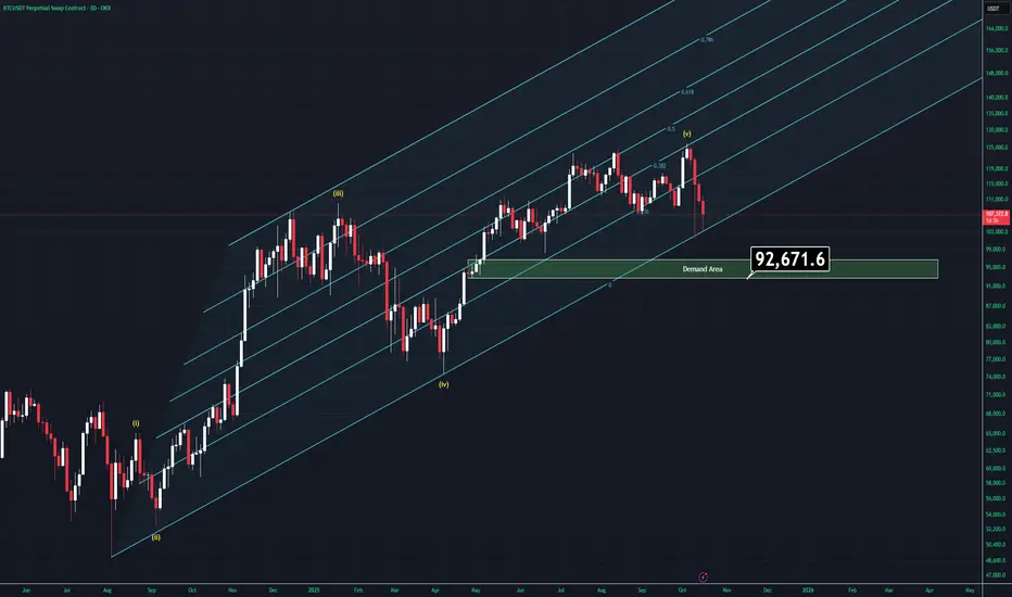
Moment of Fate - BTC Analysis (3D)There are many reasons to go up but also going down is starting to look way more charming than ever right now.
Let's examine what we have;
-FED is about to cut rates for a second time but we'll most likely to see another rate cut in december which is bullish af.
-All companies are keeping buying Bitcoin more and more which is kinda good but might be a problem for decentrlation of Bitcoin.
-US is more likely to bring more regulations about stablecoins which will effect positivly Bitcoin.
On the other hand;
-China and US are still faceing a trade war even if they state othervise.
-ETF's are not buying Bitcoin as much as they did last year.
-US and Venezuela might have a conflit very soon.
-Israel-Hamas and Russo-Ukraine wars hasn't actually over yet.
-Gold is going on god mode.
-DXY is trying to recover in weekly timeframe but is less likely due to rate cuts.
-Elliot wave theory tells us that we might actually be in the A-B-C correction cycle.
-Volume is decreasing, which is bad and supports the Elliot waves.
- Trendline support is about to be lost (Tried to break it twice in a week).
-There is a CME gap left around $92K
Well, all we have to do is, combining the factors.
If BTC breaks below the supportive trendline we will most likely drop through demand zone which is highlited in the chart. If US and China makes peace (less likely), Bitcoin actually has real reasons to try a new all time high.
The main point is simple: Wait for one of two things to happen:
Either the trendline will be broken and we'll see below the $100K, which will give us new opportuinites.
Or, Bitcoin recovers $118400 and the entire bearish senario would be invalidated and Bitcoin goes like crayz again.
Thank you for reading.
Community ideas
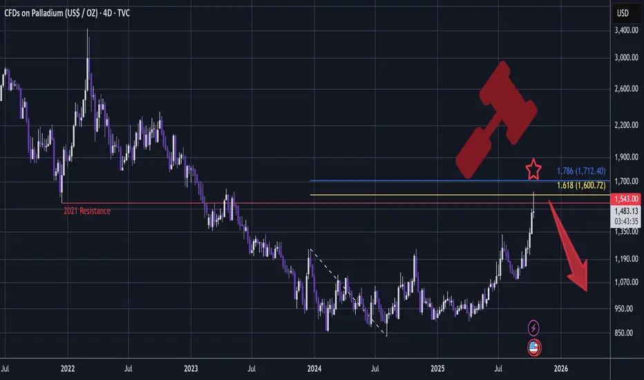
PALLADIUM - Short Setup, Bearish Rotation In MetalsA very bearish setup is developing:
Since the top, there is nowhere on the chart that has a whipsawing candle like this:
A very big Shooting Star!
This setup has my favourite conditions met:
- Whipsawing candle that sweeps liquidity through key resistance (2021)
- Tidy 1.618 Golden Window (1.618 - 1.786) - taking extremity pivots of Accumulation to draw the fib trendline.
Palladium has quite weak price action overall comparing to other metals and this very bearish whipsaw might be a signal for the overall metals market that we're passing through a major pivot.
This is also considering that SILVER may have topped at my 1.618 target @ $54:
And GOLD may perhaps also have topped after hitting the ultra long term 2.272 (image below is a previous thread I made - click to enter):
In addition news arrives that "Gold price pulls back from record as Trump eases trade concerns" - www.mining.com
Interesting isn't it how this type of news arrives exactly as GOLD, SILVER and PALLADIUM all hit hit respective Phi ratio landmarks / significant resistances !
...
Palladium may chop, however it often dumps hard when it swings bearish - I doubt it can take out this candle wick high - and even if it did then it would still be very bearish.
The candle closes in a few hours.
And from here there is a possibility that this might be the next wave down, though I won't hold anywhere near that long.
In summary, we have multiple signals from Gold, Silver, Palladium and Trump tariff news that metals may be topping / hitting a significant peak.
I entered a short position here.
This analysis is shared for educational purposes only and does not constitute financial advice. Please conduct your own research and consider that crypto is a dangerous market.
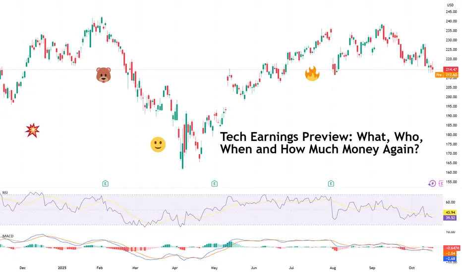
Tech Earnings Preview: What, Who, When and How Much Money Again?“ I don’t know, probably at least around $600 gazillion dollars ,” Zuck, probably if you asked him how much Meta NASDAQ:META will spend over the fiscal year.
It’s earnings season , which means Wall Street’s most expensive hobby — guessing how much the tech giants will make while pretending it’s about “long-term fundamentals” — is back in full swing.
💥 Welcome to Earnings Season
Happy third-quarter earnings, everyone. The candles are lit, the spreadsheets are out, and $1.6 trillion vanished from US stock valuations last Friday. Perfect timing.
Markets are reeling from tariff shocks and macro jitters, but traders have already shifted their gaze to the next big thing: Big Tech .
As is tradition, the Magnificent Seven — those trillion-dollar titans who make up roughly one-third of the S&P 500’s SP:SPX weight — are once again the main characters in this quarterly drama.
You’ve got AI. You’ve got spending. And you’ve got spending on AI.
🔔 Here We Go Again
This quarter, the storyline hasn’t changed much — it’s still “show me the money” season for artificial intelligence. Investors have spent the better part of two years rewarding CEOs for throwing the AI acronym in all their earnings calls. Is this time different?
• Amazon NASDAQ:AMZN reports the week of October 21, with everyone eyeing AWS — the quiet moneymaker funding Jeff Bezos’ rocket ambitions and your Prime Day discounts.
• Apple NASDAQ:AAPL , Microsoft NASDAQ:MSFT , and Meta NASDAQ:META follow around October 29. Investors will be laser-focused on who’s turning AI hype into product and revenue.
• And let’s not forget Alphabet NASDAQ:GOOGL , which already set the tone with a capex number that could fund a small country — $85 billion in 2025 alone , largely for AI infrastructure.
The question now: how much longer can these companies throw billions at Jensen Huang GPUs before shareholders start asking for a receipt?
🏗️ The AI Arms Race: Spending as a Strategy
The Magnificent Seven are still in an all-out hardware and data-center build-out. Meta’s Mark Zuckerberg is burning through cash to create the metaverse (yes, that still exists), but this time, powered by AI.
Nearly every megacap tech firm is building power plants to feed OpenAI. And Nvidia NASDAQ:NVDA — the company selling shovels in the AI gold rush — is counting every dollar.
Together, these firms are expected to spend hundreds of billions in the second half of 2025 just on computing power. Investors will be parsing every line of guidance for capex updates — because right now, spending is the strategy.
But the logic is sound (for now): If AI really does drive the next wave of productivity and profit, then whoever builds the infrastructure owns the future.
📊 The Numbers Game: What Wall Street Expects
Across the S&P 500 SP:SPX , earnings are projected to grow 8.8% year-over-year this quarter, on revenue growth of 6.4%, according to Seaport Research Partners. That may sound modest, but it’s for a reason: two-thirds of companies usually beat estimates.
Keep them achievable, and markets will celebrate. Pin them too high, and markets will be disappointed.
What’s more, earnings aren’t expected to stall anytime soon. FactSet data shows analysts projecting:
• 6.4% average annual sales growth for the S&P 500 through 2027
• 14% average annual earnings growth over the same period
That’s what rate cuts are supposed to do — a little liquidity trick, some risk-on mood, and suddenly even industrials and Buffett’s picks start looking interesting again.
Still, there’s one elephant in the room: valuation. The S&P 500 trades at 23 times forward earnings, which is, to use the technical term, “a lot.” At that level, even a small earnings miss could send stocks tumbling.
🧮 Winners, Losers, and the Market’s Short Memory
Some IPOs may have stolen headlines this year — looking at you, Figma NYSE:FIG and Circle NYSE:CRCL — but earnings season is where the real judgment happens.
A good report can add hundreds of billions in market cap overnight. But a bad one can do the same in the opposite direction .
Meta is under pressure to prove its huge spending on Superintelligence Labs is actually worth it. Apple’s got to show iPhone sales didn’t flatline in China. And Microsoft? Well, all it has to do is keep being Microsoft.
Amazon remains the dark horse. Its cloud business is stabilizing, retail’s humming along, and AI integration is just starting to take off. Traders are betting AWS will deliver, as it usually does.
🧘♂️ What Traders Should Watch
To navigate this volatility buffet, focus on:
• Forward guidance — Companies might beat earnings but guide lower, which can trigger pullbacks.
• Capex updates — Follow where the AI billions are flowing.
• Market reactions, not just results — The “sell the news” trade is real.
Sometimes the earnings game isn’t just about who made money — it’s about who surprised the market.
💡 Final Thought: Hype or Habit?
Big Tech’s gravitational pull on the markets isn’t fading anytime soon. Whether you’re bullish on AI or skeptical of its trillion-dollar promises, one thing’s certain — every move these companies make will ripple through every portfolio, index, and ETF on the planet.
As Q3 earnings hit full throttle, keep one eye on the charts and the other on the headlines . Because if there’s one thing Wall Street loves more than good earnings, it’s the story that comes after.
Off to you : How are you preparing to navigate the earnings season and the tech updates? Share your thoughts in the comments!
Back to Basics: How to Calculate Pips on Forex Pairs📌 Back to Basics: How to Calculate Pips on Forex Pairs 💱📊
Every Forex trader needs to understand pips—it’s the foundation of measuring movement in currency pairs.
✅ On most pairs, 1 pip = the 4th decimal place (0.0001).
✅ On JPY pairs, 1 pip = the 2nd decimal place (0.01).
In this quick video, I’ll break down exactly how to find the pip, how to count them, and how to use them when setting your entry and take-profit (TP) levels.
Perfect for beginners or anyone who wants a simple refresher!
✨ Trading made simple.
👉 Watch now and build your Forex foundation the right way.
⚠️ Disclaimer: This video is for educational purposes only and should not be considered financial advice. Trading carries risk, and you should only trade with money you can afford to lose. Always do your own research before making any trading decisions.

GameStop and Fibonacci: It's About TimeThis is my first attempt at publishing a video on TradingView, so hopefully it works.
I wanted to put together something educational about fib channels and why I like to use them. They're not a silver bullet, but they do tell you a lot about where to expect support and resistance because the chart has a very good memory, and you can see this play out on pretty much any instrument, including cryptocurrencies.
I follow NYSE:GME closer than any other ticker, so this video is about my philosophy on the fib channels that I have been using on the GME chart and talking about on the Echo Chamber Podcast. Hopefully this adds a little more context to that discussion, how the flat price levels are not always the only thing that matters, but taking time-based trends into account can make a big difference in your analysis and understanding of price movement.
Happy to hear people's thoughts on my crayons 🖍️ which color should I eat next?
Since this is a bit of a longer video, here's an AI summary of the content with timestamps:
Introduction 00:00-01:05
I introduce the topic of explaining my TradingView chart, which has many colorful lines. I clarify that I didn't manually draw all the lines, but used Fibonacci channels that only require selecting 3 points.
Explaining Current Chart 01:05-04:33
I show my current GameStop chart, explaining various trend lines and Fibonacci channels. I demonstrate how to adjust the Fibonacci channel points to analyze different price movements.
Fresh Chart Walkthrough 04:33-11:57
Moving to a clean chart, I explain global chart items, including trend lines from major tops and bottoms. I discuss dividend-adjusted vs non-adjusted charts and explain the "Gandalf line" of support.
Fibonacci Channels Explanation 11:57-24:54
I provide a detailed explanation of how Fibonacci channels work, demonstrating how to draw them and interpret the resulting lines. I show how these channels can describe price action across long time periods.
Additional Examples 24:54-33:44
I show more examples of Fibonacci channels applied to GameStop's entire price history. I discuss how these channels can provide insight into potential future price movements and support/resistance levels.
Conclusion 33:44-34:40
I summarize my thoughts on GameStop's current price action in relation to the Fibonacci channels and support levels identified.
Some Quotes
"I find them mathematically interesting." 11:54 - Referring to trend-based Fibonacci tools.
"Math is your friend here. But you don't have to do the math, you just can use tools that will help you." 17:19
"Price is fractal in nature in that patterns are repeating and Fibonacci is everywhere." 17:19
"Things like history repeats itself. It's just a question of when, not if." 24:30
"The point I want to drive home here is that when we start to get a little bit more granular here, and this is why I have lots of crayons on my chart." 28:34
Key Tips/Concepts
Fibonacci channels can be powerful tools for technical analysis, providing insight into potential support and resistance levels.
These channels can sometimes describe price action across very long time periods, even when drawn based on recent price movements with thoughtfully selected endpoints.
The importance of considering price, time, and volume in technical analysis, as demonstrated by the "Gandalf line".
The value of using multiple timeframes and chart types (dividend-adjusted vs non-adjusted, trading hours only vs extended hours included) to gain a more complete picture of a stock's price history. (Editorial note: something I didn't cover in the video, but the difference between log scale and linear scale sometimes will make for an interesting story on trendlines and fib channels too. I prefer to keep my chart in log scale, but will toggle between log and linear occasionally to see if there's something interesting there in the lines already drawn.)
The concept of fractal nature in price movements and how patterns tend to repeat over time.

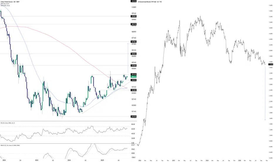
Something’s Brewing at the Front EndDonald Trump wants lower interest rates. He may well get his wish soon, at least at the front of the U.S. Treasury curve. The chart you’re looking at has two panes. On the left, we have U.S. two-year Treasury futures. On the right, we have two-year U.S. Treasury yields. The former uses a weekly tick, the latter daily.
With futures coiling in a well-defined ascending triangle pattern for more than a year, you get the sense that should we see a weekly close above 104’16’0, it may act as a catalyst to spark further upside, potentially explosive. The contract has been rejected at the level six separate times since July 2024, including four failed breakout attempts over the same period. This reinforces its importance. Given its proximity to the level with RSI (14) and MACD generating bullish momentum signals, attempt number seven—if we see it—stands a decent chance of sticking.
If we see a sustained break above 104’16’0, 105’08’0, 106’06’6 and 107’06’2 loom as the levels to watch, especially the latter as it aligns with the extension target based on the triangle’s height. If it were to be achieved, it points to a nominal two-year Treasury yield of around 1.5%.
That’s obviously far lower than where it currently resides, pointing to negative real rates given the Fed’s 2% inflation target and, in all likelihood, economic conditions far weaker than recent years or monetary policy being guided by factors other than fundamentals.
While the setup is tradable, if it plays out, it will have ramifications far beyond rate futures given the economic signal it would provide. When you look at recent moves in hard assets with perceived scarcity value, it appears many investors and traders are already positioning for such an environment.
Good luck,
DS
Tesla (TSLA) — Momentum Reload or Major Cooldown?The Next $400–$450 Decision Zone!
🧭 Weekly Chart — Big Picture Momentum
Tesla has printed one of the cleanest BOS (Break of Structure) patterns on the weekly timeframe since the post-2023 recovery, confirming that the macro downtrend has flipped into a sustained bullish expansion. The stock ripped from its $216 CHoCH base and is now consolidating above the prior macro breakout line near $425.
However, the latest weekly candle shows stalling momentum, forming a short-term distribution near the $430–$440 region. That zone lines up perfectly with the previous supply structure and fib confluence from 2022 highs.
The MACD histogram remains strongly positive but is beginning to flatten — early warning that buying pressure might be easing. Stoch RSI is also hovering near overbought at 85+, signaling the need for a short-term reset before the next leg.
* Bullish scenario: A weekly close above $436–$440 would confirm strength continuation toward $488–$500, the next liquidity zone.
* Bearish scenario: A close below $410 opens the door for a healthy pullback to $367–$376, a major equilibrium level with demand imbalance and previous BOS base.
Weekly takeaway: Trend remains bullish, but short-term overextension hints at a pause or mild retracement before another drive up.
⚙️ Daily Chart — Structure and Cooling Phase
The daily chart confirms Tesla’s minor pullback within the larger bullish wave. After breaking above $400 with strong momentum, price is now consolidating just above its breakout order block ($415–$420).
The BOS on daily shows continuation potential, but MACD has started printing red bars — suggesting that momentum is fading and a retest is underway. The Stoch RSI sitting high around 93 indicates the correction may continue until momentum rebalances.
* Bullish case: If TSLA can hold $416 and print a higher low, the next upside targets are $442 → $455, then $488 (supply zone).
* Bearish case: A daily close below $414 would invalidate near-term bullish control, triggering a slide toward $400–$397, a major demand block that aligns with GEX PUT support.
Daily summary: Still in bullish structure, but short-term retracement needed for healthy continuation. Watch for $415 hold as pivot.
⏱ 1-Hour Chart — Trading Plan
On the 1-hour chart, TSLA is forming a short-term consolidation wedge between $420 and $436 after multiple CHoCH and BOS flips. The stock is bouncing between mid-range liquidity pockets, showing clear indecision from both sides.
MACD is recovering from a previous bearish cycle, while Stoch RSI has crossed up from mid-levels — showing early signs of a micro-bounce in progress.
Volume confirms that buyers are active at $424–$425 zone, but strong resistance remains near $436–$440.
Trading Plan:
* Bullish setup: Enter above $436 breakout with target $445 → $455, stop at $425.
* Bearish setup: Short if $420 fails with downside target $405 → $400, stop at $430.
This structure allows swing-to-scalp flexibility — traders can lean bullish above $425 but must stay cautious until price reclaims $436 decisively.
💥 Options GEX & Institutional Positioning
Based on the Options GEX chart:
* Highest Call Wall: $450 — heavy resistance and likely magnet if bulls push higher.
* Next positive GEX zone: $445, where gamma flips positive and market makers chase delta hedges upward.
* Major PUT Wall: $400 — strong defense area, aligning perfectly with chart structure and demand.
* IVR 25.7 / IVx 67.7 → volatility premium moderate, favoring directional plays with limited spreads.
Gamma interpretation: As long as price holds between $425–$440, market makers maintain positive gamma, keeping price pinned and range-bound. A clean breakout above $440 could trigger a gamma squeeze toward $455–$460.
🎯 Option Strategy Ideas
1️⃣ Bullish Continuation Play:
* Buy $430C / Sell $450C (Oct 25 expiry) — risk ~$6 for a potential $14 reward if Tesla rallies to $450+.
* Aggressive intraday: Buy 0DTE/2DTE $430 Calls only if price reclaims $436 with volume.
2️⃣ Bearish Hedge:
* Buy $420P / Sell $400P (Oct 18 expiry) — ideal if $420 support fails and correction deepens.
3️⃣ Neutral Income Strategy:
* Expecting chop between $420–$440? Sell Iron Condor ($440C/$450C and $410P/$400P) to profit from time decay.
💬 Final Thoughts
Tesla remains one of the strongest setups in the market — the bullish macro trend is intact, but current levels are stretched. Expect sideways or minor correction before another breakout attempt. The $415–$425 area is the key battleground: lose it, and we test $400; reclaim $436+, and the rocket’s back on for $455–$480.
My TA continues to show high win-rate accuracy, and if you’ve followed previous analyses, you’ve seen how precise these levels play out.
If there’s any stock you want me to analyze next — even ones I don’t usually post — DM me and I’ll be happy to break it down for you.
This analysis is for educational purposes only and does not constitute financial advice. Always do your own research and manage your risk before trading.

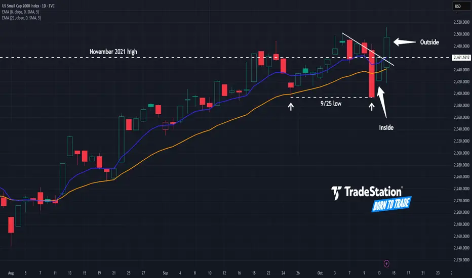
Small Caps: Finally a Breakout?The Russell 2000 has been stuck in a rut for years, but some traders may think the small-cap index has finally achieved escape velocity.
The first pattern on today’s chart is the November 2021 high around 2,460, where prices stalled last November. RUT has gotten above it this month and refused to stay below. Is a breakout finally underway?
Second is the September 25 low of 2,394. Prices tested and held that level last week, which may confirm support is in place.
Third, the index had a bullish inside candle after Friday’s selloff, followed by a bullish outside bar. That may reflect buyers are gaining control.
Next, RUT has apparently broken a trendline that began with the high on October 6.
Finally, consider this weekly ratio chart of the Russell 2000 against the Nasdaq-100. Notice how RUT outperformed in late 2023 and July 2024. Both of those moments saw expectations of Federal Reserve rate cuts. (Such moves often favor small caps.) Notice how the ratio is climbing again at the same time that investors look for more dovishness from the central bank.
TradeStation has, for decades, advanced the trading industry, providing access to stocks, options and futures. If you're born to trade, we could be for you. See our Overview for more.
Past performance, whether actual or indicated by historical tests of strategies, is no guarantee of future performance or success. There is a possibility that you may sustain a loss equal to or greater than your entire investment regardless of which asset class you trade (equities, options or futures); therefore, you should not invest or risk money that you cannot afford to lose. Online trading is not suitable for all investors. View the document titled Characteristics and Risks of Standardized Options at www.TradeStation.com . Before trading any asset class, customers must read the relevant risk disclosure statements on www.TradeStation.com . System access and trade placement and execution may be delayed or fail due to market volatility and volume, quote delays, system and software errors, Internet traffic, outages and other factors.
Securities and futures trading is offered to self-directed customers by TradeStation Securities, Inc., a broker-dealer registered with the Securities and Exchange Commission and a futures commission merchant licensed with the Commodity Futures Trading Commission). TradeStation Securities is a member of the Financial Industry Regulatory Authority, the National Futures Association, and a number of exchanges.
TradeStation Securities, Inc. and TradeStation Technologies, Inc. are each wholly owned subsidiaries of TradeStation Group, Inc., both operating, and providing products and services, under the TradeStation brand and trademark. When applying for, or purchasing, accounts, subscriptions, products and services, it is important that you know which company you will be dealing with. Visit www.TradeStation.com for further important information explaining what this means.
“I Am Become Meme, Destroyer of Short-Sellers”: Gold at $4,200Remember those days where you could short gold and turn a profit? They’re gone. The precious metal is relentlessly pushing higher, breaking every short-seller’s dreams and portfolio.
It’s official — gold has gone full meme. The shiny metal that your grandparents swore by is now trending on Reddit threads, popping in Discord chats, and somehow getting the same hype energy as Nvidia NASDAQ:NVDA in 2023 and Dogecoin COINBASE:DOGEUSD in 2021.
Gold OANDA:XAUUSD just crossed $4,200 per ounce early Wednesday, notching a 60% gain year-to-date — its best run in modern history and enough to make short-sellers lose sleep and tons of cash.
Its market cap now sits near $30 trillion, which means there’s more money parked in gold than the nominal GDP of every country not named the United States.
Let’s unpack what’s fueling this blistering rally and why traders just can’t stop buying.
🪙 Gold as the Trade of 2025?
Not too long ago, gold was a boring asset that just sat there like a pet rock. Not anymore. The OG store of value is finding new meaning as the “asset for uncertain times.” That is, even amid an ongoing earnings season .
What’s driving it? Pretty much everything that usually rattles markets.
• Rate cut expectations: The Fed’s recent pivot toward easing has taken real yields lower — and gold loves that. Non-yielding assets look a lot more appealing when Treasuries don’t pay much.
• Geopolitical jitters: The Trump-Xi trade tension reboot has everyone looking for a hedge that doesn’t involve a risk disclaimer the size of a novel.
• ETF inflows: Gold-backed ETFs are hoovering up bullion at record pace as everyone seeks exposure to the precious metal.
Add in central bank hoarding — especially from China, India, and Turkey — and you’ve got a near-perfect cocktail for demand.
💰 Meme Metal or Market Masterclass?
Reddit’s r/WallStreetBets is now flooded with gold posts, some featuring rocket emojis other saying it’s one big bubble. Regardless, the retail crowd is buzzing with memes, showing that the age-old asset has reached its youngest audience.
Individual traders are clearly in on the move, and the narrative is simple enough to spread like wildfire — gold is going up, it’s at record highs, and there’s a clean number to chase: $5,000 .
Is it rational? Maybe not entirely. If 2021 taught markets anything, it’s that “meme energy” can be a legitimate technical indicator. But it will take more than undergrads buying on their iPads to move this $30 trillion behemoth.
⚖️ The Case for (Even) Higher Prices
The $5,000 target — just 20% away — doesn’t sound crazy to gold bulls. Here’s why:
• Fed momentum: With the labor market showing signs of cracking, two more rate cuts are priced in for this year.
• Central bank accumulation: Global reserves are quietly diversifying away from the dollar. It’s a structural de-dollarization move and (likely) not a phase.
• Broader liquidity wave: Investors are flush with cash, even amid the AI boom, and some of that money inevitably spills into gold.
😬 The Other Side of the Coin
But before you run to your local pawn shop with diamond hands, it’s worth noting: no rally goes vertical forever.
Gold’s RSI has hovered above 70 for weeks — deep in overbought territory. Historically, every time the metal’s gone this far this fast, there’s been a pullback of 10-15% to shake out the latecomers.
Add in profit-taking, potential surprise Fed commentary, and a stronger dollar bounce, and you could see a retest of support near $3,850–$3,900.
And don’t forget the opportunity cost. When rates eventually bottom, stocks and crypto could start reclaiming their allure. Gold doesn’t pay yield, doesn’t innovate, and doesn’t post memes — it just sits there, shiny and smug.
🥈 The Silver Lining
If gold’s story sounds wild, silver’s chart looks even wilder. Silver OANDA:XAGUSD topped $53.60 earlier this week — up 83% year-to-date — riding on both industrial demand and good old FOMO.
ETFs tracking silver have seen some of their largest inflows ever, with some day traders even rotating profits from gold to silver in hopes of juicing returns.
When both metals rally together, it usually signals broad market uncertainty — and a collective “we don’t trust anything else right now” mood.
Off to you : How are you navigating the gold rush? Are you in already, looking to get in, or calling tops and lower from here? Share your views in the comments!

Gold/Oil Signaling Market Is In A Super Bubble Gold = Fear
Oil = how strong the economy is.
Except for COVID we have never seen such an extreme reading. Yet people are buying up stocks like we will never again be able to produce another stock again as long as we live!
Tulips!
Here are just a few of the factors to consider that make this indicator important.
Why This Indicator Matters: Key Factors at a Glance
Gold’s Surge Signals a Shift
Gold has soared nearly 60% year-to-date, adding a staggering $10 trillion in market capitalization. This rally effectively erases all the stock market gains made since May 2021, including those driven by AI enthusiasm and speculative tech runs.
USD Can Only Be Measured Against Gold
As the world’s reserve currency, the U.S. dollar’s real value is best gauged in terms of gold. This is a critical point—because when gold rises this dramatically, it reflects monetary inflation. A large part of the stock market rally has been driven by an expanding money supply, not true value creation.
Curiously, this inflation hasn’t shown up in oil prices, which have collapsed, despite geopolitical risks. More on that below.
The Dollar’s Worst Year in Decades
2025 marks one of the most significant declines for the U.S. dollar in recent history. Its role as the world reserve currency (WRC) has diminished—from 85% in the 1970s to just 50% today. Trade wars and tariffs are only accelerating this trend.
Monetary Inflation Drives Stock Prices
Stock markets are being lifted by monetary inflation, not organic growth. Stocks can be created endlessly—unlike gold. That makes gold a true inflation benchmark. The stock market’s rise is, in large part, a mirage, reflecting debased currency, not real productivity.
Oil Isn’t Behaving as Expected—Why?
Typically, when the dollar weakens, oil prices rise—because more dollars are needed to buy the same barrel of oil. But right now, oil prices are soft. Why?
Global demand is weak, outpaced by supply. Even the Russia-Ukraine war hasn’t changed that dynamic. In fact, Russia is now importing gasoline, as Ukrainian forces continue to target and disable refining capacity.
Here’s why this matters: when oil wells are opened, they can't just be turned off. If the refiners are destroyed and the oil has nowhere to go—it’s wasted. That’s a strategic win for Ukraine.
The Disconnect Between Stock Prices and Profits
While inflation has pushed stock prices higher, it hasn’t translated into equivalent profit growth.
Example: If a stock goes from $10 to $20 due to inflation, you'd expect earnings to go from $1 to $2 to maintain the same P/E ratio. Instead, the earnings yield is just 3.2%—a historical low. That’s a major red flag.
As pilots would say: WTF, over?
Here’s the likely explanation:
The money hasn’t reached consumers—it's concentrated in the hands of wealthy savers and leveraged investors, who are buying more stocks to sell to the next buyer willing to lever up even more. It’s a classic feedback loop—and a superbubble reminiscent of the tulip mania era.
The Smart Money Knows What's Coming
As this imbalance grows more obvious, central banks and institutional investors are quietly increasing their gold holdings—well above the pace of supply growth.
So when Gold/Oil (two important commodities) completely disconnect like this, and Gold explodes up like this, you'd better take notice!
Lastly, it takes 100 ounces to buy a new home. Last time this occurred was in 1978 ish, 2011, and now!
Debt to GDP in 76 was 33%, 2011 was 99% and today 126% It is not the same animal as the past.
GTFO & STFO! No matter where the prices for stocks go!
CAUTION!!!

The Art of Using IndicatorsThis idea will not only cover how to use our indicators, by the end of this read you will look at indicators differently. A unique way to use them. Lets begin!
Trend
First way to use a indicator is by their simple signals. Lets say a trend indicator, most trend oscillators have a middle line. The RSI has a 50 mid line, MACD, momentum they have 0 mid lines, when you first find a indicator whatever type it is make sure if like trends and you want to catch trends firstly identify the middle line.
On the chart above, it is demonstrated very well on how to use a middle line (RSI Settings: close, 14, EMA, 7). If indicator value is above the mid line that is a indication a trend on the upside is starting and indicator below the middle line means trend on the downside is likely starting. The downside for trend indicators are ranging markets, raw indicators that only catch trends on either side do not tend to do very well in the ranging markets.
Remember not every signal a indicator provides is 100% accurate there will always be false signals.
Valuation
Another way of using a indicator, is valuation. If indicator is too high up in value that might be a indication price is overbought and will start to reverse.
A clear example might be standard deviation bands. If indicator value is exceeding above these bands it is a clear indication price might start to reverse. Marking a overbought and a oversold zone.
The down side with this type of usage of a indicator is, if price moves up high indicator gives a overbought signal in this example, that doesn't necessarily mean price will revert. It can also keep going higher.
These type of indicators usually work better when it comes to ranging markets.
X Value, Y Chart
Another way of using a indicator is, this:
Indicator value will be IV (for the examples below)
IV Up, Price Up: Bullish🟢
IV Down, Price Up: More Bullish🟢
IV Down, Price Down: Bearish🔴
IV Up, Price Down: More Bearish🔴
Let us explain, when IV is going up and price is going up indicator is reflecting the price and it is "respecting price".
When IV is going down and price is going up, that is more bullish. Because, this gives price more room to go up by resetting the indicator maybe to its middle line or another zone.
Same goes for the bearish ones. Rarely, IV Down, Price Up and IV Up, price down aka. the more bullish/bearish conditions can be top/bottom signals
Take-Profits
Lets say you entered a trade and your not really sure when to take profit. Lets explore how you can take profits with indicators.
Lets do a quick case study. On the screen shot below.
Entry: Based on Linear Volume MACD going long.
Take-profit 1: crossed above the first standard deviation line.
Take-profit 2: When indicator crosses below the overbought line
Take-profit 3: Indicator crosses below the first stdev line.
Exit: When indicator crosses below mid line giving negative trend signal
In this trade you would have entered at 58k and your average exit would be 65.5k giving a gain about 13% on spot trade. As oppose to entering based on trend, exiting on trend which makes the exit at break even.
If you have any other type of using a indicator, or if you have any question make sure to comment below.
Thank you for reading.
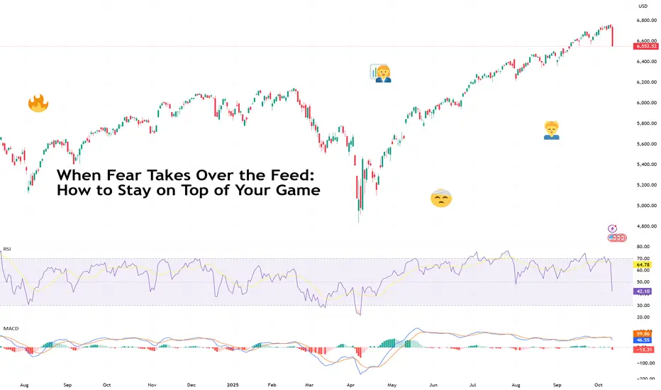
When Fear Takes Over the Feed: How to Stay on Top of Your GameFriday wasn’t just a red day — it was the kind of red that makes traders question their life choices.
The Nasdaq Composite NASDAQ:IXIC plunged 3.6% , its worst day since the April tariff-fueled meltdown.
The S&P 500 SP:SPX dropped 2.7%, the Dow Jones TVC:DJI tumbled nearly 900 points, and $1.6 trillion in market value simply evaporated.
Hello tariffs, my old friend.
President Trump announced he’s canceling a planned meeting with China’s Xi Jinping and slapping 100% tariffs on Chinese goods. Just when investors thought the trade wars were over.
It was China this time that triggered the mayhem. President Xi unveiled plans to tighten controls on rare-earth exports, materials critical for EVs and high-tech hardware.
The widespread selling was especially brutal over at the crypto corner with a record $19 billion in liquidations. Bitcoin BITSTAMP:BTCUSD face-planted 7.2% for the day, sliding below $111,000.
So, what’s a trader supposed to do when markets melt faster than your enthusiasm to study the Elliott wave?
Here’s a step-by-step guide that breaks down the psychology of panic and how smart traders stay cool when the feed turns into a fear factory.
🧠 Step One: Understand the “Fear Reflex”
When bad news breaks, the first instinct for most traders is to actually do something. Anything. Sell, short, hedge, pray — anything to make the pain stop. That’s your amygdala (the brain’s alarm system) talking.
When headlines hit, ask yourself:
• Is this new information, a re-spin of old fears, or a projection?
• Does it change the fundamentals of my positions?
• What’s the time frame of this impact — minutes, months, or meme-cycle?
If you can’t answer those calmly, and instead rush to offload your positions, you’re in panic mode and you risk making impulse decisions.
📊 Step Two: Zoom Out (Literally and Mentally)
When fear takes over the feed, the chart shrinks. Traders start staring at 1-minute candles and wonder if they should dump their stocks right now .
That’s the moment to zoom out. Pull up the 4-hour, daily, or weekly chart. You’ll likely notice that Friday’s epic collapse looks less like the apocalypse and more like a blip in an ongoing uptrend.
Case in point: The Nasdaq may have tanked 3.6%, but it’s still sitting near record territory after months of AI-fueled gains. The broader trend — higher highs, higher lows — is intact.
Volatility doesn’t mean reversal. It means emotion acting out. And markets love testing conviction.
💬 Step Three: Tune Out the Noise
When every post in your feed screams “MARKET MELTDOWN!” it’s tempting to join the panic chorus. But that doesn’t mean it’s going to be like that tomorrow.
Take for example the April crash. Stocks were rising and rising , and not too long after, they started hitting record after record .
You don’t need to read 20 opinions — you need one solid plan (and, of course, to be a daily reader of our Top Stories ).
A simple checklist helps:
• Position size: Are you overexposed?
• Stop-loss: Is it placed logically, not emotionally?
• Cash buffer: Do you have dry powder for the dip?
Don’t scramble mid-freefall. Prepare for volatility before it happens.
🧩 Step Four: Identify the Difference Between Noise and Narrative
Every market drop has two layers — the market-shaking news story and how investors perceive it.
• The headline on Friday: “Trump reignites trade war with China.”
• The perception: Markets pricing growth halt, rake hikes, gloom and doom, and apocalypse.
In the short term, that’s fear-inducing. In the medium term? It could actually mean looser monetary policy — which is generally bullish for risk assets like stocks, gold, and even crypto.
In other words, what feels like the end of the world on Friday might look like a buying opportunity by Tuesday.
🧭 Step Five: Play Offense When Others Play Defense
There’s a reason Buffett’s “be fearful when others are greedy” quote is overused — because it’s true.
When the market wipes out $1.6 trillion in a day, it’s a reminder that liquidity and emotion drive short-term moves. If your thesis is intact and you’re not that up high on leverage, you may consider this drop as a time to look for opportunities.
Instead of selling in fear, study which sectors overreacted.
• Tech led the plunge — but if (or when) there’s a rebound, these stocks will most likely be the leaders. Especially now when the third-quarter earnings season is here (check when it’s big tech’s turn to report by browsing the Earnings calendar ).
• Gold and bonds saw inflows — typical defensive plays.
• Energy and industrials may catch bids if tariffs stick.
🪙 A Note to Crypto Bros
Bitcoin’s 7% slide shows that once-independent assets have spent too much time with traditional risk assets.
And now they’re almost impossible to tell apart. As institutional capital grows in crypto, it behaves more like a growth play where risk is embraced during good times, but dumped during bad.
The lesson? Don’t buy the “decoupling” narrative so easily. Bitcoin may hedge against long-term fiat decay, but in a short-term panic, it’s still part of the same risk ecosystem. The smart move is to trade correlations , not beliefs.
If Bitcoin drops with stocks during a tariff tantrum, that’s confirmation that institutional traders are playing both arenas.
🧡 Final Takeaway
Let’s acknowledge that Friday’s bloodbath was catastrophic to many . It wiped out traders that were holding both stocks and crypto. If that happened to you, as painful as it is, keep your head up, take a breath (or a break), and come back another day.
And when you do, widen your chart, trim that leverage and keep your bets nimble so you’d survive the next inevitable meltdown.
Finally, we can't not address the elephant in the room. It was likely another Trump-led market rinse-and-repeat cycle: tweet, panic, rebound. Futures are recovering after Trump waved away tariff fears , saying “Don’t worry about China, it will all be fine!”
Off to you : How did you fare Friday? And what's your way of weathering the market storms? Share your experience in the comments!
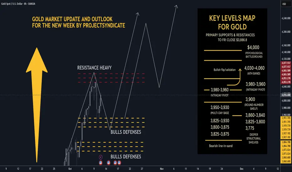
Gold next week: Key S/R Levels and Outlook for Traders🏆 Friday’s Close & Recent ATH:
Gold XAUUSD closed Friday around ~$3,990–$4,020/oz depending on venue most consolidated feeds show prints near $3.99–$4.02k at Friday close. The nearest recent intraday highs printed in the $4,030–$4,060 area across data providers this week, putting $4,000 as the immediate psychological battleground and $4,050–$4,060 as the latest short-term ATH band. YTD performance remains extraordinary 2025 YTD still showing a very large gain.
📈 Trend Structure:
Price continues to track a well-defined ascending channel on 1H/4H with clear impulsive legs out of recent consolidations. Market character = higher highs / higher lows, persistent dip-buying, and strong trend adherence into quarter-turn 25/50 handles near round thousands. Momentum has been resilient into week-end despite tariff headlines, suggesting structural demand and participation from official buyers.
🔑 Key Resistance Levels:
The most critical resistances to watch updated from Friday close ≈ $4,000:
• 4000 — immediate psychological round-number battleground.
• 4,030–4,060 — recent intraday ATH band / short-term supply recent highs printed here across venues.
• 4,075 → 4,100 — measured move / extension band if acceptance above the ATH zone occurs.
• 4,150–4,200 — stretch momentum targets on sustained risk-off and break/acceptance above 4,100 structural extension.
Quick note: different data vendors quote small differences in ticks — I used consolidated high prints to identify the ATH band.
🛡️ Support Zones:
Immediate supports step down as follows
• 3,980–3,960 intraday pivot just under Friday close.
• 3,950–3,930 multi-day base / near-week lows.
• 3,900–3,888 round-number shelf and the prior week’s consolidation band.
• Deeper structural shelves: 3,860–3,840, 3,825, 3,800 → 3,775.
A sustained break below ~3,900–3,888 would signal increasing corrective risk; daily close under ~3,825 would more clearly shift the regime.
⚖️ Likely Scenarios:
• Scenario 1 Base Case – Controlled dip toward 3,950–3,930 or the 3,900 area to reload bids, then rotation higher toward 4,030–4,060 as buyers re-engage.
• Scenario 2 Momentum Break – Quick clearance of the 4,030–4,060 ATH band → sustained acceptance above 4,075–4,100, unleashing momentum into 4,150–4,200. Overbought readings exist intraday, but structural demand has kept pullbacks shallow.
📊 Short-Term Targets:
On continuation: 4,020 → 4,030–4,060 → 4,075 → 4,100, with 4,150–4,200 as higher extensions if acceptance holds.
On retrace: 3,980 → 3,950 → 3,930 → 3,900 as the key retrace ladder.
💡 Market Sentiment Drivers updated:
• Tariff shock / geopolitical risk: President Trump announced proposals for large new tariffs reports of a 100% tariff threat and expanded export controls on Chinese imports this week, escalating trade-war risk and knocking risk sentiment — that increases safe-haven demand for gold. News outlets Reuters, AP, WaPo and market reactions were visible Friday.
• Rate & policy expectations: Markets continue to price material odds of rate easing/softer Fed path relative to earlier in the year; that reduces real yields and supports gold. Feeds and FedWatch implied pricing show elevated cut odds that underpin lower opportunity cost for gold.
• Official demand: Central bank buying has remained constructive — WGC/official stats show continued net purchases in recent months monthly buying rebounded in August. This adds structural support to dips.
• Macro/flow: Risk-off from tariff headlines, rare-earth export controls, and supply-chain concerns are the immediate drivers that could catalyze pushes toward the ATH band.
🔄 Retracement Outlook:
A tag of 3,950–3,930 or a short stop-run into 3,900–3,888 would be a typical healthy pullback inside the trend. Fast reclaim of the first support band after a liquidity flush often precedes fresh ATH tests. Breaks under 3,900 that fail to reclaim quickly increase the probability of a deeper slide into the 3,860–3,825 shelf.
🧭 Risk Levels to Watch:
• Bullish structure intact: holding above ~3,950–3,930 or more conservatively, above 3,900 keeps the bull case intact.
• Bearish line-in-sand: daily close < 3,825 weakens trend; daily close < 3,775–3,750 signals a bigger corrective phase and opens lower targets.
🚀 Overall Weekly Outlook:
Gold remains in a strong uptrend with $4,020–$4,030/ATH band $4,030–$4,060 → $4,000 as the immediate battleground after Friday’s close. Expect buyable dips while supports hold; the topside roadmap favors 4,075–4,100 and 4,150–4,200 as measured extensions if the market digests tariff news into a longer-running risk-off regime.
EURUSD: Downtrend will Continue in ChannelHello everyone, here is my breakdown of the current Euro setup.
Market Analysis
The price action has been clearly bearish, with the market being guided lower by a well-defined Downward Channel. This structure has been in place for some time, creating a series of lower highs and lower lows after a failed breakout above the 1.1775 Resistance.
Currently, the price is in a corrective rally after a 'fake breakout' below the major 1.1575 Support. This bounce from the lows is now carrying the price back up towards the upper boundary of the Downward Channel, which is a key area to watch for seller activity.
My Scenario & Strategy
My scenario is based on the expectation that the dominant downtrend will continue. I'm looking for this corrective rally to complete as it reaches the descending resistance line of the channel. The key signal would be a clear and strong rejection from this dynamic resistance, indicating that sellers are stepping back in to defend the trend.
Therefore, the strategy is to watch for this rejection. A confirmed failure to break higher would validate the short scenario. The primary target for the subsequent decline is 1.1550, which is located within the major Support zone.
That's the setup I'm tracking. Thank you for your attention, and always manage your risk.

AUDUSD Eyes 0.64500 Support as Bullish Structure Holds FirmHey Traders,
In today’s session, we’re closely monitoring AUDUSD for a potential buying opportunity around the 0.64500 zone. The pair continues to trade within a broader uptrend, and the current pullback appears to be a healthy correction toward a key support and resistance confluence near 0.64500.
A sustained reaction from this level could reaffirm the bullish structure, opening the door for a continuation toward recent highs if momentum aligns with a weaker USD backdrop.
Trade safe,
Joe.

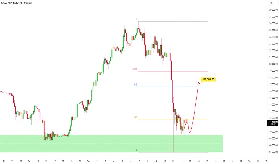
BTC to Retrace to Key Fibonacci level after Heavy SelloffPrice experienced a sharp and aggressive selloff and now, after a strong rejection from key level, the market is consolidating, showing early signs of stabilization as sellers begin to lose momentum.
If buyers can defend this area and push price higher, the next logical target lies around the Fibonacci 0.5–0.618 retracement zone, aligning with the 117,000 - 119,000 level, a key area where sellers may step back in.
Will EU go up this time?Hi traders,
Last week EU started with a gap down and dropped to take the lower liquidity.
Next week we could see price come into the lower Daily FVG and reverse from there. It still looks like that the downmove is corrective and this pair goes up one more time to finish a big ending diagonal into the Weekly FVG.
Let's see what the market does and react.
Trade idea: Wait for price come into the Daily FVG and reverse. After an impulse wave up and a correction down, look for a change in orderflow to bullish on a lower time frame to trade longs.
If you want to learn more about trading with FVG's, liquidity sweeps and Elliott wavecount and patterns, then make sure to follow me.
This shared post is only my point of view on what could be the next move in this pair based on my technical analysis.
Don't be emotional, just trade your plan!
Eduwave

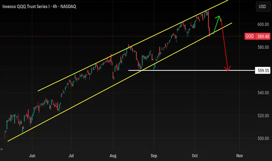
QqqBeen awhile since I went over Tech..
Let's start off with a bigger picture
Zooming out you can see that we've tagged our long term resistance since sept
Zooming in but staying on the weekly
You'll notice the reversal weekly bearish engulfing and also the volume..
The candle alone is is nasty, but that volume is a bad. The most volume we've seen since april rebound and it's bearish..
So with that being I think are headed back to 558 minimum. And also I think this moves happens before November 1st.
Nov to late Dec normally isn't to kind to bears and also we would be in the middle of tech earnings so I don't like to short the market during bullish Seasonality + earnings season.
So
Let me show you my steps one by one how I come up with my tech homework/trades
Step one Identify where your
Moving averages
Price action
Fib levels are
Start on daily time frame
I like to use my 20/50ma
The 20ma resistance will be 599-600
The 50ma support will be 582
Next I add the fib levels on my chart starting from all time high and going back lower to that launch pad at 558.. some people go back further and lower than 558 but those levels aren't ACTIONABLE for day trading or swinging weeklies. I need to know where proce can go for the next 3 sessions or next 3%
So fib levels confirm the moving average levels
As you can see 601 .786 fib level will match up closely with the 599 20sma Resistance
The 579 .382 will match nicely with the 50sma
When I say match , what I mean is let's say I short Qqq on a rebound at 599, I would be will to add another put all the way up to its next resistance at 601 if needed and then I could place a 20% loss behind 601.
Similar to if I was to buy calls at 582 50sma for a nice bounce, I would be willing to add more calls all the down to 579 gap close or .382 fib with a 20% stop below that..
This method of positioning gives you a back up plan and prevents paper hand trading.
Lastly let's look at just price action and trend lines..
For that we'll have to go down the hourly time frame (2hour chart)
Some people would argue upon seeing this trendline retest that it's a great buy area, and I would agree short term it may bounce but being up at the weekly trendline I think this summer uptrend gives way this week or next.
1hour chart
This is where I just look at price action and volume. I look for areas with a lot of traffic and heavy volume
.
Going into next week you can see its alot of support at 588 and I circled in green the previous volume that came into that area.
Overhead resistance will be the 200sma at 592 and support at 588.. over 593 and 596 comes but I expect Choppy early on between 588-592.
For a short I would only look for it below 586.00 , I know 588 is support but this is why fib levels are important for me.
586 is fib support so unless it breaks that then you may get a bear trap dip to 587 then launch back up.. only bearish below 586!!!!!!!
What I think will happen this week is a bounce back to 596 minimum and 600 max before we head lower, so unless we gap down below 586 then the move is likely to be upwards early on. If the market gaps up early Monday then wait for a pullback or fizzle out to by calls for a Tues or Wed pop higher.
I think we could see a H&S play out if price pushes back to 600
But first we need a pop, in terms of day trading you never want to open short when you see the indexes hourly RSI and Bollingerband oversold.
With the exception off thee Qqq idea .. the other trade I like is
NASDAQ:NVDA calls for a pop back to 190
Pullback to retest rectangle breakout here at 184.00.
I like calls above 185, target 190.
Over 190 and 194 comes but have a tight stop over 189 incase it can't go higher.
Entry
Above 185
Stop loss
Below 183.50
Target 190
Catch you all later , my apologies if I'm not too responsive or active lately; I've been busy.
In this post I tried to show you how I come up with my idea/ conviction. I use this method on every stock I chart and it actually only takes me 10mins max to chart something and come up with a Tradeable strategy.
You have to come up with a method/strategy in trading and charting, then apply this method every day.. you should be charting atleast 3 stocks a day with this method because that's the only way you will become proficient enough to make it. And staring at a chart because you are in a trade doesn't count. This trading and charting thing is more about repetitive discipline than intelligence. If you can't find 30mins a day to fine tune your charting craft then it will be difficult staying in this game
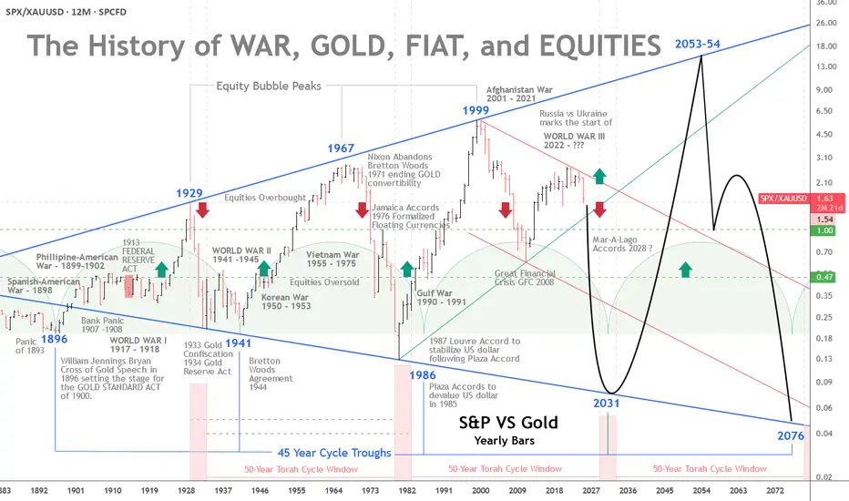
The History of War, Gold, Fiat, and EquitiesGold vs. Equities — The 45-Year Cycle and a Pending Monetary Reset
The interplay of war, gold, fiat money, and equities has long been a barometer of real wealth and economic stability. A recurring pattern emerges across modern history: approximately 45-year intervals when gold strengthens relative to equities.
From the Panic of 1893 to the present, these cycles have coincided with major monetary shifts and geopolitical shocks.
With a broadening 100-year pattern, rising geopolitical tension, and roughly $300 trillion in global debt, a monetary reset by the early 2030s is plausibly on the horizon.
The 45-Year Cycle — Gold’s Strength at Equity Troughs
The pattern’s first trough is traced to 1896, when William Jennings Bryan’s “Cross of Gold” speech preceded the Gold Standard Act of 1900. Equities were weak after the Panic of 1893, and gold gained prominence. Thirteen years later, the Federal Reserve would be created. More on the 45-year cycle later.
The 50-Year Jubilee Cycle
The Torah’s 50-year Jubilee cycle, as outlined in Leviticus 25:8–12, is a profound economic and social reset that follows seven 7-year Shemitah cycles, totaling 49 years, with the 50th year designated as the Jubilee.
Each Shemitah cycle concludes with a sabbatical year (year 7, 14, 21, 28, 35, 42, 49), during which the land rests, debts are released, and economic imbalances are addressed (Leviticus 25:1–7).
The Jubilee, occurring in the 50th year, amplifies this reset by mandating the return of ancestral lands, freeing of slaves, and further debt forgiveness, symbolizing a divine restoration of societal equity.
While built on the 49-year framework of seven Shemitahs, the 50th year stands distinct, marking a transformative culmination rather than a simple extension of the Shemitah cycle.
The five-year Jubilee windows highlighted at the base of the chart compliment the 45-year cycles previously noted. The 4 year Jubilee windows are projected from the roaring 20s peak in 1929 and the 1932 bear market low four years later.
The next Jubilee window is scheduled to occur some time between 2029 and 2031.
Returning to History and the 45-Year Cycles:
The Panic of 1907 and the Fed
The Panic of 1907 was a severe crisis, with bank runs, failing trust companies, and a liquidity crunch centered in New York. The collapse of copper speculators (F. Augustus Heinze and Charles W. Morse) triggered runs on institutions like the Knickerbocker Trust.
Private bankers led by J.P. Morgan injected liquidity (over $25 million) to stabilize the system. The shock exposed the absence of a lender of last resort and precipitated reforms.
Congress responded with the Aldrich–Vreeland Act (1908) and the National Monetary Commission, whose 1911 report recommended a central bank to supply “elastic currency.”
After debate and hearings, President Woodrow Wilson signed the Federal Reserve Act on December 23, 1913, creating a decentralized central bank with 12 regional banks.
Some alternative accounts (e.g., The Creature from Jekyll Island) argue that the panic was exploited to centralize financial control. Mainstream history, however, treats the panic as the genuine catalyst for reform.
Whatever the intent, the Fed’s creation shifted the tools available to manage crises—and, over time, central banks have played an instrumental role in financing wars and expanding Fiat currency.
The Fed and World War I
World War I began in Europe in 1914 (U.S. entry in 1917). The Fed began operations in November 1914 and later supported wartime financing by:
Marketing Liberty Bonds (~$21.5 billion raised, 1917–1919).
Providing low-interest loans to banks buying Treasury securities (via 1916-era amendments).
Expanding the money supply, which contributed to wartime inflation.
Although the Fed was created primarily to prevent panics and stabilize banking, its early role in war finance shifted expectations about central banking’s functions.
From Confiscation to Bretton Woods to the Nixon Shock
In 1933, during the Great Depression, the U.S. effectively nationalized gold—private ownership was outlawed, and the official price was later reset at $35/oz by the Gold Reserve Act of 1934. Private ownership remained restricted until President Ford legalized it again in 1974.
World War II and the Bretton Woods Agreement (1944) cemented gold’s role: the dollar became the anchor of the system, and other currencies pegged to it.
That status persisted until August 15, 1971, when President Nixon suspended dollar-gold convertibility—the “Nixon Shock”—moving the world toward fiat currencies.
The Petrodollar and Post-1971 Arrangements
After 1971, the U.S. worked to preserve dollar demand. The petrodollar system emerged in the early 1970s: following the 1973 oil shock, a U.S.–Saudi understanding (1974) helped ensure oil continued to be priced in dollars and that oil revenues were recycled into U.S. Treasuries—supporting the dollar’s global role despite its fiat status.
Devaluations, Floating Rates, and the End of Bretton Woods
Two formal “devaluations” followed the Nixon Shock:
Smithsonian Agreement (Dec 18, 1971): Raised the official gold price from $35 to $38/oz (an 8.57% change) as a stopgap attempt to stabilize fixed rates without restoring convertibility. It widened exchange banding but proved unsustainable.
On February 12, 1973, the official gold price was revalued to $42.22/oz (roughly a 10% change), a symbolic acknowledgment that Bretton Woods was collapsing. By March 1973, major economies had effectively moved to floating exchange rates, and market gold prices surged.
These moves were reactive attempts to adjust the dollar’s value amid trade deficits, inflation, and speculative pressures. They ultimately ushered in a fiat era, where market forces, not official pegs, set the price of gold.
Triffin’s Dilemma — Then and Now
Triffin’s Dilemma describes the structural tension faced by a reserve currency issuer: it must supply enough currency to ensure global liquidity (running deficits) while risking domestic instability and a loss of confidence.
Britain faced this under the gold standard; the U.S. faced it under Bretton Woods and again after 1971, albeit in a different form.
Modern manifestations include inflation, persistent fiscal and external deficits, and mounting debt. International policy coordination (e.g., the Plaza and Louvre Accords) repeatedly tried—and only partially succeeded—to manage these tensions.
The Plaza (1985) and Louvre (1987) Accords
Plaza Accord (Sept 22, 1985): G5 nations coordinated to depreciate the dollar (it had appreciated ~50% since 1980). The goal was to ease U.S. trade imbalances. The dollar fell substantially vs. the yen and mark by 1987.
Louvre Accord (Feb 22, 1987): G6 sought to stabilize the dollar after its rapid decline following the Plaza Accord, setting informal target zones and coordinating intervention. It temporarily checked volatility but did not solve underlying imbalances.
Both accords illustrate the extreme difficulty in balancing global liquidity needs with domestic economic health in a fiat system.
De-industrialization, Bubbles, and the Broadening Pattern
Orthodox history would argue that U.S. de-industrialization in the 1990s was rational at the time. Globalization and cost arbitrage provided short-term benefits, but they increased trade deficits, foreign dependency, and robbed the middle class of high-paying jobs. That loss of capacity heightens vulnerability to dollar shocks and complicates any re-industrialization efforts today.
Measured in gold, equities have experienced expanding ranges:
Equity peaks (1929, 1967, 1999) were followed by troughs where gold outperformed (1896, 1941, 1980/86).
Gold peaked in 1980, even though the cyclical trough in the broader pattern was nearer 1986—showing that cycles can shift.
The dot-com peak (1999) marked a secular low for gold relative to equities. The ensuing crashes, 9/11, and the War in Afghanistan, followed by the 2008–2009 Financial Crisis (GFC), moved markets profoundly—both nominally and in terms of gold.
From 1999, relative equity values fell until a trough around 2011 (coinciding with the European debt crisis). Quantitative easing and policy responses (2010 onward) restored growth, but frailties remained (e.g., repo market stress in 2018).
COVID produced another shock; aggressive fiscal and monetary responses engineered a V-shaped asset recovery but also higher inflation.
Relative to gold, equities peaked in 1999 and have trended lower since. As nominal stock prices register all-time-highs in dollars—fueled by AI and other themes—equities are historically overvalued. When priced against gold, the apparent bubble in nominal terms looks more like an extended bear market ready for its next down-leg.
The Broadening Pattern and the Next Trough
A broadening pattern illustrates the gold equity ratio range expanding with each major peak and trough. If we accept a roughly 45-year rhythm from the 1980/86 period, the next cyclical trough may fall between 2025 and 2031, with 2031 a focal point. Whether this manifests as a runaway gold price, a sharp equity collapse, or both remains uncertain.
If a sovereign-debt crisis or major war escalates, changes could accelerate—some scenarios even speculate about a negotiated new monetary framework (e.g., “Mar-A-Lago Accords”) in the next 5–15 years.
Geopolitics and the $300 Trillion Debt
Geopolitical tension compounds financial stress. The Russia-Ukraine war, plausibly the start of World War III, NATO involvement, and nuclear saber-rattling evoke systemic risk. Global debt—estimated at around $300 trillion (over 300% of GDP per the Institute of International Finance)—is unsustainable.
U.S. public debt (~$38 trillion) now carries interest costs comparable to defense spending.
Central bank money creation to service debt erodes confidence in fiat currencies and boosts demand for gold. Historical monetary resets (Bretton Woods, Nixon Shock) followed similar pressures of debt and conflict.
A modern reset could push gold well beyond current records—potentially into the high thousands or five-figure territory if confidence collapses.
Implications of a Pending Monetary Reset
A reset might take various forms:
A partial return to a gold-linked standard, perhaps supplemented by tokenized/digital assets.
Forced debt restructuring or coordinated global defaults.
Rapid adoption of digital currencies (including state-issued tokens—CBDCs) as part of a new settlement architecture.
Given Triffin’s Dilemma, inflated financial assets, and interconnected global linkages, a modern reset could be far larger in scale and speed than past adjustments. Assets, trade, and supply chains are far larger and more intertwined than in 1971, increasing contagion risk.
Practical takeaway: investors should consider gold’s role in portfolios; policymakers must confront debt sustainability or risk a market-driven reckoning that could disrupt global finance.
Conclusion
The Torah's 50-year Jubilee, the 45-year cycle and the century-long broadening pattern suggest we are approaching a structural turning point.
Triffin’s Dilemma, decades of accumulated imbalances, de-industrialization, and escalating geopolitical risk suggest a monetary reset is plausible between 2030 and 2035—possibly sooner under severe stress.
A modern reset would be more disruptive than past episodes because today’s global economy is larger, more integrated, and technologically complex. The question is not only whether such a reset will occur, but how policymakers and markets will manage it.
The stakes—global financial stability and the relative value of fiat versus real assets—could not be higher.
BITCOIN – THE REAL REASON BEHIND THE FALLWhen I started trading someone told me something I’ll never forget: “If you can predict tomorrow’s newspaper headline, you understand the market.”
He didn’t mean I should chase news. He meant I should read structure so well that I know what kind of headline the market is already writing, before the mass even see it.
And now, looking around online, I see the complete opposite. Everywhere you look, there’s another “confluencer” talking about crypto with big words and zero understanding.
People selling dreams, memberships, and indicators, while they don’t even know what open interest or CVD means.
I’m not here to sell anything. I’m here to help people actually learn how to read data and see through the noise. Because what most of these so-called experts call “analysis” is just emotional guessing wrapped in confidence.
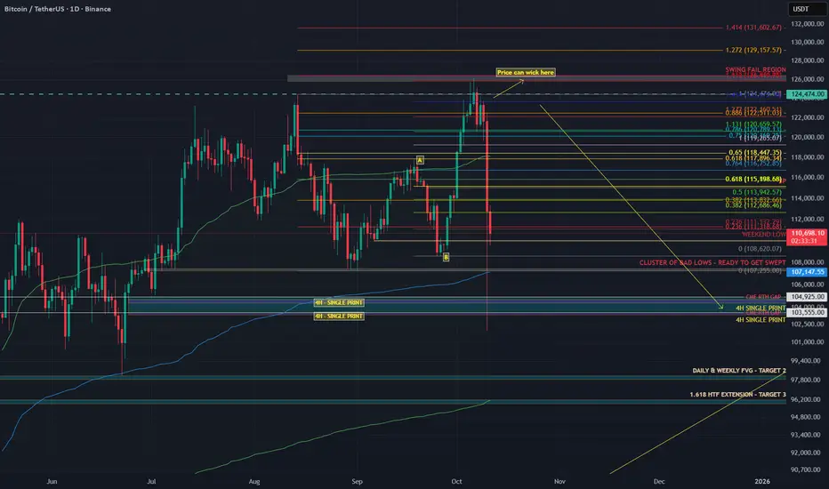
What I called and what happened
Last week I posted my “Big Dump” thesis.
I said Bitcoin would swing fail above the highs, then drop into the 104K region. That is exactly what happened.
Price ran the sweep into 126K, trapped the late buyers, and dumped straight into 104K.
People blamed tariffs. The tariff headline was the spark. The fuel was crypto’s own positioning.
Why the structure was ready to snap
Before the crash, the data told the story clearly.
Stablecoin OI went from 257K to 285K contracts (+10.9%). That is new leveraged exposure.
Coin-margined OI dropped during the breakout, then rose again near the highs. Shorts were fading strength.
Spot CVD stayed flat to slightly negative. Real buyers were missing.
The long/short ratio fell from 2.05 to 1.02 even while price kept climbing.
That’s what distribution looks like. Buyers on leverage pushing price up while stronger hands sell into them. No real spot demand, just futures exposure.
You don’t need a macro event to fall. You only need a reason for those leveraged buyers to stop bidding. Think of it like a crowded elevator. Everyone keeps piling in as it moves up, feeling safe because it hasn’t stopped yet. But the moment one person hesitates, the weight shifts. When the next person panics, the whole thing drops.
That’s what happens when a market is driven by leverage instead of conviction. You don’t need bad news, you just need hesitation.
Look back at similar events.
In May 2021, funding rates were insane, perps overloaded, and spot volume thin. Elon Musk tweeted about Bitcoin’s energy use. That tweet didn’t cause the dump. It just made leveraged longs pause. The bids disappeared and the cascade started.
In August 2023, Evergrande headlines hit. Bitcoin was sitting at resistance with flat spot CVD and rising OI. Equities wobbled, crypto longs hesitated, and the structure collapsed within hours.
In March 2020, when COVID panic hit, Bitcoin had already been stretched thin. Funding was high, leverage was heavy, and liquidity was weak. The virus didn’t break the market, leverage did.
Leverage creates confidence until it doesn’t. Price doesn’t fall because people start selling. It falls because nobody steps in to buy. Headlines decide when the drop starts. Structure decides how far it goes.
Why 104K was my first target
I didn’t pick 104K out of thin air. That level was built on confluence.
1) AVWAP from the April 7 auction
That swing low kicked off with massive volume. When a move starts with that kind of participation, the anchored VWAP becomes a key reference for institutional flow. It represents the average cost of that whole auction, and when extended forward, it acts as a dynamic area where liquidity and algorithms interact.
That blue AVWAP line from April has been running right through the 104K region.
It’s not that price revisited that auction, it’s that the anchored VWAP from that event still marks the fair value area for that entire move.When price traded back down into that region, it met that same volume-weighted anchor, creating a major confluence zone that algos and larger players watch closely.
2) The June 22 breakout left an LVN
A new auction started on June 22 and pushed higher, leaving a Low Volume Node behind.
An LVN is a thin zone on the volume profile where the market moved quickly with little trade.
Markets often revisit these thin areas later to find balance or test unfinished business.
3) HTF Fibonacci cluster
Multiple higher timeframe Fibonacci retracements and extensions overlapped near the same 104K area. When several fib levels align with structure, that’s a strong confluence zone watched by both human traders and algorithms.
The 104K region was where the AVWAP line, LVN, and fib cluster all met. That’s not a random target. It’s a structurally defined area where liquidity concentrates and where markets tend to react sharply. And that’s exactly what happened.
The spark versus the structure
The tariff headline didn’t cause the drop. It triggered it.
The structure was already unstable. Leverage was maxed. Spot demand was flat. Funding was positive and rising. When the tariff news hit, traditional markets pulled back and crypto followed instantly. It wasn’t correlation, it was liquidity contagion.
Traders managing multiple books de-risk across assets when volatility spikes. That creates a gap in liquidity. When the bids vanish, the market falls into the first real pool of resting orders — in this case, the 104K zone.
You saw the same mechanics during the March 2020 crash and the 2021 deleverage. External shocks trigger internal liquidation cascades. That’s why saying “this had nothing to do with crypto is completely wrong.
This had everything to do with crypto. It’s like blaming the thunder for breaking a window when the glass was already cracked. Or saying the iceberg sank the Titanic when the captain was already steering through a sea of warnings.
Crypto was structurally weak. Leverage was stretched, spot demand was gone, and funding was positive. When the headline hit, it didn’t cause the collapse. It just gave the market permission to do what it was already set up to do — unwind.
Crypto is built on leverage.
Perpetual futures dominate volume.
Stablecoin collateral drives exposure.
When external risk events change funding conditions or risk appetite, the crypto market reacts instantly because its structure is fragile by design.
Example:
When yields spike, the dollar strengthens and funding costs rise. Leveraged longs become more expensive to hold, so traders unwind positions.
When equities dump, cross-asset desks reduce risk globally, which pulls liquidity out of crypto perps too.
Intermarket correlation always matters. Macro sets the mood. But the speed and violence of crypto moves always come from leverage inside the system.
How you can spot it next time
Compare Spot CVD vs Stablecoin CVD. If stablecoin CVD rises while spot stays flat or negative, the rally is leverage-driven.
Track Open Interest vs Price. Both rising together usually means exposure is building. Confirm with spot flow.
Watch the Long/Short ratio. If it drops while price rises, shorts are entering and the move may be getting absorbed.
Anchor VWAPs to real pivots like swing lows, breakouts, or liquidation spikes. Those levels attract institutional flow.
Study Volume Profiles. LVNs are thin and often retested. HVNs are balance zones that attract price.
Map HTF fib clusters for confluence. Reactions are stronger when multiple timeframes agree.
Note single prints and thin brackets on TPO or volume profiles. These often act as magnets.
When these factors line up, you don’t need to predict headlines.
You’ll already most likely know which headline will break the market.
TLDR
The rally was leverage-driven: Stablecoin OI up 10.9%, Spot CVD flat, Long/Short ratio down from 2.05 to 1.02
The swing fail at 126K was the final liquidity grab
104K was the target due to AVWAP + LVN + HTF fib cluster
The tariff headline was the spark, not the cause
The crash was caused by leverage and missing spot demand
Crypto didn’t fall because of politics. It fell because the market was already begging for an excuse to reset.
The data showed it clearly weeks before the drop.
If this helped you see the market a little clearer or made you think differently about how price really moves, please leave a like and drop a reaction. It keeps me motivated to keep posting real analysis, not the copy-paste bullshit hype that floods your feed every day.
Check the Order Flow Data from 6 October here: ibb.co
Silver just hit a record high but a double‑top signals pullback!After a strong rally to new records spurred by safe-haven demand and new entrants, silver is now testing critical support levels near $47‑$48 amid the recent Gaza ceasefire news, forming a classic double‑top pattern that may turn into a long-term Cup & Handle that could place price action in a handle pattern for the years to come.
🔑 Key Drivers (Silver‑focused)
Technical breakout : Price breached $51, approaching the 161.8 % Fibonacci level at $47.50.
Double‑top formation : A clean double‑top suggests a near‑term correction could be on the way.
Support zone : The $47‑$48 area acts as the next major support; a break below could open the door to $45‑$46 levels.
Fibonacci retracement : The 61.8% retracement sits around $49.30, providing a potential bounce point before any deeper pullback.
Want the latest silver analyses, alerts on breakouts, and detailed chart breakdowns?
Subscribe, like, and hit the notification bell – then share in the comments your silver trade setup or questions!
This content is not directed to residents of the EU or UK. Any opinions, news, research, analyses, prices or other information contained on this website is provided as general market commentary and does not constitute investment advice. ThinkMarkets will not accept liability for any loss or damage including, without limitation, to any loss of profit which may arise directly or indirectly from use of or reliance on such information.

The Pullback Playbook: Buy the Dip or Bail Out?Markets don’t go up in straight lines. Even the strongest trends pause, retrace, and test your conviction.
These pauses are called pullbacks and they can either be healthy breathers before the next leg higher or the first cracks in a trend about to fall apart. The challenge for traders is knowing the difference.
📉 What Exactly Is a Pullback?
Think of a pullback as a temporary trend halt, not necessarily a crash. The price moves against the prevailing trend for a short period, testing support levels or shaking out weak hands before deciding where to go next. They’re common, normal, and — if managed right — they’re opportunities rather than threats.
But here’s where it gets tricky: not all pullbacks are trend halts. Some are the start of a flat-out reversal. And unless you’re comfortable holding through a potential nosedive, you need skills and tools to tell which is which.
🧐 Pullbacks vs. Trend Reversals
So how do know if you’re looking at a pullback or a trend reversal? The main differentiating factor is the length of the move. The healthy pullback looks orderly — modest in size, controlled in volume, and often retracing to familiar moving averages or support zones.
A healthy pullback might retrace 3-5% in a bull run, testing the 20- or 50-day moving average before bouncing higher.
A trend reversal barrels through multiple support levels in days, erasing weeks of gains. It’s often sharper, louder, and driven by news or panic.
Signs of a healthy pullback include:
• Price holding above key moving averages (20, 50-day. Some stretch to the 100-day but these tend to be rare — it’s more likely a trend reversal by then).
• Volume shrinking on the way down, then swelling on the rebound.
• Oscillators like RSI cooling off from overbought territory without plunging into oversold.
Trend reversals look more like:
• Breaks of multiple support levels in one go.
• Heavy, accelerating sell volume.
• Headlines driving panic: tariffs, central bank surprises, data releases from the Economic calendar , crypto exchange blowups, or noise coming from the Earnings calendar .
📊 Technical Tools to Judge the Dip
Charts can’t predict the future, but they can help you gauge probabilities. Pullbacks often line up with Fibonacci retracements, moving averages, or horizontal support and resistance levels.
• Moving Averages : If price pulls back to the 50-day and holds, that’s often a green light for trend continuation. If it slices straight through the 100-day? Not so healthy.
• Trendlines : Respecting the line = confidence. Breaking it = trouble.
• Volume : Low-volume pullbacks suggest sellers aren’t that committed. High-volume dumps are red flags.
None of these are crystal balls. But together, they give you a framework to avoid buying every dip.
🏄♂️ The Psychology of Buying the Dip
Why do traders love dips? Because everyone wants a discount. A pullback offers a chance to jump on a trend at a better price, and social media culture has turned “buy the dip” into a meme strategy. But memes don’t pay the bills when a dip turns into a crater.
The psychology works both ways:
• Optimists see dips as golden tickets.
• Pessimists see them as traps.
• Realists know both can be true, depending on the setup.
Being aware of your own bias — whether you lean toward buying too early or panicking too soon — is half the battle.
🔄 Asymmetric Risk and the Smart Bet
Here’s where it gets interesting. You don’t need to be right all the time if your risk-reward ratio is skewed in your favor. A tight stop and a wide target can mean one win cancels out several small losses.
Imagine risking 1% to potentially make 10%. Even if you’re wrong most of the time, the math can work. Pullbacks are prime territory for asymmetric setups: smart, thought-out entries, clear invalidation points (below support, trendline breaks), and attractive upside if the trend resumes.
This doesn’t mean chasing every dip. A pullback can wipe your position clean if you’ve placed your stop loss a little too close, a little too early.
⏳ Timing Matters
The biggest mistake with pullbacks is trying to catch the exact bottom. Traders love to brag about nailing the wick, but most who try end up paying for it. Smarter is to wait for confirmation — a bounce, a reversal candle, a break back above a short-term moving average.
Yes, you may miss the lowest price. But you’ll also miss buying into a freefall.
🌍 Pullbacks in Context
Context is everything. A dip in a raging bull market is not the same as a dip in a shaky sideways market. Macro matters too. If the Fed is cutting rates , risk assets might rebound fast. If tariffs, wars, or inflation are spiking, a pullback could turn into something bigger and deeper.
That’s why traders zoom out before diving in. Daily charts tell one story; weekly charts often tell the bigger tale.
🚀 Buy or Bail?
So, do you buy the dip or bail out? The honest answer is: it depends. A well-structured pullback in a strong uptrend with unchanged fundamentals is an opportunity.
A violent, volume-heavy selloff in a fragile market with cracked fundamentals is a warning.
The pullback dilemma isn’t just about charts but also about psychology. Can you hold your nerve when the market wobbles, or will you cut and run? Both choices can be right in the right context.
🎯 Final Takeaway
Pullbacks are part of every trend’s DNA. They test conviction, patience, and risk management. The key isn’t to predict every wiggle but to recognize whether price action is just cooling off or signaling something bigger.
Stay disciplined, respect your stops, and let the chart, not the noise, tell you when it’s time to stay in or step aside.
Off to you : Buy the dip? Or bail out? How do you respond to expected and unexpected market pauses? Let us know your coping mechanism in the comments!
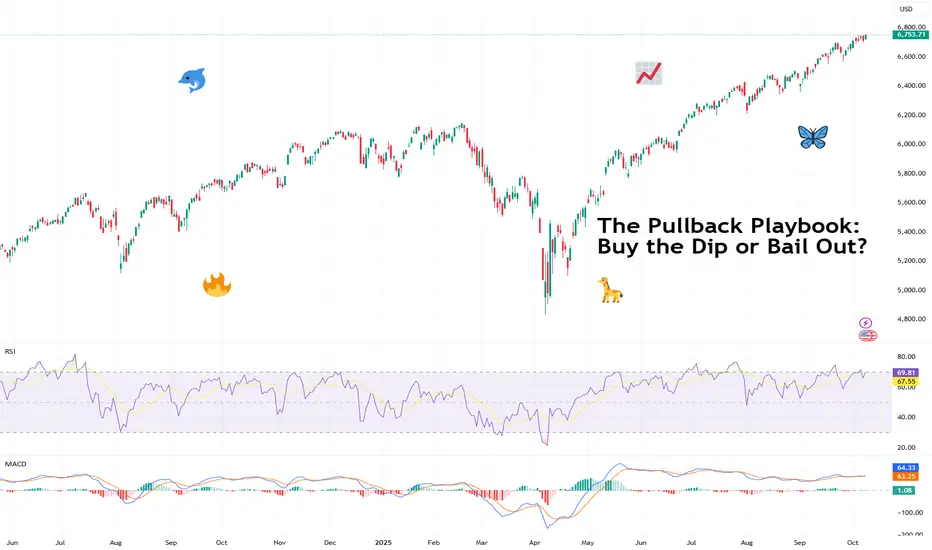
The Market Doesn't Care About Your Thesis"The market can remain irrational longer than you can remain solvent." - John Maynard Keynes
A month ago, I wrote about the brutality of trading and introduced a concept I called the "trading pandemic" - when a chain of events clouds judgment, breaks confidence, and brings down even the best traders.
Life has a dark sense of humor. Shortly after publishing that post, I found myself living through exactly what I'd described.
The Storm That Found Me
Last week, I took significant losses. Not from ignorance. Not from recklessness. But from something far more dangerous: the very conviction that makes me a disciplined trader became the weight that pulled me under.
My thesis wasn't built on hopium or hunches. It was constructed on macro fundamentals:
The Setup:
IG:BITCOIN halving cycle suggesting the rally should fade by September
TVC:GOLD due for a correction as recession stress builds
SP:SPX primed for a rollover amid a macro death cross between inflation ECONOMICS:USINTR and unemployment ECONOMICS:USUR
The U.S. government shutdown on October 1st - echoing 2008 crisis conditions
And the blackout of key data reinforcing the uncertainty
Everything pointed to significant market stress. The fundamentals weren't just bearish - they were screaming. I waited patiently for the setup. I did the analysis. I had conviction backed by historical parallels and macro reality.
Then the market did what it does best: it ignored the script and wrote its own story.
When the Market Rewrites the Rules
Week two of October, IG:BITCOIN didn't just hold - it broke through ATH. TVC:GOLD continued its relentless climb. SP:SPX kept grinding higher with controlled strength that suggested continuation, not exhaustion.
Not with the kind of instability you'd expect during a government shutdown. Not with the fear you'd anticipate when economic data goes dark. But with the kind of structural strength that signals something bigger is happening beneath the surface.
What I started seeing instead was a completely different story unfolding:
Dedollarization accelerating faster than models predicted
Sovereigns accumulating TVC:GOLD at record pace
Institutional capital flooding IG:BITCOIN breaking cycle theory entirely
SP:SPX pricing in policy accommodation before stress even surfaced
Assets moving as if they're pricing in a paradigm shift, not a recession
The thesis wasn't wrong about stress in the system. It was wrong about how markets would price that stress.
Maybe this resolves later and my macro read proves correct on a longer timeframe. Maybe this controlled bull market is just an extended distribution before the real move down. Or maybe - and this is the hardest thing to accept - the market is telling me the playbook changed, and I'm still trading the old game.
I expected liquidation, but the market priced transformation.
The Paradox of Deep Conviction
Here's what last week reminded me: The same deep macro understanding that separates sophisticated traders from noise traders is also the double-edged sword that can cut you down.
You don't forget that conviction without risk management is dangerous. You know this. I know this. But when your thesis isn't just technical - when it's built on macro lens, death crosses, historical crisis parallels, cycle theories - conviction doesn't feel like opinion anymore. It feels like inevitability.
And that's when you start making exceptions:
"The 2008, and year 2000 parallels are undeniable - history doesn't lie"
"Government shutdown + data blackout = liquidity stress is coming"
"Dedollarization and sovereign gold buying confirms the global system is cracking"
" TVC:GOLD can’t keep climbing into a deflationary panic."
" Halving cycles has been the most accurate prediction of IG:BITCOIN for over a decade."
You're not abandoning your principles. You're just... trusting the depth of your research. This isn't a coin flip - you've done the macro work. You understand what's happening at a structural level.
But sometimes, conviction blinds you to what price is screaming: the rules changed.
When Fundamentals and Price Disagree
Here's the hardest pill to swallow: You can have an airtight macro thesis and still get destroyed if the market is playing a different game than the one you're analyzing.
I wasn't wrong to study the 2008 crisis parallels. I wasn't wrong to watch the unemployment-inflation death cross. I wasn't wrong to position for stress when the government shut down and economic data went dark. I wasn't even wrong about sovereign de-risking - that's actually happening.
But I was wrong about what markets would do with that information.
The markets didn’t ignore stress they front-ran the policy response.
Assets aren't climbing despite the fundamentals - they're climbing because of what those fundamentals imply about the future of fiat currencies, monetary policy, and the global financial system.
TVC:GOLD isn't rallying because everything's fine - it's rallying because sovereigns are losing faith in dollar hegemony
IG:BITCOIN isn't breaking halving theory because technicals matter less - it's breaking them because institutional adoption is rewriting the cycle dynamics
SP:SPX isn't ignoring the shutdown - it's pricing in that monetary policy remains accommodative no matter what happens
I was positioned for crisis.
The market was positioning for transformation.
Same data, entirely different interpretation and timeline...
When Knowing Isn't Enough
Nothing I learned this week was new. I got reminded.
Reminded that macro analysis tells you what might happen, not when or how markets will price it.
Reminded that historical parallels inform probabilities but don't dictate outcomes - especially when structural forces are shifting.
Reminded that when fundamentals say "crisis" but price action says "transformation," you don't fight price - you reassess your interpretation of the fundamentals.
Reminded that the market doesn't humble you because you're ignorant. It humbles you because you forgot that being right about the problem doesn't mean being right about the solution markets will price in.
The irony? The conviction that comes from deep macro research, from understanding sovereign behavior, from recognizing historical patterns - that same conviction blinds you to the moment you stop asking "What if markets are pricing this differently than 2008?" and start insisting "I know what's coming because I know what happened before."
The Trading Pandemic, Revisited
The trading pandemic isn’t when you’re lost.
It’s when you’re certain - certain enough to ignore what price is saying.
You stop asking “What if this time it’s different?” and start defending why it shouldn’t be.
You stop respecting liquidity dynamics and start fighting them.
And when you’re already drained personally or emotionally, that conviction turns to concrete. You don’t bend - you break.
The Double-Edged Sword
Here's the brutal truth: What makes us sophisticated traders - deep macro research, historical pattern recognition, fundamental analysis - is precisely what makes the storm hit us harder when markets reprice the narrative.
The trader who randomly bought IG:BITCOIN , TVC:GOLD , and SP:SPX in September and held? They're up significantly.
Not because they saw the shift - but because they had no thesis to be wrong about.
But when you lose after being this prepared - after reading every indicator, watching every pattern - it shakes more than confidence. It shakes identity.
Because if you can be this right on fundamentals and still be this wrong on timing, what does that say?
It says the market just handed you a gift wrapped in pain: the reminder that understanding the fundamentals doesn't guarantee understanding how markets will discount those fundamentals.
What the Market Reminded Me
Not taught. Not showed. Reminded.
That 2008 parallels matter less when the monetary system itself is being questioned
That a macro death cross doesn’t guarantee a crash - it can precede a reflationary melt-up.
That government shutdown + data blackout doesn't always trigger fear - it can mean "Fed will do whatever it takes"
That Bitcoin breaking halving cycles isn't a bug - it might be the feature of institutional adoption
That being unable to get updated economic data doesn't stop markets from pricing in what they expect that data to show
That when fundamentals and price diverge, price is telling you your interpretation is early
The Humbling Truth
Maybe my macro thesis resolves later - markets realize the stress, panic ensues, and the correction comes. Maybe this controlled bull market across IG:BITCOIN , CAPITALCOM:GOLD , and equities is just a longer distribution phase before reality hits.
Or maybe I'm watching the market tell me in real-time that we're not repricing a 2008-style crisis - we're repricing the end of dollar dominance, and I'm still trying to trade it like 2008.
Either way, it doesn't matter right now. What matters is that I was positioned for my version of the story, and the market is writing its own.
The government shut down October 1st. Data went dark. And instead of fear, markets priced in transformation. Instead of crisis, they priced in paradigm shift.
I was trading the problem. They were trading the solution.
Moving Forward
The losses hurt not because I didn’t know better - but because I did.
I knew that fundamentals don’t dictate timing.
I knew liquidity rules all.
But I trusted the thesis more than the tape.
Maybe it all reverses. Maybe it doesn't. But my job isn't to insist on my macro thesis - it's to respect what's happening right now and position accordingly, even when it contradicts everything my research suggests should happen.
The infinite game continues. The conviction that hurt me last week is the same conviction that's made me successful countless times before. I'm not trying to kill the macro analysis. I'm trying to keep it humble in the face of price action.
Final Word
The market only truly beats the trader who quits.
But it tests the trader who stays by reminding them, again and again, that mastery isn't having the right macro thesis. It's respecting price action even when - especially when - it contradicts every fundamental you've studied.
October 1st came. Government shut down. Data went dark. Death crosses formed. 2008 parallels aligned. Halving Cycle completed.
And yet, here we are - breaking every rule the old playbook taught us.
My thesis might still be right eventually. But "eventually" doesn't pay the bills, and it certainly doesn't save your account when you're positioned for a crisis and the market is pricing a transformation.
This week was expensive tuition for a lesson I already knew:
The market can remain irrational - or perhaps perfectly rational in a way you don't yet understand - longer than you can remain solvent betting against it.
Rise, remember, and keep playing the infinite game. 💚
