EURCAD - Bounce Play at the Rail!EURCAD has been respecting its ascending channel beautifully , bouncing between the rails like clockwork. And right now, price is once again retesting the lower trendline, where buyers have consistently stepped in before launching new bullish waves.
🏹As long as this trendline and minor support around 1.62 hold firm, I’ll be watching closely for bullish rejections or reversal patterns to confirm a fresh leg upward. A clean bounce from here could send price back toward the orange structure zone around 1.6350, followed by a potential push toward 1.64+ if momentum builds up.
⚔️However, a break and close below 1.6180 would invalidate the setup and could shift control back to the bears — but until that happens, the path of least resistance remains to the upside.
In short, I’m expecting EURCAD to trap late sellers and fuel another rebound from the channel’s base, the kind of move that rewards patience and precision.
📊 All Strategies Are Good; If Managed Properly!
~Richard Nasr
Oscillators

Three Failed Probes Hint at Silver UpsideAfter three failed probes beneath $48 and a bullish engulfing candle, some upside may be in store for silver.
While entry on a pullback would be preferred, longs could be considered around current levels with a stop below $48 for protection, targeting $51, which acted as both support and resistance earlier this month.
Even though the momentum picture has changed dramatically over the past week, RSI (14) has flattened just above 50 while MACD remains in positive territory despite crossing the signal line from above. Combined, the message is one of diminished upside pressure, not an outright bearish signal. As with this setup, more emphasis should be placed on price action rather than retaining a specific directional bias.
Good luck!
DS

Steel Dynamics Could Be Fighting Higher Steel Dynamics hit a record high on Tuesday after earnings beat estimates. Now, after a pullback, some traders may see potential for more upside.
The first pattern on today’s chart is the October 9 closing price of $147.78. STLD was trapped below that level for more than a week, but it ripped through resistance following quarterly results. The stock remained above it the next two sessions as it fell and bounced, which may suggest new support is emerging above an old high.
Second is the November 2024 all-time high of $155.56. The steelmaker has made an initial probe of that level. Will another test be more successful?
Third, notice how the moving averages have spread out since September. The 8-day exponential moving average (EMA) is above the 21-day EMA and the 50-day simple moving average (SMA) is above the 200-day SMA. That may suggest its short- and long-term trends are getting more bullish.
Finally, MACD has been rising.
TradeStation has, for decades, advanced the trading industry, providing access to stocks, options and futures. If you're born to trade, we could be for you. See our Overview for more.
Past performance, whether actual or indicated by historical tests of strategies, is no guarantee of future performance or success. There is a possibility that you may sustain a loss equal to or greater than your entire investment regardless of which asset class you trade (equities, options or futures); therefore, you should not invest or risk money that you cannot afford to lose. Online trading is not suitable for all investors. View the document titled Characteristics and Risks of Standardized Options at www.TradeStation.com . Before trading any asset class, customers must read the relevant risk disclosure statements on www.TradeStation.com . System access and trade placement and execution may be delayed or fail due to market volatility and volume, quote delays, system and software errors, Internet traffic, outages and other factors.
Securities and futures trading is offered to self-directed customers by TradeStation Securities, Inc., a broker-dealer registered with the Securities and Exchange Commission and a futures commission merchant licensed with the Commodity Futures Trading Commission). TradeStation Securities is a member of the Financial Industry Regulatory Authority, the National Futures Association, and a number of exchanges.
TradeStation Securities, Inc. and TradeStation Technologies, Inc. are each wholly owned subsidiaries of TradeStation Group, Inc., both operating, and providing products and services, under the TradeStation brand and trademark. When applying for, or purchasing, accounts, subscriptions, products and services, it is important that you know which company you will be dealing with. Visit www.TradeStation.com for further important information explaining what this means.

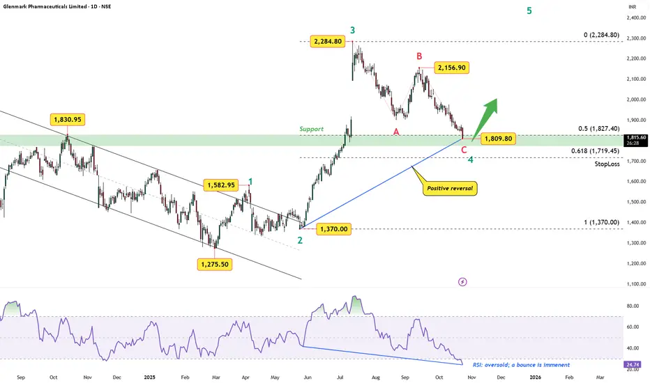
Glenmark Pharma: Wave 4 Nearing Its End — Wave 5 Setup in FocusAfter an impulsive five-wave advance from ₹1,275 to ₹2,284, Glenmark Pharmaceuticals appears to be wrapping up a textbook A-B-C correction for Wave 4.
Wave Structure
The drop from ₹2,284.80 subdivides cleanly into A–B–C, with Wave C finding support near the 0.5 retracement (₹1,827).
A rising trendline from Wave 2 adds confluence, turning the current zone into a potential launchpad.
Momentum Check
RSI has dipped into oversold territory and is showing a positive reversal — a classic early sign of bullish resumption.
Any sustained push above ₹1,900 may confirm Wave 5 ignition.
Invalidation / Stop-Loss
A decisive close below ₹1,719 (0.618 Fib) would invalidate the bullish view.
Targets (Wave 5 projection)
Initial target zone: ₹2,284 (previous high).
Bias: Bullish (Wave 5 setup forming)
Disclaimer: This analysis is for educational purposes only and does not constitute investment advice. Please do your own research (DYOR) before making any trading decisions.
OP/USDT – Order Block Accumulation + RSI OversoldOP is currently bound within a consolidation range, showing signs of a potential order block formation—a zone where larger players may be accumulating. These structures often precede impulsive, expansive moves once the range is broken. We're seeing tight price action between $0.400 and $0.410, which could act as a springboard.
🔍 The RSI is deep into oversold territory, signaling that the selling momentum may be fading. This aligns with the idea of a reversal or breakout from the current accumulation zone. Watch for volume spikes or candle structure shifts as potential early signals.
📊 Trade Idea:
Entry Zone: $0.400 – $0.410
Take Profit Targets: $0.462 → $0.499 → $0.570
Stop Loss: Below $0.39

Ethereum Uptrend Under Pressure, Setup in PlayETH/USD is clinging to uptrend support, providing a level that can be used to build setups around. The first thing that stands out is the inability for the price to bounce meaningfully, differentiating it from last week, at least so far. Secondly, prior to Wednesday’s bearish candle, there was a string of dojis, indicating that while the recent price action has been bearish, there’s still plenty of indecision out there as to whether the move will extend.
As things stand, momentum signals favour downside with RSI (14) and MACD shifting from neutral to bearish territory. However, marginal bullish divergence between RSI (14) and price provides an early warning signal that downside pressure may be in the process of bottoming. As such, while selling rallies and downside breaks is preferred, until one of those eventuates, there’s still opportunity to look for short-term countertrend trades.
If we see a definitive break of the April uptrend and push below the October 17 low beneath $3700, shorts could be established with a stop above either level to protect against reversal. $3500 and $2930 screen as two potential targets.
However, if the trendline continues to be defended successfully, longs could be established with a stop beneath either today’s or the October 17 low for protection. $4100 or the 50-day moving average loom as possible targets.
Good luck!
DS

ZECUSDT Breakdown Incoming? Don’t Get Caught Long!Yello, Paradisers! Have you been paying attention to what’s happening on ZECUSDT lately? If not, now’s the time to look closely—because the signs of an incoming bearish move are stacking up fast, and getting caught on the wrong side could be costly.
💎Right now, ZECUSDT is reacting directly from a key 4H resistance zone, and the price structure is showing some serious warning signals. We’re seeing the formation of a clear Head & Shoulders pattern, which is one of the most reliable bearish reversal setups. On top of that, there’s bearish divergence showing up—indicating that upside momentum is fading, even as price attempts to push higher.
💎This kind of setup is what experienced traders wait for. For aggressive traders, there’s already a potential short opportunity from current levels. However, if you're more conservative (as you should be in this kind of uncertain environment), it's smarter to wait for a pullback and then look for a clear bearish candlestick formation. That confirmation will not only improve the probability of success but also provide a much more favorable risk-to-reward ratio.
💎But caution is key here. If price breaks and closes above the resistance zone, this whole bearish idea becomes invalid. In that case, the best move is to stay patient and wait for clearer price action before making any decisions. Jumping in early without confirmation is what wrecks most traders.
🎖Strive for consistency, not quick profits. Treat the market as a businessman, not as a gambler.
MyCryptoParadise
iFeel the success🌴

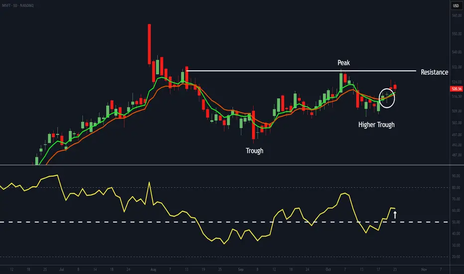
Microsoft’s Higher Trough Hints at a Bullish LegWe believe Microsoft (MSFT) has formed a higher trough - a bullish sign. Its EMAs have crossed positively, and the RSI has moved above 50, signalling improving momentum. If the RSI holds above that level, it will confirm a strengthening trend that could see MSFT challenge resistance near $530.
The company reports next Wednesday after the close, with investor attention centred on Azure and Copilot - the pillars of its AI strategy. Copilot, now embedded across Microsoft 365, Teams, and Outlook, is gaining strong enterprise adoption; for instance, Barclays recently expanded its licences from 15,000 to 100,000. The AI assistant could generate billions in recurring revenue, while Azure - which grew 39% year-on-year last quarter, its fastest pace in three years - remains the primary growth driver. Sustained progress in both areas will be crucial for maintaining investor confidence.
Although momentum has yet to reach full strength for a decisive breakout, it is clearly building. Next week’s earnings could provide the catalyst needed to push it over that threshold.
MET (Meteora) - TGE 15m FA/TA, Levels & RiskBias: short-term neutral>bullish if 0.581 holds; mid-term neutral.
Market read:
BTC ≈ $110.6k, ETH ≈ $3.88k, SOL ≈ $193.1. Risk tone modestly positive.
DXY ≈ 99.0; USD/JPY ≈ 152.6; SPY ≈ 671.8; UST 10Y ≈ 4.00%. Liquidity backdrop acceptable.
MET status (T+~13h)
Price ≈ 0.58 with intraday reclaim attempts. Day-one range ~0.516–0.687. Fib from H→L: 0.552 (0.236 up from L), 0.577–0.581 cluster, 0.601, 0.621, 0.646. Your 5–15m charts show RSI>70, MACD crossing up, TRIX rising, DEMA≈0.581 acting as pivot. Expect supply near 0.581/0.597 and heavy inventory 0.55–0.58.
Levels:
Support: 0.566 → 0.559 → 0.545 → 0.515.
Resistance: 0.581 pivot → 0.597–0.601 → 0.621 → 0.646.
Setups and risk (1m/5m/15m/30m)
• Break-retest long: Confirm a 5–15m close ≥0.581, then entry on retest 0.573–0.581. SL 0.566. TP1 0.597–0.601, TP2 0.621, TP3 0.646.
• Fail-reclaim short: If rejection at 0.581 with RSI>75 and waning volume, short perps only; SL 0.586; TP 0.565 then 0.559.
• 30m bias flip: Two consecutive closes ≥0.581 with rising volume/OBV shift bias to constructive; below 0.566 momentum stalls back to 0.559–0.545.
• Execution: post-only limits on Jupiter/Meteora, slippage ≤0.5%. Risk ≤1R per attempt.
FA + flow:
Day-one unlock and broad venue access create two-sided flow; watch Solana beta and CEX listings for impulse. MET’s microcap relative to SOL/JUP/ME/GRASS implies higher variance; treat 0.581 as line-in-the-sand for continuation.
Plan:
If you are flat: only engage on 0.581 hold. If long from lower: trim 25–50% into 0.597–0.601, trail to 0.569, run remainder for 0.621/0.646. If 0.566 breaks on volume, step aside and reassess near 0.559/0.545.
Outlook:
bullish above 0.581 and strengthening into 0.601; neutral-to-bearish on failures back under 0.566.
For educational purposes; not financial advice.

ZECUSDT.P - forming long swing trade opportunityPrice reacting at the fib pullback zone but watchout for breaking down from the ascending triangle and can make pivot from the premium fibonacci pullback zone and bouncing back in to triangle.

Hidden Cup & Handle, $DFLI $3+I am publishing a very speculative cup & handle chart analysis idea. I have never seen such a technical analysis for a cup & handle and do not recommend any financial advice due to it. This is an idea alone.
On the 30min timeframe, I have isolated the price pattern between today and October 15 and moved it up to the ending price on October 15 (effectively ignoring the downward gap that occurred after hours that day). The reason why I am ignoring that downward gap and not ignoring the pre-market upward gap before October 15 is explained below.
If you chart the price action this way, a clear and obvious cup and handle chart exists on the half-day chart (195min), which I successfully used in a previous chart analysis idea. I am publishing this idea with the 30min chart to more clearly show the bullish reversal taking place with the indicators and the failing selling pressure.
Chart analysis price target $3+
Chart analysis invalidated below $1-
Background:
NASDAQ:DFLI has experienced very choppy price action due to heightened involvement and excitement with the stock in combination with materially significant company and stock operations (new stock offerings, debt payments, NASDAQ compliance, patent approvals, bullish institutional fundamentals, etc). In particular, on October 15, the day began with news of a new patent approval (that gapped the stock up) and ended the day with news of a new stock offering (that gapped the stock down). After observing what the stock has done since that day, I believe the down gap which occurred after hours October 15 to be an overreaction and the underlying stock transactions since that day to actually be in an upward trend. The reason I believe this is due to the failing selling pressure being applied toward the beginning of each trading session AND due to the clear bullish trend reversal on the 30min MFI, MACD, and BB since the down gap (as shown with the perpendicular line). Data shows that short selling significantly increased over the past month (most likely on Oct 15 and causing the down gap), but given the failure to break the support above $1 - $1.15 and also given the the upward indicators, I expect shorts might cover soon.

XLMUSDT - This Classic Bearish Setup Could Trap Late LongsYello, Paradisers! Are you prepared for what could be the next leg down in XLMUSDT? Many are still looking for long setups, but this clean bearish formation could catch them completely off guard.
💎XLMUSDT has officially broken below its key ascending support trendline, and price action has since retested this breakdown level—right where it meets a strong resistance zone. This area is further reinforced by the 200 EMA, which has historically acted as a powerful dynamic resistance in trending markets. What adds even more weight to the bearish case is the textbook Double Top-pattern that has formed right at this confluence.
💎To make matters worse for the bulls, we’re seeing clear bearish divergence across multiple indicators, including the MACD, RSI, and Stochastic RSI. When these divergences align with a structural breakdown and a resistance retest, the probability of a bearish continuation significantly increases. This is not the kind of setup smart traders ignore.
💎For those looking to enter this move, aggressive traders could consider a position from the current price area. However, a more disciplined approach would be to wait for a clean pullback into the resistance zone, followed by a clear bearish candlestick confirmation. This not only offers a better entry, but also significantly improves the risk-to-reward ratio by allowing tighter risk placement above the invalidation level.
💎That said, if the price breaks out and closes a full candle above the resistance zone, the current bearish outlook would be invalidated. In that scenario, it would be best to stand aside and wait for clearer price action to develop before making any further decisions. Chasing moves after invalidation is never worth it.
🎖This is how professional traders separate themselves from the crowd—by waiting for high-probability setups and protecting capital when the market proves them wrong. Discipline and timing will always outperform emotion and FOMO in the long run. Stay sharp, Paradisers, and remember: consistency, strategy, and patience are the only way you’ll make it far in this market.
MyCryptoParadise
iFeel the success🌴

ZCash Wave Analysis – 21 October 2025
- ZCash reversed from round resistance level 300.00
- Likely to fall to support level 240.00
ZCash cryptocurrency recently reversed down from the resistance area surrounding the round resistance level 300.00 (which stopped the previous impulse wave 1 at the start of October).
The downward reversal from this resistance area formed the daily Japanese candlesticks reversal pattern long-legged Doji.
Given the strength of the resistance level 300.00 and the bearish divergence on the dally Stochastic, ZCash cryptocurrency can be expected to fall to the next support level 240.00.

BTC 1H Analysis | Day 7🥳 Hey everyone! Hope you’re doing great! Welcome to SatoshiFrame channel.
✨ Today we’re diving into the 1-Hour Bitcoin analysis. Stay tuned and follow along!
👀 On the one-hour timeframe of Bitcoin, we can see that after last night’s pump, Bitcoin failed to break through the resistance zone at $113,400 and was rejected downward from this area. It’s currently sitting at its support floor around $107,537, and losing this level could lead to a further decline.
🧮 The RSI oscillator has now formed two important zones — 50 and 38 — and when the fluctuation limit crosses these zones, Bitcoin may start its next move with increased volatility.
🕯 Last night, Bitcoin had good buying volume while approaching its resistance, but the key point was that it was then pushed down sharply by heavy selling pressure, losing even its multi–timeframe support floors. Keep in mind that Bitcoin needs an increase in buying or selling volume to break through these identified levels.
🧠 I’ve explained the upcoming Bitcoin scenarios in the following paragraph.
🟢 Long Position Scenario: A breakout of the nearest resistance zone at $109,383, along with the RSI crossing above the 50 level and buying pressure strong enough to absorb all the sell orders in this area.
🔴 Short Position Scenario: The current level Bitcoin is sitting at is a very critical support. Losing this support at $107,537, combined with the RSI dropping below 38 and increased selling pressure, could trigger a continued downward move, pushing Bitcoin toward its lower support zones.
❤️ Disclaimer : This analysis is purely based on my personal opinion and I only trade if the stated triggers are activated .

$eth 15 min , new york setup 🧠 Session-Based Liquidity & Manipulation
Asia low was swept — liquidity grab confirmed.
Price is now stabilizing above the Alligator, signaling potential reversal.
🐊 Bill Williams Alligator Signal
Alligator is coiling and turning up — bullish awakening in progress.
Price holding above lips/teeth supports long bias.
🎯 Corrected ETHUSD Trade Plan – Long Setup
Entry Zone: 3,846 – 3,850 (retest of Alligator support)
Stop Loss: 3,777 (below recent swing low — as per chart)
TP1: 3,875 (first liquidity above)
TP2: 3,900 (next HTF level & Asia high)
✅ Confirmation Needed:
Bullish candle close above 3,850.
Hold above Alligator lips (~3,840–3,845).
Volume spike on the move up.
Bottom Line:
Asia low taken, manipulation complete.
Alligator supports bullish reversal.
Long above 3,846, stop below 3,777.
— origami_capita133 | TradingView
👉 Like & Follow if this helps your trading. Trade with discipline, not emotion.

The 3 Parts Of The Rocket Booster Strategy The the three parts are simple to remember.
Let me tell you a story.
I still remember the time I broke up with my girlfriend.
I got "Rocket Stocks" by M. Kratter.
I studied that book everyday for about 50 days!
It was not easy.But I wanted to master this skill.
I was deeply sad.
She said "Lubosi am helping you."
WTF - 😡
Well I am now stuck no cash , no hope and no love.
I studied as if this will help me.This was before the pandemic hit the peak months of lockdowns.
Am telling you it was a beast.
Two months pass by this year I start streaming.
I say a small prayer,
" God help me help your people learn how to trade."
Boom 🤯!!!
The Rocket Booster Strategy is boosted.
What is the boost?
20 Day Moving Average.
The price should be below the 20 SMA.
It was right there in our faces and I missed it.
Not only that the price should Touch the support.
Or else it's called a "Random" pattern.
The 3 Parts:
🚀Price above the 50 SMA
🚀Price above the 200 SMA
🚀Price touching support (50 SMA)
🌟 Bonus 🌟
*** Make sure price below 20 SMA
*** High Volume
*** 40 - 60 RSI indicator
That's it 😅
Trade safe.
Rocket boost this content to learn more.
P.S.
The high volume + Earnings Report provides a powerful catalyst.
Disclaimer ⚠️ Trading is risky please learn about risk management and profit taking strategies.
Also feel free to use a simulation trading account before you use real money.

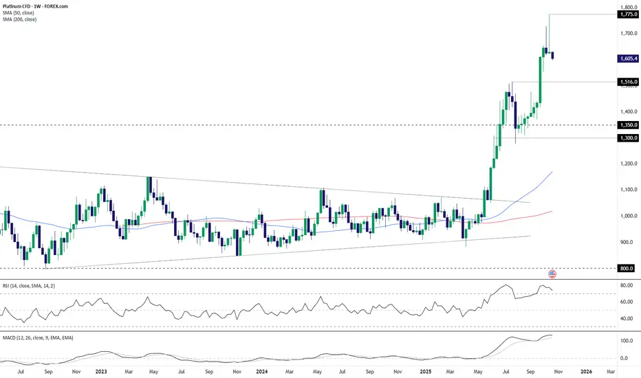
Bearish Key Reversal Puts Platinum Bulls on NoticePlatinum was slaughtered along with every other precious metal on Tuesday, delivering on the risk we flagged 24 hours earlier. Given the scale of the move, the question everyone is now asking is whether that was it? I don’t know personally, but the bearish key reversal candle that printed only adds to the signals from longer timeframes in recent weeks, warning of the potential for more downside to come.
Looking at the price action on the dailies, it’s notable the rout halted Tuesday at $1516—the high that was set in July. That suggests technicals still matter even if some of the selling was likely forced in nature. As such, it’s now the key level to watch when assessing directional risks.
Should $1516 give way, the 50-day moving average is the first point of interest, with $1478 and $1440 other minor levels before more substantive support is found at $1380. Should $1516 hold, $1555, $1675 and $1775 are the levels to watch.
The momentum picture has unsurprisingly shifted quickly as a result of the pullback, with RSI (14) now trending lower beneath 50, indicating increasing downside pressure. MACD has yet to turn outright negative, but it has already crossed the signal line and is accelerating downwards. At the very least, it provides a warning for bulls looking to immediately buy the dip.
Good luck!
DS

BTC 1H Analysis | Day 6🥳 Hey everyone! Hope you’re doing great! Welcome to SatoshiFrame channel.
✨ Today we’re diving into the 1-Hour Bitcoin analysis. Stay tuned and follow along!
👀 After faking the 111377$ resistance area, Bitcoin ran its stop-hunts and then moved toward its supports. In the process, after breaking the 109383$ support, it headed toward its current support in the 107508$ price area.
🔍 The exhaustion of buyers’ strength and the unusual participation of TakerSeller at the 111377$ price caused selling pressure on Bitcoin, making sellers the winners from that area. Bitcoin is now near its support, and the next resistances are at 109383$ and 111377$. With a break of these zones, it can move further upward.
🧮 On the RSI oscillator, we see that after losing the 50 zone, it moved strongly toward the oversell area and stayed there for a very short time—so short that we can call it a fakeout—and it formed a low near the 30 area. Now, losing the 30 zone and entering Oversell can be a confirmation for more selling pressure. The RSI resistance zone is at 50, and once the oscillation range passes above this zone, long-side momentum increases.
🕯 We’re going to check volume to understand better and get more data. After approaching its resistance, Bitcoin was accompanied by a decrease in buy volume, and subsequently sellers took control of the market; with increasing sell volume, Bitcoin’s price moved downward.
🧠 For a Bitcoin position we have 2 scenarios on the table that, if they occur, we can evaluate a position.
🟢 Long scenario: Break of the 109383$ resistance area and the oscillation limit crossing above the RSI 50 zone, together with increasing buy volume, with maker buyers also participating in this scenario for a price jump.
🔴 Short scenario: Break of the current support along with more selling pressure on Bitcoin, losing the 30 oscillation zone and RSI entering the oversell area.
❤️ Disclaimer : This analysis is purely based on my personal opinion and I only trade if the stated triggers are activated .

FTSE 100 Outlook: Twin Bullish Signals Point to Fresh HighsFresh record highs for the FTSE 100 contract may be on the cards, with consecutive bullish signals pointing to growing upside risks.
The first arrived on Friday with a hammer candle on the daily chart, rebounding strongly after testing the 50-day moving average. That was followed on Monday by another large bullish bar that saw the price break out of the falling wedge pattern it had been trading in for much of the past month. The breakout points to the risk of further upside ahead, putting the record high of 9,579 set on October 8 on the menu for bulls.
Given the twin bullish signals, traders may want to consider initiating longs around these levels or slightly lower, targeting 9,485 or the record highs. Stop placement should reflect the desired risk-reward you’re seeking from the trade.
RSI (14) has broken its downtrend and now sits in marginally bullish territory. MACD also remains in positive territory despite crossing the signal line from above earlier this month and is now starting to flatten out. Combined, the two indicators suggest diminishing bullish momentum may be in the early stages of building again, improving the probability of the breakout playing out in full.
Good luck!
DS

/SI: Going ShortEvery time weekly RSI > 86,
1. 60% of the time it go down after 1 week
2. 80% of the time it go down after 2 weeks
3. 100% of the time it go down after 3 weeks
4. 100% of the time it go down after 1 month
4. 100% of the time it go down after 2 months
4. 100% of the time it go down after 3 months
4. 100% of the time it go down after 6 months

BTC 4H Analysis | Day 5🥳 Hey everyone! Hope you’re doing great! Welcome to SatoshiFrame channel .
✨ Today we’re diving into the 4-Hour Bitcoin analysis. Stay tuned and follow along!
👀 After breaking out of the descending channel and confirming the long setup I explained in the previous post, Bitcoin moved upward and easily broke through its Maker-buyer zone.
🔍 Over the past two market-holiday days, Bitcoin consolidated in a multi-timeframe accumulation phase with a ceiling at $107,356, which was easily breached. The price then advanced toward its higher-level key resistances. It’s now trading between $110,500 and $113,000 — the $113,000 zone is our long trigger since price has struggled there multiple times before. This makes it a bit risky, but if the upward movement continues, the next resistances could be at $115,800 and $120,836.
🧮 Looking at the RSI oscillator, it has comfortably passed the 50 level on the 4-hour chart and is now heading toward the overbought zone, facing a key resistance at 70. This 70 level overlaps with the 50 zone on the daily timeframe, meaning that if RSI enters overbought on the 4-hour, the daily will just be shifting from a bearish swing phase to a long-position momentum phase — so the 70 zone is crucial.
🕯 If you check the lower-volume section of the chart, you’ll notice something interesting: the breakout above the two-day accumulation range came with a clear rise in buy volume, which helped Bitcoin easily break both the resistance area and the descending trendline (the upper boundary of the previous channel). This suggests Bitcoin may soon take a volume or price correction to gain more strength for another upward move.
⏰ During today’s New York session, we might see some strong moves. Remember last week when U.S. investors were selling off their ETF holdings, and the market was hesitant to buy? That fear caused weak participation. This time, we may have a reason to stay active during New York hours as sentiment shifts.
🧠 Here are the two key scenarios to watch:
🟢 Long Position Scenario
Wait for Bitcoin to react either to the micro-buyer zone or to the $113,000 area. If we see a pullback followed by an indecision candle (confirmation setup) touching the SMA-7, that’s our entry cue — ideally with a tighter stop size.
🔴 Short Position Scenario
Ignore shorts for now. Bitcoin already completed its second downward wave with an imbalanced slope, and over the last two days, seller momentum has weakened. Buyers are now driving price through resistance levels, so shorting here would go against the current flow.
❤️ Disclaimer : This analysis is purely based on my personal opinion and I only trade if the stated triggers are activated .

Bearish Candles Flash Warning: Platinum’s Rally May Be OverPlatinum’s breakneck rally since June looks at risk of reversing, with the last two weekly candles delivering notable topping patterns. A shooting star from above $1,700 was followed by an enormous bearish pin, doubling down on the message. With momentum indicators like RSI (14) and MACD rolling over but still in overbought territory, selling into rallies is preferred near term, especially if we see another push above $1,650 where bears were active in each of the past three weeks.
Downside targets for shorts include the July high of $1,516, with the February 2021 swing high of $1,350 and $1,300 as other options after that. Risk management is extremely important for anyone looking to act on the bearish price signals given how far the price has run over recent months, so make sure stop placements above entry are aligned with your desired risk-reward ratio from the trade.
Good luck!
DS
Breaking Down my Strategy for YM Trade46,700 to 45,700 is my prediction this week. I'm breaking down my thought process for journaling purposes.
