ADA going up ADA has had a strong retrace into a doji,
Price is levelling off at key fib level and price may bounce from here.
Oversold stochastic confirms bullish signals.
Pitchforks

I figure timing is everything around major interest rate events.FOMC Bottom? Looking for hitting the retrace fibs and resistances.

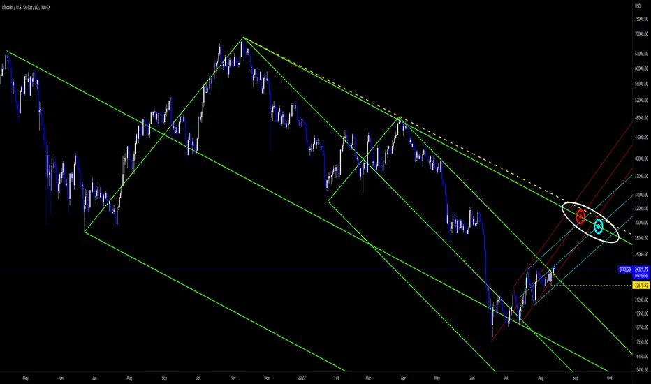
pup it then dup it22555 is such a nice place for short . blue PF is last valid and its trigger line must not be broken for long validation

Algorand Knife CatchingBINANCE:ALGOUSDT
Algorand might be ready to make a big move to the upside.
Alts and Algorand by itself, both look bullish against BTC.
ALGO/BTC:
Altcoin Index/BTC:
Looking at Algorand alone:
After a 90% decline, Algorand might be putting in a bottom.
Bullish Evidence: Weekly MACD crossing bullish, Weekly RSI rising out of oversold levels, Weekly Heiken Ashi candles bullish, Support levels from 2020 are directly below, Daily Ichimoku is a penny away from a "Buy" signal.
If this bottom holds and price stays within either of the Pitchforks, the upside median line take-profit targets are massive.
It's a textbook Pitchfork trade, that has already seen 6 weekly candles test/retest either of the two L-MLH.
Stop-Loss can be set just below the pivot at $0.27. (I'm going with $0.25)
In my opinion, a 20-25% drawdown on an appropriately sized position is worth it, considering the upside.

NQ1! - Monthly Closed, What Next?In my previous NDX thread I suggested that the 6M candle would create incredible bearish sentiment and would be a great time to trap shorts and lock out sellers in a reversal and that is exactly what happened. Notice that there is very little lower wick for July candle. It shows that the turn of 1/2 year was a significant turning point.
On the monthly chart July has printed a bullish engulfing candle and so now the sentiment is reversed. The bottom is in everyone thinks and come rushing in.
The inverse trapping doesn't have to happen again, but it is starting to look like it might do just that.
Now on the daily chart at the top NQ1! has just tagged the 100MA which found the retracement top in March.
The last candle of the month printed a hanging man and there is a large gap between the last two candles which could be a topping exhaustion gap.
There are two circled resistances in this area and so it is a key price point.
I have used a pitchfork also to show how the trend has pushed upward and now passed the upper median line. This could be just strength in trend increasing however there has been a lot of choppy movement since the low and it could be topping out to collapse back down and then perhaps a more impulsive structure will form.
The dotted white line is how a trend line could be drawn and it is also the lower median line. I think there is a good chance it will tag that line before the uptrend really takes off.
It could push higher and i'm not saying it won't have a flurry upward and that would provide the path for a Shakeout Reversal Pattern to print through resistance and 100MA.
Not advice.

Are we dealing with a fake Hash ribbons signal?Hash ribbons Oscillator has generated a buy signal. But it seems that this signal is generated in an inappropriate place and it may be a fake signal. The reason is to respect the pitchfork and RSI resistances.

#KATMR TechnicalAnalysis Possible trend channels can be followed as in the chart for the volumetric rise seen in the stock in recent days. Inside Pitchfork chart tool is used for trend channels.

Bitcoin Bear Market RallyBINANCE:BTCUSDT
After BTC perfectly dropped to the "energy point" , (intersection of the two green median lines) price has managed to break out of the minor green fork.
The next logical target would be the U-MLH of the major green fork.
I plotted two paths to the U-MLH of the major fork with an Andrews and Schiff Pitchfork using two different origin points.
I'm expecting price to follow the path of either the blue or red fork, and make it's way to the U-MLH of the major green fork in the $28k - $32k range.
Fat_Fat
BTCUSD - Pitchfork idea 2.0BTCUSD - Pitchfork idea 2.0
BTCUSD - Pitchfork idea 2.0
BTCUSD - Pitchfork idea 2.0

ETH 4H Long Trade IdeaEntry: 1830
SL: 1783.2
TP: 1971.8
4H Long:
The blue rising wedge has been created from alternating major highs and lows since June. Price is reacting again to the rising wedge support zone, along with a demand zone (yellow zone) created from its previous major and minor highs.
The white pitchfork estimates momentum from the previous two highs and low. Price is also reacting to the midline (possible) reversal point. Some deeper wicks may form in the demand zone. We will use the demand zone and midline of the major pitchfork to set our stop loss in a meaningful position. Our take profit comes before the previous high to increase the likelihood that the trade will close at a profit.
Feel free to share your thoughts and ideas. Let's see how this plays out.

Information about PITCHFORK (Andrew's Pitchfork)Pitchfork a simple yet effective tool, if implemented correctly, can offer you dynamic levels to watch which one could have ignored otherwise.
------- Pitchfork has three points -------
1) Anchor Point
2) High Point of TREND
3) Low point of TREND
------- Quality of Pitchfork -------
1) Applying Pitchfork on Higher timeframes to Judge where we are in a macro trend is a good way to use Pitchfork and to see if MACRO trend is actually changing or not.
2) Number of interaction points to the median line and extreme lines which can act as DYNAMIC support or resistance lines is crucial.
3) HAVING your ANCHOR POINT between High and Low of next TREND is OPTIMAL way to get good result from your PITCHFORK.
If you would like me to update this with how to use pitchfork and post more educational content,
then please do like this idea and comment your queries which i will try to answer.
My previous ideas :-

GOLD short ideaAfter long consolidation/bullish uptrend, it barely breaks through the median line parallel and reverse back. Breaking the small pitchfork, indicating trend reversal and high possibility to reach the nearest median line.

TSLA BullishNASDAQ:TSLA
TSLA daily chart.
Price broke above the (green-descending) major fork and briefly consolidated after a retest of the U-MLH.
Following the retest and consolidation, price rallied on Friday to close the week.
I'm expecting price to continue higher: based on the pitchfork breakout, bullish Ichimoku Cloud set-up, and upcoming stock-split.
The next logical target for price is the trigger line of the (green) major descending fork.
I plotted a (purple) ascending minor fork from the lows to show a probable path towards the trigger-line.
The minor fork intersects the trigger line in the $1050-$1075 range.
I have also plotted a "Greedy Target" at $1150 , using the price level of the "C" pivot of the major descending pitchfork.
The "C" pivot level would be the next logical target if price were to continue higher after reaching the trigger line.
While the "Greedy Target" is not my first choice, it is certainly a possibility if the upcoming stock split significantly boosts buying pressure.
I'm going to look for a long entry on Monday.
I'll stay long until my targets are reached; or close the trade early if price breaks below the L-MLH of the minor fork.
Fat_Fat


The Inflection point is almost here!
As Bitcoin is approaching the last down trending line , Will zoom in on some key zones and dates.
On the 8H chart we currently have 2 uptrends . The blue lined Channel and the pink pitchfork.
On the bullish side a solid close above the pink fork's median line coinciding with a break of the down trending green line approx price at $26550-$26850. These 2 lines cross paths on 21 August.
Mildly bullish a hold on the lower parallel breaking the green line to the upside approx price $25500. These 2 lines cross paths on 28 August. I say mildly bullish because there is a chance that it turns out to be a fake break of the green line as within the pink pitchfork we would be losing momentum testing the lower parallel with all attempts to get back above the median line proving fruitless.
Mildly bearish scenario a break below the pink pitchfork prior to crossing the Green down trending ( prior to 28 August ) . Mildly bearish as we still have the blue channel support.
Bearish would be breaking the Blue channel to the downside. These 2 lines cross paths 16-18 Sept.
Adding to the 2 uptrends on the 8H is this uptrend on the H1 . Some nice moves to the upside from top yellow parallel line , however all fading quickly just below the upper quartile line. Would like to see it hold and base above the median line to give the bullish cases described above the best outcome. A break of this fork to the downside though could be an early indication of the bearish outcomes.
All the best.
cheerio FXcrypto

Btc playBtc will probably look for liquidity below before moving towards the cme gap around 28k.
NFA

BTC Weekly AnalysisBINANCE:BTCUSDT
COINBASE:BTCUSD
The long-term and short-term viewpoints are both crucial to our analysis:
First, we will look at the market's perspective over the long run.
Since the latest increase in the upward price cycle, Bitcoin's movement has been moving in a fork structure and, based on the current market trend and the resistances it is facing, has generated lower bottoms up until this point.
According to the framework controlling the market, the ascending channels will, in most circumstances, break from the floor and make lower floors. The price has been moving in an ascending channel during the past few weekly candles.
We should also anticipate another lower floor from Bitcoin given this structure and the shape of the just produced candles.
Expect the channel to break from the bottom if Bitcoin is unable to move past its most recent run-in with the bottom of the channel and go higher (if the daily candle does not close above 20,000).
However, when we examine the volume of recent transactions, we notice a large increase in the volume of recent candles. This perception may result in the formation of a strong price floor that propels price growth toward 26,000. (even higher). Of course, we shouldn't let this expansion obscure the market's underlying negative structure (the growth will be temporary).
An important level for Bitcoin can be seen at the lower levels; this level, which is highlighted in red, will be crucial for the price's future. We do not anticipate a price decline to levels of 14444 and 14058 after it breaks through this barrier.
If the analysis satisfied you, please follow & support our team by telling your friends.
CrazyS

NZD/USD Short OANDA:NZDUSD
Pretty self explanatory.
Head & Shoulders along the U-MLH of a descending Pitchfork.
Target lines up perfectly with the energy point (two median lines crossing), as well as a double bottom.
I'm getting into this trade as soon as the market opens in 2 minutes.
Targeting $0.606 - $0.608


BTC/USD - Is it a Rising Wedge or a Falling Wedge?Quick BTC/USD 1 week chart update:
BTC is in a massive Rising Wedge Pattern.
BTC is also in a massive Falling Wedge Pattern.
At the moment of typing this, BTC is still back above its 200MA on this 1 week timeframe.
At the moment of typing this, BTC is still way below its 50MA on this 1 week timeframe.
At the moment of typing this, BTC is still way below its Bollinger Bands Middle Band Basis 20 period SMA. Note that the Upper Band is curving downwards and the Lower Band is starting to curve around slightly.
At the moment of typing this, BTC is still back above its Least Squares Moving Average (LSMA) on this 1 week timeframe.
BTC is still in its Descending Pitchfork Pattern above the Median Line and back above its Upper Green Resistance/Support line.
It will probably be some time before we see BTC back above the Ichimoku Cloud Equilibrium Zone and back in the Bullish Zone on this 1 week timeframe but that doesn't mean profit cannot be made while the Price is still in the Bearish Zone under the Equilibrium Zone, that is why it's always best to check multiple timeframes for any potential breakouts on those.
Looking at the Average Directional Index Indicator (ADX DI), we can see that Negative Momentum has continued to drop with the -DI (Red Line) dropping to 31.45. Positive Momentum has dropped slightly with the +DI (Green Line) at 15.01. The Trend Strength has increased with the ADX (Orange Line) at 32.18 note it is still above its 9 Period EMA (White Line) which is at 28.89.
Looking at the Moving Average Convergence Divergence Indicator (MACD), we can see that the MACD Line (Blue Line) is still in the Negative Zone under the 0.0 Base Line but it has risen sharply with Red Histograms decreasing in size and it looks like we could soon see the MACD Line (Blue Line) crossing back above the Signal Line (Orange Line) creating a Buy Signal on this 1 week timeframe. Note that the MACD Line (Blue Line) has not been in the Positive Zone above the 0.0 Base Line since the 10th Jan 2022.
For the mid to longterm upside, be on the lookout for a successful weekly close above the 28.60% ($24,314) Fib Re-tracement level and any successful re-test as strong support.
For the mid to longterm downside, be on the lookout for a weekly close back under the LSMA and 200MA with any successful re-test as strong resistance.
So a Rising Wedge or a Falling Wedge? Which will it be?……. only time will tell.
I hope this is helpful with your trading and hodl-ing.
Notes:
200MA = Red Line on chart
50MA = Yellow Line on chart
LSMA = Cyan Line on chart

Keeping an eye on GBP/USD OANDA:GBPUSD
GBP/USD appears to be putting in a bottom.
RSI/MACD showing bullish divergence and price has just made an exit from a Descending Wedge.
If price can hold above $1.17, I'm expecting GBP/USD to eventually reach $1.30
The $1.30 price level coincides with the median line of the (red) Schiff Pitchfork, and is approximately a 50% retracement of the drop from $1.42 to $1.17
I'm not putting on a trade just yet, but I will enter a long position on a double-bottom that stays within the Schiff Pitchfork and arc.
Stay Tuned.
Fat_Fat

Solana Action/Reaction Short/Long (2 for 1) SpecialKUCOIN:SOLUSDT
Price bottomed out in June 13th and has been navigating through an ascending triangle.
I'm expecting the resistance along the flat-top of the ascending triangle to hold one more time.
This would also qualify as a Hagopian gap, which should push price down substantially and out of the primary fork.
A perfect place for the short term down-move to find support would be the lower boundary of the triangle; which just so happens to coincide with the trigger line of the fork. (Trigger Line = Red Dashed Line)
(Purple Dotted Lines = Fib Extensions 1.618, 2.618, 4.236, 6.854) & (Purple Dashed Lines = Linear Extensions 2, 3, 4, 5)
The Fork's extension lines have been interacting with price quite well, and serving as textbook action/reaction lines.
If the triangle/trigger line support holds, I'm expecting a violent bullish breakout of this ascending triangle that should move upward along the extension lines.
The height of the triangle and 1.618 fib extension point to a breakout target around the $68-$70 area.
Although an even bigger move to $78-$80 level is also possible.
Currently, I'm short at $46 with a stop-loss set at $49
I hope to close the short and go long on a retest of the lower triangle support line/trigger line.
If price breaks through the upper line of the triangle before heading lower, I may flip long with a tight stop.
I'll update this idea if I make any moves.
Let's see what happens.
