OPEN-SOURCE SCRIPT
Updated BTC & SPX vs Yield Curve: Recession Risk Zones
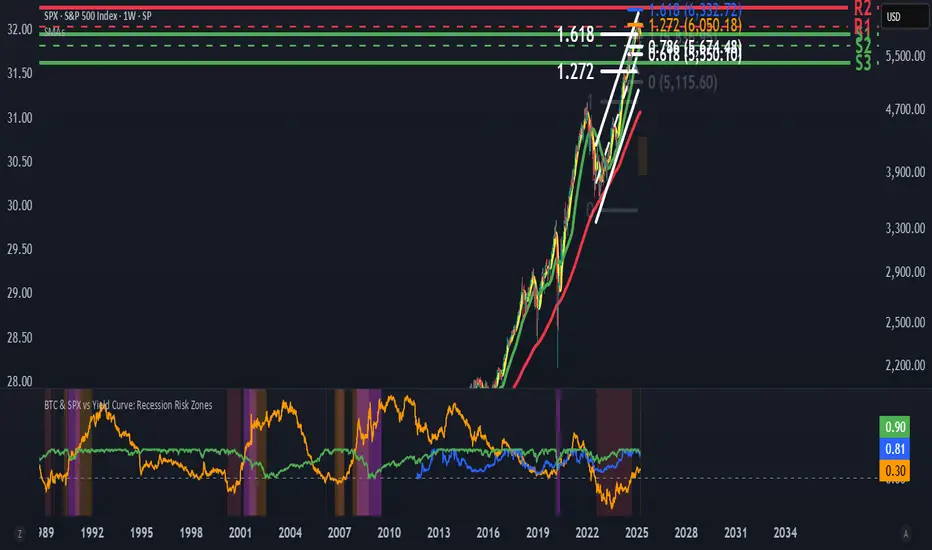
BTC & SPX vs Yield Curve – Recession Risk Zones
This tool helps you track Bitcoin (BTC) and the S&P 500 (SPX) against key macro signals from the U.S. yield curve to spot potential recession risks.
🟪 Color Legend:
🔴 Red = Yield curve is inverted (warning starts)
🟡 Yellow = Projected 6–18 month recession risk (if inversion still active)
🟠 Orange = Active 6–18 month risk window (after inversion ends)
💜 Fuchsia = Real historical U.S. recessions
📈 What’s Plotted:
🔵 BTCUSD (blue line) – Normalized price
🟢 S&P 500 (green line) – Normalized price
🟠 10Y–2Y Yield Spread – Macro signal for risk
✅ Use it to:
Spot macro pressure zones
See how BTC and SPX behave around economic stress
Stay cautious when red/orange/yellow areas appear
Let me know if you'd like to enable toggles to hide/show BTC or SPX independently!
Release Notes
📘 BTC & SPX vs Yield Curve – Recession Risk ZonesThis macro tool helps you identify when Bitcoin (BTC) and the S&P 500 (SPX) may be at risk based on the U.S. 2Y–10Y yield curve and historical recession timing.
🧠 How It Works:
Strong Inversion Triggered (🔴 Red):
When the yield spread drops below -0.15%, a strong inversion begins — a proven early warning signal for economic trouble.
True Un-Inversion Detected:
The script waits until the spread crosses back above 0% after a strong inversion.
This confirms a "true un-inversion" — historically a key signal before recessions.
Recession Risk Period (🟠 Orange):
After a true un-inversion, the script tracks a 6–18 month warning window, where recession risk is elevated.
Projected Risk (🟡 Yellow):
If the strong inversion is still active, this area forecasts where the risk zone could occur in the future.
Historical Recessions (💜 Fuchsia):
Recession periods from the 1980s onward are shaded to validate how well this logic matches history.
📈 What’s Plotted:
🔵 BTCUSD (blue line) – Normalized price
🟢 SPX (green line) – Normalized price
🟠 Yield spread (orange line) – 10Y minus 2Y yield
✅ Use It To:
Time macro conditions affecting BTC & SPX
Avoid entering high-risk periods blindly
See how major assets react around real economic events
Open-source script
In true TradingView spirit, the creator of this script has made it open-source, so that traders can review and verify its functionality. Kudos to the author! While you can use it for free, remember that republishing the code is subject to our House Rules.
For quick access on a chart, add this script to your favorites — learn more here.
Disclaimer
The information and publications are not meant to be, and do not constitute, financial, investment, trading, or other types of advice or recommendations supplied or endorsed by TradingView. Read more in the Terms of Use.