Noxon Cycles Session High/Low Indicator
This powerful indicator automatically marks the Highs and Lows of the Asian, London, and New York trading sessions directly on your chart. It helps traders identify key liquidity zones, potential reversals, and breakout points with precision. Whether you're scalping or swing trading, this tool enhances your market structure analysis and timing for better entries and exits. Perfect for intraday strategies and institutional trading insights.
Cycles

Fractal Wave MarkerFractal Wave Marker is an indicator that processes relative extremes of fluctuating prices within 2 periodical aspects. The special labeling system detects and visually marks multi-scale turning points, letting you visualize fractal echoes within unfolding cycles dynamically.
What This Indicator Does
Identifies major and minor swing highs/lows based on adjustable period.
Uses Phi in power exponent to compute a higher-degree swing filter.
Labels of higher degree appear only after confirmed base swings — no phantom levels, no hindsight bias. What you see is what the market has validated.
Swing points unfold in a structured, alternating rhythm . No two consecutive pivots share the same hierarchical degree!
Inspired by the Fractal Market Hypothesis, this script visualizes the principle that market behavior repeats across time scales, revealing structured narrative of "random walk". This inherent sequencing ensures fractal consistency across timeframes. "Fractal echoes" demonstrate how smaller price swings can proportionally mirror larger ones in both structure and timing, allowing traders to anticipate movements by recursive patterns. Cycle Transitions highlight critical inflection points where minor pivots flip polarity such as a series of lower highs progress into higher highs—signaling the birth of a new macro trend. A dense dense clusters of swing points can indicate Liquidity Zones, acting as footprints of institutional accumulation or distribution where price action validates supply and demand imbalances.
Visualization of nested cycles within macro trend anchors - a main feature specifically designed for the chartists who prioritize working with complex wave oscillations their analysis.

Market Sessions by BASSWELLThis TradingView indicator visually highlights major global trading sessions (Tokyo, London, New York) directly on intraday charts. It provides a clear, color-coded display of session activity and key statistics to help traders better understand session dynamics and overlaps.
✅ Key Features:
Visual Session Boxes: Draws background boxes for each session with configurable colors.
Session Names: Displays the name of each session as a label above the session box.
Open/Close Lines: Optionally shows dashed lines at session open and close prices.
Average Price Line: Plots the average session price as a dotted line.
Tick Range Display: Calculates and shows the high-low range in ticks.
Time Zone Support: Fully timezone-aware via IANA definitions (e.g. "Europe/London").
Overlap Handling: Automatically dims older sessions when a new one starts for visual clarity.
🔧 Configurable Parameters:
Show/hide each session individually.
Set session times and timezones.
Customize label visibility and box contents.
Adjust session colors with transparency.
Includes basic visual styling for better chart readability.
⚠️ Note: Works only on intraday timeframes. Daily/weekly/monthly charts are not supported.

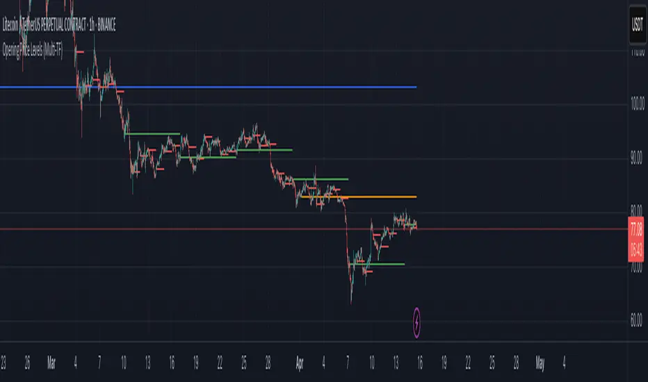
Opening Price LevelsOpening Price Levels
This simple and effective indicator automatically draws horizontal lines at the opening price of each major period:
Year
Quarter
Month
Week
Day
Each line extends until the end of its respective period, helping you quickly identify and react to key institutional price levels and market structure shifts.
🔧 Features:
Toggle visibility for each timeframe (Year, Quarter, Month, Week, Day)
Clean visual presentation using plot.style_linebr, ensuring no overlapping or vertical jumps
Automatically adapts to your chart’s timeframe and session settings
This tool is great for both discretionary and systematic traders who want to add more context and structure to their analysis.

Opening Price Levels (by Period)This indicator draws clean horizontal lines at the opening prices of key time periods: Year, Quarter, Month, Week, and Day.
Each line is plotted only within its own time range, so there's no visual clutter or vertical jumps between periods.
Perfect for traders who want to:
Identify and react to institutional levels.
Track price behavior relative to major opens.
Keep charts clean and easy to read.
Features:
✅ Toggle visibility for each period (Year, Quarter, Month, Week, Day).
🎯 Accurate open levels, aligned with your chart's timeframe and session settings.
✨ Clean segments — each line only spans its original period.
Daily Borders with Weekday Labels[fitfatq]Indicator Overview
This indicator displays daily vertical border lines and the previous day’s weekday label on intraday charts (i.e., charts with a timeframe lower than Daily). It draws a vertical line at the start of each new trading day and places a label displaying the previous day’s weekday (e.g., Monday) at the horizontal midpoint between the previous and the current day. Users can customize various visual aspects such as the separator line style and width, label style, text color, and text size. Additionally, the indicator offers an option to fix the label’s Y coordinate at a specified price level to prevent it from being overlapped by candlesticks.
Parameter Details
Use Fixed Weekday Label Y Coordinate
Type: Boolean
Default: false
Description: When enabled, the weekday label’s vertical position will be fixed at a specified price level (see next parameter). Otherwise, the label’s Y position is determined dynamically (typically based on the current bar’s low minus 3 ticks).
Fixed Weekday Label Y Coordinate (price)
Type: Float
Default: 130.0
Description:
This parameter sets the fixed price level at which the weekday label will be displayed if the "Use Fixed Weekday Label Y Coordinate" option is enabled. Please input a value that corresponds to your chart’s price scale (e.g., 130.50). Note: In charts with high price levels (for example, stocks trading at 3000 or above), it is recommended to set this value to 3000 or above. The higher the value, the closer the label will appear to the candlesticks.
Separator Line Style
Type: String (Options: "Solid", "Dotted", "Dashed")
Default: "Dotted"
Description: Specifies the style of the vertical separator line drawn at the start of each new day. "Solid" displays a continuous line, "Dotted" shows a dotted line, and "Dashed" provides a dashed line.
Separator Line Width
Type: Integer
Default: 1
Description: Determines the thickness of the separator line. A higher number results in a thicker line; the minimum value is 1.
Label Style
Type: String (Options: "None", "Label Up", "Label Down", "Label Left", "Label Right", "Label Center")
Default: "None"
Description: Sets the built-in style for the weekday label. "None" means no background or border (plain text only), while other options apply predefined visual effects.
Text Color
Type: Color
Default: Black
Description: Determines the text color of the weekday label.
Label Text Size
Type: String (Options: "Tiny", "Small", "Normal", "Large", "Huge")
Default: "Normal"
Description: Specifies the text size of the weekday label. Adjust according to preference to ensure the label is readable.
Usage Summary
How It Works:
The indicator detects the start of a new trading day using a change in the daily timeframe (via ta.change(time("D"))). When a new day begins, it draws a vertical separator line at the first bar of that day. If previous day data is available, the indicator calculates the horizontal midpoint between the start of the previous day and the current day and displays the previous day’s weekday label at that position. If the fixed Y coordinate option is enabled, the label is drawn at the specified price level; otherwise, it is positioned relative to the current bar’s low.
Customization:
Users can adjust all visual aspects, including the line style and width as well as the label style, text color, and text size. The fixed Y coordinate option allows the label’s vertical position to remain constant, which helps prevent overlapping with price bars.
Chart Requirement:
This indicator only operates on intraday charts (timeframes lower than Daily) and will not display on Daily or higher timeframe charts.
License
This indicator is released under the Mozilla Public License 2.0. Please credit the original author (fitfatq) when using or sharing this script.

Buffett Indicator (Wilshire 5000 / GDP)The Buffett Indicator (Wilshire 5000 / GDP) is a macroeconomic metric used to assess whether the U.S. stock market is overvalued or undervalued. It is calculated by dividing the total market capitalization (represented by the Wilshire 5000 Index) by the U.S. Gross Domestic Product (GDP). A value above 1 (or 100%) may indicate an overvalued market, while a value below 1 suggests potential undervaluation. This indicator is best suited for long-term investment analysis.

Mebob High-Low Lines (30 Days)Here is the introduction to the rules:
1. You trade it on the SP500 Index.
2. You use a 5-min chart.
3. You only use it during Regular trading hours only (09:30am – 15:00pm
Eastern Standard time).
A more detailed explanation follows below:
1. The US stock market indices opens at 09:30am New York local time.
2. The 5-min reference bar to wait for is the 10:05am – 10:10am bar.
3. This is the 8th 5min bar into the regular trading session.
4. Observe the high and the low of the reference bar.
5. Draw a horizontal line through the high of the reference bar.
6. Draw a horizontal line through the low of the reference bar.
7. If the SP500 closes above the high of the reference bar “highest line”, it is a
BUY signal.
8. If the SP500 closes below the low of the reference bar “lowest line”, it is a SELL
SHORT signal.
9. The stop loss is placed either at the most recent swing or above/below the
reference bar.
The seemingly erratic performance of the "MeBob" (trading rule) is simply what one
would expect from a trend following system. Bob, who has a lot of good stuff, was
simply giving the newbies a "Trigger" to get them into day trades at good times.

Triple StochasticTriple Stochastic Elasticity Indicator
This custom indicator leverages the power of multi-timeframe analysis by combining three Stochastic Oscillators across different timeframes to identify potential trade entries based on elasticity and divergence between momentum curves.
📊 How It Works:
The indicator plots Stochastic values from three timeframes (e.g., 5m, 15m, and 1h), allowing you to observe how momentum behaves at different scales.
It highlights moments of elasticity—where the Stochastics stretch apart and then begin to converge—potentially signaling a reversion opportunity or trend continuation.
By identifying these stretches and snapbacks in momentum alignment, you can better time your entries and exits with improved confidence.
🔍 Use Case:
Look for divergence or convergence between the Stochastics.
Ideal for trend-following entries, pullback setups, and momentum reversal spotting.
Works best when combined with price action, S/R zones, or volume confirmation.
🛠 Customization:
Timeframes for each Stochastic are fully customizable.
Options to tweak %K, %D, and smoothing values to fit your strategy.
I recommend to remove the D%
And set the following settings
5 : 3 : 3
14 : 3 : 3
56 : 12 :12
Visual alerts can be added for when certain conditions are met (e.g., all three Stochs cross overbought/oversold levels).
Global Liquidity IndexGlobal Liquidity Index
This indicator tracks worldwide liquidity by aggregating global M2 money supply, the U.S. Treasury General Account (TGA), the Federal Reserve’s Reverse Repo (RRP) facility, and major central bank balance sheets. It offers insight into the overall liquidity environment, often a key driver of risk asset performance.

sideways market for strangle📌 Description of "Sideways Market for Strangle" Script**
This **Pine Script** is designed to identify a **sideways market**, which is ideal for **option strangle strategies**. The script plots a **green signal** below the price chart when the market is in a low-volatility, non-trending phase.
---
🔹 How It Works**
1️⃣ **RSI Condition (Measures Market Momentum)**
- The script uses a **Relative Strength Index (RSI) with a length of 11**.
- If **RSI is between 40 and 60**, the market is neither overbought nor oversold, indicating a range-bound or sideways trend.
2️⃣ **ADX Condition (Checks Trend Strength)**
- The **Average Directional Index (ADX)** is used to measure trend strength.
- If **ADX is below 25**, it confirms a weak trend.
- Additionally, ADX must be **lower than both DI+ and DI-**, ensuring that there’s no strong bullish or bearish momentum.
3️⃣ **Signal Plotting**
- When both conditions are met (RSI between 40-60 and ADX < 25 with ADX < DI+ & DI-), a **green shape appears below the price chart**.
- This signal suggests that the market is in a **sideways phase**, making it suitable for **strangle or non-directional option strategies**.
---
🔹 Why Use This for a Strangle Strategy?**
- **Strangles perform best in a sideways market** where implied volatility is low.
- This indicator helps traders avoid **trending markets**, reducing risk.
- **Simple visualization** makes it easy to identify low-movement zones at a glance.
---
🔹 How to Use in TradingView**
1. **Add this script** as a custom indicator.
2. **Look for green signals** appearing below candles.
3. When the signal appears, consider setting up a **strangle options strategy**.
4. Avoid trading when the market shows **strong trends** (RSI out of range or ADX above 25).
---
🚀 Summary**
✅ **Detects sideways markets for strangle strategies**
✅ **Uses RSI (11) & ADX (14) for confirmation**
✅ **Filters out trending conditions**
✅ **Easy-to-use signal for option traders**

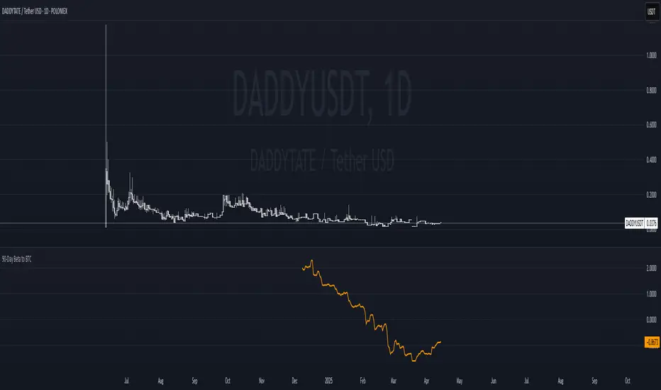
90-Day Beta to BTCOverview:
The 90-Day Beta to BTC indicator measures the volatility of a specific token relative to Bitcoin (BTC) over the past 90 days. Beta is a widely used statistical measure in financial markets that indicates how much a token's price moves in relation to BTC. A higher beta means the token is more volatile compared to BTC, while a lower beta means it is less volatile or moves similarly to BTC.
How It Works:
This indicator calculates the daily logarithmic returns of both the token and Bitcoin, then computes the covariance between their returns and the variance of Bitcoin’s returns. The resulting Beta value reflects the degree to which the token’s price fluctuates relative to Bitcoin's price over the past 90 days.
Beta > 1: The token is more volatile than Bitcoin, showing higher price swings.
Beta = 1: The token moves in lockstep with Bitcoin, exhibiting similar volatility.
Beta < 1: The token is less volatile than Bitcoin, showing smaller price fluctuations.
Beta = 0: The token's price movement is uncorrelated with Bitcoin’s price.
Negative Beta: The token moves opposite to Bitcoin, indicating an inverse relationship.
Use Case:
This indicator is particularly useful for traders or investors looking to identify tokens with high speculative volatility. Tokens with Beta values above 1 are typically high-risk, high-reward assets, often driven by hype, social trends, or market speculation. Conversely, tokens with Beta values below 1 offer a more stable price relationship with Bitcoin, making them less volatile and potentially safer.
In the context of a Trash Token Tournament, tokens with a higher Beta (greater than 1) may be more attractive due to their heightened volatility and potential for larger price swings, making them the “wild cards” of the market.
Visual Representation:
The Beta value is plotted as a line chart beneath the main price chart, offering a visual representation of the token’s volatility relative to Bitcoin over the last 90 days. Spikes in Beta indicate periods of increased volatility, while drops suggest stability.
Indian Market Price LevelsScript to mark levels in Indian market to look for levels in market that including supports and resistance in the market

3 KZ w/ DSTScript is based on the guide from www.tradingcode.net
I have added and aligned multiple User input, formating, timezones and DST options for Japan, Berlin, London and New York.
I have created it to make my back testing easier without needing to think about DST changes.
If anybody have an good idea on how to place session name and day above each session (like in "MKT Session"). Please let me know. Plan is to added it eventually.
Feel free to reuse and please give a heads-up if You add additional cool features.
Kind regards
Bjørn Voss

Quarterly Theory ICT 04 [TradingFinder] SSMT 4Quarter Divergence🔵 Introduction
Sequential SMT Divergence is an advanced price-action-based analytical technique rooted in the ICT (Inner Circle Trader) methodology. Its primary objective is to identify early-stage divergences between correlated assets within precise time structures. This tool not only breaks down market structure but also enables traders to detect engineered liquidity traps before the market reacts.
In simple terms, SMT (Smart Money Technique) occurs when two correlated assets—such as indices (ES and NQ), currency pairs (EURUSD and GBPUSD), or commodities (Gold and Silver)—exhibit different reactions at key price levels (swing highs or lows). This lack of alignment is often a sign of smart money manipulation and signals a lack of confirmation in the ongoing trend—hinting at an imminent reversal or at least a pause in momentum.
In its Sequential form, SMT divergences are examined through a more granular temporal lens—between intraday quarters (Q1 through Q4). When SMT appears at the transition from one quarter to another (e.g., Q1 to Q2 or Q3 to Q4), the signal becomes significantly more powerful, often aligning with a critical phase in the Quarterly Theory—a framework that segments market behavior into four distinct phases: Accumulation, Manipulation, Distribution, and Reversal/Continuation.
For instance, a Bullish SMT forms when one asset prints a new low while its correlated counterpart fails to break the corresponding low from the previous quarter. This usually indicates absorption of selling pressure and the beginning of accumulation by smart money. Conversely, a Bearish SMT arises when one asset makes a higher high, but the second asset fails to confirm, signaling distribution or a fake-out before a decline.
However, SMT alone is not enough. To confirm a true Market Structure Break (MSB), the appearance of a Precision Swing Point (PSP) is essential—a specific candlestick formation on a lower timeframe (typically 5 to 15 minutes) that reveals the entry of institutional participants. The combination of SMT and PSP provides a more accurate entry point and better understanding of premium and discount zones.
The Sequential SMT Indicator, introduced in this article, dynamically scans charts for such divergence patterns across multiple sessions. It is applicable to various markets including Forex, crypto, commodities, and indices, and shows particularly strong performance during mid-week sessions (Wednesdays and Thursdays)—when most weekly highs and lows tend to form.
Bullish Sequential SMT :
Bearish Sequential SMT :
🔵 How to Use
The Sequential SMT (SSMT) indicator is designed to detect time and structure-based divergences between two correlated assets. This divergence occurs when both assets print a similar swing (high or low) in the previous quarter (e.g., Q3), but in the current quarter (e.g., Q4), only one asset manages to break that swing level—while the other fails to reach it.
This temporal mismatch is precisely identified by the SSMT indicator and often signals smart money activity, a market phase transition, or even the presence of an engineered liquidity trap. The signal becomes especially powerful when paired with a Precision Swing Point (PSP)—a confirming candle on lower timeframes (5m–15m) that typically indicates a market structure break (MSB) and the entry of smart liquidity.
🟣 Bullish Sequential SMT
In the previous quarter, both assets form a similar swing low.
In the current quarter, one asset (e.g., EURUSD) breaks that low and trades below it.
The other asset (e.g., GBPUSD) fails to reach the same low, preserving the structure.
This time-based divergence reflects declining selling pressure, potential absorption, and often marks the end of a manipulation phase and the start of accumulation. If confirmed by a bullish PSP candle, it offers a strong long opportunity, with stop-losses defined just below the swing low.
🟣 Bearish Sequential SMT
In the previous quarter, both assets form a similar swing high.
In the current quarter, one asset (e.g., NQ) breaks above that high.
The other asset (e.g., ES) fails to reach that high, remaining below it.
This type of divergence signals weakening bullish momentum and the likelihood of distribution or a fake-out before a price drop. When followed by a bearish PSP candle, it sets up a strong shorting opportunity with targets in the discount zone and protective stops placed above the swing high.
🔵 Settings
⚙️ Logical Settings
Quarterly Cycles Type : Select the time segmentation method for SMT analysis.
Available modes include: Yearly, Monthly, Weekly, Daily, 90 Minute, and Micro.
These define how the indicator divides market time into Q1–Q4 cycles.
Symbol : Choose the secondary asset to compare with the main chart asset (e.g., XAUUSD, US100, GBPUSD).
Pivot Period : Sets the sensitivity of the pivot detection algorithm. A smaller value increases responsiveness to price swings.
Activate Max Pivot Back : When enabled, limits the maximum number of past pivots to be considered for divergence detection.
Max Pivot Back Length : Defines how many past pivots can be used (if the above toggle is active).
Pivot Sync Threshold : The maximum allowed difference (in bars) between pivots of the two assets for them to be compared.
Validity Pivot Length : Defines the time window (in bars) during which a divergence remains valid before it's considered outdated.
🎨 Display Settings
Show Cycle :Toggles the visual display of the current Quarter (Q1 to Q4) based on the selected time segmentation
Show Cycle Label : Shows the name (e.g., "Q2") of each detected Quarter on the chart.
Show Bullish SMT Line : Draws a line connecting the bullish divergence points.
Show Bullish SMT Label : Displays a label on the chart when a bullish divergence is detected.
Bullish Color : Sets the color for bullish SMT markers (label, shape, and line).
Show Bearish SMT Line : Draws a line for bearish divergence.
Show Bearish SMT Label : Displays a label when a bearish SMT divergence is found.
Bearish Color : Sets the color for bearish SMT visual elements.
🔔 Alert Settings
Alert Name : Custom name for the alert messages (used in TradingView’s alert system).
Message Frequency :
All: Every signal triggers an alert.
Once Per Bar: Alerts once per bar regardless of how many signals occur.
Per Bar Close: Only triggers when the bar closes and the signal still exists.
Time Zone Display : Choose the time zone in which alert timestamps are displayed (e.g., UTC).
Bullish SMT Divergence Alert : Enable/disable alerts specifically for bullish signals.
Bearish SMT Divergence Alert : Enable/disable alerts specifically for bearish signals
🔵 Conclusion
The Sequential SMT (SSMT) indicator is a powerful and precise tool for identifying structural divergences between correlated assets within a time-based framework. Unlike traditional divergence models that rely solely on sequential pivot comparisons, SSMT leverages Quarterly Theory, in combination with concepts like liquidity sweeps, market structure breaks (MSB) and precision swing points (PSP), to provide a deeper and more actionable view of market dynamics.
By using SSMT, traders gain not only the ability to identify where divergence occurs, but also when it matters most within the market cycle. This empowers them to anticipate major moves or traps before they fully materialize, and position themselves accordingly in high-probability trade zones.
Whether you're trading Forex, crypto, indices, or commodities, the true strength of this indicator is revealed when used in sync with the Accumulation, Manipulation, Distribution, and Reversal phases of the market. Integrated with other confluence tools and market models, SSMT can serve as a core component in a professional, rule-based, and highly personalized trading strategy.

AI-123's BTC vs Gold (Lag Correlation)
DISCLAIMER
I made this indicator with the help of ChatGPT and using what I have learned so far from The Pine Script Mastery Course, LOTS of edits based on what I have learned so far had to be made as well as additions and modifications to my liking thanks to what I have learned so far. I am aware this already exists but I have done my best to make a first ever script/indicator while learning how to properly publish as well, so please bear that in mind.
Overview
This indicator analyzes the correlation between Bitcoin (BTC) and Gold (XAUUSD), with a customizable lag applied to the Gold price, providing insight into the macro relationship between these two assets.
It is designed for traders and investors who want to track how Bitcoin and Gold move in relation to each other, particularly when Gold is lagged by a specific number of days.
Key Features:
BTC and Gold (Lagged) Price Overlay: Display Bitcoin (BTC) and Gold (XAUUSD) prices on the chart, with an adjustable lag applied to the Gold price.
Rolling Correlation Calculation: Measures the correlation between Bitcoin and lagged Gold prices over a customizable lookback period.
Adjustable Lag: The number of days that Gold is lagged relative to Bitcoin is fully customizable (default: 20 days).
Customizable Correlation Length: Allows you to choose the lookback period for the correlation (default: 50 days), providing flexibility for short-term or long-term analysis.
Normalized Plotting: Prices of Bitcoin and Gold are normalized for better visual alignment with the correlation values. BTC is divided by 1000, and Gold by 100.
Correlation Scaling: The correlation value is amplified by 10 for better visual clarity and comparison with price data.
Zero Line: Horizontal line representing a correlation of 0, making it easier to identify positive or negative correlation shifts.
Maximum Correlation Lines: Horizontal lines at +10 and -10 values for extreme correlation scenarios.
Input Settings:
Gold Symbol: Customize the Gold ticker (default: OANDA:XAUUSD).
Bitcoin Symbol: Customize the Bitcoin ticker (default: BINANCE:BTCUSDT).
Lag (in trading days): Adjust the number of trading days to lag the Gold price relative to Bitcoin (default: 20).
Correlation Length (days): Set the number of days over which the rolling correlation is calculated (default: 50).
How to Use:
Price Comparison: The BTC (Spot) and Lagged Gold plots give you a side-by-side visual comparison of the two assets, normalized for clarity.
Correlation Line: The correlation line helps you gauge the strength and direction of the relationship between BTC and lagged Gold. Positive values indicate a strong positive correlation, while negative values indicate a negative correlation.
Visual Analysis: Watch how the correlation shifts with changes in lag and correlation length to identify potential market dynamics between Bitcoin and Gold.
Potential Applications:
Macro Trading: Track how Bitcoin and Gold behave in relation to each other during periods of economic uncertainty or inflation.
Sentiment Analysis: Use the correlation data to understand the sentiment between digital and traditional assets.
Strategic Timing: Identify potential opportunities where Bitcoin and Gold show a strong correlation or diverge based on the lag adjustment.
Understanding Macro Trends/Correlations.
Disclaimer:
This indicator is for informational purposes only. The correlation between Bitcoin and Gold does not guarantee future performance, and users should conduct their own research and use risk management strategies when making trading decisions.
Notes: This script uses historical data, so results may vary across different timeframes.
Customization options allow users to adjust the lag and correlation length to better fit their trading strategy.
Future Enhancements: Additional Correlation Line: A second correlation line for different lengths of lag or different assets.
Color-Coding of Correlation: Future updates may include color-coded correlation strength, visually indicating positive or negative correlation more effectively.

BINANCE:BTCUSDT RSI📊 BTC RSI Deviation Visualizer
This indicator visualizes the deviation of BTC RSI from the neutral level (50) to highlight momentum extremes and potential reversal zones in a simplified and color-coded format.
It is specifically designed for traders who prefer to monitor RSI strength centered around neutrality (0 as midpoint) instead of absolute RSI values.
🧠 Concept
This tool subtracts 50 from the RSI of BINANCE:BTCUSDT, creating a deviation value:
java
복사
편집
RSI Deviation = RSI - 50
This approach allows traders to interpret bullish or bearish bias more intuitively:
RSI > 50 → positive deviation → bullish
RSI < 50 → negative deviation → bearish
The result is plotted as a zero-centered histogram, where color and shape dynamically indicate the strength of deviation.
🔍 Visual Components
Color-coded Histogram:
Gradient bar colors reflect the size and direction of deviation.
Strong bullish (+10 to +30): light to dark orange
Strong bearish (-10 to -30): light to dark blue
Extreme values (>|30|): highlighted in yellow
Reversal Zone Circles:
Green circles are plotted when RSI deviation exceeds +30
Red circles appear when deviation is below -30
Circles are rate-limited to avoid visual noise (one signal every 5+ bars)
Reference Lines:
0 line (neutral RSI 50)
±35 threshold lines for identifying abnormal momentum
🔧 Settings
RSI Length: Default 14 (can be adjusted based on your time frame or strategy)
✅ Use Cases
Momentum Strength Monitoring:
Identify when BTC is showing sustained buying/selling pressure above typical ranges.
Reversal Signal Layer:
Use the circle markers to flag possible overbought/oversold peaks in conjunction with other tools.
Trend Filtering:
Use deviation direction (+/-) as an additional filter for trend-based strategies.
🧩 Compatibility
Works on any time frame
Only uses BINANCE:BTCUSDT price
Lightweight and highly responsive
🔐 Originality & Value
Unlike traditional RSI plots, this indicator offers a centered and directional perspective on RSI momentum.
The design emphasizes trend pressure, not just overbought/oversold thresholds, making it highly compatible with scalping, swing, or trend-following strategies.

EMA Envelope + EMA Bollinger BandsEMA envelope and bollinger bands together. It works on the principal of exponential moving average useful in identifying rallies top and bottoms.
Precision is high on higher timeframes like weekly and daily and monthly for swingtrades

Trend Dashboard (Short / Medium / Long)🔍 Overview
This script:
Calculates the short, medium, and long-term trend based on moving average crossovers
Displays the current trend status in a color-coded table on your TradingView chart
Helps you visually identify market trend direction at a glance — great for quick decision making
🧱 1. Inputs Section
shortMA_len = input.int(9, title="Short-Term MA")
mediumMA_short = input.int(21, title="Medium-Term Fast MA")
mediumMA_long = input.int(50, title="Medium-Term Slow MA")
longMA_short = input.int(50, title="Long-Term Fast MA")
longMA_long = input.int(200, title="Long-Term Slow MA")
This part lets you customize the moving averages used to determine each trend type:
Short-term: 9 vs 21 SMA
Medium-term: 21 vs 50 SMA
Long-term: 50 vs 200 SMA
You can change these from the indicator settings on your chart.
📈 2. Calculating the Moving Averages
shortMA = ta.sma(close, shortMA_len)
mediumFast = ta.sma(close, mediumMA_short)
mediumSlow = ta.sma(close, mediumMA_long)
longFast = ta.sma(close, longMA_short)
longSlow = ta.sma(close, longMA_long)
This section calculates:
The short MA (e.g. 9-period)
The medium fast & slow MAs (21 & 50)
The long fast & slow MAs (50 & 200)
📊 3. Determining the Trend
shortTrend = shortMA > mediumFast ? "Bullish" : shortMA < mediumFast ? "Bearish" : "Neutral"
mediumTrend = mediumFast > mediumSlow ? "Bullish" : mediumFast < mediumSlow ? "Bearish" : "Neutral"
longTrend = longFast > longSlow ? "Bullish" : longFast < longSlow ? "Bearish" : "Neutral"
Here, each trend is determined by a simple moving average crossover:
If the fast MA is above the slow MA → Bullish
If below → Bearish
If equal → Neutral
🎨 4. Trend Color Helper Function
getColor(trend) =>
trend == "Bullish" ? color.lime : trend == "Bearish" ? color.red : color.gray
Returns a color based on the trend type:
Green for Bullish
Red for Bearish
Gray for Neutral
📋 5. Creating and Updating the Table
var table trendTable = table.new(position.top_right, 2, 4, border_width=1)
This creates a 2-column, 4-row table in the top-right of the chart.
pinescript
Copy
Edit
table.cell(...)
Updates the table every few bars:
Row 1: headers
Row 2: Short-term trend
Row 3: Medium-term trend
Row 4: Long-term trend
Each trend is colored based on its status.
📌 6. Optional: Plot the Moving Averages
plot(shortMA, ...)
plot(mediumFast, ...)
...
Just to give you a visual reference, it plots each moving average on the chart in a different color.
✅ Summary: What You Get
🧠 Short-Term Trend: (e.g., 9 vs 21 SMA)
📈 Medium-Term Trend: (e.g., 21 vs 50 SMA)
📉 Long-Term Trend: (e.g., 50 vs 200 SMA)
🎨 Color-coded dashboard for instant recognition
📊 Great for trend-following, filtering trades, and quick analysis

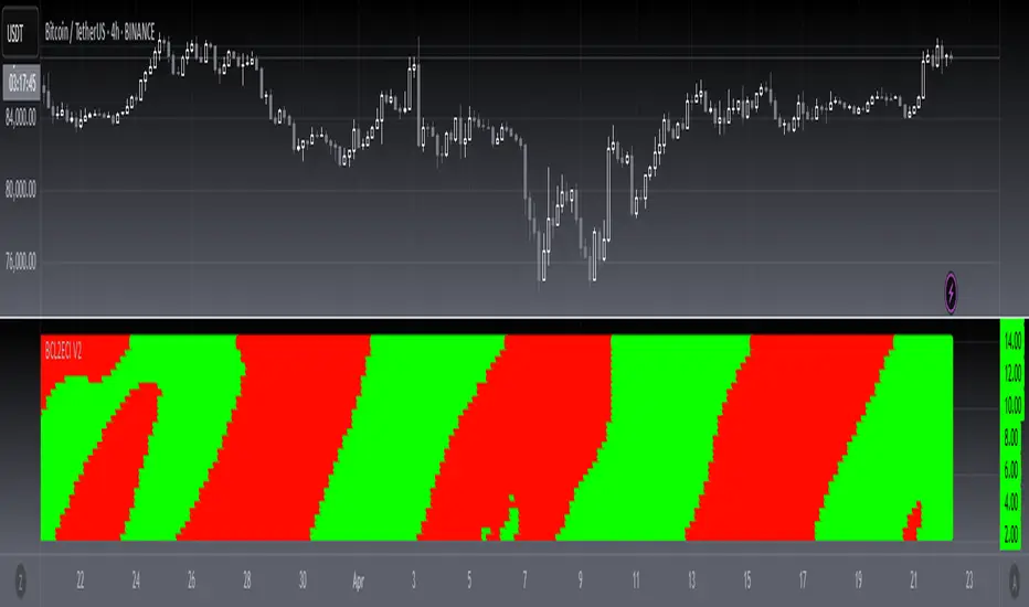
[blackcat] L2 Ehlers Convolution Indicator V2OVERVIEW The L2 Ehlers Convolution Indicator V2 is an advanced technical analysis tool that applies convolution techniques to identify market trends and potential reversal points. It uses adaptive filtering to analyze price movements across multiple timeframes.
FEATURES
• Advanced convolution algorithm based on Ehlers' methodology
• Multiple timeframe analysis (S2 through S60)
• Dynamic color coding for trend direction:
Red: Downward trend
Green: Upward trend • Adjustable sensitivity through period inputs
HOW TO USE
Input Parameters:
• ShortestPeriod: Minimum period length for calculations
• LongestPeriod: Maximum period length for calculations
Interpretation:
• Red bars indicate downward momentum
• Green bars indicate upward momentum
• Bar height corresponds to the timeframe analyzed
LIMITATIONS
• Requires sufficient historical data for accurate calculations
• May produce false signals during volatile markets
• Performance depends on selected period parameters
NOTES
• The indicator uses arrays to store correlation, slope, and convolution values
• Each bar represents a different timeframe analysis
• Color intensity varies based on the strength of the signal
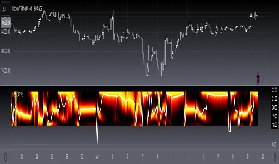
[blackcat] L2 Ehlers Autocorrelation Periodogram V2OVERVIEW
The Ehlers Autocorrelation Periodogram is a sophisticated technical analysis tool that identifies market cycles and their dominant frequencies using autocorrelation and spectral analysis techniques.
BACKGROUND
Developed by John F. Ehlers and detailed in his book "Cycle Analytics for Traders" (2013), this indicator combines autocorrelation functions with discrete Fourier transforms to extract cyclic information from price data.
FUNCTION
The indicator works through these key steps:
Calculates autocorrelation using minimum three-bar averaging
Applies discrete Fourier transform to extract cyclic information
Uses center-of-gravity algorithm to determine dominant cycle
ADVANTAGES
• Rapid response within half-cycle periods
• Accurate relative cyclic power estimation over time
• Correlation constraints between -1 and +1 eliminate amplitude compensation needs
• High resolution independent of windowing functions
HOW TO USE
Add the indicator to your chart
Adjust AvgLength input parameter:
• Default: 3 bars
• Higher values increase smoothing
• Lower values increase sensitivity
Interpret the results:
• Colored bars represent spectral power
• Red to yellow spectrum indicates cycle strength
• White line shows dominant cycle period
INTERPRETATION
• Strong colors indicate significant cyclic activity
• Sharp color transitions suggest potential cycle changes
• Dominant cycle line helps identify primary market rhythm
LIMITATIONS
• Requires sufficient historical data
• Performance may vary in non-cyclical markets
• Results depend on proper parameter settings
NOTES
• Uses highpass and super smoother filtering techniques
• Spectral estimates are normalized between 0 and 1
• Color intensity varies based on spectral power
THANKS
This implementation is based on Ehlers' original work and has been adapted for TradingView's Pine Script platform.
Market Session StrategyMarket Session Strategy Indicator Explanation
This is a TradingView Pine Script indicator called "Market Session Strategy" that monitors different market sessions and generates trading signals based on pattern analysis between sessions. Let me break down how it works:
Core Functionality
The indicator divides the trading day into three sessions:
Pre-Market (7:30 PM - 3:00 AM ET by default)
Regular Market (3:00 AM - 9:30 AM ET by default)
After Hours (9:30 AM - 4:00 PM ET by default)
For each session, it:
Tracks price action (open, high, low, close)
Calculates range percentages
Identifies session bias (bullish or bearish)
Draws visual session boxes on the chart
Generates trading signals based on historical patterns
Signal Generation Methodology
The indicator generates BUY/SELL signals at the beginning of the Regular Market and After Hours sessions using three main strategies:
1. Trend Continuation/Reversal Analysis
The script tracks how often a bullish/bearish trend in one session continues or reverses in the next session. For example:
If pre-market trends historically continue into regular hours 70% of the time and today's pre-market is bullish, it may generate a BUY signal.
If reversals are more common, it may generate a counter-trend signal.
2. Tight Range Breakout Signal
The indicator identifies "tight range" sessions (where price movement is unusually constrained compared to recent averages). A tight range with a bullish bias generates a BUY signal, while a bearish bias generates a SELL signal.
3. Day of Week Pattern Analysis
The script analyzes which days of the week show stronger trend continuation probabilities. If a particular day (like Monday) historically shows strong trend continuation and the threshold is met, it generates a signal accordingly.
Visual Components
The indicator provides several visual elements:
Colored session boxes showing high/low ranges
Signal labels at entry points
Session background colors with high transparency
A comprehensive dashboard showing session status, range percentages, bias, and signals
Performance Tracking
The script tracks trade success by session and day of week, which helps refine future signals. A trade is considered successful if:
A BUY signal is followed by a close higher than open
A SELL signal is followed by a close lower than open

