Inverse Chart of VELO "Massive Dump Inbound" | Mid Term (3D)Inverse Chart of KUCOIN:VELOUSDT "Massive Dump Inbound" | Mid Term (3D)
- As a hedge against the market I am accumulating small and micro cap ALTs to weather the storm of the impending market correction/pullback period leading into the BTC halving event in April.
Personal Approach & Base Chart Setup
- Stacked Parallel Channels for Grid of Confluence Points
- High Time Frame (HTF) Fib Extensions, Retracements, & Time Cycles
- Red Filled Horizontal Rectangles between areas of major Fib level from Extensions and Retracements
- Price Label Callout with Red Circle highlighting points of interest where I'd consider making a trade
- I will consistently monitor and adjust taking into consideration long/mid/near term price action and market conditions/news
Additional Remarks
Something I like to do to give myself some valuable perspective when looking to invest/trade for after I've mocked up HTF price action and possible movements with fibs, parallel channels, and fractals, is to then inverse the chart (Keyboard Shortcut ALT + I), and zoom out... Sometimes just seeing things from an alternate perspective, can give you that last little bit of confidence needed.
VELOUSDT trade ideas

VELO Price Surge Alert! The Path to Financial Freedom Starts Her**Short Fundamental Analysis of VELO Coin**
VELO (Velocity) is a blockchain-based payment network designed to facilitate fast, secure, and low-cost transactions. It utilizes a unique DAG (Directed Acyclic Graph) consensus mechanism that eliminates the need for miners, resulting in significantly faster transaction speeds and lower fees than traditional blockchains.
**Key Features of VELO:**
* **High Speed:** VELO transactions can be processed in as little as 0.1 seconds, significantly faster than Bitcoin and other blockchains.
* **Low Fees:** VELO transaction fees are typically around a fraction of a penny, making it an attractive option for micropayments and everyday transactions.
* **Scalability:** VELO is designed to be scalable, capable of handling millions of transactions per second.
* **Security:** VELO utilizes a robust security model that includes cryptographic signatures and a decentralized network of nodes.
**Recent News**
* **VELO Integrates with WooCommerce:** In December 2023, VELO announced a partnership with WooCommerce, the world's most popular e-commerce platform. This integration will allow merchants to accept VELO payments directly on their WooCommerce stores.
* **VELO Partners with CoinPayments:** In November 2023, VELO partnered with CoinPayments, a leading cryptocurrency payment processor. This partnership will enable merchants to accept VELO payments through CoinPayments' extensive network of merchants.
* **VELO Launches Mobile App:** In October 2023, VELO launched its official mobile app, providing users with a convenient way to store, send, and receive VELO tokens.
**Disclaimer**
Please note that this is not financial advice. Cryptocurrency markets are highly volatile and risky. Always do your own research before investing in any cryptocurrency.

$VELO macro Adam and Eve$VELO macro Adam and Eve double bottom, montly RSI crossed the MA, and monthly Bollinger Band cross the mid line.
Not financial advice.

✴️ Velo One Month Later & 940% PotentialThis is the exact same chart, I only moved the green arrow a little bit to the right.
You know what I keep on saying, "Patience is key".
This pair continues consolidating, going sideways with a downward bent; This is normal and bullish or we can say neutral.
The bullish bias described in previous trade ideas remains valid, the chart technicals are the same.
As long as VELOUSDT trades above the orange trend lines, we can expect prices to go up... Notice the trading volume becoming weaker and weaker... The lower it goes, the closer we get to the bullish breakout and a bullish breakout will definitely take place; When?
The breakout can happen within hours just as it can take weeks or days.
We can't predict the exact date as to when a certain move will show up but we can predict with a very high level of accuracy the direction of the move and the target, so all we need is patience to trade these charts.
Some charts will breakdown and the analysis will fail, that's ok.
The majority will move just as the chart shows.
We have a bullish chart and so we expect additional growth.
Namaste.

$VELO to $0.003888$VELO will Reach to Find Footing ANew Heights!
$VELO to $0.003888
GoGo $VELO
#VELOCITY

Ambitious Velo betIf that last local top top was a neckline, then this target could be pretty high.
Not financial advice. Amateur opinion

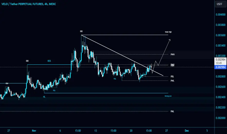
#VELO/USDT breaks the Diagonal Trendline in 4-Hour TF!#VELO/USDT breaks the Diagonal Trendline in 4-Hour TF!
SEED_ALEXDRAYM_BIGMAC:VELO retests the Trendline and trying to break PMH $0.003035 resistance level. Wait for BO to open a long position.
$VELO targets$velo targets for holders and for traders as well
the X mark would be a good stop loss level if you planning to go long right now
otherwise, wait for the break of the yellow trend line

$VELO to $0.003160$VELO is looking to breakout of a wedge with a measured move that has confluence with the 1.272 fib retracement from the recent decline.
$VELO to $0.003160
NASDAQ:GOGO $VELO

$VELO 20% Pump Short Term$VELO Breakout Eminent
Velo is about to break out of a channel to the target from the previously predicted wedge breakout.
you might notice the channel breakout traget is the level that the wedge broke to
Play the Reverse Card

#VELO KUCOIN OKX CHSRT ANALYSIS This is the velo chart on a 4-hour frame. We may get a bounce from the entry area up to the prz line for the harmonic pattern. Also, when the price reaches prz, a price correction may occur and we enter another entry, and the target is then ob extreme at the green line. The chart will be updated when the price reaches prz 🌹🌹🌹🌹
Please adhere to the chart instructions and the entry and stop zones

✴️ Velo Update (700% Potential Growth Mapped)I am using the same chart used in July.
For VELOUSDT, I am using an internal trendline to remove the excesses.
The "May support" broke down in August but now VELOUSDT is trading back above it, regaining the bullish bias.
The breakdown ended in a higher low compared to January 2023, a very strong bullish signal.
👉 The August drop is literally an extension of the correction that started in February. As volume can be clearly seen going lower and lower as the correction extends, it signals that the bears are losing strength. With Velo now trading back above its May support, we can expect the next wave to develop within this or next month.
This is an easy one... Patience is all that is needed, potential is huge.
👉 We are looking at 200%+ easy/fast and over 700% mid-term.
Namaste.

Velo After Buy Hitt our Stoploss is Ready to SellHere is My Study on Velo
Consider All Take Profit Zone are Important.
Welcome to my channel! Here you'll find daily technical analysis ofthe latest trends in the crypto market. From Bitcoin to altcoins, I'lIl be sharing my insights and predictions to help you make informed decisions
about your investments. Follow me for the latest updates and join the conversation in the comments!
Crypto technical analysis uses past price history to predict future price. It's not a guarantee and shouldn't be relied on solely for investment decisions. Consider other factors such as market trends, economic strength and
information dissemination. Use with caution.
This Is Not A Financial Advise

Velo We Try Again. Here is My Study On Velo.
Welcome to my channel! Here you'll find daily technical analysis ofthe latest trends in the crypto market. From Bitcoin to altcoins, I'lIl be sharing my insights and predictions to help you make informed decisions
about your investments. Follow me for the latest updates and join the conversation in the comments!
Crypto technical analysis uses past price history to predict future price. It's not a guarantee and shouldn't be relied on solely for investment decisions. Consider other factors such as market trends, economic strength and
information dissemination. Use with caution.
This Is Not A Finacial Advise

$VELO VELOUSDT$VELO
In crypto anything may happen
DYOR - NFA - mange you money - never invest money you need

Velo Buy Trade Here Is My Study on Velo.
Welcome to my channel! Here you'll find daily technical analysis ofthe latest trends in the crypto market. From Bitcoin to altcoins, I'lIl be sharing my insights and predictions to help you make informed decisions
about your investments. Follow me for the latest updates and join the conversation in the comments!
Crypto technical analysis uses past price history to predict future price. It's not a guarantee and shouldn't be relied on solely for investment decisions. Consider other factors such as market trends, economic strength and
information dissemination. Use with caution.
This Is Not A Finacial Advise

VELO LONG Trade
🚀 Long Callout for $VELO/USDT! 🚀
Hello fellow traders! 📈 We're back with an exciting opportunity on the $VELO/USDT trading pair that's caught our attention.
🔍 Technical Analysis Highlights:
Bullish Momentum: The price is showing strong upward momentum, suggesting a potential bullish trend.
Support Confirmation: The key support level has held firm, indicating positive market sentiment.
Volume Surge: A notable increase in trading volume adds weight to the potential upside.
💡 Our Strategy:
We're excited about $VELO's prospects. With clear technical signals aligning, we're leaning towards an optimistic outlook. The support level's strength and increasing volume are key factors driving our confidence.

$velo good r/r ratio hereSeems $velo has bottomed and primed for the upside. Final target first range a 83% up.

✴️ Velo Prepares For Massive 635% Bullish WaveVELOUSDT is preparing for a massive bullish wave or the resumption of the bullish cycle that started late December 2022.
We can see how the daily volume just broke the descending pattern. Each time there is a volume breakout, a bullish wave shows up.
The chart is really strong in general, huge swings and prices holding high after each correction. The higher lows and higher highs are easy to spot.
Yesterday's session is very telling based on the long lower wick with high volume. Supported by the RSI and MACD.
✔️ Easy target is 132%, so this pair is very volatile which is great.
✔️ Then we have 230% and 300% on the way up...
✔️ The final potential target for this wave can reach $0.0228 or 635%, this is just a projection, the final price when the wave ends can be higher or lower but the initial wave from Dec. '22 through Feb. '23 produced more than 1200% of growth.
Namaste.

Velo to .0275 Loooong.IYKYK.
1. Lightnet.
2. Visa
3. CEX and DEX
4. Universe
Built on stellar and bridges BNB and ETH.


could velo do the head and shoulders thing here?Looks complete so needs to play out soon or it's not looking so good.

VELO What's the range?Here we are 85% off the recent high, price gets narrowed inside a tiny range most likely implicating a strong move to follow. Up or down, we shall see but a conservate target of 0.618 would mean 3,5x
Have we seen a similar movement before? Hell yeah, End of 2022 and even 2021 on a HTF
MA's flattening out, patience!
---
If you like my content, if it helps you gain profit, give it a like!
Thanks!
---
Hold my beer pls
----
No financial advice, do your own research, don't be stupid
