Smart Money OscillatorSmart Money Oscillator — Description and Interpretation
The Smart Money Oscillator is a momentum-style indicator designed to highlight when informed, institutional traders (“smart money”) are likely accumulating (buying) or distributing (selling) assets.
Chart patterns

Smart Money vs Dumb Money ZonesSmart Money vs Dumb Money Buy & Sell Signals on Candle Chart
Smart Money Signals
Smart Money Buy: Indicates institutional or informed traders accumulating positions. This usually happens when volume spikes on a down candle near recent lows — a sign of savvy buying before price rises.
Smart Money Sell: Signals institutional distribution. Typically shown by volume spikes on up candles near recent highs — suggesting smart traders are offloading positions before a potential drop.
Dumb Money Signals
Dumb Money Buy: Reflects retail traders chasing price momentum at overbought levels, often buying near local or recent highs based on hype or fear of missing out.
Dumb Money Sell: Represents panic selling by retail traders at oversold levels near recent lows, often selling in fear as price falls further.
Visual on Candle Chart:
This data is restricted to paid members
Why It Matters:
Smart Money signals help identify potential turning points caused by large, well-informed players. Following these can help you align trades with market movers.
Dumb Money signals warn of retail emotional extremes — often contrarian trade opportunities when the crowd is overly optimistic or fearful.

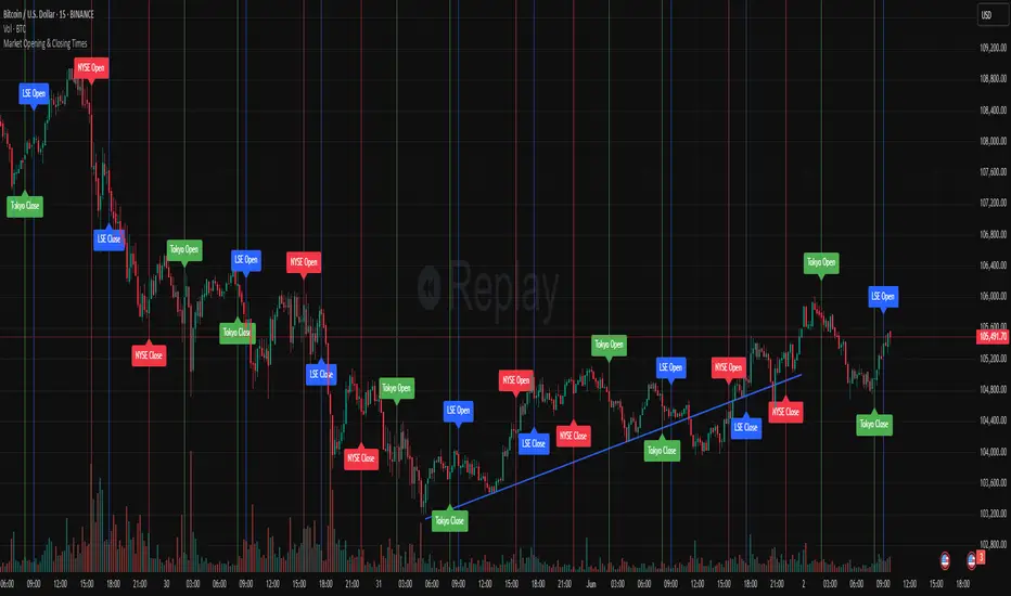
Market Opening & Closing TimesThis indicator highlights the opening and closing times of major global markets (NYSE, LSE, Tokyo) on any chart timeframe. Users can toggle the display of lines and labels, and customize colors per market.
Features:
Toggle each market’s Open/Close separately
Global toggles: Show/Hide all lines or labels
Customizable colors for NYSE, LSE, and Tokyo markers
Accurate event detection using timezone-aware timestamp checks within each bar
Rapid HTF Price Action Dashboard V2.0Rapid HTF Price Action Dashboard V2.0
Overview
Stop the constant switching between timeframes. The Rapid HTF Price Action Dashboard is an all-in-one analysis suite designed to give you a crystal-clear view of the market's true intent by projecting critical higher-timeframe (HTF) data directly onto your trading chart.
This tool is more than just a pattern indicator; it's a complete dashboard that provides institutional-grade insights into price action. It helps you anticipate market moves by showing you where liquidity lies and how the bigger players are positioning themselves, all from the comfort of your lower-timeframe chart.
Key Features
Multi-Timeframe Dashboard: A clean, intuitive panel on the right of your chart displays the last two closed higher-timeframe candles (Candle A & B) and the live, developing one (Candle C).
Projected HTF Levels: Automatically draws and projects the previous HTF candle's high and low across your chart, acting as critical dynamic support and resistance levels.
Advanced Pattern Recognition: Identifies seven high-conviction candlestick patterns based on our proprietary filtering system, designed to eliminate noise and pinpoint only the most potent signals.
The Logic: Why Our Signals Are More Accurate
This indicator goes far beyond textbook definitions. We don't just look for shapes; we look for the story behind the price action. Each pattern is filtered through a rigorous set of conditions to ensure it represents true market conviction.
Hammers & Inverted Hammers: The Liquidity Grab
Classic Hammer/IH patterns are often misleading. Ours are different. We identify them as true liquidity grab signals, a core concept used in ICT (Inner Circle Trader) methodologies.
A Hammer (H) is only valid if its low wick has pierced below the low of the previous candle (low < low ). This signifies a "stop hunt" where liquidity was absorbed below a key level before buyers aggressively pushed the price up.
An Inverted Hammer (IH) is only valid if its high wick has pierced above the high of the previous candle (high > high ). This shows liquidity was taken above a prior high before sellers took control and suppressed the price.
Harami: Filtering for Conviction
A classic Harami (an inside bar) can often just be a weak doji, signaling indecision. We filter this noise out.
Our Harami signal (BeH, BuH) requires the inside candle to have a meaningful body (defaulting to 30% of its own range, but fully customizable).
Furthermore, we have enhanced the logic to ensure the body of the inside candle is strictly contained within the body of the previous candle, making it a more precise and reliable signal of consolidation before a potential expansion.
Power Engulfing: A Signal of Overwhelming Force
We don't flag just any engulfing candle. We look for true displacement and momentum.
Our Power Engulfing pattern (BE, BuE) requires the body of the current candle to completely engulf the body of the previous candle.
Crucially, it must also close decisively beyond the entire range (including the wick) of the previous candle. A Bullish Engulfing must close above the previous high, and a Bearish Engulfing must close below the previous low. This confirms overwhelming force has entered the market and a reversal is highly probable.
How to Use the Dashboard
Set Your Reference Timeframe (refTF): Choose the higher timeframe you want to analyze (e.g., "240" for 4-Hour).
Identify the Narrative: Use the projected High/Low lines as your key support and resistance zones. A primary strategy is to wait for price to interact with these levels.
Anticipate the Draw on Liquidity: Watch as price approaches the previous HTF high or low. The dashboard helps you predict the market's next move. For example, if price is trading below the previous HTF low, you can anticipate a potential sweep of that level.
Confirm with a Signal: When a signal like a Hammer (H) appears on the dashboard after sweeping the previous low, it provides high-conviction confirmation that liquidity has been taken and price is ready to reverse.

GB Time Tracker - DST AwareThis script shows certain GB times combinations based on Zurich/NY time. The idea of GB time as a concept comes from aka_shan/delboy26. This script is meant to follow his logic.

Satyam: Custom IndicatorThis script has two main functions focusing on EMAs (Exponential Moving Average) and Stochastic RSI.
EMAs
EMAs are typically used to give a view of bullish / bearish momentum. When the shorter EMA (calculated off more recent price action) crosses, or is above, the slower moving EMA (calculated off a longer period of price action), it suggests that the market is in an uptrend. This can be an indication to either go long on said asset, or that it is more preferable to take long setups over short setups. Invalidation on long setups is usually found via price action (e.g. previous lows) or simply waiting for an EMA cross in the opposite direction (i.e. shorter EMA crosses under longer term EMA).
This is not a perfect system for trade entry or exit, but it does give a good indication of market trends. The settings for the EMAs can be changed based on user inputs, and by default the candles are coloured based on the crosses to make it more visual. The default settings are based on “Trader XO’s” settings who is an exceptional swing trader.

Price Cross Over LcfxKey Features:
HalfTrend Calculation:
Uses amplitude value (default 100)
Calculates based on highest/lowest prices and smoothed moving averages
Includes volatility adjustment using ATR
Signal Detection:
Buy signals when price closes ABOVE HalfTrend line
Sell signals when price closes BELOW HalfTrend line
Uses actual candle close prices for reliable signals
Visual Elements:
Plots HalfTrend line in blue
Shows green "BUY" labels below bars
Shows red "SELL" labels above bars
Alerts created for both signal types
Input Customization:
Adjustable amplitude parameter
Min value constrained to 1
Usage:
Apply to any chart
Signals appear at the close of the candle that crosses the HalfTrend line
Alerts can be set for automated notifications

Multi-Confluence Swing Hunter V1# Multi-Confluence Swing Hunter V1 - Complete Description
Overview
The Multi-Confluence Swing Hunter V1 is a sophisticated low timeframe scalping strategy specifically optimized for MSTR (MicroStrategy) trading. This strategy employs a comprehensive point-based scoring system that combines optimized technical indicators, price action analysis, and reversal pattern recognition to generate precise trading signals on lower timeframes.
Performance Highlight:
In backtesting on MSTR 5-minute charts, this strategy has demonstrated over 200% profit performance, showcasing its effectiveness in capturing rapid price movements and volatility patterns unique to MicroStrategy's trading behavior.
The strategy's parameters have been fine-tuned for MSTR's unique volatility characteristics, though they can be optimized for other high-volatility instruments as well.
## Key Innovation & Originality
This strategy introduces a unique **dual scoring system** approach:
- **Entry Scoring**: Identifies swing bottoms using 13+ different technical criteria
- **Exit Scoring**: Identifies swing tops using inverse criteria for optimal exit timing
Unlike traditional strategies that rely on simple indicator crossovers, this system quantifies market conditions through a weighted scoring mechanism, providing objective, data-driven entry and exit decisions.
## Technical Foundation
### Optimized Indicator Parameters
The strategy utilizes extensively backtested parameters specifically optimized for MSTR's volatility patterns:
**MACD Configuration (3,10,3)**:
- Fast EMA: 3 periods (vs standard 12)
- Slow EMA: 10 periods (vs standard 26)
- Signal Line: 3 periods (vs standard 9)
- **Rationale**: These faster parameters provide earlier signal detection while maintaining reliability, particularly effective for MSTR's rapid price movements and high-frequency volatility
**RSI Configuration (21-period)**:
- Length: 21 periods (vs standard 14)
- Oversold: 30 level
- Extreme Oversold: 25 level
- **Rationale**: The 21-period RSI reduces false signals while still capturing oversold conditions effectively in MSTR's volatile environment
**Parameter Adaptability**: While optimized for MSTR, these parameters can be adjusted for other high-volatility instruments. Faster-moving stocks may benefit from even shorter MACD periods, while less volatile assets might require longer periods for optimal performance.
### Scoring System Methodology
**Entry Score Components (Minimum 13 points required)**:
1. **RSI Signals** (max 5 points):
- RSI < 30: +2 points
- RSI < 25: +2 points
- RSI turning up: +1 point
2. **MACD Signals** (max 8 points):
- MACD below zero: +1 point
- MACD turning up: +2 points
- MACD histogram improving: +2 points
- MACD bullish divergence: +3 points
3. **Price Action** (max 4 points):
- Long lower wick (>50%): +2 points
- Small body (<30%): +1 point
- Bullish close: +1 point
4. **Pattern Recognition** (max 8 points):
- RSI bullish divergence: +4 points
- Quick recovery pattern: +2 points
- Reversal confirmation: +4 points
**Exit Score Components (Minimum 13 points required)**:
Uses inverse criteria to identify swing tops with similar weighting system.
## Risk Management Features
### Position Sizing & Risk Control
- **Single Position Strategy**: 100% equity allocation per trade
- **No Overlapping Positions**: Ensures focused risk management
- **Configurable Risk/Reward**: Default 5:1 ratio optimized for volatile assets
### Stop Loss & Take Profit Logic
- **Dynamic Stop Loss**: Based on recent swing lows with configurable buffer
- **Risk-Based Take Profit**: Calculated using risk/reward ratio
- **Clean Exit Logic**: Prevents conflicting signals
## Default Settings Optimization
### Key Parameters (Optimized for MSTR/Bitcoin-style volatility):
- **Minimum Entry Score**: 13 (ensures high-conviction entries)
- **Minimum Exit Score**: 13 (prevents premature exits)
- **Risk/Reward Ratio**: 5.0 (accounts for volatility)
- **Lower Wick Threshold**: 50% (identifies true hammer patterns)
- **Divergence Lookback**: 8 bars (optimal for swing timeframes)
### Why These Defaults Work for MSTR:
1. **Higher Score Thresholds**: MSTR's volatility requires more confirmation
2. **5:1 Risk/Reward**: Compensates for wider stops needed in volatile markets
3. **Faster MACD**: Captures momentum shifts quickly in fast-moving stocks
4. **21-period RSI**: Reduces noise while maintaining sensitivity
## Visual Features
### Score Display System
- **Green Labels**: Entry scores ≥10 points (below bars)
- **Red Labels**: Exit scores ≥10 points (above bars)
- **Large Triangles**: Actual trade entries/exits
- **Small Triangles**: Reversal pattern confirmations
### Chart Cleanliness
- Indicators plotted in separate panes (MACD, RSI)
- TP/SL levels shown only during active positions
- Clear trade markers distinguish signals from actual trades
## Backtesting Specifications
### Realistic Trading Conditions
- **Commission**: 0.1% per trade
- **Slippage**: 3 points
- **Initial Capital**: $1,000
- **Account Type**: Cash (no margin)
### Sample Size Considerations
- Strategy designed for 100+ trade sample sizes
- Recommended timeframes: 4H, 1D for swing trading
- Optimal for trending/volatile markets
## Strategy Limitations & Considerations
### Market Conditions
- **Best Performance**: Trending markets with clear swings
- **Reduced Effectiveness**: Highly choppy, sideways markets
- **Volatility Dependency**: Optimized for moderate to high volatility assets
### Risk Warnings
- **High Allocation**: 100% position sizing increases risk
- **No Diversification**: Single position strategy
- **Backtesting Limitation**: Past performance doesn't guarantee future results
## Usage Guidelines
### Recommended Assets & Timeframes
- **Primary Target**: MSTR (MicroStrategy) - 5min to 15min timeframes
- **Secondary Targets**: High-volatility stocks (TSLA, NVDA, COIN, etc.)
- **Crypto Markets**: Bitcoin, Ethereum (with parameter adjustments)
- **Timeframe Optimization**: 1min-15min for scalping, 30min-1H for swing scalping
### Timeframe Recommendations
- **Primary Scalping**: 5-minute and 15-minute charts
- **Active Monitoring**: 1-minute for precise entries
- **Swing Scalping**: 30-minute to 1-hour timeframes
- **Avoid**: Sub-1-minute (excessive noise) and above 4-hour (reduces scalping opportunities)
## Technical Requirements
- **Pine Script Version**: v6
- **Overlay**: Yes (plots on price chart)
- **Additional Panes**: MACD and RSI indicators
- **Real-time Compatibility**: Confirmed bar signals only
## Customization Options
All parameters are fully customizable through inputs:
- Indicator lengths and levels
- Scoring thresholds
- Risk management settings
- Visual display preferences
- Date range filtering
## Conclusion
This scalping strategy represents a comprehensive approach to low timeframe trading that combines multiple technical analysis methods into a cohesive, quantified system specifically optimized for MSTR's unique volatility characteristics. The optimized parameters and scoring methodology provide a systematic way to identify high-probability scalping setups while managing risk effectively in fast-moving markets.
The strategy's strength lies in its objective, multi-criteria approach that removes emotional decision-making from scalping while maintaining the flexibility to adapt to different instruments through parameter optimization. While designed for MSTR, the underlying methodology can be fine-tuned for other high-volatility assets across various markets.
**Important Disclaimer**: This strategy is designed for experienced scalpers and is optimized for MSTR trading. The high-frequency nature of scalping involves significant risk. Past performance does not guarantee future results. Always conduct your own analysis, consider your risk tolerance, and be aware of commission/slippage costs that can significantly impact scalping profitability.

MABB55 Full-CrossIndicates when the MABB55 crosses the:
MABB13
MABB21
EMA8
When a full crossover happens, where the long-term average (MABB 55) moves above or below the faster ones (EMA 8, MABB 13, and 21) it means the trend has shifted so strongly and consistently that it overcomes short-term price movement. That kind of shift usually signals a trend reversal.
Bullish reversals with the MABB55 crossing from above, indicated by a green arrowl.
Bearish reversals with the MABB55 crossing from below, indicated by a red arrow.

P3 Malaysian SNR This is a premium invite indicator now for those who have used it before!
Malaysian Support and Resistance (SNR) zones are defined by precise horizontal levels on a line chart corresponding to local price peaks, valleys, and inter-candle gaps rather than broad price ranges
A-Levels at peaks shaped like the letter “A.”
V-Levels at valleys shaped like the letter “V.”
Fresh levels—those never retested by a wick after origin or retested only by a candle body—carry higher significance and are more likely to prompt price reactions than unfresh (tested) levels
This Malaysian SNR zones offer traders precise, dynamically maintained support and resistance levels that enhance entry and exit timing across multiple timeframes

[DEM] Better McGinley Better McGinley implements a variation of the McGinley Dynamic indicator. The McGinley Dynamic is an adaptive moving average that aims to provide a smoother and more responsive line than traditional moving averages, reducing whipsaws and following price more accurately during trending periods. This Better McGinley version then applies an additional smoothing layer to the primary McGinley line. It overlays directly on the price chart.

[DEM] ATR Filtered Sequential Signal (With Backtesting) ATR Filtered Sequential Signal (With Backtesting) combines a modified sequential counting methodology with an Average True Range (ATR) based filter to generate buy and sell signals. It includes a robust backtesting framework to evaluate the historical performance of these signals. The indicator overlays directly on the price chart, plotting signals and displaying performance statistics in a table.

ROGUE ICT PRORogue ICT PRO — Smart Money Confluence Tool
The Rogue ICT Buy/Sell indicator is a precision-built, multi-confirmation tool inspired by Inner Circle Trader (ICT) concepts. It identifies high-probability trade setups using market structure, fair value gaps, killzone sessions, and higher timeframe trend alignment.
✅ Core Features
🔹 Market Structure Shift (MSS)
Detects clean breaks of swing highs or lows, indicating potential trend continuation or reversal.
🔹 Fair Value Gap Detection (FVG)
Automatically highlights institutional imbalances — essential ICT confluence zones.
🔹 Smart Killzone Filtering
Signals only trigger during high-liquidity sessions:
Asian (19:00–22:00)
London (02:00–05:00)
New York (07:00–10:00)
Each session is color-highlighted on the chart.
🔹 HTF EMA Bias Filter
Only trades in the direction of the Higher Timeframe 50 EMA (e.g., 1H on 5M chart). This ensures entries align with institutional directional bias. I have default set to the Daily 9 EMA but can be changed to your preference.
🔹 ATR-Based Stop Loss & Take Profit Lines
SL is calculated using ATR × multiplier
TP is placed using a customizable Risk-Reward Ratio
Both levels are plotted on the chart with "SL" and "TP" labels.
🔹 Cooldown Logic
Prevents overtrading by requiring a minimum number of bars between each signal.

DAVPAK LONG AND SHORTDAVPAK LONG AND SHORT is a multi-timeframe MACD-based indicator designed to detect long and short entry signals with high precision across five configurable timeframes (5min, 15min, 30min, 1H, 4H).
The script draws color-coded vertical lines when a MACD crossover is detected in each timeframe, with customizable color, line style, and thickness.
MACD values are scaled to enhance visual clarity.
Configurable alerts are included for each crossover event.
Additionally, the MACD and signal lines are plotted with distinct colors to identify bullish or bearish momentum easily.
The indicator also includes ±270, ±1000, and ±2000 visual zones to guide overbought/oversold regions.
Features:
MACD-based logic across multiple timeframes
Custom styling per timeframe
Scalable MACD visualization
Alert-ready
Visual crossover markers on chart
Ideal for:
Scalpers, swing traders, and MTF confirmation strategies.

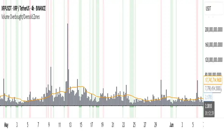
Volume Overbought/Oversold Zones📊 What You’ll See on the Chart
Red Background or Red Triangle ABOVE a Candle
🔺 Means: Overbought Volume
→ Volume on that bar is much higher than average (as defined by your settings).
→ Suggests strong activity, possible exhaustion in the trend or an emotional spike.
→ It’s a warning: consider watching for signs of reversal, especially if price is already stretched.
Green Background or Green Triangle BELOW a Candle
🔻 Means: Oversold Volume
→ Volume on that bar is much lower than normal.
→ Suggests the market may be losing momentum, or few sellers are left.
→ Could signal an upcoming reversal or recovery if confirmed by price action.
Orange Line Below the Candles (Volume Moving Average)
📈 Shows the "normal" average volume over the last X candles (default is 20).
→ Helps you visually compare each bar’s volume to the average.
Gray Columns (Actual Volume Bars)
📊 These are your regular volume bars — they rise and fall based on how active each candle is.
🔍 What This Indicator Does (In Simple Words)
This indicator looks at trading volume—which is how many shares/contracts were traded in a given period—and compares it to what's considered "normal" for recent history. When volume is unusually high or low, it highlights those moments on the chart.
It tells you:
• When volume is much higher than normal → market might be overheated or experiencing a buying/selling frenzy.
• When volume is much lower than normal → market might be quiet, potentially indicating lack of interest or indecision.
These conditions are marked visually, so you can instantly spot them.
💡 How It Helps You As a Trader
1. Spotting Exhaustion in Trends (Overbought Signals)
If a market is going up and suddenly volume spikes way above normal, it may mean:
• The move is getting crowded (lots of buyers are already in).
• A reversal or pullback could be near because smart money may be taking profits.
Trading idea: Wait for high-volume up bars, then look for price weakness to consider a short or exit.
2. Identifying Hidden Opportunities (Oversold Signals)
If price is falling but volume drops unusually low, it might mean:
• Panic is fading.
• Sellers are losing energy.
• A bounce or trend reversal could happen soon.
Trading idea: After a volume drop in a downtrend, watch for bullish price patterns or momentum shifts to consider a buy.
3. Confirming or Doubting Breakouts
Volume is critical for confirming breakouts:
• If price breaks a key level with strong volume, it's more likely to continue.
• A breakout without volume could be a fake-out.
This indicator highlights volume surges that can help you confirm such moves.
📈 How to Use It in Practice
• Combine it with candlestick patterns, support/resistance, or momentum indicators.
• Use the background colors or shapes as a visual cue to pause and analyze.
• Adjust the sensitivity to suit fast-moving markets (like crypto) or slow ones (like large-cap stocks).
Regression Analysis Fibonacci Color📊 Regression Analysis Fibonacci Color
🎯 What Is the Purpose?
This system is designed to generate high-accuracy buy and sell signals by combining trend analysis, dynamic support/resistance calculation, and momentum & volatility confirmation.
🔍 How Does It Work?
✅ 1️⃣ Trend Analysis
A linear regression line is calculated based on price data.
The slope of this line is measured and smoothed to reduce noise.
This way, the system reacts not only to price but also to trend strength.
✅ 2️⃣ Dynamic Level Calculation (Fibonacci-Based)
Based on trend data, historical highs and lows are identified.
This range is divided using Fibonacci ratios: 0%, 23.6%, 38.2%, 50%, 61.8%, 78.6%...
These levels are drawn on the chart as dynamic support/resistance zones that adapt to price movement.
✅ 3️⃣ Trend Strength & Volatility Filtering (ATR-Based)
The Average True Range (ATR) is calculated to measure the market’s average movement range.
This indicates the strength of the trend:
Strong uptrend: Green
Strong downtrend: Pink
Signals are blocked in weak or sideways conditions.
✅ 4️⃣ Smart Buy & Sell Signals
Buy (Long) Signal:
Price dips into the lower zone and then moves back up.
The trend direction is upward.
Volatility confirms strength.
Momentum is validated.
Sell (Short) Signal:
Price breaks down from the upper zone.
The trend direction is downward.
Volatility confirms weakness.
Each signal is shown on the chart with a label & color:
Ⓐ → Buy
(S) or SAT → Sell
✅ RESULT
🔑 What Does This System Do?
✔️ Combines trend direction, momentum, and historical price ranges,
✔️ Generates dynamic support/resistance zones,
✔️ Smartly detects potential reversal areas,
✔️ Uses filtering to reduce false signals,
✔️ Allows you to track & test the entire process on a single chart.

Volatility Index Percentile Risk STOCK StrategyVolatility-Index Percentile Risk STOCK Strategy
──────────────────────────────────────────────
PURPOSE
• Go long equities only when implied volatility (from any VIX-style index) is in its quietest percentile band.
• Scale stop-loss distance automatically with live volatility so risk stays proportional across timeframes and market regimes.
HOW IT WORKS
1. Pull the closing price of a user-selected volatility index (default: CBOE VIX, Nasdaq VXN, etc.).
2. Compute its 1-year (252-bar) percentile.
– If percentile < “Enter” threshold → open / maintain long.
– If percentile > “Exit” threshold → flatten.
3. Set the stop-loss every bar at:
SL % = (current VIX value) ÷ Risk Divisor
(e.g., VIX = 20 and divisor = 57 → 0.35 % SL below entry).
This keeps risk tighter when volatility is high and looser when it’s calm.
USER INPUTS
• VIX-style Index — symbol of any volatility index
• Look-back — length for percentile (default 252)
• Enter Long < Percentile — calm-market trigger (default 15 %)
• Exit Long > Percentile — fear trigger (default 60 %)
• Risk Divisor (SL) — higher number = tighter stop; start with 57 on 30-min charts
• Show Debug Plots — optional visibility of percentile & SL%
RECOMMENDED BACK-TEST SETTINGS
• Timeframe: 30 min – Daily on liquid stocks/ETFs highly correlated to the chosen VIX.
• Initial capital: 100 000 | Order size: 10 % of equity
• Commission: 0.03 % | Slippage: 5 ticks
• Enable *Bar Magnifier* and *Fill on bar close* for realistic execution.
ADDITIONAL INFORMATION
• **Self-calibrating risk** – no static ATR or fixed %, adapts instantly to changing volatility.
• **Percentile filter** – regime-aware entry logic that avoids false calm periods signalled by raw VIX levels.
• **Timeframe-agnostic** – works from intraday to weekly; √T-style divisor lets you fine-tune stops quickly ,together with the percentiles and days length.
• Zero look-ahead.
CAVEATS
• Long-only; no built-in profit target. Add one if your plan requires fixed R:R exits.
• Works best on indices/stocks that move with the selected vol index.
• Back-test results are educational; past performance never guarantees future returns.
LICENSE & CREDITS
Released under the Mozilla Public License 2.0.
Inspired by academic research on volatility risk premia and mean-reversion.
DISCLAIMER
This script is for informational and educational purposes only. It is **not** financial advice. Use at your own risk.

FutureObitz Bank LevelsFutureObitz Bank Levels - Daily Structure & Trading Zones
"The Obitz Bank Levels indicator is a powerful tool designed to help traders identify key daily structural price levels. It automatically extracts the 1 hour and 4 hour High and 1 hour and 4 hour Low. You may also use this indicator for lower timeframes aswell. Going lower than 15 min is not recommended.
What This Indicator Provides:
Dynamic Daily Levels: Calculates and plots the Daily High, Daily Low, Middle, Middle High, and Middle Low of the current trading day. These lines provide clear reference points for price action.
Defined Buy & Sell Zones: Visualizes potential accumulation (Buy Zone) and distribution (Sell Zone) areas. These zones are calculated as a customizable percentage (via inputs) above/below the 'Middle' of the daily range, helping to identify potential entry or exit points.
Multi-Timeframe Compatibility: Displays the exact same daily levels regardless of your active chart's timeframe, offering a consistent higher-timeframe perspective for intraday traders.
Visual Clarity: Includes filled zones for better visualization of the Buy and Sell areas.
Optional Labels: Provides clear labels for the latest daily levels (D. High, D. Low, D. Middle, D. Buy Zone, D. Sell Zone) on the last bar of your chart for quick reference.
This indicator serves as a robust framework for understanding daily market structure and can assist in identifying potential areas of support, resistance, and trading opportunities. It's an excellent tool for traders who rely on clear, higher-timeframe levels to inform their trading decisions.
-FutureObitz

Saty ATR Levels// Saty ATR Levels
// Copyright (C) 2022 Saty Mahajan
// Author is not responsible for your trading using this script.
// Data provided in this script is not financial advice.
//
// Features:
// - Day, Multiday, Swing, Position, Long-term, Keltner trading modes
// - Range against ATR for each period
// - Put and call trigger idea levels
// - Intermediate levels
// - Full-range levels
// - Extension levels
// - Trend label based on the 8-21-34 Pivot Ribbon
//
// Special thanks to Gabriel Viana.
// Based on my own ideas and ideas from Ripster, drippy2hard,
// Adam Sliver, and others.
//@version=5
indicator('Saty ATR Levels', shorttitle='Saty ATR Levels', overlay=true)
// Options
day_trading = 'Day'
multiday_trading = 'Multiday'
swing_trading = 'Swing'
position_trading = 'Position'
longterm_trading = 'Long-term'
trading_type = input.string(day_trading, 'Trading Type', options= )
use_options_labels = input(true, 'Use Options Labels')
atr_length = input(14, 'ATR Length')
trigger_percentage = input(0.236, 'Trigger Percentage')
previous_close_level_color = input(color.white, 'Previous Close Level Color')
lower_trigger_level_color = input(color.yellow, 'Lower Trigger Level Color')
upper_trigger_level_color = input(color.aqua, 'Upper Trigger Level Color')
key_target_level_color = input(color.silver, 'Key Target Level Color')
atr_target_level_color = input(color.white, 'ATR Target Level Color')
intermediate_target_level_color = input(color.gray, 'Intermediate Target Level Color')
show_all_fibonacci_levels = input(true, 'Show All Fibonacci Levels')
show_extensions = input(false, 'Show Extensions')
level_size = input(2, 'Level Size')
show_info = input(true, 'Show Info Label')
use_current_close = input(false, 'Use Current Close')
fast_ema = input(8, 'Fast EMA')
pivot_ema = input(21, 'Pivot EMA')
slow_ema = input(34, 'Slow EMA')
// Set the appropriate timeframe based on trading mode
timeframe_func() =>
timeframe = 'D'
if trading_type == day_trading
timeframe := 'D'
else if trading_type == multiday_trading
timeframe := 'W'
else if trading_type == swing_trading
timeframe := 'M'
else if trading_type == position_trading
timeframe := '3M'
else if trading_type == longterm_trading
timeframe := '12M'
else
timeframe := 'D'
// Trend
price = close
fast_ema_value = ta.ema(price, fast_ema)
pivot_ema_value = ta.ema(price, pivot_ema)
slow_ema_value = ta.ema(price, slow_ema)
bullish = price >= fast_ema_value and fast_ema_value >= pivot_ema_value and pivot_ema_value >= slow_ema_value
bearish = price <= fast_ema_value and fast_ema_value <= pivot_ema_value and pivot_ema_value <= slow_ema_value
// Data
period_index = use_current_close ? 0 : 1
ticker = ticker.new(syminfo.prefix, syminfo.ticker, session=session.extended)
previous_close = request.security(ticker, timeframe_func(), close , gaps=barmerge.gaps_off, lookahead=barmerge.lookahead_on)
atr = request.security(ticker, timeframe_func(), ta.atr(atr_length) , gaps=barmerge.gaps_off, lookahead=barmerge.lookahead_on)
period_high = request.security(ticker, timeframe_func(), high, gaps=barmerge.gaps_off, lookahead=barmerge.lookahead_on)
period_low = request.security(ticker, timeframe_func(), low, gaps=barmerge.gaps_off, lookahead=barmerge.lookahead_on)
range_1 = period_high - period_low
tr_percent_of_atr = range_1 / atr * 100
lower_trigger = previous_close - trigger_percentage * atr
upper_trigger = previous_close + trigger_percentage * atr
lower_0382 = previous_close - atr * 0.382
upper_0382 = previous_close + atr * 0.382
lower_0500 = previous_close - atr * 0.5
upper_0500 = previous_close + atr * 0.5
lower_0618 = previous_close - atr * 0.618
upper_0618 = previous_close + atr * 0.618
lower_0786 = previous_close - atr * 0.786
upper_0786 = previous_close + atr * 0.786
lower_1000 = previous_close - atr
upper_1000 = previous_close + atr
lower_1236 = lower_1000 - atr * 0.236
upper_1236 = upper_1000 + atr * 0.236
lower_1382 = lower_1000 - atr * 0.382
upper_1382 = upper_1000 + atr * 0.382
lower_1500 = lower_1000 - atr * 0.5
upper_1500 = upper_1000 + atr * 0.5
lower_1618 = lower_1000 - atr * 0.618
upper_1618 = upper_1000 + atr * 0.618
lower_1786 = lower_1000 - atr * 0.786
upper_1786 = upper_1000 + atr * 0.786
lower_2000 = lower_1000 - atr
upper_2000 = upper_1000 + atr
lower_2236 = lower_2000 - atr * 0.236
upper_2236 = upper_2000 + atr * 0.236
lower_2382 = lower_2000 - atr * 0.382
upper_2382 = upper_2000 + atr * 0.382
lower_2500 = lower_2000 - atr * 0.5
upper_2500 = upper_2000 + atr * 0.5
lower_2618 = lower_2000 - atr * 0.618
upper_2618 = upper_2000 + atr * 0.618
lower_2786 = lower_2000 - atr * 0.786
upper_2786 = upper_2000 + atr * 0.786
lower_3000 = lower_2000 - atr
upper_3000 = upper_2000 + atr
// Add Labels
tr_vs_atr_color = color.green
if tr_percent_of_atr <= 70
tr_vs_atr_color := color.green
else if tr_percent_of_atr >= 90
tr_vs_atr_color := color.red
else
tr_vs_atr_color := color.orange
trading_mode = 'Day'
if trading_type == day_trading
trading_mode := 'Day'
else if trading_type == multiday_trading
trading_mode := 'Multiday'
else if trading_type == swing_trading
trading_mode := 'Swing'
else if trading_type == position_trading
trading_mode := 'Position'
else if trading_type == longterm_trading
trading_mode := 'Long-term'
else
trading_mode := ''
long_label = ''
short_label = ''
if use_options_labels
long_label := 'Calls'
short_label := 'Puts'
else
long_label := 'Long'
short_label := 'Short'
trend_color = color.orange
if bullish
trend_color := color.green
else if bearish
trend_color := color.red
else
trend_color := color.orange
var tbl = table.new(position.top_right, 1, 4)
if barstate.islast and show_info
table.cell(tbl, 0, 0, 'Saty ATR Levels', bgcolor=trend_color)
table.cell(tbl, 0, 1, trading_mode + ' Range ($' + str.tostring(range_1, '#.##') + ') is ' + str.tostring(tr_percent_of_atr, '#.#') + '% of ATR ($' + str.tostring(atr, '#.##') + ')', bgcolor=tr_vs_atr_color)
table.cell(tbl, 0, 2, long_label + ' > $' + str.tostring(upper_trigger, '#.##') + ' | +1 ATR $' + str.tostring(upper_1000, '#.##'), bgcolor=upper_trigger_level_color)
table.cell(tbl, 0, 3, short_label + ' < $' + str.tostring(lower_trigger, '#.##') + ' | -1 ATR: $' + str.tostring(lower_1000, '#.##'), bgcolor=lower_trigger_level_color)
// Add levels
plot(show_extensions ? lower_3000 : na, color=color.new(atr_target_level_color, 40), linewidth=level_size, title='-300.0%', style=plot.style_stepline)
//plot(show_all_fibonacci_levels and show_extensions ? lower_2786 : na, color=color.new(intermediate_target_level_color, 40), linewidth=level_size, title='-278.6%', style=plot.style_stepline)
plot(show_extensions ? lower_2618 : na, color=color.new(key_target_level_color, 40), linewidth=level_size, title='-261.8%', style=plot.style_stepline)
//plot(show_all_fibonacci_levels and show_extensions ? lower_2500 : na, color=color.new(intermediate_target_level_color, 40), linewidth=level_size, title='-250.0%', style=plot.style_stepline)
//plot(show_all_fibonacci_levels and show_extensions ? lower_2382 : na, color=color.new(intermediate_target_level_color, 40), linewidth=level_size, title='-238.2%', style=plot.style_stepline)
plot(show_extensions ? lower_2236 : na, color=color.new(key_target_level_color, 40), linewidth=level_size, title='-223.6%', style=plot.style_stepline)
plot(show_extensions ? lower_2000 : na, color=color.new(atr_target_level_color, 40), linewidth=level_size, title='-200.0%', style=plot.style_stepline)
plot(show_all_fibonacci_levels and show_extensions ? lower_1786 : na, color=color.new(intermediate_target_level_color, 40), linewidth=level_size, title='-178.6%', style=plot.style_stepline)
plot(show_extensions ? lower_1618 : na, color=color.new(key_target_level_color, 40), linewidth=level_size, title='-161.8%', style=plot.style_stepline)
plot(show_all_fibonacci_levels and show_extensions ? lower_1500 : na, color=color.new(intermediate_target_level_color, 40), linewidth=level_size, title='-150.0%', style=plot.style_stepline)
plot(show_all_fibonacci_levels and show_extensions ? lower_1382 : na, color=color.new(intermediate_target_level_color, 40), linewidth=level_size, title='-138.2%', style=plot.style_stepline)
plot(show_extensions ? lower_1236 : na, color=color.new(key_target_level_color, 40), linewidth=level_size, title='-123.6%', style=plot.style_stepline)
plot(lower_1000, color=color.new(atr_target_level_color, 40), linewidth=level_size, title='-100%', style=plot.style_stepline)
plot(show_all_fibonacci_levels ? lower_0786 : na, color=color.new(intermediate_target_level_color, 40), linewidth=level_size, title='-78.6%', style=plot.style_stepline)
plot(lower_0618, color=color.new(key_target_level_color, 40), linewidth=level_size, title='-61.8%', style=plot.style_stepline)
plot(show_all_fibonacci_levels ? lower_0500 : na, color=color.new(intermediate_target_level_color, 40), linewidth=level_size, title='-50.0%', style=plot.style_stepline)
plot(show_all_fibonacci_levels ? lower_0382 : na, color=color.new(intermediate_target_level_color, 40), linewidth=level_size, title='-38.2%', style=plot.style_stepline)
plot(lower_trigger, color=color.new(lower_trigger_level_color, 40), linewidth=level_size, title='Lower Trigger', style=plot.style_stepline)
plot(previous_close, color=color.new(previous_close_level_color, 40), linewidth=level_size, title='Previous Close', style=plot.style_stepline)
plot(upper_trigger, color=color.new(upper_trigger_level_color, 40), linewidth=level_size, title='Upper Trigger', style=plot.style_stepline)
plot(show_all_fibonacci_levels ? upper_0382 : na, color=color.new(intermediate_target_level_color, 40), linewidth=level_size, title='38.2%', style=plot.style_stepline)
plot(show_all_fibonacci_levels ? upper_0500 : na, color=color.new(intermediate_target_level_color, 40), linewidth=level_size, title='50.0%', style=plot.style_stepline)
plot(upper_0618, color=color.new(key_target_level_color, 40), linewidth=level_size, title='61.8%', style=plot.style_stepline)
plot(show_all_fibonacci_levels ? upper_0786 : na, color=color.new(intermediate_target_level_color, 40), linewidth=level_size, title='78.6%', style=plot.style_stepline)
plot(upper_1000, color=color.new(atr_target_level_color, 40), linewidth=level_size, title='100%', style=plot.style_stepline)
plot(show_extensions ? upper_1236 : na, color=color.new(key_target_level_color, 40), linewidth=level_size, title='123.6%', style=plot.style_stepline)
plot(show_all_fibonacci_levels and show_extensions ? upper_1382 : na, color=color.new(intermediate_target_level_color, 40), linewidth=level_size, title='138.2%', style=plot.style_stepline)
plot(show_all_fibonacci_levels and show_extensions ? upper_1500 : na, color=color.new(intermediate_target_level_color, 40), linewidth=level_size, title='150.0%', style=plot.style_stepline)
plot(show_extensions ? upper_1618 : na, color=color.new(key_target_level_color, 40), linewidth=level_size, title='161.8%', style=plot.style_stepline)
plot(show_all_fibonacci_levels and show_extensions ? upper_1786 : na, color=color.new(intermediate_target_level_color, 40), linewidth=level_size, title='178.6%', style=plot.style_stepline)
plot(show_extensions ? upper_2000 : na, color=color.new(atr_target_level_color, 40), linewidth=level_size, title='200.0%', style=plot.style_stepline)
plot(show_extensions ? upper_2236 : na, color=color.new(key_target_level_color, 40), linewidth=level_size, title='223.6%', style=plot.style_stepline)
//plot(show_all_fibonacci_levels and show_extensions ? upper_2382 : na, color=color.new(intermediate_target_level_color, 40), linewidth=level_size, title='238.2%', style=plot.style_stepline)
//plot(show_all_fibonacci_levels and show_extensions ? upper_2500 : na, color=color.new(intermediate_target_level_color, 40), linewidth=level_size, title='250.0%', style=plot.style_stepline)
plot(show_extensions ? upper_2618 : na, color=color.new(key_target_level_color, 40), linewidth=level_size, title='261.8%', style=plot.style_stepline)
//plot(show_all_fibonacci_levels and show_extensions ? upper_2786 : na, color=color.new(intermediate_target_level_color, 40), linewidth=level_size, title='278.6%', style=plot.style_stepline)
plot(show_extensions ? upper_3000 : na, color=color.new(atr_target_level_color, 40), linewidth=level_size, title='300%', style=plot.style_stepline)

N4A - Dynamic ORB Algo v7N4A - Dynamic ORB Algo v7
A precision-engineered intraday breakout system designed for professional traders operating in NQ and ES futures markets. The strategy blends advanced ORB (Opening Range Breakout) logic with adaptive session control, dynamic filters, and quartile-based trade management to deliver robust and structured execution across multiple global trading zones.
🧠 Core Framework
Opening Range Breakout (ORB)
Automatically defines a breakout window and detects directional moves when price decisively exits the range high or low, triggering structured entries with defined risk.
Multi-Session Adaptability
Supports automated session presets for Pre-London, London, and New York trading hours. Each session auto-configures its own ORB and entry periods, while maintaining full manual control via Custom mode. Timezones are always user-configurable.
Quartile-Based Structure
All risk and profit calculations are grounded in the ORB range and its quartile subdivisions. Stops and targets are derived from mathematically relevant price zones, not arbitrary values.
🧠 Advanced Filtering Architecture
In the 4 modes, the strategy employs a multi-dimensional filter stack to validate breakout quality and reduce false signals. Each filter contributes unique confirmation logic:
1. 📏 EMA Bias Filter
Establishes directional bias using 2x 200-period EMAs clouds (on both high and close).
Filters out counter-trend setups.
Active in: Moderate, Conservative modes.
2. 📐 Range Geometry (RG) Filter
Measures directional conviction by analyzing whether price consistently pushes in one direction within a smoothed dynamic range:
Utilizes smoothed deviation envelopes and adaptive trend centerline.
Monitors for sustained directional flow (via upCounter/downCounter logic).
Prevents entries during sideways or mean-reverting environments.
3. ⚡️ Momentum Shift Validator
A WAE-style module using fast vs slow EMAs to capture directional thrust:
Tracks positive or negative momentum shifts between bars.
Long trades require increasing bullish momentum; shorts require the opposite.
Ensures active market participation and screens out weak breakouts.
This layered logic produces high-confidence signals and eliminates low-quality market noise.
⚙️ Strategic Mode Selection (Built-in Presets)
Users can select from four predefined filter configurations depending on risk appetite and market conditions:
Basic – Raw ORB breakout without filters; ideal for clean trend days
Conservative – EMA filter active with higher sensitivity (19), RG filter off
Aggressive – EMA filter active with fast sensitivity (5), RG filter off
Custom – Full manual control over all filters and logic components
Each mode automatically configures the system without requiring manual re-adjustments.
🎯 Execution Logic
Entry Conditions
A breakout entry is triggered only after a full bar closes beyond the ORB boundary, subject to filter validation.
Stop Loss Structure
Stops are placed using the ORB quartile framework (typically below Q1 or above Q4), combined with mid-range invalidation logic.
Risk Sizing:
Contract size is dynamically computed from ORB range volatility.
Typical exposure per trade: $200–$400
Profit-Taking Methodology
Targets can be enabled at SD0.5, SD1.0, SD1.5, and SD2.0 intervals from the ORB range. Users control exit percentages per target level. Breakeven is automatically managed after partial take-profit.
Additional Controls
No pyramiding
No re-entries per signal
Max hold duration enforced (default: 270 minutes)
🔔 Alerts Included
Instant alerts trigger upon confirmed Long or Short entries, fully compatible with popup and sound actions.
👤 Developed by Antony.N4A
Built for intraday strategists, quant developers, and execution modelers who demand structured logic, visual clarity, and multi-context adaptability.
Protected script. Unauthorized reuse or redistribution is strictly prohibited.
For access or customization inquiries, contact the author directly.

Doji Candlestick w/ Volatility & Uninterrupted CyclesTracks Doji formation and provides a rating score of Low Medium and High for stocks.

BskLAB - Price Target 🎯 BskLAB – Price Target | Usage Guide & Description
BskLAB – Price Target is a smart structural tool that automatically identifies potential price targets and reversal zones using a proprietary Fibonacci Extension method developed by BskLAB.
Unlike standard Fibo tools, this system requires no manual drawing — everything is automated and anchored from key structure shifts such as CHoCH (Change of Character) and BoS (Break of Structure).
🧭 How It Works
After detecting a structural reversal (bullish or bearish), the system:
Locates the recent swing high and swing low
Calculates the midpoint between the two
Uses a proprietary BskLAB formula to project forward Fibonacci levels from the midpoint toward the dominant price direction
Each level represents a zone where price may:
Complete its move
Find resistance/support
Or potentially reverse
This automated process eliminates the need for manual zone-drawing, making it especially useful for fast-paced traders who need clean, reliable visual guides.
🧩 Key Features
✅ Proprietary Fibonacci Extension algorithm unique to BskLAB
🔄 Auto-detection of CHoCH/BoS with forward zone projection
🎯 Color-coded levels for easier recognition of reversal areas
🛠️ Fully automated — no manual drawing required
🧩 Adjustable sensitivity, length, and zone count
🔗 Best Used With
📈 BskLAB Signal Assistant – For precise signal entry filtering
📊 BskLAB Money Flow X – To confirm reversal zones via volume pressure and divergence
⚠️ Important Note
Zones appear only when a valid structure shift is confirmed, ensuring high relevance to current market context.
This tool is ideal for:
Setting high-probability targets
Anticipating reversal zones
Enhancing precision in trade planning

BskLAB - Signals Assistant 🧠 BSKLab Signal Assistant – Usage Guide & Description
BSKLab Signal Assistant is a multi-strategy signal tool designed to support both trend-following and swing trading styles. The system integrates adaptive zone filters, momentum confirmation, and customized overlays to provide clean, filtered buy/sell signals based on dynamic market conditions.
🔧 Preset Modes Overview
The script includes three built-in modes, each tailored for a specific trading approach:
🌀 Mode 1: Swing
Focus: Reversal trading
Signals are generated at potential turning points in price, typically after the market pulls back into support/resistance zones.
This mode leverages the Zone Style (a dynamic TMA-based zone system) to define high-probability reversal areas based on price volatility. The system also integrates Bollinger Band logic to detect when price reaches extreme conditions (overbought/oversold).
🔹 Entry condition:
Buy signals occur when price drops below the lower boundary of both the Bollinger Band and Zone Style zone, then rebounds upward.
Sell signals occur when price rises above the upper boundary of both the Bollinger Band and Zone Style zone, then reverses down.
All entries are further confirmed by a momentum shift using SuperTrend logic.
This combination ensures that signals are only triggered when price action moves beyond normal volatility boundaries and aligns with a clear reversal condition—helping traders avoid false signals during ranging markets.
Ideal for traders looking to catch early reversals with clean, volatility-based confirmation.
📈 Mode 2: Following
Focus: Trend-following
This mode is designed for traders who prefer to trade in the direction of the dominant trend, avoiding early reversals and false breakouts.
It uses the BskLAB Cloud — a custom-enhanced Ichimoku system — to determine the current market trend. Traders can adjust the Cloud Strength Level (Lv 1–3) to control the strictness of the trend filter:
Level 1 = faster signals
Level 3 = stricter confirmation
Signals are only generated when price follows the confirmed trend direction and is aligned with both the Cloud and the adaptive midline zone from Zone Style.
🔹 Entry condition:
Buy signals occur when price remains in an uptrend (Cloud bullish), and breaks upward through the Bollinger Band mid/high zone.
Sell signals occur during confirmed downtrends (Cloud bearish), with price breaking downward from the Bollinger Band.
Entries are permitted only when price is clearly trending — avoiding sideways or choppy conditions.
This mode is ideal for momentum traders who prefer trading with trend confirmation, using layered filters for high-conviction entries.
⚖️ Mode 3: Normal Swing
Focus: Flexible logic between swing and trend
Signals are based on overbought/oversold behavior with added confirmation from trend momentum.
🔹 Buy condition: Price dips below the lower Bollinger Band and rebounds upward, confirmed by a bullish SuperTrend shift.
🔹 Sell condition: Price spikes above the upper Bollinger Band and reverses down, confirmed by a bearish SuperTrend shift.
This mode offers a balanced entry system for those who want flexibility between reversal and trend trades.
📌 Key Components Explained
📍 Zone Style
A dynamic support/resistance overlay using TMA (Triangular Moving Average) combined with ATR expansion. It helps visually define potential reversal areas and filters low-probability entries.
→ Most effective in Swing and Following modes.
☁️ BskLAB Cloud
An enhanced version of Ichimoku Cloud that scores trend strength using ATR-based logic and adjustable levels.
→ Used only in Following Mode to confirm the dominant market direction.
📊 Bollinger Band Behavior
Used primarily in Normal Swing Mode to detect reversal zones based on price breaking out of overbought or oversold thresholds.
✅ SuperTrend Confirmation
All entries are confirmed with a trend shift logic using SuperTrend-style momentum calculation, improving accuracy and avoiding early entries.
✅ Buy/Sell Signal Logic Summary
🌀 Swing Mode
Signals are generated when price moves outside the Zone Style boundaries and aligns with a reversal confirmation from Bollinger Band behavior (i.e., price exiting from overbought/oversold zones).
A trend shift is confirmed using SuperTrend to validate the momentum reversal.
📈 Following Mode
Signals are allowed only when price is in line with the dominant trend as defined by the BskLAB Cloud, with strength adjustable via Cloud Level 1–3.
Entries are triggered when price follows the trend and shows breakout behavior relative to Bollinger Band zones, ensuring alignment with momentum and volatility.
⚖️ Normal Swing Mode
Signals are triggered when price sharply reverses from the upper or lower Bollinger Band, indicating potential exhaustion.
These signals are only confirmed when the SuperTrend also shifts direction, providing additional momentum validation for more accurate entries.

Rejection Blocks (RJB) and Liquidity Grabs (SFPs)- Milana TradesThis indicator highlights Rejection Blocks (RJB) and Liquidity Grabs (SFPs)—two advanced price action concepts used by professional traders, especially those following ICT (Inner Circle Trader) strategies.
Rejection Block (RJB) is an advanced version of the traditional Order Block. It marks areas where price has been sharply rejected—often zones where smart money enters or exits positions. The logic is based on specific wick rejection criteria and candle structure, with mitigated RJBs marked or hidden automatically.
Liquidity Grab (SFP) detects key Swing Failure Patterns—where price takes out a previous high/low, grabs liquidity, and reverses. Optional volume validation is available for more accurate filtering, especially using LTF (lower timeframe) data.
Key Features:
Rejection Block (RJB)
1) Identifies both bullish and bearish rejection blocks.
2) Two logic types: “trapped wick” and “signal wick” configurations.
3) Auto-detection of mitigated RJBs and customizable visualization.
4)Adjustable color, transparency, box style, label text, and more.
5)Limit on max RJBs displayed to keep the chart clean.
Liquidity Grab (SFP)
1)Detects bullish and bearish SFPs (Swing Failure Patterns).
2)Optional volume validation with threshold control (based on LTF).
3)Dynamically adjusts lower timeframe resolution (auto/manual).
4)Visual confirmation lines, wick highlights, and labels.
5)SFP Dashboard table (optional) for LTF & validation display.
SFP Wick to RJB Zones
Converts confirmed SFPs into new RJB boxes.
Adds powerful confluence between rejection and liquidity.
🔔 Built-in Alerts
Alerts can be set up for both bullish and bearish Rejection Blocks, as well as confirmed SFPs.
Ideal for traders who want to be notified in real-time when price:
Forms a valid Rejection Block,
Prints a confirmed SFP (Swing Failure),
Enters or exits key liquidity zones.
Alerts are fully compatible with TradingView’s alert system.
⚙️ Settings Overview:
Rejection Blocks
Enable plotting, box limit, mitigated filtering, label customization.
Liquidity Grabs (SFPs)
Enable SFPs (bull/bear), pivot length, volume % threshold, LTF resolution.
Enable dashboard, wick display, and validation logic.
SFP-based RJB
Create RJB zones from confirmed SFP signals.
Independent box length and color settings.
Dashboard & Labels
Enable/disable visual labels and LTF info table.
Customize font size, color, and position.
Use Cases:
Identify smart money rejection zones before price reversals.
Use mitigated RJBs to anticipate failed retests or structure breaks.
Trade with confidence by combining RJB + SFP signals.
Set alerts to monitor setups without staring at charts 24/7.
Notes:
Compatible with any market (Forex, Crypto, Indices, Stocks).
Works on all timeframes.
