Multi-Pairs Stratrgy Backtesting ScreenerThis indicator is for viewing and checking the results of a specific strategy simultaneously on 25 currency pairs. Results such as number of trades, wins, losses, canceled trades and most importantly win rate.
Long condition is as follows:
Short condition is as follows:
An Alert Fibo Level is built in to indicate the buy or sell status.
Reset Deal Calculation Fibo Level , if the price hits it, the indicator resets all calculations and prepares for the next situation.
If Other situation appear after missed situation, indicator consider it:
All statistics collected in Screener Table :
Date Period:
Users can customize the date period during which the strategy is tested, allowing for a more granular analysis of performance over specific timeframes.
Entry:
Entry is based on Fibonacci level between the Lower Low and Higher High pivots for Long deals.
Entry is based on Fibonacci level between the Higher High and Lower Low pivots for Short deals.
Allowing a second entry
There is a feature that If the risk-to-reward ratio is below the specified input (rr), the trading deal wont initiate.
Stop Loss:
Adjustable based on Fibonacci levels , Base Pivot, Percent and ATR.
The Base Pivot is calculate from LL pivot point for Long and HH pivot point for short (not Entry price).
The Percent and ATR is calculate from Entry price.
Targets:
Adjustable based on Source, Fibonacci levels , Percent and ATR.
Source indicates the maximum (minimum) value between the open and close of the candle where the Higher High (Lower Low) pivot point was formed for Long (Short) deals.
Percent and ATR calculates from Entry 1 Price
Exit Methods :
The goal is to offer users a diverse set of exits before the price touches the target or stop loss.
1. Pending Entry Time-out
cancel pending entry based on candle counting since alert fired. (before deal started)
2. Active Deal Reverse
If a deal (long or short position) is currently open, and the reverse signal is emitted, the script will close the existing deal.
3. Reverse Deal Exit
If a deal (long or short position) is currently open, and the reverse signal is emitted, the script will automatically close the existing deal.
4. Move Exit
With this method, if Entry 2 is triggered, the deal will be closed when the price touches the Entry price.
5. Candle Counting Exit
This exit type is based on the number of candles since the deal started.
Pivot points and levels

BINANCE-BYBIT Cross Chart: Spot-Perpetual CorrelationName: "Binance-Bybit Cross Chart: Spot-Perpetual Correlation"
Category: Scalping, Trend Analysis
Timeframe: 1M, 5M, 30M, 1D (depending on the specific technique)
Technical analysis: This indicator facilitates a comparison between the price movements shown on the Binance spot chart and the Bybit perpetual chart, with the aim of discerning the correlation between the two charts and identifying the dominant market trends. It automatically generates the corresponding chart based on the ticker selected in the primary chart. When a Binance pair is selected in the main chart, the indicator replicates the Bybit perpetual chart for the same pair and timeframe, and vice versa, selecting the Bybit perpetual chart as the primary chart generates the Binance spot chart.
Suggested use: You can utilize this tool to conduct altcoin trading on Binance or Bybit, facilitating the comparison of price actions and real-time monitoring of trigger point sensitivity across both exchanges. We recommend prioritizing the Binance Spot chart in the main panel due to its typically longer historical data availability compared to Bybit.
The primary objective is to efficiently and automatically manage the following three aspects:
- Data history analysis for higher timeframes, leveraging the extensive historical data of the Binance spot market. Variations in indicators such as slow moving averages may arise due to differences in historical data between exchanges.
- Assessment of coin liquidity on both exchanges by observing candlestick consistency on smaller timeframes or the absence of gaps. In the crypto market, clean charts devoid of gaps indicate dominance and offer enhanced reliability.
- Identification of precise trigger point levels, including daily, previous day, or previous week highs and lows, which serve as sensitive areas for breakout or reversal operations.
All-Time High (ATH) and All-Time Low (ATL) levels may vary significantly across exchanges due to disparities in historical data series.
This tool empowers traders to make informed decisions by leveraging historical data, liquidity insights, and precise trigger point identification across Binance Spot and Bybit Perpetual market.
Configuration:
EMA length:
- EMA 1: Default 5, user configurable
- EMA 2: Default 10, user configurable
- EMA 3: Default 60, user configurable
- EMA 4: Default 223, user configurable
- Additional Average: Optional display of an additional average, such as a 20-period average.
Chart Elements:
- Session separator: Indicates the beginning of the current session (in blue)
- Background: Indicates an uptrend (60 > 223) with a green background and a downtrend (60 < 223) with a red background.
Instruments:
- EMA Daily: Shows daily averages on an intraday timeframe.
- EMA levels 1h - 30m: Shows the levels of the 1g-30m EMAs.
- EMA Levels Highest TF: Provides the option to select additional EMA levels from the major timeframes, customizable via the drop-down menu.
- "Hammer Detector: Marks hammers with a green triangle and inverted hammers with a red triangle on the chart
- "Azzeramento" signal on TF > 30m: Indicates a small candlestick on the EMA after a dump.
- "No Fomo" signal on TF < 30m: Indicates a hyperextended movement.
Trigger Points:
- Today's highs and lows: Shows the opening price of the day's candlestick, along with the day's highs and lows (high in purple, low in red, open in green).
- Yesterday's highs and lows: Displays the opening price of the daily candlestick, along with the previous day's highs and lows (high in yellow, low in red).
You can customize the colors in "Settings" > "Style".
It is best used with the Scalping The Bull indicator on the main panel.
Credits:
@tumiza999: for tests and suggestions.
Thanks for your attention, happy to support the TradingView community.

Brilliance Academy Secret StrategyThe Brilliance Academy Secret Strategy is a powerful trading strategy designed to identify potential trend reversals and optimize entry and exit points in the market. This strategy incorporates a combination of technical indicators, including Moving Average Convergence Divergence (MACD), Relative Strength Index (RSI), Pivot Points, and Bollinger Bands.
Key Features:
MACD Indicator: A momentum oscillator that helps identify changes in trend strength and direction.
RSI Indicator: A momentum oscillator that measures the speed and change of price movements, indicating potential overbought or oversold conditions.
Pivot Points: Key levels used by traders to identify potential support and resistance levels in the market, aiding in trend reversal identification.
Bollinger Bands: Volatility bands placed above and below a moving average, indicating potential market volatility and overbought or oversold conditions.
How to Use:
Long Signals: Look for long signals when the market price is above the 200-period moving average, MACD line crosses below the signal line, RSI is above 30, and price is above the lower Bollinger Band or at a pivot low.
Short Signals: Look for short signals when the market price is below the 200-period moving average, MACD line crosses above the signal line, RSI is below 70, and price is below the upper Bollinger Band or at a pivot high.
Exit Strategy: Long trades are closed when the next short signal occurs or when the profit reaches a fixed take profit percentage (3% above entry price). Short trades are closed when the next long signal occurs or when the profit reaches a fixed take profit percentage (3% below entry price).

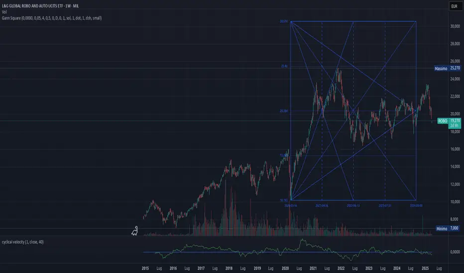
Gann SquareIntroduction
Legendary trader W.D. Gann illuminated the cyclical nature of financial markets, revealing their adherence to predictable patterns rooted in geometry, astronomy, and numerology. With his own trading results as evidence, Gweaklann showcased the efficacy of these principles in uncovering market dynamics, including breakouts, reversals, and crucial price levels acting as support and resistance.
Introducing Gann Square
Gann Square, also known as the Gann Box, stands as a cornerstone of technical analysis, offering traders a powerful tool to decipher market movements and anticipate future price action. Built upon primary angles, notably the 45-degree (1x1 angle) ascending from the origin to the top-right corner and its corresponding negative angle descending from the top-right to the bottom-left corner, Gann Square epitomizes precision and foresight in chart analysis.
Unveiling Points of Setup
Central to Gann Square's functionality is the identification of points of setup. These critical junctures mark significant highs or lows in price movements, serving as pivotal reference points for traders seeking to navigate market shifts and capitalize on emerging opportunities.
Time scale: Calendar or Trading days
A lot of effort was spent to realize a precise relationship between time and price, as angles of price arise with time or with chart bars. The best of these two options is related to the type of instrument used, and is usually could be determines empirically.
For example, consider a ticker that is at market five days per week. By using TradingDays we have a match between candles on the chart and days as time, so the angle arises in a linear way. Instead of using Calendar option, from Monday to Monday we have 7 days, and the algorithm takes care of this and the angle arise faster. Look at the pictures below, with Calendar option there's a little step every time there is day's jump between consecutive candles.
Same square on TradingDays and Calendar
Timeframe independence
In Gann analysis, the correlation between angles and time periods is inherently cyclical, where each degree corresponds to approximately one day, and a full circle of 360 degrees symbolizes a year. This timeless relationship allows Gann indicators to transcend individual timeframes, ensuring consistency while preserving the critical balance between time and price dynamics.
Gann indicators operate seamlessly across multiple timeframes, yet they remain steadfastly anchored to the daily timeframe as the primary reference point. This deliberate choice maintains the integrity of the time-price relationship, essential for accurate analysis and interpretation.
Preserving Proportion Amidst Time Shifts
When an angle intersects a pivot point during a timeframe transition, the Gann indicator upholds its proportional integrity without compromise. Whether examining daily, weekly, or monthly intervals, the indicator seamlessly aligns with pivotal price levels, ensuring continuity and precision in analysis.
Illustrating Consistency in Practice
Visualize the power of timeframe independence through a single Gann fan spanning both daily and weekly intervals. Witness how each angle touches the same pivotal point, meticulously maintaining proportionality across varying timeframes, as depicted in the accompanying illustration.
Same square on daily and weekly
Intraday daily and hourly
Handle TradingView bounds
By placing a square at the limits of the chart you risk going beyond the limits of the TradingView drawable area which is 500 bars in the future. In this case the indicator manages this eventuality by truncating the drawing and trying to calculate the theoretical measurement anyway to draw the angles inside it. This leads to having a square with some geometric errors but still allows you to proceed with the analysis.
Summary of features
Automatic price placement: the indicator look at the trend and decide autonomously if angle starts from candle low or high;
Manual price placement: it's possible to disable automatic placement and specify a start price;
Angle extension to present: draw angle until last available bar;
Extension to future: draw angle and square in the future after the latest available bar ( actual TradingView limit is 500 bars in the future );
Multiple timeframe are supported ( more details below);
Trading days: time is considered in number of bars, for example the ticker AAPL usually has 5 daily bars per week;
Calendar: time is considered in number of days, for example the ticker AAPL usually has 7 days per week;
Future bars: It's possible to draw until 500 bars after the latest ( TradingView bound);
Square over bound handling (explained above);
Operating Instructions
Placing the Gann Square on the chart
When positioning the Gann Square, ensure that the positive square is placed on an important pivot low, while the negative angle should be positioned on a pivot high. By default, the script automatically selects the pivot price based on the trend of the previous candle. However, it's important to note that automatic price selection may not always be accurate, especially in certain market conditions. In such cases, users have the option to manually specify the pivot price.
Exercise caution when using automatic price selection in conjunction with changing timeframes. For instance, the pivot low of a monthly candle may not align perfectly with a daily candle. In such scenarios, it is advisable to either opt for manual price selection or initially place the indicator using the daily timeframe before switching to a wider timeframe, such as monthly.
In intraday trading, transitioning to a daily or wider timeframe while maintaining angle proportionality between timeframes may pose challenges with automatic price selection. In this particular scenario, it is recommended to utilize manual price selection for accuracy.
Furthermore, it's beneficial to differentiate between intraday operations and daily or longer-term operations when utilizing the Gann Square, as each may require distinct considerations and approaches for optimal effectiveness.
Price unit, Factor and divisor
The size of the Gann Square can be customized using the following settings:
Price Unit (Scale) : The Price Unit, also known as the scale, determines the increment along the main angle (45°) of the Gann Square. Adjusting the Price Unit allows you to fine-tune the relationship between price and time, enabling the adaptation of the square to suit the characteristics of any financial instrument.
Factor : The Factor setting provides additional flexibility in adjusting the scale of the Gann Square. By modifying the Factor, you can further refine the proportions of the square to align with specific trading strategies or market conditions.
Divisor : The Divisor setting enables you to divide the square size by a specified factor (e.g., 2, 4, etc.). This feature offers a convenient way to adjust the size of the square while maintaining proportionality and symmetry, enhancing the versatility of the Gann Square tool.
By utilizing these settings in combination, traders can effectively tailor the Gann Square to their preferences and requirements, empowering them to conduct detailed technical analysis and make informed trading decisions across various financial instruments and market environments.
Point of setup
The Gann Square provides settings to divide the square by vertical lines, allowing for enhanced analysis and identification of key points of setup. Users can choose to divide the square by four, by three, or both, providing flexibility in their analysis approach.
Utilizing Vertical Lines
These vertical lines play a crucial role in identifying important candles, price levels, and time intervals where trend reversals or significant market movements may occur. By dividing the square into smaller sections, traders can pinpoint potential areas of interest with greater precision.
Intersection of Angles
The points of setup identified by the vertical lines also correspond to the intersection of various angles drawn on the square. These intersections serve as focal points for analysis, indicating potential shifts in market dynamics and offering valuable insights into future price movements.
By leveraging the point of setup settings and paying attention to the intersection of angles, traders can enhance their understanding of market trends and make more informed trading decisions.
Setting examples
NQ1! (D, W):
price unit: 4, 8
Factor: 1
Square Division: 1
CL1! (D, W):
price unit: 0.5
Factor: 8
Square Division: 0.25
BTCUSD (4h):
price unit: 512
Factor: 1
Square Division: 4
WARNING
This indicator is for educational purpose only. I am in no way responsible for bad setups, strategies and possible losses or gains of money as a result!
Market Structure Volume Distribution [LuxAlgo]The Market Structure Volume Distribution tool allows traders to identify the strength behind breaks of market structure at defined price ranges to measure de correlation of forces between bulls and bears visually and easily.
🔶 USAGE
This tool has three main features: market structure highlighting, grid levels, and volume profile. Each feature is covered more in depth below:
🔹 Market Structure
The basic unit of market structure is a swing point, the period of the swing point is user-defined, so traders can identify longer-term market structures. Price breaking a prior swing point will confirm the occurrence of a market structure.
The tool will plot a line after a market structure is confirmed, by default the lines on bullish MS will be green (indicative of an uptrend), and red in case of bearish MS (indicative of a downtrend).
🔹 Grid Levels
The Grid visually divides the price range contained inside the tool execution window, into equal size rows, the number of rows is user-defined so users can divide the full price range up to 100 rows.
The main objective of this feature is to help identify the execution window and the limits of each row in the volume profile so traders can know in a simple look what BoMS belongs to each row.
There is however another use for the grid, by dividing the range into equal-sized parts, this feature provides automatic support and resistance levels as good as any other.
Grid provides a visual help to know what our execution window is and to associate MS with their rows in the profile. It can provide S/R levels too.
🔹 Volume Profile
The volume profile feature shows in a visually easy way the volume behind each MS aggregated by rows and divided into buy and sell volume to spot the differences in a simple look.
This tool allows users to spot the liquidity associated with the event of a market structure in a specific price range, allowing users to know which price areas where associated with the most trading activity during the occurrence of a market structutre.
🔶 SETTINGS
🔹 Data Gathering
Execute on all visible range: Activate this to use all visible bars on the calculations. This disables the use of the next parameter "Execute on the last N bars". Default false.
Execute on the last N bars: Use last N bars on the calculations. To use this parameter "Execute on all visible range" must be disabled. Values from 20 to 5000, default 500.
Pivot Length: How many bars will be used to confirm a pivot. The bigger this parameter is the fewer breaks of structure will detect. Values from 1, default 2
🔹 Profile
Profile Rows: Number of rows in the volume profile. Values from 2 to 100, default 10.
Profile Width: Maximum width of the volume profile. Values from 25 to 500, default 200.
Profile Mode: How the volume will be displayed on each row. "TOTAL VOLUME" will aggregate buy & sell volume per row, "BUY&SELL VOLUME" will separate the buy volume from the sell volume on each row. Default BUY&SELL VOLUME.
🔹 Style
Buy Color: This is the color for the buy volume on the profile when the "BUY&SELL VOLUME" mode is activated. Default green.
Sell Color: This is the color for the sell volume on the profile when the "BUY&SELL VOLUME" mode is activated. Default red.
Show dotted grid levels: Show dotted inner grid levels. Default true.

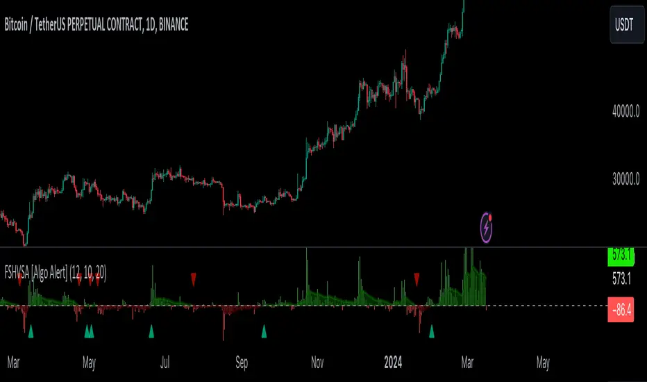
Fourier Smoothed Hybrid Volume Spread AnalysisIndicator id:
USER;91bdff47320b4284a375f428f683b21e
(only relevant to those that use API requests)
MEANINGFUL DESCRIPTION:
The Fourier Smoothed Hybrid Volume Spread Analysis (FSHVSA) indicator is an innovative trading tool designed to fuse volume analysis with trend detection capabilities, offering traders a comprehensive view of market dynamics.
This indicator stands apart by integrating the principles of the Discrete Fourier Transform (DFT) and volume spread analysis, enhanced with a layer of Fourier smoothing to distill market noise and highlight trend directions with unprecedented clarity.
This smoothing process allows traders to discern the true underlying patterns in volume and price action, stripped of the distractions of short-term fluctuations and noise.
The core functionality of the FSHVSA revolves around the innovative combination of volume change analysis, spread determination (calculated from the open and close price difference), and the strategic use of the EMA (default 10) to fine-tune the analysis of spread by incorporating volume changes.
Trend direction is validated through a moving average (MA) of the histogram, which acts analogously to the Volume MA found in traditional volume indicators. This MA serves as a pivotal reference point, enabling traders to confidently engage with the market when the histogram's movement concurs with the trend direction, particularly when it crosses the Trend MA line, signalling optimal entry points.
It returns 0 when MA of the histogram and EMA of the Price Spread are not align.
HOW TO USE THE INDICATOR:
The FSHVSA plots a positive trend when a positive Volume smoothed Spread and EMA of Volume smoothed price is above 0, and a negative when negative Volume smoothed Spread and EMA of Volume smoothed price is below 0. When this conditions are not met it plots 0.
ORIGINALITY & USEFULNESS:
The FSHVSA is unique because it applies DFT for data smoothing, effectively filtering out the minor fluctuations and leaving traders with a clear picture of the market's true movements. The DFT's ability to break down market signals into constituent frequencies offers a granular view of market dynamics, highlighting the amplitude and phase of each frequency component. This, combined with the strategic application of Ehler's Universal Oscillator principles via a histogram, furnishes traders with a nuanced understanding of market volatility and noise levels, thereby facilitating more informed trading decisions.
DETAILED DESCRIPTION:
My detailed description of the indicator and use cases which I find very valuable.
What is the meaning of price spread?
In finance, a spread refers to the difference between two prices, rates, or yields. One of the most common types is the bid-ask spread, which refers to the gap between the bid (from buyers) and the ask (from sellers) prices of a security or asset.
We are going to use Open-Close spread.
What is Volume spread analysis?
Volume spread analysis (VSA) is a method of technical analysis that compares the volume per candle, range spread, and closing price to determine price direction.
What does this mean?
We need to have a positive Volume Price Spread and a positive Moving average of Volume price spread for a positive trend. OR via versa a negative Volume Price Spread and a negative Moving average of Volume price spread for a negative trend.
What if we have a positive Volume Price Spread and a negative Moving average of Volume Price Spread ?
It results in a neutral, not trending price action.
Thus the indicator returns 0.
In the next Image you can see that trend is negative on 4h, neutral on 12h and neutral on 1D. That means trend is negative .
I am sorry, the chart is a bit messy. The idea is to use the indicator over more than 1 Timeframe.
What is approximation and smoothing?
They are mathematical concepts for making a discrete set of numbers a
continuous curved line.
Fourier and Euler approximation of a spread are taken from aprox library.
Key Features:
Noise Reduction leverages Euler's White noise capabilities for effective Volume smoothing, providing a cleaner and more accurate representation of market dynamics.
Choose between the innovative Double Discrete Fourier Transform (DTF32) and Regular Open & Close price series.
Mathematical equations presented in Pinescript:
Fourier of the real (x axis) discrete:
x_0 = array.get(x, 0) + array.get(x, 1) + array.get(x, 2)
x_1 = array.get(x, 0) + array.get(x, 1) * math.cos( -2 * math.pi * _dir / 3 ) - array.get(y, 1) * math.sin( -2 * math.pi * _dir / 3 ) + array.get(x, 2) * math.cos( -4 * math.pi * _dir / 3 ) - array.get(y, 2) * math.sin( -4 * math.pi * _dir / 3 )
x_2 = array.get(x, 0) + array.get(x, 1) * math.cos( -4 * math.pi * _dir / 3 ) - array.get(y, 1) * math.sin( -4 * math.pi * _dir / 3 ) + array.get(x, 2) * math.cos( -8 * math.pi * _dir / 3 ) - array.get(y, 2) * math.sin( -8 * math.pi * _dir / 3 )
Fourier of the imaginary (y axis) discrete:
y_0 = array.get(x, 0) + array.get(x, 1) + array.get(x, 2)
y_1 = array.get(x, 0) + array.get(x, 1) * math.sin( -2 * math.pi * _dir / 3 ) + array.get(y, 1) * math.cos( -2 * math.pi * _dir / 3 ) + array.get(x, 2) * math.sin( -4 * math.pi * _dir / 3 ) + array.get(y, 2) * math.cos( -4 * math.pi * _dir / 3 )
y_2 = array.get(x, 0) + array.get(x, 1) * math.sin( -4 * math.pi * _dir / 3 ) + array.get(y, 1) * math.cos( -4 * math.pi * _dir / 3 ) + array.get(x, 2) * math.sin( -8 * math.pi * _dir / 3 ) + array.get(y, 2) * math.cos( -8 * math.pi * _dir / 3 )
Euler's Smooth with Discrete Furrier approximated Volume.
a = math.sqrt(2) * math.pi / _devided
b = math.cos(math.sqrt(2) * 180 / _devided)
c2 = 2 * math.pow(a, 2) * b
c3 = math.pow(a, 4)
c1 = 1 - 2 * math.pow(a, 2) * math.cos(b) + math.pow(a, 4)
filt := na(filt ) ? 0 : c1 * (w + nz(w )) / 2.0 + c2 * nz(filt ) + c3 * nz(filt )
Usecase:
First option:
Leverage the script to identify Bullish and Bearish trends, shown with green and red triangle.
Combine Different Timeframes to accurately determine market trend.
Second option:
Pull the data with API sockets to automate your trading journey.
plot(close, title="ClosePrice", display=display.status_line)
plot(open, title="OpenPrice", display=display.status_line)
plot(greencon ? 1 : redcon ? -1 : 0, title="position", display=display.status_line)
Use ClosePrice, OpenPrice and "position" titles to easily read and backtest your strategy utilising more than 1 Time Frame.
Indicator id:
USER;91bdff47320b4284a375f428f683b21e
(only relevant to those that use API requests)
Zone TP SL [By Gone]It creates a price zone for TP 3 Level, increasing from the price by 500 points and setting an SL zone of 500 points of the price.
You must enter the price range yourself, recommended to be 500 points apart.
1. select Type Bay And Sell
2. Input Price Start And End
suitable for gold
Made to help with hitting the price zone. For use in making decisions about trading.

Fib Pivot Points HLThis TradingView indicator allows users to select a specific timeframe (TF) and then analyzes the high, low, and closing prices from the past period within that TF to calculate a central pivot point. The pivot point is determined using the formula (High + Close + Low) / 3, providing a key level around which the market is expected to pivot or change direction.
In addition to the central pivot point, the indicator enhances its utility by incorporating Fibonacci levels. These levels are calculated based on the range from the low to the high of the selected timeframe. For instance, a Fibonacci level like R0.38 would be calculated by adding 38% of the high-low range to the pivot point, giving traders potential resistance levels above the pivot.
Key features of this indicator include:
Timeframe Selection: Users can choose their desired timeframe, such as weekly, daily, etc., for analysis.
Pivot Point Calculation: The indicator calculates the pivot point based on the previous period's high, low, and closing prices within the selected timeframe.
Fibonacci Levels: Adds Fibonacci retracement levels to the pivot point, offering traders additional layers of potential support and resistance based on the natural Fibonacci sequence.
This indicator is particularly useful for traders looking to identify potential turning points in the market and key levels of support and resistance based on historical price action and the Fibonacci sequence, which is widely regarded for its ability to predict market movements.
Example:
Suppose you're analyzing the EUR/USD currency pair using this indicator with a weekly timeframe setting. The previous week's price action showed a high of 1.2100, a low of 1.1900, and the week closed at 1.2000.
Using the formula ( High + Close + Low ) / 3 (High+Close+Low)/3, the pivot point would be calculated as ( 1.2100 + 1.2000 + 1.1900 ) / 3 = 1.2000. Thus, the central pivot point for the current week is at 1.2000.
The range from the low to the high is 1.2100 − 1.1900 = 0.0200 1.2100−1.1900=0.0200.
To calculate a specific Fibonacci level, such as R0.38, you would add 38% of the high-low range to the pivot point: 1.2000 + ( 0.0200 ∗ 0.38 ) = 1.2076 1.2000+(0.0200∗0.38)=1.2076. Thus, the R0.38 Fibonacci resistance level is at 1.2076.
Similarly, you can calculate other Fibonacci levels such as S0.38 (Support level at 38% retracement) by subtracting 38% of the high-low range from the pivot point.
Traders can use the pivot point as a reference for the market's directional bias: prices above the pivot point suggest bullish sentiment, while prices below indicate bearish sentiment. The Fibonacci levels act as potential stepping stones for price movements, offering strategic points for entry, exit, or placing stop-loss orders.
SMC Market Structure (MTF)Introducing the Smart Money Concept Market Structure analysis indicator, a sophisticated tool designed to display the true market structure, in multiple timeframes. Inspired by Lewis Kelly's renowned strategy, this indicator offers a unique approach to defining market structure.
It's worth noting that the Smart Money Concept Market Structure analysis indicator employs Lewis Kelly's strategy for swing detection.
However, it differs from other scripts in the market that utilize alternative methods for swing detection.
Some of these alternative methods that are not used by this script (as it doesn't define market structure properly according to Lewis Kelly's rules):
- ignoring previous market swings. New swings are created inside the internal noise, as they don't need a close above or below previous swings.
- considering that a swing detection is a tops/bottoms with pivots (left, right) with HH/LL.
Any existing market structure script using any of the above will lead to a wrong Break of Structure or Change of character detection and may induce traders to wrongly take trades against the true trend (and lose their trades).
This is why none of the listed above is used here, and this distinction also offers traders a diverse range of options to suit their individual trading preferences and styles.
Here's the main principles of how it works that differentiate from other scripts:
- New Swings are detected only if the new candle closes above/below the previous swing.
- A pullback is detected after 3 (by default) candles going in the same direction, against the current trend. The pullback candles do not need to follow each other, but the count is reset when invalidated. The pullback invalidation strategy is not disclosed here.
Also, unlike most indicators out there, the Smart Money Concept Market Structure (MTF) is multi-timeframe, eliminating the need for traders to constantly switch between different timeframes or add additional indicators. This feature enhances efficiency and streamlines the analysis process, allowing traders to focus more on making informed decisions.
It's important to understand that this indicator is fundamentally based on price action and is not specifically designed to detect market manipulations. Therefore, it should be used in conjunction with your own analytical skills and expertise to derive optimal trading strategies.
While still in its development phase, the indicator may receive updates and new features in the future to further enhance its functionality and usability.
Some of these new features may also not be implemented by existing market structure scripts.
If you have any question or need for new features, please feel free to ask them.
Also, it is recommended to compare the results of this indicator and other existing ones to see which is the most suitable to your trading style.
In the meantime, Enjoy !
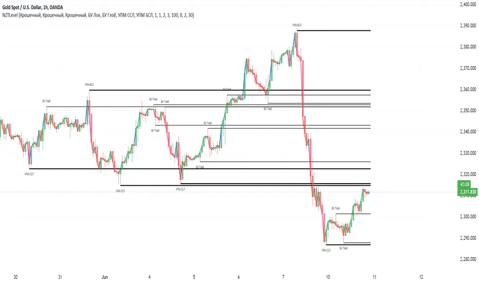
NZTLevelDESCRIPTION IN ENGLISH
🔶 INTRODUCTION
NZTLevel is an advanced indicator for TradingView, inspired by mentor Almaz , and designed to provide traders with in-depth analysis of market liquidity and the movements of key players.
🔶 CONTENT
Based on an analysis based on liquidity and tracking a key player , the indicator identifies Breaker levels and UPM (MarketMaker Position Level in RU), which help determine potential pivot points and market direction (trend) , and also shows a direction line , giving information about the state in which each candle is located on the chart (effort, consolidation or normal trend movement without effort), as well as the transparency of the candles , made specifically so that the direction line is clearly and clearly visible.
🔶 LOGIC
🔹Breaker Levels (Local and Global)
Breaker levels , divided into local and global , are identified through a detailed algorithm that takes into account the penetration of levels with high liquidity and the expected subsequent reaction of the market. These levels are visualized on the chart as lines, the color and thickness of which are customizable by the user, providing a clear understanding of the current market situation. Breaker levels allow us to determine the direction of the market , these are the levels from which we can expect a reaction, and after breaking through this level we receive valuable information
🔹UPM (Sell Stop and Buy Stop)
UPM monitors the activity of market makers and helps predict significant market movements . For example, if the last UPM indicates a buy stop, this signals the possibility of long positions, which is extremely valuable for traders looking to optimize their entries and manage risk.
🔹Directional line (Линия направленности)
The Indicator also includes a directional line that changes color depending on the strength and direction of the current movement , providing a visual representation of market trends and consolidation.
🔶 SETTINGS
🔹Text (Текст)
Allows you to configure or turn off/on the display of level text, specifying their type with text at the beginning of the level drawing (labels), as well as its size, the color of the level text at the top or bottom separately.
🔹Levels (Уровни)
Allows you to configure or turn off/on the display of the levels themselves, their color, thickness. As well as the number of penetrations of the level to remove it, as well as the number of candles for consideration and analysis by the indicator on the chart.
🔹Directional Line (Линия направленности)
Allows you to adjust the thickness of this line; you can disable it in the style tab.
🔹Graph and Candle Settings (Настройки графика и свечей)
Allows you to configure how many candles to extend the level to the right, the transparency of candles (can be disabled in styles), default colors of candles (for setting transparency)
🔶 RECOMMENDATIONS FOR USE
Customize the visual display of the indicator through the built-in settings, including the colors of the liquidity lines and their thickness.
NZTLevel surpasses basic indicators such as moving averages, Bollinger Bands, RSI, and others with a unique approach to analyzing liquidity and positioning of major players, providing traders with a comprehensive tool for making informed decisions in the market.
The indicator was developed by Temirlan Tolegenov for NZT Trader Community , March 2024, Prague, Czech Republic
ОПИСАНИЕ НА РУССКОМ ЯЗЫКЕ
🔶 ВСТУПЛЕНИЕ
NZTLevel — это продвинутый индикатор для TradingView, вдохновленный ментором Алмазом , и разработанный с целью предоставить трейдерам глубокий анализ рыночной ликвидности и движения крупных игроков.
🔶 СОДЕРЖАНИЕ
На основе анализа, основанном на ликвидности и отслеживании крупного игрока , индикатор выявляет Брейкер уровни и УПМ (Уровень Позиции МаркетМейкера) , которые помогают определить потенциальные точки разворота и направленность рынка , а так же показывает линию направленности , дающую информацию о состоянии в которой находится каждая свеча на графике (усилие, консолидация или обычное трендовое движения без усилия), а так же прозрачность свечей , сделанная специально для того, чтобы линия направленности была ясно и четко видима.
🔶 ЛОГИКА
🔹Брейкер Уровни (Локальные, Глобальные)
Брейкер уровни , подразделяются на локальные и глобальные , идентифицируются через детализированный алгоритм, учитывающий пробитие уровней с высокой ликвидностью и ожидаемую последующую реакцию рынка. Эти уровни визуализируются на графике в виде линий, цвет и толщина которых настраиваются пользователем, предоставляя четкое понимание текущей рыночной ситуации . Брейкер уровни позволяют нам определить настроение и направлениедвижения рынка , это уровни, от которых мы можем ожидать реакции, и после пробития которых мы получаем ценную информацию .
🔹УПМ (Бай стоп, Селл стоп)
УПМ отслеживает активность МаркетМейкеров и помогает проанализировать значительные рыночные движения . К примеру если последний УПМ указывает на бай стоп, это сигнализирует о возможности длинных позиций, что чрезвычайно ценно для трейдеров, стремящихся к оптимизации своих входов и управлению рисками.
🔹Линия направленности
Так же Индикатор включает линию направленности , которая изменяет цвет в зависимости от силы и направления текущего движения , предоставляя наглядное представление о трендах и консолидации рынка.
🔶 НАСТРОЙКИ
🔹Текст
Позволяет настроить или выключить/включить отображение текста уровней, уточняющий их тип текстом у начала отрисовки уровня (labels), так же его размер, цвет текста уровня сверху, или снизу отдельно.
🔹Уровни
Позволяет настроить или выключить/включить отображение самих уровней, их цвет, толщину. А так же количество пробитий уровня для его удаления, как и количество свеч для рассмотрения и анализа индикатором на графике.
🔹Линия направленности
Позволяет настроить толщину этой линии, отключить ее можно во вкладке style (стиль)
🔹Настройки графика и свечей
Позволяют настроить то, на сколько свеч протягивать уровень направо, прозрачность свечей (можно отключить в стилях (style)), цвета свечей по умолчанию (для настройки прозрачности)
🔶 РЕКОМЕНДАЦИИ К ИСПОЛЬЗОВАНИЮ
Настроить визуальное отображение индикатора через встроенные настройки, включая цвета линий ликвидности и их толщину.
NZTLevel превосходит базовые индикаторы, такие как скользящие средние, Bollinger Bands, RSI, и другие, благодаря уникальному подходу к анализу ликвидности и позиционирования крупных игроков, предоставляя трейдерам комплексный инструмент для принятия обоснованных решений на рынке.
Индикатор разработан Темирланом Толегеновым для международного сообщества NZT Trader , Март 2024, Прага, Чешская Республика
The indicator is published in accordance and respect to all House Rules of the TradingView platform.
Индикатор опубликован в соответствии и уважением ко всем внутренним правилами платформы TradingView.
Previous Day High Low Close By Anil ChawraHow Users Can Make Profit Using This Script:
1. Calculate the difference between the previous day's high and low prices to determine the price range.
2. Identify if today's close price is significantly higher or lower than the previous day's close price.
3. If today's close price is at least 10 points higher than the previous close, consider a potential buy signal.
4. If today's close price is at least 10 points lower than the previous close, consider a potential sell signal.
5. These signals indicate potential profit opportunities based on significant price movements.
6. Users should verify market conditions and perform additional analysis before executing trades.
7. Monitoring price action and volume can help confirm the validity of these signals.
8. Implementing stop-loss orders can help mitigate risks associated with trading based on price movements.
9. Regularly reviewing and adjusting trading strategies based on market conditions is essential for long-term success.
10. Exercise caution and discipline when trading, and consider seeking advice from financial professionals if needed.
How the Script Works:
1. The strategy analyzes the high, low, and close prices of the previous trading day.
2. It calculates the range of prices by subtracting the low from the high.
3. The close price of the current trading day is compared to the previous day's close.
4. If today's close is significantly higher than yesterday's close, it could indicate bullish sentiment.
5. Conversely, if today's close is significantly lower, it could suggest bearish sentiment.
6. A threshold, typically 10 points, is set to identify significant price movements.
7. If today's close is at least 10 points higher, it triggers a potential buy signal.
8. If it's at least 10 points lower, it triggers a potential sell signal.
9. Users can act on these signals to enter or exit trades for potential profit.
10. Regular monitoring, risk management, and market analysis are essential for effective implementation of this strategy.

Pivot Length BandsPivot Length Bands Indicator
Description:
The Pivot Length Bands indicator is designed to visualize price volatility based on pivot points and ATR-adjusted pivot points. I. These bands can help traders identify potential support and resistance levels and assess the current volatility of the market.
Inputs:
Swing Length: The length of the swing used to calculate the pivot points and average true range.
Pivot Length Left Hand Side: The number of candles to the left of the current pivot point to consider when calculating the pivot high and low.
Pivot Length Right Hand Side: The number of candles to the right of the current pivot point to consider when calculating the pivot high and low.
Usage:
Traders can use the bands as potential levels for placing stop-loss orders or profit targets.
The width of the bands adjusts dynamically based on the current volatility of the market.
Note:
This indicator is best used in conjunction with other technical analysis tools and should not be relied upon as a standalone trading signal.
EXAMPLE 1:
Entry:
Exit:
EXAMPLE 2:
Entry:
Exit:

LevelUp^ AlphaLevelUp Alpha is a collection of tools designed in collaboration with Brian Shannon, CMT, creator of the anchored VWAP (AVWAP) and the author of two best-selling books on technical analysis. This indicator is focused on tools and techniques that Brian uses in both his analysis and trading.
LevelUp Alpha Goals
One primary goal of LevelUp Alpha was to create an indicator with tools and visuals that mimic Brian's preferred chart layouts. For example, the default lengths/colors for AVWAP, 5-day moving average and vertical lines where moving averages begin, are all aligned with Brian's approach to technical analysis. Through this educational process, one can learn how to effectively use AVWAP and other intraday tools to properly manage trades and adhere to sound risk management principles. At any point, the indicator can be customized to match one's preferred layout, colors and trading style.
Trend Alignment - Multiple Timeframe Analysis
As trend followers, we look for stocks in an established uptrend. This starts with reviewing stocks on weekly and/or daily charts. From there, we focus on lower timeframes using intraday charts, with the objective to verify alignment between the timeframes.
Important Note: The majority of tools in LevelUp Alpha are for lower timeframes (intraday) analysis as this is where potential trade setups, entries and exits (stops) are often determined.
Key Features:
▪ AVWAP auto-anchored on 1-day, 2-day, week-to-date and month-to-date (for intraday charts).
▪ AVWAP works with any exchange around the globe, respecting trading days, hours and holidays.
▪ AVWAP works with the TradingView Replay feature, facilitating historical and post-mortem analysis.
▪ 5-day moving average auto-calculated based on the chart timeframe.
▪ 5-day moving average auto-adjusts the minutes in the trading day for crypto and futures.
▪ View up to three daily moving averages on intraday charts, including optional price data.
▪ Anticipate moving average direction based on vertical lines placed at the first bar for each moving average.
▪ Pivot points, aka floor trader pivots or support/resistance levels (R1/S1, R2/S2, etc).
▪ Highlight current and prior day highs/lows with line and price data as these are areas of potential support and resistance.
▪ Table of stats for AVWAP, current and prior day highs/lows, and pivot point price levels, helpful for entries, exits and stops.
▪ Custom alerts for all AVWAPs and pivot points.
AVWAP
The Volume Weighted Average Price (VWAP) is the cumulative average price a stock traded for one day. AVWAP is the same as the VWAP with the exception that the start point (the anchor) is configurable based on a trader's preference, not simply the start of the trading day. From the anchor point forward, on each bar, AVWAP is calculated based on the cumulative volume and average price.
The AVWAP shows the relationship between price and volume over any time period based on the anchor point. At a glance we can see who is in control, the buyers (bulls) or the sellers (bears).
AVWAP Concepts:
▪ When a stock is above an advancing AVWAP, buyers are in control for that timeframe, as the average price is increasing.
▪ When prices are below a declining AVWAP, sellers are in control for that timeframe, as the average price is declining.
▪ When prices oscillate above and below the AVWAP it indicates indecision for that timeframe.
What's unique about AVWAP in this indicator is that it is auto-anchored on 1-day, 2-day, week-to-date and month-to-date. In addition, LevelUp Alpha supports any exchange around the globe, respecting trading days, hours and holidays. You can also use the TradingView replay feature with this indicator, a powerful tool for historical and post-mortem analysis.
AVWAP Auto-Anchor: 1-day, 2-day, week-to-date and month-to-date
AVWAP and TradingView Replay: Review Historical Data and Past Trades
Saudi Exchange (Tadāwul): Trading Days, Sunday to Thursday, 10:00am to 3:00pm
Auto-Anchor: Detects Trading Days
London Stock Exchange (LSE): Trading Days, Monday to Friday, 8:00am to 4:30pm
Auto-Anchor: Detects U.K. Bank Holiday
5-Day Moving Average
When using AVWAP, we look for stocks where the trend of the 50-SMA is higher. We follow this by reviewing lower timeframes (intraday charts) to see if the price action is setting up for a low risk trade by verifying the shorter timeframes align with the longer. As we look at various timeframes, we need to make sure the moving average is consistent across the timeframes, which is done via the 5-day moving average as explained by Brian:
"If you want to see a five DAY moving average on a chart with 10 minute candles, you have to consider how many 10 minute periods of trading there are in the trading day. The US equities markets are open from 9:30- 4:00 each day, which is 6.5 hours per trading day. In each hour of trading, there are 6-10 minute periods, so during the regular session for equities, the market is open for 390 minutes or 39-10 minute periods per day. If we are to get a five day moving average, we would take the 39-10 minute periods the market is open each day and then multiply that by five days. 39 x 5 = 195. So a 5 DAY moving average is represented by a 195 PERIOD moving average when looking at a 10 minute timeframe."
In LevelUp Alpha, the default value for the minutes per day is 390, the number of minutes in one trading day in the U.S. This value can be changed to match any exchange. For example, if trading the India National Stock Exchange (NSE), which is open from 9:30am to 3:30pm, the minutes per day would be set to 375.
As trend followers, our goal is to find stocks where the 5-day moving average is trending up.
5-Day Moving Average Trending Up
When viewing charts of crypto or futures, the minutes per trading day will be auto-adjusted as follows:
• Crypto: 1440 minutes per day based on 24 hrs per day.
• Futures: 1380 minutes per day based on 23 hrs per day - S&P 500 E-mini Futures (ES1!) & NASDAQ 100 E-mini Futures (NS1!)
Important Note: Based on the math as described above using the minutes in the trading day, there will be chart timeframes where the 5-day moving average is not shown. If you have the 5-day moving average enabled from within the indicator Settings, yet the 5-day line is not visible, try changing to another timeframe.
Moving Averages
There are three configurable daily moving averages, including the option to use simple or exponential calculations. These daily moving averages can be viewed on intraday charts as they can often act as areas of support or resistance. There is also an option to smooth the daily moving average when they are shown on an intraday chart.
Daily 10-SMA on Intraday Chart - Acting as Support
Auto-smoothing feature is off.
Daily 20-SMA on Intraday Chart - Acting as Support
Auto-smoothing feature is on.
Vertical Lines - Anticipating Direction
By placing vertical lines at the starting bar where a moving average calculation begins, one can anticipate the direction of the moving average by viewing the trend of the bars that will fall off the moving average as new bars are added. This can be helpful to gauge if the trend will continue in its current trajectory or begin to move in a different direction.
Intraday Chart
Daily Chart
S&P 500 E-mini Futures (ES1!)
Crypto
Pivot Points
Pivot points are intraday price levels that may act as areas of support or resistance. These pivot points were initially created by floor traders operating within the trading pits of the equity futures exchange in Chicago.
The calculations for determining these pivots are based on the prior days high, low and close:
Pivot (P) = (prevHigh + prevLow + prevClose) / 3
Resistance R1 = (2 * P) - prevLow
Support S1 = (2 * P) - prevHigh
Resistance R2 = P + (prevHigh - prevLow)
Support S2 = P - (prevHigh - prevLow)
Resistance R3 = prevHigh + (2 * (pivot - prevLow))
Support S3 = prevLow - (2 * (prevHigh - pivot))
R1 Acting as Resistance
S2 Acting as Support
Prior Day High and Low
With LevelUp Alpha you can show horizontal lines at both the prior day high and low values. This makes it easy to visualize the prior day's trading range in anticipation of potential areas of support or resistance. These area can also be potential points for entering, exiting or profit taking.
Current Day High and Low
In a similar manner to prior day high and low values, you can also view the current day high and low. Notice in the chart below that you can easily see inside days and watch the price action in real-time.
Tables for AVWAP and Pivot Stats
To make it easy to quickly determine potential entries, exits and stops, as well as areas of support or resistance, key values can be shown in a table. The table contents are configurable, with options to include: AVWAP, current day and prior day highs/lows as well as pivot points.
AVWAP Color Coded & Pivot Points
Current Day High/Low and Prior Day High Low
Custom Alerts
There are alert options for all AVWAP values as well as resistance levels R1, R2 and support levels S1 and S2.
Acknowledgements
Many thanks to Brian Shannon for sharing his expertise on technical analysis and risk management, as well as providing feedback and suggestions on the indicator.

Fibonacci Entry SignalsЭтот индикатор "Fibonacci Entry Signals" помогает определить точки входа в покупку и продажу на основе уровней Фибоначчи и скользящей средней.
Ключевые особенности:
Уровни Фибоначчи: Индикатор рисует на графике несколько уровней Фибоначчи, таких как 38.2%, 50% и 61.8%. Эти уровни определяются на основе крайних точек цены за последние 100 баров. Уровень 0% соответствует самой низкой точке, а уровень 100% - самой высокой.
Точки входа: При наступлении условий входа в покупку или продажу, индикатор отмечает на графике точки входа в виде треугольников вверх или вниз соответственно. Условия входа в покупку определяются, когда цена пересекает уровень Фибоначчи 38.2% вверх и находится выше скользящей средней за последние 50 баров. Условия входа в продажу аналогичны, но цена пересекает уровень Фибоначчи 61.8% вниз.
Этот индикатор может быть полезен для трейдеров, которые используют уровни Фибоначчи в своей торговой стратегии и ищут точки входа в рынок. Однако, перед использованием на реальном счете, рекомендуется провести тщательное тестирование и адаптацию к своим индивидуальным потребностям и стратегии торговли.
Давайте рассмотрим, как пользоваться индикатором "Fibonacci Entry Signals":
Установка на график: Для начала необходимо добавить индикатор на график вашего торгового актива. Вы можете сделать это, выбрав его из списка индикаторов в торговой платформе.
Интерпретация уровней Фибоначчи: Индикатор отображает на графике несколько уровней Фибоначчи, таких как 38.2%, 50% и 61.8%. Понимание этих уровней поможет вам определить возможные точки входа в рынок. Обычно, уровень 38.2% используется как уровень поддержки, а уровень 61.8% - как уровень сопротивления.
Точки входа в покупку и продажу: Индикатор помогает определить моменты, когда можно войти в покупку или продажу. При наступлении условий входа в покупку, индикатор отмечает на графике точку входа в виде зеленого треугольника вверх. При наступлении условий входа в продажу, индикатор отмечает точку входа на графике в виде красного треугольника вниз.
Управление позициями: После получения сигнала от индикатора, решение о входе в позицию остается за вами. Важно помнить, что индикатор является только инструментом, который помогает в принятии решений, и его сигналы всегда следует подтверждать другими аспектами вашей торговой стратегии, такими как подтверждение другими индикаторами или анализ фундаментальных данных.
Тестирование и адаптация: Прежде чем использовать индикатор на реальном счете, рекомендуется провести тщательное тестирование на исторических данных и адаптировать его к своим индивидуальным торговым потребностям и стратегии.
Индикатор "Fibonacci Entry Signals" может быть полезным инструментом для трейдеров, которые используют уровни Фибоначчи в своей торговой стратегии и ищут точки входа в рынок.
his "Fibonacci Entry Signals" indicator helps identify entry points for buying and selling based on Fibonacci levels and moving averages.
Key features:
Fibonacci Levels: The indicator draws several Fibonacci levels on the chart, such as 38.2%, 50%, and 61.8%. These levels are determined based on the extreme price points over the last 100 bars. The 0% level corresponds to the lowest point, and the 100% level corresponds to the highest point.
Entry Points: When conditions for buying or selling occur, the indicator marks entry points on the chart as upward or downward triangles, respectively. Entry conditions for buying are determined when the price crosses above the 38.2% Fibonacci level and remains above the 50-bar moving average. Entry conditions for selling are similar, but the price crosses below the 61.8% Fibonacci level.
This indicator can be useful for traders who use Fibonacci levels in their trading strategy and look for entry points in the market. However, before using it on a real account, it is recommended to conduct thorough testing and adaptation to your individual trading needs and strategy.
Let's look at how to use the "Fibonacci Entry Signals" indicator:
Installation on the Chart: First, you need to add the indicator to the chart of your trading asset. You can do this by selecting it from the list of indicators in the trading platform.
Interpreting Fibonacci Levels: The indicator displays several Fibonacci levels on the chart, such as 38.2%, 50%, and 61.8%. Understanding these levels will help you identify potential entry points in the market. Usually, the 38.2% level is used as support, and the 61.8% level is used as resistance.
Entry Points for Buying and Selling: The indicator helps identify moments when you can enter buying or selling positions. When conditions for buying occur, the indicator marks the entry point on the chart as a green upward triangle. When conditions for selling occur, the indicator marks the entry point on the chart as a red downward triangle.
Position Management: After receiving a signal from the indicator, the decision to enter a position is up to you. It's important to remember that the indicator is just a tool to help you make decisions, and its signals should always be confirmed by other aspects of your trading strategy, such as confirmation from other indicators or fundamental analysis.
Testing and Adaptation: Before using the indicator on a real account, it's recommended to conduct thorough testing on historical data and adapt it to your individual trading needs and strategy.
The "Fibonacci Entry Signals" indicator can be a useful tool for traders who use Fibonacci levels in their trading strategy and look for entry points in the market.

Vanitati's Market Scope=========================================================
How to Use the Indicator
=========================================================
Configuration: Begin by setting the session times to match your trading interests. Customize the colors and styles according to your preferences.
Observation: Watch for the high and low markers of each session to form the initial balance. Note how the price moves in relation to these levels.
Action: Pay special attention to God Candles and engulfing patterns, especially when they coincide with high volume. These may offer trading signals in line with your strategy.
Adjustment: Regularly review and adjust the settings (e.g., session times, lookback periods) based on market conditions and your trading performance.
=========================================================
Initial Balance (IB) Settings:
=========================================================
Purpose: Marks the high and low of a specific trading session to indicate the initial range of market movement.
Usage: Customize session times for New York (NY), London (LN), and Tokyo (TK) to see the initial balance of each. Colors for the high, low, and mid-point lines can be adjusted.
Practical Application: Traders can use these lines to gauge market volatility or breakouts outside of these initial ranges.
=========================================================
Session Settings and Session Highlight Boxes
=========================================================
Purpose: Highlights trading sessions with customizable background colors and border styles, allowing for a quick visual reference of market sessions.
Usage: Set the times for NY, London, and Tokyo sessions along with desired background colors to have these periods visually marked on the chart.
Practical Application: Helps in identifying the overlap between major market sessions and potential increases in trading volume and volatility.
=========================================================
God Candle Settings
=========================================================
Purpose: Identifies significantly large and voluminous candles, known as "God Candles", which could signal strong market movements.
Usage: Adjust the lookback period, line length, and volume criteria to define what constitutes a God Candle. These settings also allow for the display of diamonds on bars that meet certain criteria but are not classified as God Candles.
Practical Application: These candles can signal strong buying or selling pressure and might be used as potential entry or exit points based on the trader's strategy.
=========================================================
Additional Features
=========================================================
Session Time Filters: Allows for filtering signals based on the time of day, useful for focusing on specific market hours.
Engulfing Pattern Detection: The script includes logic to identify bullish and bearish engulfing patterns, adding another layer of analysis for potential trading opportunities.
Volume Analysis: Incorporates volume into the analysis of God Candles and engulfing patterns to identify significant market movements.
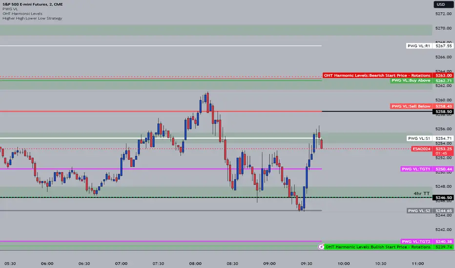
OHT Harmonic LevelsHarmonic Level plotter I've been talking about on the discord - right now a lot of this is manual and some day maybe we can get it to be automatic across different time frames but that is probably far off in the future.
For now, you need to probably create a new tab/layout for each instrument you add this to. It will then ask for the long start price and short start price. I would like to leave this how it is as I don't like using the top of pivot points, its lazy and you don't learn to go find the current trend.
The levels have an area around them equal to 10% of the rotation size, so if NQ has a rotation size of 60, there is a 6pt area around the actual level to either size to account for rotation average changes.
DWM S/R levels (blockFlow)What the script does:
This script dynamically identifies and displays support and resistance levels for daily, weekly and monthly timeframes. These levels are untapped , meaning the respective candle (daily/weekly/monthly) did not close below the support or above the resistance level. They serve as potential liquidity pools due to positions accumulated by traders around these points.
How It works:
The script calculates the levels based on historical price data. It uses a sophisticated algorithm to detect pivot points in the price action, which are then classified as either support or resistance levels. These levels are determined for daily (D), weekly (W), and monthly (M) timeframes and are drawn on the chart as horizontal rays. The script is configurable, allowing users to show or hide levels for each timeframe, adjust the sensitivity of level detection, and limit the lookback period to minimize clutter.
The algorithm works as follows:
* Pivot Point Detection and Integrity Check: The algorithm begins by identifying pivot points, which are potential turning points in price action across daily, weekly, and monthly timeframes. A critical part of this process is ensuring that these levels have not been breached - meaning, for support levels, the price has not closed below them, and for resistance levels, the price has not closed above them. This integrity check helps filter out levels that might have lost their significance for future price movements.
* Classification Based on Price Movement and Level Integrity: After identifying a pivot point, the script classifies it based on the direction of price movement and confirms that the level still holds, indicating it hasn't been breached. This approach ensures that the levels marked are current and relevant, reflecting areas where the market sentiment might shift, leading to potential entry or exit points for traders.
* Drawing and Adjusting Levels on the Chart: The script then draws horizontal rays to represent these levels of support or resistance that have maintained their integrity. It offers customization options for these lines and ensures they are dynamically updated with new market data.
* Minimizing Chart Clutter with Relevant Levels: To keep the chart focused and useful, the script includes features to hide levels that are no longer relevant or are significantly far from the current price. This decluttering is based on user-defined settings that allow traders to focus on the most actionable levels—those that have not been breached and are in close proximity to the current price.
* Efficiency in Handling Data and Levels: Through the use of efficient data structures and matrices, the script ensures that only levels that are currently valid and have not been breached are maintained and displayed. This efficiency is crucial for the script's performance, particularly when dealing with large volumes of historical data across multiple timeframes.
How to use It:
* Interpreting Levels: Once the script is active, it will display the calculated support and resistance levels on the overlay of your chart. These levels can guide entry and exit points, set stop-loss orders, or identify potential breakout or breakdown areas.
* Configure Settings: The out-of-box settings are usually fine but there are options to choose which levels to display (daily, weekly, monthly), set colors for each level, and define how far back in time the script should look to identify these levels. You can also hide distant levels to reduce clutter
What makes It original:
The originality of this script lies in its multifaceted approach to identifying support and resistance levels across different timeframes, all within a single indicator. It combines the practical utility of daily, weekly, and monthly levels with advanced customization options, such as the ability to minimize chart clutter through a percentage-based visibility threshold. Moreover, its built-in functionality to adjust the sensitivity of level detection and the capacity to limit historical lookback provide users with a highly tailored tool, making it a unique addition to any trader's arsenal.

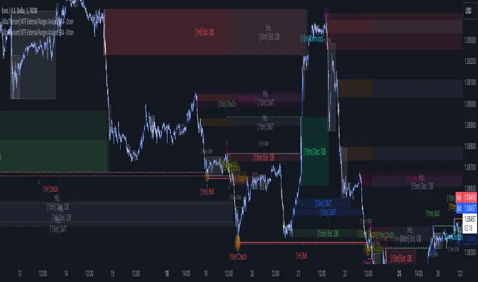
[AlbaTherium] MTF External Ranges Analysis - ERA-Orion for SMC MTF External Ranges Analysis - ERA - Orion for Smart Money Concepts
Introduction:
The MTF External Ranges Analysis - ERA - Orion offers enhanced insights into multi-timeframe external structure points, swing structure points, POIs (Points of Interest), and order blocks (OB) . By incorporating this enhancement, your multi-timeframe analysis are streamlined, simplifying the process and reducing chart workload, no need for manual chart drawing anymore, stay focus on Low Time Frame and get High Time Frame insights in one single Time frame.
This identification process remains effective even when focusing on Lower Time Frames (LTF), providing detailed insights without sacrificing the broader market perspective.
The MTF External Ranges Analysis - ERA – Orion is specifically designed to be used in conjunction with OptiStruct™ Premium for Smart Money Concepts . This strategic combination enhances the workflow of identifying optimal entry points. OptiStruct acts as the analysis tool for Lower Time Frames (LTF), zeroing in on immediate interest areas, while Orion expands this analysis to Higher Time Frames (HTF), providing a broader view of market trends and importants key levels . The integration of Orion with OptiStruct seamlessly merges LTF and HTF analyses, ensuring a thorough understanding of market dynamics for informed and strategic decision-making. This toolkit in one package assembly is pivotal for traders relying on Smart Money Concepts, offering unmatched clarity and actionable insights to navigate the markets effectively.
This tool offers an advanced smart money technical analysis to improve your trading experience. It introduces four key concepts:
Main Features:
Entries Enhancements
Inducements HTF
High/Low Markings HTF
Multiple Timeframes and Confluences on Extreme, Dec and SMT Order Blocks
By integrating these concepts into one, traders can identify high-probability zones across multiple timeframes and develop a thorough understanding of market dynamics. These confluence zones enhance order block skills and potential, establishing them as essential pillars in smart money trading strategies and enabling traders to make more informed decisions.
Settings Overview:
HTF Settings Enable HTF Analysis
Select timeframe {Select or 4H Chart}
Labels Alignment for Lines and Boxes
Inside bar ranges HTF
Break of Structure /Change of Character HTF
Inducements HTF
High/Low Markings HTF
High/Low Sweeps HTF
Extreme Order Blocks HTF
Decisional Order Blocks HTF
Smart Money Traps HTF
IDM Demands and Supplies HTF
Historical Order Blocks HTF
OB Mitigation HTF {touch/ extended}
Understanding the Features:
Chapter 1: Entries Enhancements
In this chapter, we delve into strategies to refine trading entries, focusing on the multi-timeframe analysis of extreme or decisional order blocks in the High Time Frame timeframe as a key point of interest. We highlight the significance of transitioning to the Low Time Frame chart for observing pivotal shifts in market behavior. By examining these concepts, traders can gain deeper insights into market dynamics and make more informed entries decisions at critical junctures.
Practical Example:
We had an Order Block Extreme on the 1-hour timeframe, and currently, we are on the recommended chart for trade entry, which is the 5-minute timeframe. We are patiently waiting to observe a 5-minute ChoCh in the market to enter a buying position since it's an OB Extreme Demand on the 1-hour timeframe. Here, it's crucial and important to focus on the entry timeframe rather than checking what's happening in the higher timeframe. The indicator facilitates this task as it provides us with real-time perspective and visibility of everything happening in the higher timeframe.
Chapter 2: Inducements HTF
It is important and useful to be aware of the various liquidity points across the different timeframes we use; sometimes, a reliable entry point in the Lower Time Frame (LTF) may be surrounded by inducements. Consequently, this point becomes unreliable, and prior to the arrival of this functionality, such anomalies could not be detected, especially when focusing on the market in the LTF. From now on, there will be no more such issues.
Practical Example:
Suppose we identify an Order Block Extreme on the 5M timeframe, indicating a potential entry level. However, when we switch to the 5M timeframe to look for an entry point, we observe an accumulation of inducements around this Order Block coming from a higher timeframe, whether it's M15 or H1. This suggests a potential weakness in the entry point and significant market liquidity, which will act as a trap zone. Before the introduction of this feature, we might have missed this crucial observation, but now we can detect these anomalies and adjust our strategy accordingly.
The only practical way to see theses confluences is to use this Indicator, see the example below
Chapter 03: High/Low – Bos - ChoCh Markings HTF
The High/Low Markings HTF feature in the MTF External Ranges Analysis - ERA - Orion provides a comprehensive view into the market's heartbeat across different timeframes, right from within the convenience of the Lower Time Frame (LTF). It meticulously highlights pivotal shifts, allowing traders to seamlessly discern market sentiment and anticipate potential price reversals without needing to toggle between multiple charts. This innovation ensures that critical market movements and sentiment across various timeframes are visible and actionable from a single, focused LTF perspective, enhancing decision-making and strategic planning in trading activities.
Understanding High/Low Markings in HTF Analysis
High/Low Markings in High Time Frame (HTF) analysis mark the market's extremities within a given period, pinpointing potential areas for reversals or continuation and delineating crucial support and resistance levels. These markings are not arbitrary but represent significant market responses, serving as essential indicators for traders and analysts to gauge market momentum and sentiment.
The Role of HTF in Market Analysis
HTF analysis extends a comprehensive view over market movements, distinguishing between ephemeral fluctuations and substantial trend shifts. By scrutinizing these high and low points across wider time frames, analysts can unravel the underlying market momentum, enabling more strategic, informed trading decisions.
Identifying High/Low Markings
Identifying these crucial points entails detailed chart analysis over extended durations—daily, weekly, or monthly. The search focuses on the utmost highs and lows within these periods, which are more than mere points on a chart. They are significant market levels that have historically elicited robust market reactions, serving as key indicators for future market behavior.
Real-world Example:
Chapter 04: Multiple Timeframes and Confluences on Extreme, Dec and SMT Order Blocks Across HTF
The Orion indicator serves as a bridge between the multiple dimensions of the market, enabling a unified and strategic interpretation of potential movements. It's an indispensable tool for those seeking to capitalize on major opportunity zones, where the convergence of diverse perspectives creates ideal conditions for significant market movements.
Designed to navigate through the data of different timeframes and market analysis, Orion provides a clear and consolidated view of major points of interest. With this indicator, traders can not only spot opportunity zones where consensus is strongest but also adjust their strategies based on the dynamic interaction of various market participants, all while remaining within the Lower Time Frame (LTF).
Conclusion:
MTF External Ranges Analysis - ERA - Orion for Smart Money Concepts as “ The Orion ” indicator captures consensus among scalpers, day traders , swing traders, and investors, turning key areas into major opportunities. It allows for precise identification of areas of interest by analyzing the convergence of actions from various market participants. In short, Orion is crucial for detecting and leveraging the most promising points of convergence in the market.
This identification occurs even while focusing on Lower Time Frames (LTF), allowing for detailed insights without losing the broader market perspective.
This document provides an extensive overview of MTF External Ranges Analysis - ERA - Orion , emphasizing its importance in comprehending market dynamics and utilizing essential smart money concepts trading principles.
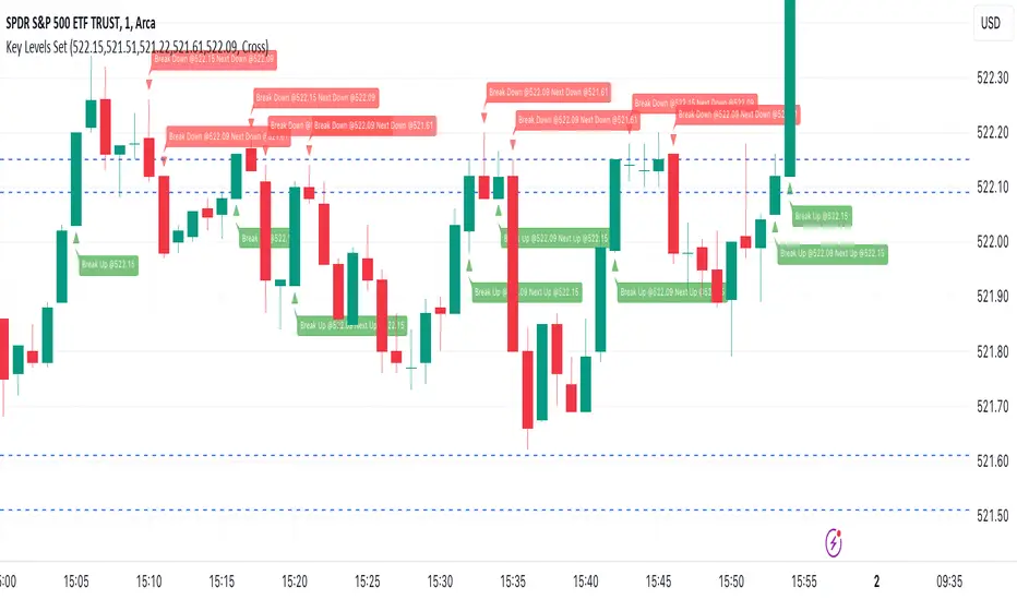
Key Levels SetKey Levels Set allows to set key levels as comma separated values, and to detect breaks to the downside and/or upside, taking into account potential gaps between bars.
This indicator can be very handy if you, like me, rely on some key levels that you identified as potential support/resistance from some technical analysis.
Features
+ It allows for key levels to be set as comma separated values.
+ It draws key levels on chart.
+ On close, it identifies highest key level that has been broken to the upside, if any.
+ On close, it identifies lowest key level that has been broken to the downside, if any.
+ In Cross mode, as bar is printing, it also detects highest/lowest key levels being broken to the upside/downside between bar high and low, if any.
+ It plots and labels breaks with current level and next level information.
+ It includes alerts from breaks on close.
+ It includes turn on/off functionality.
Settings
+ {Prices} checkbox: turns on/off entire functionality
+ {Prices} text field: comma separated values for key levels
+ {Breaks on} checkbox: turns on/off breaks detection functionality
+ {Breaks on} options: selects Close or Cross mode
[UST] Protein+Support/Resistance Script: A Comprehensive Overview
Thanks to Pmgjiv for providing the foundation to this improved Version.
In the world of trading, having a robust support and resistance analysis tool can make a significant difference in decision-making and overall strategy. Let's delve into the enhancements made to the support/resistance script and how each component contributes to a trader's arsenal:
Changes and improvements made for the script to help Traders make better rational decisions in their Trading:
1. Multiple Timeframes:
Integrating multiple timeframes into the analysis provides a multi-dimensional view of the market. Traders can now assess price action across different time horizons simultaneously. This feature allows for a deeper understanding of market dynamics and helps in identifying significant support and resistance levels across various timeframes.
2. Timeframe Labels Inside Zones:
By including timeframe labels within the zones, traders can easily identify the origin of each support or resistance level. This contextual information enhances clarity and facilitates more informed decision-making, especially when navigating through multiple timeframes.
3. Visual Zone Update:
Visual updates on zones enable traders to track changes in support and resistance levels in real-time. This dynamic feature enhances the analytical process by providing immediate insights into evolving market conditions, thereby enabling traders to adapt their strategies accordingly.
4. Zones Hit:
Understanding the frequency and intensity of zone hits offers valuable insights into the strength and relevance of support and resistance levels. Traders can gauge the significance of each zone based on its historical interaction with price, thereby gaining a deeper understanding of market sentiment and potential trading opportunities.
5. Option to Turn off Current Timeframe:
The ability to toggle off the current timeframe streamlines chart analysis by focusing only on the most critical support and resistance zones. This decluttering feature helps traders prioritize key levels, reducing cognitive overload and enhancing decision-making efficiency.
Explanation of Additional Functions:
a. Lookback:
The 'lookback' parameter allows traders to customize the age of support and resistance zones based on their trading style and preferences. By adjusting the lookback setting, traders can choose whether to prioritize recent price action or consider historical data, thus tailoring the analysis to their specific trading strategies.
b. Swinglength:
Swinglength determines the sensitivity of the support and resistance zones. By modifying this parameter, traders can control how aggressively the script identifies pivot points. A higher swinglength value results in smoother, more stable zones, whereas a lower value increases sensitivity, capturing smaller price movements.
c. ZigZag Indicator:
The ZigZag indicator plays a pivotal role in identifying significant price reversals. Its period setting determines the number of price bars considered before confirming a pivot point. Traders can utilize this indicator to identify key turning points in the market, aiding in the identification of robust support and resistance levels.
Impact of Sensitivity on Zones:
Adjusting the sensitivity of the ZigZag indicator directly influences the identification and delineation of support and resistance zones. Higher sensitivity levels result in fewer but more robust zones, capturing significant price movements. Conversely, lower sensitivity levels yield more zones, accommodating smaller price fluctuations but potentially introducing noise into the analysis.
d. S/R Range:
The ability to adjust the width of support and resistance zones allows traders to customize the breadth of key areas on a chart. Choosing a wider range encompasses a broader spectrum of prices, thereby identifying more comprehensive support and resistance levels. This flexibility enables traders to adapt their analysis to different market conditions and trading strategies.
Utilization in Trading:
Comprehensive Analysis: By incorporating multiple timeframes, traders gain a holistic view of market dynamics, enabling them to identify high-probability trading opportunities across various horizons.
Contextual Understanding: Timeframe labels within zones provide context, helping traders understand the significance of each level in relation to different timeframes and market conditions.
Real-time Adaptability: Visual zone updates facilitate real-time analysis, allowing traders to adjust their strategies promptly in response to changing market conditions.
Informed Decision-making: By considering zone hits, traders can assess the strength and relevance of support and resistance levels, enhancing their ability to make informed trading decisions.
Customized Analysis: Adjustable parameters such as lookback, swinglength, and sensitivity empower traders to tailor the analysis to their individual trading styles and preferences, enhancing precision and effectiveness.
In summary, these enhancements to the support/resistance script provide traders with a powerful toolkit for analyzing market dynamics, identifying key levels, and executing well-informed trading strategies across various timeframes and market conditions.
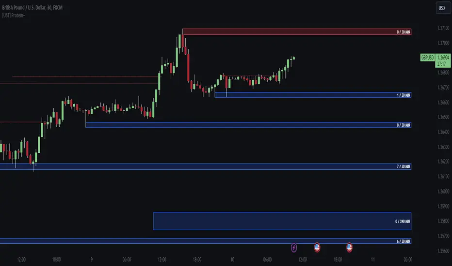
Smart Money Concept + Strategy Backtesting Toolkit [Shah]This indicator, primarily designed for strategy backtest. It’s important to emphasize that the orders generated by this indicator are in the form of stop-limit orders .
For Long setup , When lower lows and lower highs form, after price moving up from the last higher high, a “change of character” occurs. Entry will takes place in the golden zone.
This the Long setup:
And this is the Long setup Example on chart:
For Short setup , When higher lows and higher highs form after the price moves down from the last higher low, a “change of character” occurs. Entry will take place within the golden zone.
This the Short setup:
And this is the Short setup Example on chart:
Key Features:
Date Period:
Users can customize the date period during which the strategy is tested, allowing for a more granular analysis of performance over specific timeframes.
DCA Entry:
Entry is based on Fibonacci level between the Lower Low and Higher High pivots for Long deals .
Entry is based on Fibonacci level between the Higher High and Lower Low pivots for Short deals .
Allowing a second entry with a specified position size
Entering at a different price based on a Percent or ATR change.
There is a feature that If the risk-to-reward ratio is below the specified input (rr), the trading deal wont initiate, and the signal alert wont be triggered.
Stop Loss:
Adjustable based on Fibonacci levels , Percent and ATR.
The percent and ATR is calculate from LL pivot point for Long and HH pivot point for short (not Entry price)’
Targets:
Adjustable based on Source, Fibonacci levels , Percent and ATR.
Source indicates the maximum (minimum) value between the open and close of the candle where the Higher High (Lower Low) pivot point was formed for Long (Short) deals.
Percent and ATR calculates from Entry 1 Price
There is a feature that closes the part of the position size at Target 1 based on a percentage, leaving the rest to close at Target 2, entry, exit price, or stop loss.
Plots:
The visual representation of the indicator includes the key plots:
Reset Deal Calculation Fibonacci Level
Alert Fire Fibonacci Level
Entry 1
Entry 2
Entry Average
Stop Loss
Target 1
Target 2
Labels:
Displays informative labels upon trade open and close, providing details about each transaction like gain and equity and etc.
Risk Management:
Allows setting initial capital, risk per trade, and commission for each transaction.
Score Table:
Provides statistical information for Regular deals (refers to deals that closed in Target price or Stop loss price) and Exited deals (representing deals that didn’t touch the stop loss or targets.):
Number of trades
Win rate
Profit factor
Average Risk to Reward ratio
Total Profit and Loss (PnL)
Commission paid
Live equity
It should note that Winrate calculated based on closed deals at target or stop loss. (Exited trades doesn’t into account in calculation of Winrate)
Exit Methods :
The goal is to offer users a diverse set of exits before the price touches the target or stop loss.
1. Pending Entry Time-out
cancel pending entry based on candle counting since alert fired. (before deal started)
2. Break Even
If Target 2 is reached, the stop loss automatically adjusts to the entry price.
3. Active Deal Reverse
If a deal (long or short position) is currently open, and the reverse signal is emitted, the script will close the existing deal.
4. Reverse Deal Exit
If a deal (long or short position) is currently open, and the reverse signal is emitted, the script will automatically close the existing deal.
5. Move Exit
With this method, if Entry 2 is triggered, the deal will be closed when the price touches the Entry price.
6. Candle Counting Exit
This exit type is based on the number of candles since the deal started.
7. Profit Zone Shield Exit
Once a deal enters profit, the Exit level moves to the entry level after reaching a Fibonacci level between TP1 and Entry 1.
Deep Backtesting Table:
It includes:
Time period of the backtest
Pair name and timeframe
Count the long and short trades
Win streak and loss streak
Total deal chances and missed chances
Count the deals goes directly from entry 1 to tp1 and entry 2 to tp1
Count the deals that touched entry 2 and entry 2 filled percent
Count the number of each exit type
Other statistics such as CAGR, Sharpe, Kurtosis, Skewness, and Max Drawdown.

Market Structure AlgoThe "Market Structure Algo" (MS Algo) is a comprehensive tool developed by OmegaTools. This advanced indicator is designed to analyze the market's structure through a combination of pivot highs and lows, creating a nuanced understanding of potential market movements.
Core Functionality:
- Internal and External Market Structure (MS): The MS Algo differentiates between internal and external market structures by analyzing pivot points over different periods. This dual analysis allows for a deeper understanding of short-term and long-term market trends.
- Zone Distance and Visualization: The indicator introduces a novel approach to visualizing potential areas of interest or 'zones' around pivot points, adjustable through the 'Zone Distance' setting. This feature enhances the visual representation of zone created on the chart that can be used as a support and resistance area.
- Dynamic Signal Generation: Utilizing a comprehensive algorithm, the MS Algo identifies potential signals for entering and exiting trades based on the internal market structure. These signals are visually represented on the chart, aiding in decision-making. These signals are based on the acceptance and confirmed breakout or the refusal of the pivot points by the price.
Operational Mechanism:
- The MS Algo calculates pivot highs and lows over specified periods (input by the user) to determine the market's current structure. It then evaluates the market's position relative to these pivot points to assign a market structure score, which can range from bullish to bearish extremes.
- Signals for long and short positions, as well as exits, are generated based on the interaction between the close price and these pivot points.
- Additionally, the indicator plots zones around the moving average, adjusted for the ATR and the specified 'Zone Distance,' providing a visual guide to areas where the market might find support or resistance.
Usage Guidelines:
- To apply the MS Algo to your TradingView charts, adjust the 'Internal MS' and 'External MS' settings to align with your analysis preferences. The 'Zone Distance' input allows for customization of the zone visualization feature.
- The color-coded signals and zone fillings serve as guides to understanding the current market structure and potential areas of interest. These should be interpreted within the context of a broader trading strategy and risk management framework.
Understanding the Indicator's Originality:
The MS Algo stands out due to its unique blend of pivot analysis and zone visualization, providing traders with a detailed view of the market's structure that goes beyond traditional indicators. Its originality lies in the methodological integration of these components to offer a tool that enhances market analysis.
Responsible Use Disclaimer:
The financial markets are unpredictable, and the MS Algo is designed to serve as an analytical tool within a trader's arsenal, not a standalone solution for trading decisions. Traders should use this tool judiciously, alongside comprehensive market analysis and sound risk management practices. It's important to understand that the MS Algo does not guarantee trading success nor does it claim to predict specific price movements. Trading involves risks, including the potential loss of capital.

ATR Price Targets w/POC
ATR Price Targets with Point of Control (POC):
This script is designed to help traders identify key price target levels based on configurable multipliers of the the Average True Range (ATR) and the volume based Point of Control (POC). It is intended for intraday traders looking to capture significant price movements.
Features:
ATR Price Targets: The script calculates three levels of price targets above and below the first bar of the day, based on the ATR of the last 22 days (assuming 5-minute candles). These targets are adjustable through the settings, allowing traders to set their own ATR multipliers.
Point of Control (POC): The POC is determined as the price level of the highest volume bar since the start time, providing an indication of the most traded price within the specified period.
Customizable Start Time: Traders can set their desired start time for the calculation of price targets and POC, allowing for flexibility in aligning the indicator with their trading strategy.
Plot Lines: The ATR price targets are plotted as lines for easy visualization on the chart.
Usage:
The ATR price targets can be used as potential take-profit or stop-loss levels.
The POC can serve as a key level for assessing market sentiment and potential reversals.
Traders can adjust the ATR multipliers and start time based on their specific trading style and market conditions.
Settings:
ATR Price Targets 1, 2, 3: Adjust the multipliers for the ATR price targets. By default, these are set to 1*ATR for T1+/T1-, 3*ATR for T2+/T2- and ATR*6 for T3+/T3-. Adjust with caution as the price targets found in defaults have proven to be more accurate over intraday cycles for volatile stocks.
Start Hour & Start Minute: Set the starting hour and minute for the calculations. By default, these are set to the opening 5 minute intraday bar, but can also be set to the opening bar of pre-market hours.

TrippleMACDCryptocurrency Scalping Strategy for 1m Timeframe
Introduction:
Welcome to our cutting-edge cryptocurrency scalping strategy tailored specifically for the 1-minute timeframe. By combining three MACD indicators with different parameters and averaging them, along with applying RSI, we've developed a highly effective strategy for maximizing profits in the cryptocurrency market. This strategy is designed for automated trading through our bot, which executes trades using hooks. All trades are calculated for long positions only, ensuring optimal performance in a fast-paced market.
Key Components:
MACD (Moving Average Convergence Divergence):
We've utilized three MACD indicators with varying parameters to capture different aspects of market momentum.
Averaging these MACD indicators helps smooth out noise and provides a more reliable signal for trading decisions.
RSI (Relative Strength Index):
RSI serves as a complementary indicator, providing insights into the strength of bullish trends.
By incorporating RSI, we enhance the accuracy of our entry and exit points, ensuring timely execution of trades.
Strategy Overview:
Long Position Entries:
Initiate long positions when all three MACD indicators signal bullish momentum and the RSI confirms bullish strength.
This combination of indicators increases the probability of successful trades, allowing us to capitalize on uptrends effectively.
Utilizing Linear Regression:
Linear regression is employed to identify consolidation phases in the market.
Recognizing consolidation periods helps us avoid trading during choppy price action, ensuring optimal performance.
Suitability for Grid Trading Bots:
Our strategy is well-suited for grid trading bots due to frequent price fluctuations and opportunities for grid activation.
The strategy's design accounts for price breakthroughs, which are advantageous for grid trading strategies.
Benefits of the Strategy:
Consistent Performance Across Cryptocurrencies:
Through rigorous testing on various cryptocurrency futures contracts, our strategy has demonstrated favorable results across different coins.
Its adaptability makes it a versatile tool for traders seeking consistent profits in the cryptocurrency market.
Integration of Advanced Techniques:
By integrating multiple indicators and employing linear regression, our strategy leverages advanced techniques to enhance trading performance.
This strategic approach ensures a comprehensive analysis of market conditions, leading to well-informed trading decisions.
Conclusion:
Our cryptocurrency scalping strategy offers a sophisticated yet user-friendly approach to trading in the fast-paced environment of the 1-minute timeframe. With its emphasis on automation, accuracy, and adaptability, our strategy empowers traders to navigate the complexities of the cryptocurrency market with confidence. Whether you're a seasoned trader or a novice investor, our strategy provides a reliable framework for achieving consistent profits and maximizing returns on your investment.
