RSI-Adaptive T3 [ChartPrime]The RSI-Adaptive T3 is a precision trend-following tool built around the legendary T3 smoothing algorithm developed by Tim Tillson , designed to enhance responsiveness while reducing lag compared to traditional moving averages. Current implementation takes it a step further by dynamically adapting the smoothing length based on real-time RSI conditions — allowing the T3 to “breathe” with market volatility. This dynamic length makes the curve faster in trending moves and smoother during consolidations.
To help traders visualize volatility and directional momentum, adaptive volatility bands are plotted around the T3 line, with visual crossover markers and a dynamic info panel on the chart. It’s ideal for identifying trend shifts, spotting momentum surges, and adapting strategy execution to the pace of the market.
HOIW IT WORKS
At its core, this indicator fuses two ideas:
The T3 Moving Average — a 6-stage recursively smoothed exponential average created by Tim Tillson , designed to reduce lag without sacrificing smoothness. It uses a volume factor to control curvature.
A Dynamic Length Engine — powered by the RSI. When RSI is low (market oversold), the T3 becomes shorter and more reactive. When RSI is high (overbought), the T3 becomes longer and smoother. This creates a feedback loop between price momentum and trend sensitivity.
// Step 1: Adaptive length via RSI
rsi = ta.rsi(src, rsiLen)
rsi_scale = 1 - rsi / 100
len = math.round(minLen + (maxLen - minLen) * rsi_scale)
pine_ema(src, length) =>
alpha = 2 / (length + 1)
sum = 0.0
sum := na(sum ) ? src : alpha * src + (1 - alpha) * nz(sum )
sum
// Step 2: T3 with adaptive length
e1 = pine_ema(src, len)
e2 = pine_ema(e1, len)
e3 = pine_ema(e2, len)
e4 = pine_ema(e3, len)
e5 = pine_ema(e4, len)
e6 = pine_ema(e5, len)
c1 = -v * v * v
c2 = 3 * v * v + 3 * v * v * v
c3 = -6 * v * v - 3 * v - 3 * v * v * v
c4 = 1 + 3 * v + v * v * v + 3 * v * v
t3 = c1 * e6 + c2 * e5 + c3 * e4 + c4 * e3
The result: an evolving trend line that adapts to market tempo in real-time.
KEY FEATURES
⯁ RSI-Based Adaptive Smoothing
The length of the T3 calculation dynamically adjusts between a Min Length and Max Length , based on the current RSI.
When RSI is low → the T3 shortens, tracking reversals faster.
When RSI is high → the T3 stretches, filtering out noise during euphoria phases.
Displayed length is shown in a floating table, colored on a gradient between min/max values.
⯁ T3 Calculation (Tim Tillson Method)
The script uses a 6-stage EMA cascade with a customizable Volume Factor (v) , as designed by Tillson (1998) .
Formula:
T3 = c1 * e6 + c2 * e5 + c3 * e4 + c4 * e3
This technique gives smoother yet faster curves than EMAs or DEMA/Triple EMA.
⯁ Visual Trend Direction & Transitions
The T3 line changes color dynamically:
Color Up (default: blue) → bullish curvature
Color Down (default: orange) → bearish curvature
Plot fill between T3 and delayed T3 creates a gradient ribbon to show momentum expansion/contraction.
Directional shift markers (“🞛”) are plotted when T3 crosses its own delayed value — helping traders spot trend flips or pullback entries.
⯁ Adaptive Volatility Bands
Optional upper/lower bands are plotted around the T3 line using a user-defined volatility window (default: 100).
Bands widen when volatility rises, and contract during compression — similar to Bollinger logic but centered on the adaptive T3.
Shaded band zones help frame breakout setups or mean-reversion zones.
⯁ Dynamic Info Table
A live stats panel shows:
Current adaptive length
Maximum smoothing (▲ MaxLen)
Minimum smoothing (▼ MinLen)
All values update in real time and are color-coded to match trend direction.
HOW TO USE
Use T3 crossovers to detect trend transitions, especially during periods of volatility compression.
Watch for volatility contraction in the bands — breakouts from narrow band periods often precede trend bursts.
The adaptive smoothing length can also be used to assess current market tempo — tighter = faster; wider = slower.
CONCLUSION
RSI-Adaptive T3 modernizes one of the most elegant smoothing algorithms in technical analysis with intelligent RSI responsiveness and built-in volatility bands. It gives traders a cleaner read on trend health, directional shifts, and expansion dynamics — all in a visually efficient package. Perfect for scalpers, swing traders, and algorithmic modelers alike, it delivers advanced logic in a plug-and-play format.
Indicators and strategies

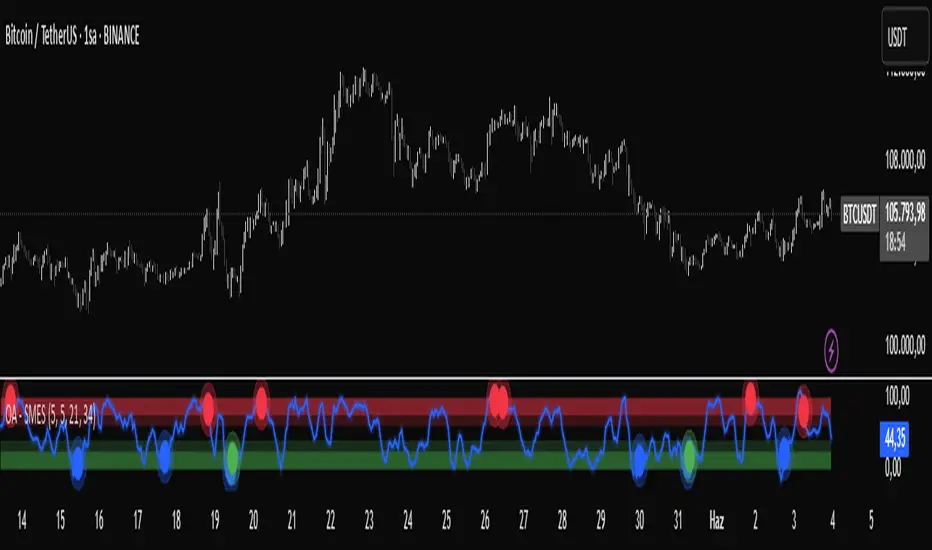
OA - SMESSmart Money Entry Signals (SMES)
The SMES indicator is developed to identify potential turning points in market behavior by analyzing internal price dynamics, rather than relying on external volume or sentiment data. It leverages normalized price movement, directional volatility, and smoothing algorithms to detect potential areas of accumulation or distribution by market participants.
Core Concepts
Smart Money Flow calculation based on normalized price positioning
Directional VHF (Vertical Horizontal Filter) used to enhance signal directionality
Overbought and Oversold regions defined with optional glow visualization
Entry and Exit signals based on dynamic crossovers
Highly customizable input parameters for precision control
Key Inputs
Smart Money Flow Period
Smoothing Period
Price Analysis Length
Fibonacci Lookback Length
Visual toggle options (zones, glow effects, signal display)
Usage
This tool plots the smoothed smart money flow as a standalone oscillator, designed to help traders identify potential momentum shifts or extremes in market sentiment. Entry signals are generated through crossover logic, while optional filters based on price behavior can refine those signals. Exit signals are shown when the smart money line exits extreme regions.
Important Notes
This indicator does not repaint
Works on all timeframes and instruments
Best used as a confirmation tool with other technical frameworks
All calculations are based strictly on price data
Disclaimer
This script is intended for educational purposes only. It does not provide financial advice or guarantee performance. Please do your own research and apply appropriate risk management before making any trading decisions.
Auto Fractal [theUltimator5]This indicator is what I call the Auto Fractal. It is a unique algorithm that looks back in time, finds a segment on the chart that closest matches the recent price action, then projects the price forwards. It effectively finds chart patterns and shows you what the price did the last time the same/similar chart pattern was observed.
Creating an algorithm to match abstract curves to other abstract curves and provide a confidence score was the fundamental problem that needed to be solved in order to create this indicator, which curve matches with surprising accuracy.
The most effective method to "curve match" that I found is the Pearson Coefficient, set by a segment length and a lookback period. After the highest coefficient curve is located, the curve then gets scaled and offset to match the current price.
The past segment is drawn over the current price (orange line), giving a visualization of the two curves and how closely they match each other. The indicator then projects the price forwards in time based on the price action of the chart from the historical segment (dashed fuchsia line).
A bounding box also gets drawn around the historical segment to give you a clear visual of where the price is getting pulled from for proper analysis and ease of use.
The Pearson Coefficient % is shown in a table in the top right-hand corner of the chart and can be toggled off if desired. The values range from -100% (perfectly inverse correlation) to +100% (perfectly correlated) with 0 meaning no correlation whatsoever. The closer to +100% the value is, the better the segment match.
As with most/all of my indicators, user interface and simplicity was at the top of my priority list. I designed this to be easily readable and intuitive to both novice and veteran traders, without cluttering the chart.
Note:
This indicator is extremely heavy in terms of memory usage due to nested for loops, and takes several seconds to initially load the chart overlay. If the lookback period is increased too high (>600) then the indicator may time out and fail to load anything. If nothing loads on the chart, try reducing the lookback length and wait up to 10 seconds for lines to appear.

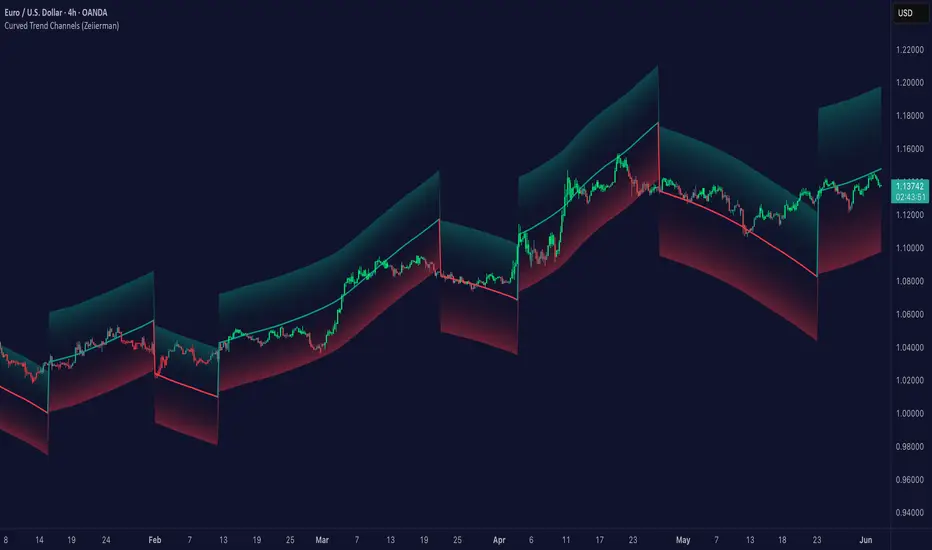
Curved Trend Channels (Zeiierman)█ Overview
Curved Trend Channels (Zeiierman) is a next-generation trend visualization tool engineered to adapt dynamically to both linear and non-linear market behavior. It introduces a novel curvature-based channeling system that grows over time during trending conditions, mirroring the natural acceleration of price trends, while simultaneously leveraging adaptive range filtering and dual-layer candle trend logic.
This tool is ideal for traders seeking smooth yet reactive dynamic channels that evolve with market structure. Whether used in curved mode or traditional slope mode, it provides exceptional clarity on trend transitions, volatility compression, and breakout development.
█ How It Works
⚪ Adaptive Range Filter Foundation
The core of the system is a volatility-based range filter that determines the underlying structure of the bands:
Pre-Smoothing of High/Low Data – Highs and lows are smoothed using a selectable moving average (SMA, EMA, HMA, KAMA, etc.) before calculating the volatility range.
Volatility Envelope – The range is scaled using a fixed factor (2.618) and further adjusted by a Band Multiplier to form the primary envelope around price.
Smoothed Volatility Curve – Final bands are stabilized using a long lookback, ensuring clean visual structure and trend clarity.
⚪ Curved Channel Logic
In Curved Mode, the trend channel grows over time when the trend direction remains unchanged:
Base Step Size (× ATR) – Sets the minimum unit of slope change.
Growth per Bar (× ATR) – Defines the acceleration rate of the channel slope with time.
Trend Persistence Recognition – The longer a trend persists, the more pronounced the slope becomes, mimicking real market accelerations.
This dynamic, time-dependent logic enables the channel to "curve" upward or downward, tracking long-standing trends with increasing confidence.
⚪ Trend Slope
As an alternative to curved logic, traders can activate a regular Trend slope using:
Slope Length – Determines how quickly the trend line adapts to price shifts.
Multiplicative Factor – Amplifies the sensitivity of the slope, useful in fast-moving markets or lower timeframes.
⚪ Candle Trend Confirmation
A robust second-layer trend detection method, the Candle Trend System evaluates directional pressure by analyzing smoothed price action:
Multi-tier Smoothing – Trend lines are derived from short-, medium-, and long-term candle movement.
█ How to Use
⚪ Trend Identification
When the Trend Line direction and Candle Colors are in agreement, this indicates strong, persistent directional conviction. Use these moments to enter with trend confirmation and manage risk more confidently.
⚪ Retest
During ongoing trends, the price will often pull back into the dynamic channel. Look for:
Support/resistance interactions at the upper or lower bands.
█ Settings
Scaled Volatility Length – Controls the historical depth used to stabilize the volatility bands.
Smoothing Type – Choose from HMA, KAMA, VIDYA, FRAMA, Super Smoother, etc. to match your asset and trading style.
Volatility MA Length – Smoothing length for the calculated range; shorter = more reactive.
High/Low Smoother Length – Additional smoothing to reduce noise from spikes or false pivots.
Band Multiplier – Widens or tightens the band range based on personal preference.
Enable Curved Channel – Toggle between curved or regular trend slope behavior.
Base Step (× ATR) – The starting point for curved slope progression.
Growth per Bar (× ATR) – How much the slope accelerates per bar during a sustained trend.
Slope – Reactivity of the standard trend line to price movements.
Multiplicative Factor – Sensitivity adjustment for HyperTrend slope.
Candle Trend Length – Lookback period for trend determination from candle structure.
-----------------
Disclaimer
The content provided in my scripts, indicators, ideas, algorithms, and systems is for educational and informational purposes only. It does not constitute financial advice, investment recommendations, or a solicitation to buy or sell any financial instruments. I will not accept liability for any loss or damage, including without limitation any loss of profit, which may arise directly or indirectly from the use of or reliance on such information.
All investments involve risk, and the past performance of a security, industry, sector, market, financial product, trading strategy, backtest, or individual's trading does not guarantee future results or returns. Investors are fully responsible for any investment decisions they make. Such decisions should be based solely on an evaluation of their financial circumstances, investment objectives, risk tolerance, and liquidity needs.
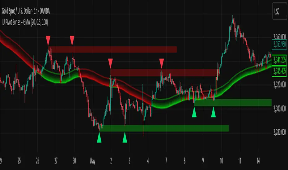
IU Pivot Zones + GMADESCRIPTION:
IU Pivot Zones + GMA is a smart price-action-based indicator that detects meaningful support and resistance zones formed through pivot highs/lows while combining them with dynamic zone generation and Geometric Moving Averages (GMA). This tool is built to help traders visualize institutional breakout/rejection zones with clear, logical mapping and live box management — helping you stay ahead of the move.
The indicator is designed for intraday, swing, and positional traders who want to enhance their trading decisions with visual confluence zones and market structure logic.
USER INPUTS
* Pivot point Lengths: Number of bars used to detect pivot highs/lows
* Zone length: Controls the thickness of the support/resistance zone; higher values create wider zones
* GMA Length: Period for calculating the geometric moving averages based on highs and lows
* Allow Bar/candle Color: Enables or disables special candle coloring when price interacts with the zones
LOGIC OF THE INDICATOR:
* Detects pivot highs and pivot lows using the user-defined length
* Compares consecutive pivot levels to determine if they fall within a valid ATR-based price band to form a zone
* If confirmed, the indicator dynamically plots a resistance or support box between those pivot points, colored respectively (red for resistance, green for support)
* The boxes update in real-time based on price action. If price respects the zone, the box extends forward. If price breaks the zone, the box disappears
* Geometric Moving Averages (GMA) based on logarithmic mean of highs and lows are plotted to offer a trend bias
* Candles that touch the top of the support zone are colored yellow, and those touching the bottom of the resistance zone are orange, enhancing zone reaction visibility
WHY IT IS UNIQUE:
* Uses logarithmic-based GMAs, which are smoother and less reactive than traditional moving averages
* ATR-based zone logic makes it adaptive to volatility instead of using fixed-width zones
* Combines structural levels (pivots), volatility filters (ATR), and trend overlays (GMA) in one unified tool
* Real-time zone extension and disappearance logic based on price interaction
HOW USER CAN BENEFIT FROM IT:
* Spot high-probability breakout or reversal zones that price respects consistently
* Use the GMA cloud for trend confirmation — for example, bullish bias when price is above both GMAs
* Build price action strategies around zone touches, breakouts, or rejections
* Use color-coded candles as real-time alerts for potential entry/exit signals near S/R levels
* Save time by avoiding manual marking of zones on charts across timeframes
DISCLAIMER:
This indicator is created for educational and informational purposes only. It does not constitute financial advice or a recommendation to buy or sell any asset. All trading involves risk, and users should conduct their own analysis or consult with a qualified financial advisor before making any trading decisions. The creator is not responsible for any losses incurred through the use of this tool. Use at your own discretion.

abusuhil bullish breakAbusuhil Bullish Break is a price action-based confirmation tool that identifies a bullish reversal pattern consisting of:
Two consecutive bearish candles followed by
A strong bullish candle that closes above the high of both.
The script includes:
Optional dual MACD filter (current timeframe + higher timeframe)
Configurable stop-loss and multiple take-profit levels
Visual lines for targets and stop
Custom styling for all elements
It’s a clean, logic-driven entry confirmation tool for intraday and swing trading.
⚠️ Open-source and fully customizable.
مؤشر Abusuhil Bullish Break هو أداة تأكيد لانعكاسات الاتجاه الصاعد بناءً على حركة السعر (Price Action)، ويكتشف نموذجًا يتكون من:
شمعتين هابطتين متتاليتين
تتبعهما شمعة صاعدة قوية تغلق فوق أعلى الشمعتين السابقتين
يحتوي المؤشر على:
فلتر MACD مزدوج اختياري (للفريم الحالي وفريم أعلى)
إعدادات مخصصة للوقف والأهداف المتعددة
خطوط مرئية احترافية للأهداف والوقف
تحكم كامل في الألوان والنمط والعرض
مناسب للتداول اللحظي والسوينج.
✅ مفتوح المصدر وقابل للتعديل بالكامل.

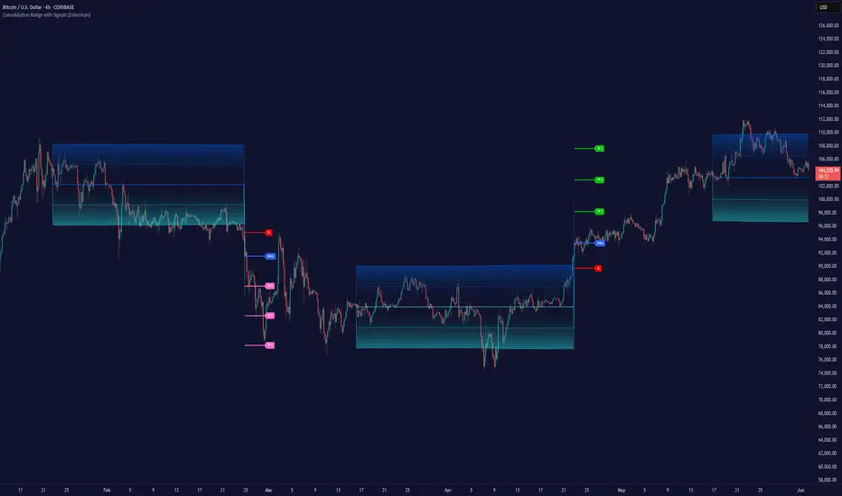
Consolidation Range with Signals (Zeiierman)█ Overview
Consolidation Range with Signals (Zeiierman) is a precision tool for identifying and trading market consolidation zones, where price contracts into tight ranges before significant movement. It provides dynamic range detection using either ADX-based trend strength or volatility compression metrics, and offers built-in take profit and stop loss signals based on breakout dynamics.
Whether you trade breakouts, range reversals, or trend continuation setups, this indicator visualizes the balance between supply and demand with clearly defined mid-bands, breakout zones, and momentum-sensitive TP/SL placements.
█ How It Works
⚪ Multi-Method Range Detection
ADX Mode
Uses the Average Directional Index (ADX) to detect low-trend-strength environments. When ADX is below your selected threshold, price is considered to be in consolidation.
Volatility Mode
This mode detects consolidation by identifying periods of volatility compression. It evaluates whether the following metrics are simultaneously below their respective historical rolling averages:
Standard Deviation
Variance
Average True Range (ATR)
⚪ Dynamic Range Band System
Once a range is confirmed, the system builds a dynamic band structure using a volatility-based filter and price-jump logic:
Middle Line (Trend Filter): Reacts to price imbalance using adaptive jump logic.
Upper & Lower Bands: Calculated by expanding from the middle line using a configurable multiplier.
This creates a clean, visual box that reflects current consolidation conditions and adapts as price fluctuates within or escapes the zone.
⚪ SL/TP Signal Engine
On detection of a breakout from the range, the indicator generates up to 3 Take Profit levels and one Stop Loss, based on the breakout direction:
All TP/SL levels are calculated using the filtered base range and multipliers.
Cooldown logic ensures signals are not spammed bar-to-bar.
Entries are visualized with colored lines and labeled levels.
This feature is ideal for traders who want automated risk and reward reference points for range breakout plays.
█ How to Use
⚪ Breakout Traders
Use the SL/TP signals when the price breaks above or below the range bands, especially after extended sideways movement. You can customize how far TP1, TP2, and TP3 sit from the entry using your own risk/reward profile.
⚪ Mean Reversion Traders
Use the bands to locate high-probability reversion zones. These serve as reference zones for scalping or fade entries within stable consolidation phases.
█ Settings
Range Detection Method – Choose between ADX or Volatility compression to define range criteria.
Range Period – Determines how many bars are used to compute trend/volatility.
Range Multiplier – Scales the width of the consolidation zone.
SL/TP System – Optional levels that project TP1/TP2/TP3 and SL from the base price using multipliers.
Cooldown – Prevents repeated SL/TP signals from triggering too frequently.
ADX Threshold & Smoothing – Adjusts sensitivity of trend strength detection.
StdDev / Variance / ATR Multipliers – Fine-tune compression detection logic.
-----------------
Disclaimer
The content provided in my scripts, indicators, ideas, algorithms, and systems is for educational and informational purposes only. It does not constitute financial advice, investment recommendations, or a solicitation to buy or sell any financial instruments. I will not accept liability for any loss or damage, including without limitation any loss of profit, which may arise directly or indirectly from the use of or reliance on such information.
All investments involve risk, and the past performance of a security, industry, sector, market, financial product, trading strategy, backtest, or individual's trading does not guarantee future results or returns. Investors are fully responsible for any investment decisions they make. Such decisions should be based solely on an evaluation of their financial circumstances, investment objectives, risk tolerance, and liquidity needs.
Directional Strength IndexThis indicator is designed to detect the dominant market direction and quantify its strength by aggregating signals across six key timeframes: 1H, 4H, 1D, 3D, 1W, and 1M.
At its core, it uses a SMEMA 'the Simple Moving Average of an EMA' as the main trend reference. This hybrid smoothing method was chosen for its balance: the EMA ensures responsiveness to recent price moves, while the SMA dampens short-term volatility. This makes the SMEMA more stable than a raw EMA and more reactive than a simple SMA, especially in noisy or volatile environments.
For each timeframe, a score between -10 and +10 is calculated. This score reflects:
- the distance of the price from the SMEMA, using ATR as a dynamic threshold
- the number of price deviations above or below the SMEMA
- the slope of the SMEMA, which adjusts the score based on momentum
These six timeframe scores are then combined into a single Global Score, using weighted averages. Three weighting profiles are available depending on your trading horizon:
- Long Term: emphasizes weekly and monthly data
- Swing Trading: gives balanced importance to all timeframes
- Short Term: prioritizes 1H and 4H action
This multi-timeframe aggregation makes the indicator adaptable to different styles while maintaining a consistent logic.
The result is displayed in a table on the chart, showing:
- the trend direction per timeframe (up, down or neutral)
- the strength score per timeframe
- the overall trend direction and strength based on the selected profile
Optional deviation bands based on ATR multiples are also plotted to provide visual context for overextensions relative to the SMEMA.
This indicator is non-repainting and built for objective, trend-based decision making.

DB1800 Gann Angle Levels Table (CMP Based)Gann Angles for Resistance and Support
2 = 360 degree for 1 month
1 = 180 degree for 1 week
0.5 = 90 degree for 1 to 2 days
0.25 = 45 degree for next day
0.125 = 22.5 degree for more granular than next day (scalping)
The only thing that multiplies when you share it is knowledge.
Inspired by Sudhir Sharma Sir
www.youtube.com

Regression Channel (Interactive)Weighted Interactive Regression Channel (WIRC)
Overview
The Weighted Interactive Regression Channel improves on traditional regression channels by emphasizing key price points through intelligent weighting. Instead of treating all candles equally, WIRC adapts to market dynamics for better trend detection and channel accuracy.
Key Differences from Standard Channels
Weighted vs. Equal: Prioritizes significant events over uniform weighting
Dynamic vs. Static: Adapts in real time to market changes
Accurate vs. Basic: Reduces noise, enhances signal clarity
Customizable vs. Fixed: Full control over weights and visuals
Weighting Methods
Direction Change – Highlights reversal points via local peaks/troughs
Volume-Based – Emphasizes high-volume candles, ideal for breakouts
Price Range – Weights wide-range candles to capture volatility
Time Decay – Prioritizes recent data for current market relevance
Interactive Features
Data Range: Set channel start/end over 1–500 bars
Visuals: Line styles, color coding, fill options, reference lines
Stats: Slope, R², standard deviation, point count, weight method
Technical Implementation
Weighted Regression Formula: Uses weights for slope, intercept, and deviation
Channel Lines: Center = weighted regression; bounds = ± deviation × multiplier
Usage Scenarios
Trend Analysis: Use Direction Change + longer range
Breakouts: Use Volume weighting + fill + boundary watching
Volatility: Apply Price Range weighting + monitor standard deviation
Current Market: Use Time Decay + shorter ranges + stat display
Parameter Tips
Channel Width:
Narrow (1.0–1.5): Responsive
Standard (1.5–2.0): Balanced
Wide (2.0–3.0+): Conservative
Weighting Intensity:
Conservative (1.5–2.0)
Moderate (2.0–3.0)
Aggressive (3.0+)
Advanced Use
Multi-Timeframe: Use different weightings per timeframe
Market Structure: Detect swings, institutional zones
Risk Management: Dynamic S/R levels, volatility-driven sizing
Best Practices
Start with Direction Change
Test different ranges
Monitor stats
Combine with other indicators
Adjust to market context
Recalibrate regularly
Conclusion
WIRC delivers a smarter, more adaptive view of price action than standard regression tools. With real-time customization and multiple weighting options, it’s ideal for traders seeking precision across strategies—trend tracking, breakout confirmation, or volatility insight.

NDOG & NWOG Indicatorndicator automatically identifies and displays New Day Opening Gaps (NDOG) and New Week Opening Gaps (NWOG) directly on your chart. It focuses on gaps based on specific session times in the New York (NY) timezone.
Key Features:
NDOG: Identifies the gap between the NY 4:59 PM (daily close) and the NY 6:00 PM (daily open).
NWOG: Identifies the gap between the Friday NY 4:59 PM (weekly close) and the Sunday NY 6:00 PM (weekly open).
Draws customizable lines for the high and low levels of each gap.
Option to show an additional mid-level line for each gap.
Includes options for line colors, styles, and width.
Allows filtering gaps by a minimum size.
Control the maximum number of recent NDOGs and NWOGs displayed.
Optionally shows text labels on the lines and a summary table on the chart.
This tool can help traders visualize potential areas of interest related to these specific opening gaps.
Note: Calculations are based on the "America/New_York" timezone.
Disclaimer: Trading involves risk and may not be suitable for all investors. This indicator is provided for informational and educational purposes only and does not constitute financial advice or a recommendation to trade. Use at your own risk.

CISD Levels by HAZEDCISD Levels by HAZED - Advanced Market Structure Analysis
📊 Overview
The CISD Levels indicator is a sophisticated market structure analysis tool that automatically identifies and plots critical support and resistance levels based on Change in State Direction (CISD) methodology. This indicator helps traders visualize key market turning points and potential breakout/breakdown levels with precision.
🎯 What are CISD Levels?
CISD (Change in State Direction) levels represent significant price points where market sentiment shifts from bullish to bearish or vice versa. These levels are dynamically calculated based on:
Market structure breaks (higher highs/lower lows)
Pullback patterns and trend continuations
Real-time price action analysis
Dynamic level updates as market conditions evolve
✨ Key Features
🔥 Smart Level Detection
Automatically identifies bullish (+CISD) and bearish (-CISD) levels
Real-time updates as market structure evolves
Intelligent pullback detection algorithm
🎨 Full Customization
Colors: Customize bullish/bearish level colors
Line Styles: Choose from solid, dotted, or dashed lines
Text Labels: Fully customizable text, size, and font options
Transparency: Adjustable line transparency (0-100%)
Extensions: Control how far lines extend into the future
📈 Historical Analysis
Show All Levels: Option to display historical CISD levels
Max Levels Control: Limit the number of historical levels shown (1-50)
Level Management: Automatic cleanup of old levels
🚨 Smart Alerts
Bullish Alerts: Get notified when price breaks above +CISD levels
Bearish Alerts: Get notified when price breaks below -CISD levels
Alert Frequency: Choose between "Once Per Bar" or "Once Per Bar Close"
📊 Statistics Table
Market State: Current bullish/bearish market condition
Active Levels: Count of currently active CISD levels
Latest Levels: Display of most recent +CISD and -CISD values
Positioning: 5 different table positions available
🛠️ How to Use
For Swing Traders:
Use CISD levels as key support/resistance zones
Enter positions on level breaks with proper risk management
Set stop losses below/above opposite CISD levels
For Day Traders:
Watch for price reactions at CISD levels
Use levels for entry/exit timing
Combine with volume analysis for confirmation
For Position Traders:
Identify major market structure changes
Use higher timeframe CISD levels for strategic entries
Monitor level breaks for trend continuation signals
⚙️ Settings Guide
CISD Level Settings
Bullish/Bearish Colors: Customize level appearance
Custom Text: Add your own labels to levels
Alert Setup: Enable notifications for level breaks
Historical Levels: Choose to show past levels for context
Appearance Customization
Line Width: 1-5 pixel thickness options
Line Style: Solid, dotted, or dashed
Extension Bars: Control future projection (1-50 bars)
Text Options: Size, font, and bold formatting
Statistics Table
Enable/Disable: Toggle table visibility
Position: 5 placement options on chart
Real-time Data: Live market state and level information
🎯 Best Practices
Multi-Timeframe Analysis: Use CISD levels across different timeframes for confluence
Risk Management: Always use proper position sizing and stop losses
Confirmation: Combine with volume, momentum, or other indicators
Market Context: Consider overall market conditions and news events
Backtesting: Test the levels on historical data before live trading
📋 Technical Specifications
Overlay: True (plots directly on price chart)
Max Lines: 500 (handles multiple historical levels)
Max Labels: 500 (supports extensive labeling)
Real-time Updates: Dynamic level calculation and alerts
Performance: Optimized code for smooth chart operation
🚀 Why Choose CISD Levels?
Precision: Advanced algorithm for accurate level identification
Flexibility: Extensive customization options for any trading style
Reliability: Proven market structure analysis methodology
User-Friendly: Intuitive settings with helpful tooltips
Professional: Clean, professional appearance on any chart
📞 Support & Updates
This indicator is actively maintained and updated. For questions, suggestions, or feature requests, feel free to reach out through TradingView messaging.
⚠️ Disclaimer: This indicator is for educational and informational purposes only. Always conduct your own analysis and risk management. Past performance does not guarantee future results.

CNN Statistical Trading System [PhenLabs]📌 DESCRIPTION
An advanced pattern recognition system utilizing Convolutional Neural Network (CNN) principles to identify statistically significant market patterns and generate high-probability trading signals.
CNN Statistical Trading System transforms traditional technical analysis by applying machine learning concepts directly to price action. Through six specialized convolution kernels, it detects momentum shifts, reversal patterns, consolidation phases, and breakout setups simultaneously. The system combines these pattern detections using adaptive weighting based on market volatility and trend strength, creating a sophisticated composite score that provides both directional bias and signal confidence on a normalized -1 to +1 scale.
🚀 CONCEPTS
• Built on Convolutional Neural Network pattern recognition methodology adapted for financial markets
• Six specialized kernels detect distinct price patterns: upward/downward momentum, peak/trough formations, consolidation, and breakout setups
• Activation functions create non-linear responses with tanh-like behavior, mimicking neural network layers
• Adaptive weighting system adjusts pattern importance based on current market regime (volatility < 2% and trend strength)
• Multi-confirmation signals require CNN threshold breach (±0.65), RSI boundaries, and volume confirmation above 120% of 20-period average
🔧 FEATURES
Six-Kernel Pattern Detection:
Simultaneous analysis of upward momentum, downward momentum, peak/resistance, trough/support, consolidation, and breakout patterns using mathematically optimized convolution kernels.
Adaptive Neural Architecture:
Dynamic weight adjustment based on market volatility (ATR/Price) and trend strength (EMA differential), ensuring optimal performance across different market conditions.
Professional Visual Themes:
Four sophisticated color palettes (Professional, Ocean, Sunset, Monochrome) with cohesive design language. Default Monochrome theme provides clean, distraction-free analysis.
Confidence Band System:
Upper and lower confidence zones at 150% of threshold values (±0.975) help identify high-probability signal areas and potential exhaustion zones.
Real-Time Information Panel:
Live display of CNN score, market state with emoji indicators, net momentum, confidence percentage, and RSI confirmation with dynamic color coding based on signal strength.
Individual Feature Analysis:
Optional display of all six kernel outputs with distinct visual styles (step lines, circles, crosses, area fills) for advanced pattern component analysis.
User Guide
• Monitor CNN Score crossing above +0.65 for long signals or below -0.65 for short signals with volume confirmation
• Use confidence bands to identify optimal entry zones - signals within confidence bands carry higher probability
• Background intensity reflects signal strength - darker backgrounds indicate stronger conviction
• Enter long positions when blue circles appear above oscillator with RSI < 75 and volume > 120% average
• Enter short positions when dark circles appear below oscillator with RSI > 25 and volume confirmation
• Information panel provides real-time confidence percentage and momentum direction for position sizing decisions
• Individual feature plots allow granular analysis of specific pattern components for strategy refinement
💡Conclusion
CNN Statistical Trading System represents the evolution of technical analysis, combining institutional-grade pattern recognition with retail accessibility. The six-kernel architecture provides comprehensive market pattern coverage while adaptive weighting ensures relevance across all market conditions. Whether you’re seeking systematic entry signals or advanced pattern confirmation, this indicator delivers mathematically rigorous analysis with intuitive visual presentation.

CVD Divergence & Volume ProfileThis Pine Script indicator, named "CVD Divergence & Volume Profile," is designed to identify potential trading opportunities by combining Cumulative Volume Delta (CVD) divergence with Volume Profile levels and an optional Simple Moving Average (SMA) trend filter. It plots signals directly on the price chart.
Here's a breakdown of what each component does and how to potentially trade with it:
1. Cumulative Volume Delta (CVD) Divergence
What it does: CVD measures the cumulative difference between buying and selling volume. A rising CVD indicates more buying pressure, while a falling CVD indicates more selling pressure. Divergence occurs when the price action contradicts the CVD's direction, suggesting a potential shift in momentum or trend reversal.
Bearish Divergence: The price makes a higher high, but the CVD makes a lower high (or fails to make a new high). This suggests that despite the price increasing, the underlying buying pressure is weakening.
Bullish Divergence: The price makes a lower low, but the CVD makes a higher low (or fails to make a new low). This suggests that despite the price decreasing, the underlying selling pressure is weakening.
Visualization:
Red triangle pointing down on the chart indicates a Bearish Divergence signal.
Green triangle pointing up on the chart indicates a Bullish Divergence signal.
2. Volume Profile Levels (VAH, VAL, POC)
What it does: The indicator calculates simplified Volume Profile levels over a user-defined vp_range (number of candles). These levels represent areas where significant trading activity has occurred:
VAH (Value Area High): The upper boundary of the "Value Area," where 70% of the volume traded.
VAL (Value Area Low): The lower boundary of the "Value Area," where 70% of the volume traded.
POC (Point of Control): The price level within the vp_range where the most volume was traded.
Significance: These levels often act as significant support and resistance zones.
Visualization:
Orange lines for VAH and VAL.
Yellow line for POC.
Zone Proximity (zone_thresh): The indicator only generates divergence signals if the current close price is within a specified percentage zone_thresh of either VAH, VAL, or POC. This filters signals to areas of high liquidity and potential turning points.
3. Trend Filter (SMA)
What it does: This is an optional filter (use_trend_filter) that uses a Simple Moving Average (sma_period, default 200).
Significance: It helps ensure that divergence signals are traded in alignment with the broader market trend, potentially increasing their reliability.
For long signals (bullish divergence), the price (close) must be above the SMA (indicating an uptrend).
For short signals (bearish divergence), the price (close) must be below the SMA (indicating a downtrend).
Visualization: A blue line on the chart representing the SMA.
How to Trade with It (Potential Strategies)
The indicator aims to provide high-probability entry points by combining multiple confirming factors. Here's how you might interpret and trade the signals:
Identify Divergence: Look for the triangle signals on your chart (red for bearish, green for bullish).
Confirm Proximity to Volume Profile Levels: The signal itself confirms that the price is near a significant Volume Profile level (VAH, VAL, or POC). These are areas where price often reacts.
Bullish Signal (Green Triangle): This suggests buying momentum is returning after a price decline, especially when the price is near VAL or POC, which might act as support.
Bearish Signal (Red Triangle): This suggests selling momentum is increasing after a price rally, especially when the price is near VAH or POC, which might act as resistance.
Check Trend Alignment (SMA Filter):
For a long trade: You would ideally want to see a green triangle (bullish divergence) while the price is above the blue SMA line. This indicates a bullish divergence confirming a potential bounce within an existing uptrend.
For a short trade: You would ideally want to see a red triangle (bearish divergence) while the price is below the blue SMA line. This indicates a bearish divergence confirming a potential rejection within an existing downtrend.
Entry and Exit Considerations:
Entry: Consider entering a trade on the candle where the signal appears, or on the subsequent candle for confirmation.
Stop Loss: For a long trade, a logical stop-loss could be placed below the lowest point of the divergence, or below the VAL/POC if the signal occurred near it. For a short trade, above the highest point of the divergence or VAH/POC.
Take Profit: Targets could be set at the opposite Volume Profile level, previous swing highs/lows, or using a fixed risk-reward ratio.
Example Trading Scenario:
Long Trade: You see a green triangle (bullish divergence) printed on the chart. You notice the price is currently at the VAL (orange line). You check the blue SMA line and confirm that the price is above it (uptrend). This confluence of factors (bullish divergence, support at VAL, and uptrend) provides a strong potential long entry signal. You might enter, place your stop loss just below VAL, and target VAH or the next resistance level.
Short Trade: You see a red triangle (bearish divergence). The price is at the VAH (orange line). The price is also below the blue SMA line (downtrend). This suggests a potential short entry. You might enter, place your stop loss just above VAH, and target VAL or the next support level.

HTF Overlay Candles (Aggregated)🕯️ Synthetic Aggregated Candles
Created by: The_Forex_Steward
License: Mozilla Public License 2.0
🔍 Description
This indicator creates visually aggregated candles directly on your chart, allowing you to view synthetic candlesticks that combine multiple bars into one. It enables a higher-level perspective of price action without switching timeframes.
Each synthetic candle is built by combining a user-defined number of consecutive bars (e.g., 4 bars from the current timeframe form one aggregated candle). It accurately tracks open, high, low, and close values, then draws a colored box and wick to represent the aggregated data.
⚙️ Features
Aggregation Factor: Combine candles over a custom number of bars (e.g., 4 = 4x current TF)
Timezone Alignment: Aggregation is aligned with midnight in UTC-5 (modifiable in code)
Custom Colors: Choose colors for bullish and bearish synthetic candles
Body Opacity: Control the opacity of the candle body for visual clarity
Wick Width: Customize the thickness of the candle wick
📌 Use Case
Ideal for traders looking to:
- Reduce noise in lower timeframes
- Visualize price action in broader chunks
- Spot larger structure and swing patterns without switching charts
📈 How It Works
At every bar, the script checks whether a new aggregation interval has begun (aligned to the day start). If so, it finalizes the previous candle and starts a new one. On the last bar of the chart, it ensures the final synthetic candle is drawn.
✅ Tip
For best results, apply this script on intraday timeframes and experiment with different aggregation factors (4, 6, 12, etc.) to discover the most insightful compression for your strategy.
Note: This script is optimized for visual representation only. It does not repaint, but it is not intended for algorithmic strategies or alerts.

Wave Trend With SignalsBased on Wave Trend With Signals ...thx bro. Added RSI and a little of fine tuning.
Enjoy!

Fractals (Customizable)This indicator finds fractals on the chart with customizable numbers of candles to the left and right of the central candle. It marks local highs (fractal highs) and lows (fractal lows) using arrows directly on the chart.

ZEN FVGA Fair Value Gap (FVG) indicator with Fibonacci levels is a technical analysis tool designed to identify market inefficiencies and potential price reversal or continuation zones, enhanced by the strategic application of Fibonacci ratios. It combines two powerful concepts to provide traders with a more nuanced view of price action.
**Understanding Fair Value Gaps (FVG)**
* **Definition:** An FVG, also known as an "imbalance," represents a price range where one side of the market (buying or selling) was significantly more aggressive than the other. This aggression leaves behind an inefficiency or a "gap" in the price delivery.
* **Formation:** FVGs are typically identified by a three-candle pattern:
* **Bullish FVG:** The highest point of the first candle and the lowest point of the third candle do not overlap with the second, strong bullish (upward moving) candle. The FVG is the space between the high of the first candle and the low of the third candle. This indicates a strong buying imbalance.
* **Bearish FVG:** The lowest point of the first candle and the highest point of the third candle do not overlap with the second, strong bearish (downward moving) candle. The FVG is the space between the low of the first candle and the high of the third candle. This indicates a strong selling imbalance.
* **Significance:** Traders watch FVGs because the price has a tendency to revisit these zones to "rebalance" the inefficiency or "fill the gap" before potentially continuing in its original direction. They can act as magnets for price and highlight areas of institutional interest.
**Integrating Fibonacci Levels**
Fibonacci retracement and extension levels are mathematical ratios derived from the Fibonacci sequence that are widely used in financial markets to identify potential support and resistance areas. When combined with FVGs, they can offer more precise entry, exit, and target levels.
* **How it Works:** Once an FVG is identified, Fibonacci retracement levels (commonly 23.6%, 38.2%, 50%, 61.8%, and 78.6%) can be drawn across the FVG zone (from its high to its low, or vice versa).
* **Purpose:**
* **Confluence:** When an FVG aligns with a key Fibonacci level (especially the 50% or 61.8% "golden ratio"), it can create a powerful area of confluence, suggesting a higher probability of a price reaction.
* **Entry Points:** Traders might look for entries within the FVG as price retraces to a specific Fibonacci level within that gap. For example, price entering a bullish FVG and finding support at the 61.8% Fibonacci level drawn within that FVG could be a potential long entry signal.
* **Profit Targets:** Fibonacci extension levels can be used to project potential profit targets once price has reacted to an FVG and resumed its trend.
* **Stop-Loss Placement:** Fibonacci levels can also assist in placing stop-loss orders, typically just beyond the FVG or a significant Fibonacci level that, if breached, would invalidate the trade idea.
**Key Features of an FVG Indicator with Fib Levels:**
* **Automatic FVG Detection:** The indicator automatically identifies and visually highlights bullish and bearish FVGs on the price chart, usually as colored boxes.
* **Fibonacci Level Overlay:** It dynamically draws selected Fibonacci retracement (and sometimes extension) levels within or based on the identified FVG.
* **Customization:** Users can typically customize:
* The sensitivity and parameters for FVG detection.
* Which Fibonacci levels are displayed.
* The colors and styles of the FVG boxes and Fibonacci lines.
* Alerts for when price enters an FVG or interacts with a specific Fibonacci level within the FVG.
* **Multi-Timeframe Analysis:** Some advanced versions may allow for the display of FVGs and Fibonacci levels from higher timeframes on the current chart, providing a broader market context.
* **Mitigation Tracking:** The indicator might show how much of an FVG has been "filled" or mitigated by subsequent price action.
**How Traders Use It:**
1. **Identify the Trend:** Determine the overall market trend (e.g., using moving averages or market structure). FVGs traded in the direction of the prevailing trend are generally considered more reliable.
2. **Spot FVGs:** Look for the indicator to highlight FVGs that align with the current trend.
3. **Observe Fibonacci Confluence:** Check if key Fibonacci levels (e.g., 50%, 61.8%) within the FVG provide an additional layer of support or resistance.
4. **Plan Entry:** Consider entering a trade if the price retraces into the FVG and reacts at a significant Fibonacci level. For example, in an uptrend, a pullback into a bullish FVG that finds support at the 50% Fibonacci level of that FVG could be a buy signal.
5. **Set Stop-Loss and Take-Profit:** Place stop-loss orders outside the FVG (e.g., below the low of a bullish FVG or above the high of a bearish FVG) or beyond a key Fibonacci level. Use Fibonacci extensions or other analysis methods to set profit targets.
**In Summary:**
An FVG indicator with Fibonacci levels is a sophisticated tool that aims to improve trading decisions by:
* Clearly identifying areas of market imbalance (FVGs).
* Providing objective potential support and resistance zones through Fibonacci analysis.
* Offering traders more precise entry, stop-loss, and take-profit levels by combining these two analytical methods.
As with any trading indicator, it's crucial to use it as part of a comprehensive trading plan that includes risk management and potentially other confirming indicators or price action analysis.

RSI by Harsh Bhagat (VITTAARA)This is a customised RSI indicator designed for pro traders who want to stay ahead in the market.
🚀 Key Features:
• Standard RSI with precision tuning
• Two Upper Bands: 60 & 65 for smart overbought tracking
• Two Lower Bands: 40 & 38 for sharp oversold alerts
• Dual-tone color scheme for better visual clarity
Ideal for identifying reversal zones, trend weakness, and momentum shift — with an edge.

Fair Value Gap with Advanced FibonacciFair Value Gap with Advanced Fibonacci — Indicator Description
The Fair Value Gap with Advanced Fibonacci indicator combines the concept of price inefficiencies (Fair Value Gaps, or FVGs) with customizable Fibonacci levels for deeper market structure analysis.
🔍 Core Features:
Fair Value Gap Detection
Automatically identifies FVGs based on market imbalances (typically where a candle's wick does not overlap with the prior candle’s body/wick).
Highlights gaps visually with shaded regions on the chart.
Options to filter by bullish, bearish, or both types of FVGs.
Advanced Fibonacci Integration
Dynamically draws Fibonacci retracement levels from the FVG zone, such as from the top to bottom (or vice versa) of the gap.
Allows full customization of Fibonacci levels:
Adjust line thickness and color for each level.
Toggle visibility of specific levels.
Define custom Fib ratios or use default (0.0, 0.236, 0.382, 0.5, etc.).
Flexible Labeling & Layout
Text labels (e.g., price level, percentage, or custom text like “XYZ entfernt”) can be:
Positioned left or right of the Fib lines,
Aligned above or below the lines,
Optionally anchored inside or outside the chart window.
Avoids visual clutter by offering dynamic positioning to prevent overlap with candles or other indicators.
Alerts & Conditions (Optional)
Can trigger alerts when price enters or exits a Fair Value Gap zone.
Can be extended with confluences such as volume spikes, RSI levels, or order blocks.
by Virtuouss

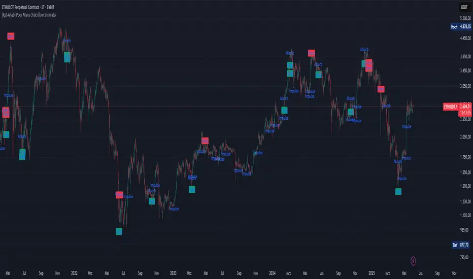
[Kpt-Ahab] Poor Mans Orderflow SimulatorScript Description – Poor Mans Orderflow Simulator
Purpose of the Script
This script simulates a simplified order flow approach ("Poor Man's Orderflow") without access to actual Bid/Ask data. The goal is to detect, quantify, and visualize patterns such as absorption, impulsive moves, and structured re-entry behaviors.
Calculation Logic
Absorption Candles
A candle is classified as "absorption" if:
The ratio of body size to full candle range is below a defined threshold,
Volume is significantly higher than the average of the last N periods,
The candle direction is negative (for long absorption) or positive (for short absorption).
These conditions define a candle with high activity but minimal price movement in the respective direction.
Impulse Candles
A candle is classified as "impulse" if:
The body-to-range ratio is high (indicating a strong directional move),
Volume exceeds the average significantly,
The price closes in the direction of the candle body (bullish or bearish).
Additionally, the average range of previous candles serves as a minimum benchmark for the impulse.
Cluster Detection
A cluster is detected when:
A minimum number of absorption candles is counted within a defined lookback period,
Either the long or short version of the absorption logic is used,
The result is a binary condition: cluster active or inactive.
Entry Signals (Re-entry)
An entry signal is generated when:
One or more absorption candles occurred in the last two bars,
A pullback against the direction of absorption occurs,
The current candle shows a directional move confirmed by a close in the expected direction.
These re-entry signals are evaluated separately for long and short scenarios.
Cluster-Confirmed Signals
A separate signal is generated when a valid re-entry setup occurs while a cluster is active. This represents a combined logic condition.
Alert Logic
The script provides a multi-layer alert framework:
Signal selection (Alertmode):
The user defines which signal type should trigger an alert (e.g. re-entry only, cluster only, combination, or impulse).
Optional filter (Filtermode):
A secondary filter limits alerts to cases where an additional condition (e.g. absorption cluster) is active.
Signal output:
As a simple binary value (+1 / –1) for classic alerts,
Or via an encoded Multibit signal, compatible with other modules in the djmad ecosystem.
These alerts are intended for integration with external systems or for use within platform-native visual or automation features.
Reversal Watchdog + Entry OverlayAn indicator that helps reading candlesticks and gives directional advice. Also colours the chart a light pink colour when the DVI indicator is to flat intended to keep you out of a choppy market.

Other TimeFrame Candle Display Evolution Markets FXOther TimeFrame Candle Display Evolution Markets FX
