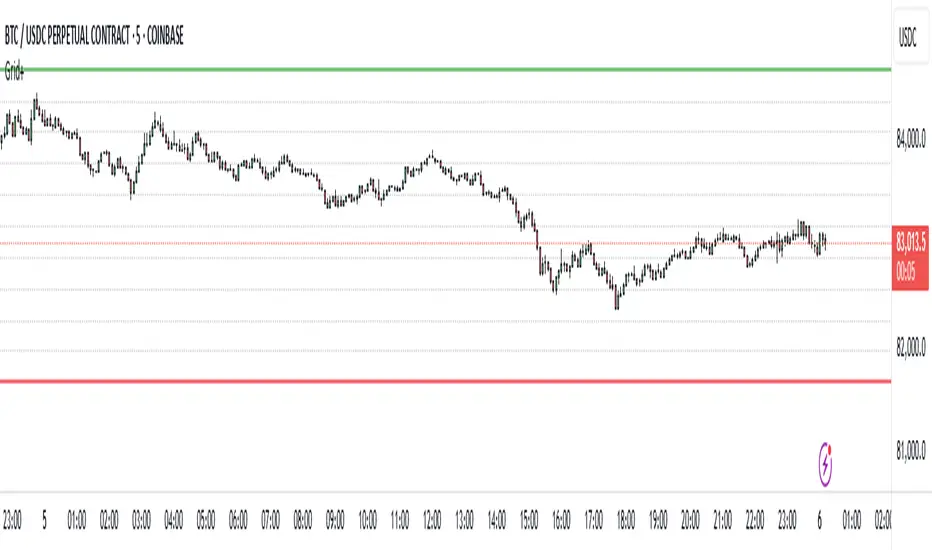
Grid Level Visualizer v1.0Overview
This indicator draws a customizable grid of horizontal price levels directly on your chart. It's designed to help traders visualize potential support and resistance zones, manage grid trading strategies, or simply divide a price range into equal segments. The script offers interactive controls, extensive customization options, and alert functionality.
Key Features:
Customizable Grid: Draws a grid based on user-defined Upper Price Bound and Lower Price Bound.
Interactive Bounds: Easily adjust the Upper and Lower bounds by dragging the corresponding lines directly on the chart (click the line first to select, then drag). Bounds can also be set numerically in the settings.
Adjustable Levels: Specify the total number of horizontal lines in the grid (Number of Grid Levels), including bounds.
Custom Styling: Independently configure the color, width, and style (Solid, Dashed, Dotted) for the boundary lines and the intermediate grid lines.
Price Labels: Optional display of price values for each grid level, positioned on the right side near the current bar.
Labels for boundary levels automatically inherit the boundary line colors.
Adjustable horizontal offset (Price Label Offset (X)) for labels.
Customizable text size (Text Size) and color (Price Text Color (Mid)) for mid-levels.
Grid Start Time: Define a specific date and time (Grid Start Time) from which the grid lines should start appearing on the chart (defaults to the beginning of the current month).
Line Extension: Grid lines automatically extend to the right margin of the chart.
Alert Condition: Provides a "Grid Level Cross" condition for creating custom alerts when price crosses any active grid level.
Alert Toggle: An option (Enable Alert Condition?) in the settings to enable or disable the availability of the "Grid Level Cross" condition when creating alerts.
Real-time Calculation: Uses calc_on_every_tick=true for responsive alert checking against the current price.
How to Use:
Add the "Improved Grid Level Visualizer" indicator to your chart.
Set Bounds: Adjust the Upper Price Bound and Lower Price Bound lines by clicking and dragging them on the chart, or set precise values in the indicator settings.
Set Levels: Define the Number of Grid Levels you need in the settings.
Set Start Time: Use the Grid Start Time input to control when the grid visualization begins.
Customize: Configure colors, line styles, label visibility, etc., in the settings panel.
Set Alerts (Optional): Follow the steps below.
Notes:
The grid levels are calculated purely based on the mathematical division of the specified price range. They do not automatically adapt to market structure unless you manually adjust the bounds.
When changing the Grid Start Time after the indicator has been running, you might need to refresh the chart or remove/re-add the indicator for the visual starting point to update correctly.
Indicators and strategies
MohammadBayazid techinique - (06-16-24)my TRADING PLAN.... everything start reading AMD and together with signal days.


Cảnh báo Breakout nâng cao (Sideway + Volume + RSI)Sideway Zone High and Low Calculation Conditions: You have used ta.highest() and ta.lowest() to calculate the high and low correctly.
Volume Spike: You have used SMA to determine if the current volume is above average.
RSI Check: The condition for RSI has also been checked correctly.

Session DividerThis tool is especially helpful for traders who want to:
See how price behaves during different times of day
Identify patterns that occur during specific trading sessions
Quickly recognize important price levels from different times of the trading day
The indicator works best on intraday charts (like 1-hour or shorter timeframes) where these session divisions are most relevant.

CANDLESThe script is designed to display Higher Timeframe (HTF) candles on a chart, with a maximum of 6 candle sets
OBV-SMA-BBOn-Balance Volume (OBV) is a technical indicator that measures buying and selling pressure by adding volume on rising days and subtracting it on falling days. It helps traders identify trends and confirm price movements. An increasing OBV suggests strong buying pressure, while a decreasing OBV indicates selling pressure.

Blood IndicatorBlood Indicator
Weekly (FRED:TB3MS / FRED:BAMLH0A0HYM2) plotted against the 100 WK MA. If red be ready for a sell off. Use Confluence in price action to confirm trades.

STFS-EZ, SMA200, FI TriggerThe Force Index is a technical indicator that measures the strength behind a price movement by combining three elements:
1. Price direction (up or down)
2. Price range (the difference between prices)
3. Trading volume

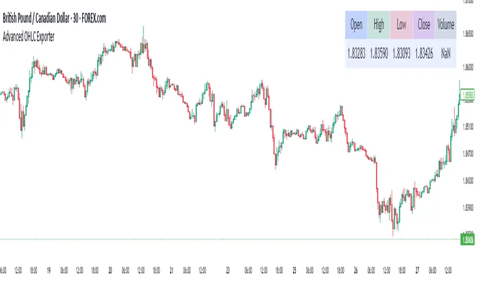
Advanced OHLC ExporterThis Pine Script indicator provides one-click export of candlestick data (OHLC + Volume) from any TradingView chart. It displays the current candle's values in a clean table while ensuring all visible historical data is available for export in CSV format.
Key Features
📊 Visual Data Display
Real-time OHLC table in the top-right corner.
Color-coded values for quick analysis (green=high, red=low).
Volume shown in standardized formatting.
Data Export Ready
All plotted values appear in TradingView's Data Window.
Right-click → "Export Data" to save:
Open, High, Low, Close (OHLC) prices
Trading volume
Timestamps for each candle
⚙️ Customizable Output
Works on any timeframe (1m to 1M)
Compatible with: Forex, Stocks, Crypto, Futures
How Traders Use This
Technical Analysts - Export clean datasets for external analysis.
Backtesters - Quickly gather historical price data for strategy development.
Researchers - Study candlestick patterns with precise numerical data.
Nifty Range % and Points by Time BlocksPine Script that gives you day-wise intraday range percentage for these 3 time blocks (9:16–10:45, 10:45–1:15, 1:15–3:15), we can:
Detect time blocks during the day
Track High/Low for each block
Calculate range % for each block:
\text{Range %} = \frac{(High - Low)}{\text{Previous Day Close}} \times 100
Plot / Label it on the chart at the end of each block

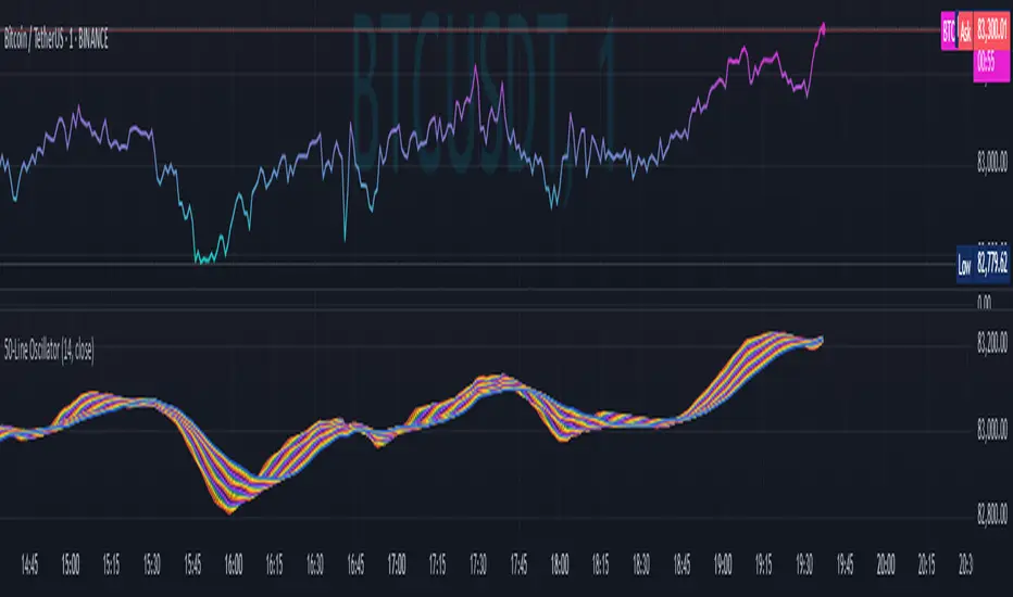
50-Line Oscillator // (\_/)
// ( •.•)
// (")_(")
25-Line Oscillator
Description:
The 25-Line Oscillator is a sophisticated technical analysis tool designed to visualize market trends through the use of multiple Simple Moving Averages (SMAs). This indicator computes a series of 26 SMAs, incrementally increasing the base length, providing traders with a comprehensive view of price dynamics.
Features:
Customizable Base Length: Adjust the base length of the SMAs according to trading preferences, enhancing versatility for different market conditions.
Rainbow Effect: The indicator employs a visually appealing rainbow color scheme to differentiate between the various trend lines, making it easy to identify crossovers and momentum shifts.
Crossovers Detection: The script includes logic to detect crossover events between consecutive trend lines, which can serve as signals for potential entry or exit points in trading.
Clear Visualization: Suitable for both novice and seasoned traders, the plots enable quick interpretation of trends and market behavior.
How to Use:
Add the indicator to your chart and customize the base length as desired.
Observe the rainbow-colored lines for trend direction.
Look for crossover events between the SMAs as potential trading signals.
Application: This indicator is particularly useful for swing traders and trend followers who aim to capitalize on market momentum and identify reversals. By monitoring the behavior of multiple SMAs, traders can gain insights into the strength and direction of price movements over various time frames.
Candle Size Alerts (Manual size)This TradingView Pine Script (v6) is an indicator that triggers alerts based on the size of the previous candle. Here's a breakdown of how it works:
1. Indicator Definition
//version=6
indicator('Candle Size Alerts (Manual size)', overlay = true)
The script is written in Pine Script v6.
indicator('Candle Size Alerts (Manual size)', overlay = true):
Defines the indicator name as "Candle Size Alerts (Manual size)".
overlay = true means it runs directly on the price chart (not as a separate panel).
2. Calculate the Previous Candle's Body Size
candleSize = math.abs(close - open )
close and open refer to the previous candle’s closing and opening prices.
math.abs(...) ensures that the size is always a positive value, regardless of whether it's a green or red candle.
3. Define a User-Adjustable Candle Size Threshold
candleThreshold = input(500, title = 'Fixed Candle Size Threshold')
input(500, title = 'Fixed Candle Size Threshold'):
Allows users to set a custom threshold (default is 500 points).
If the previous candle's body size exceeds or equals this threshold, an alert is triggered.
4. Check if the Candle Size Meets the Condition
sizeCondition = candleSize >= candleThreshold
This evaluates whether the previous candle's size is greater than or equal to the threshold.
If true, an alert will be generated.
5. Determine Candle Color
isRedCandle = close < open
isGreenCandle = close > open
isRedCandle: The candle is red if the closing price is lower than the opening price.
isGreenCandle: The candle is green if the closing price is higher than the opening price.
6. Generate Alerts Based on Candle Color
if sizeCondition
if isRedCandle
alert('SHORT SIGNAL: Previous candle is RED, body size = ' + str.tostring(candleSize) + ' points (Threshold: ' + str.tostring(candleThreshold) + ')', alert.freq_once_per_bar)
else if isGreenCandle
alert('LONG SIGNAL: Previous candle is GREEN, body size = ' + str.tostring(candleSize) + ' points (Threshold: ' + str.tostring(candleThreshold) + ')', alert.freq_once_per_bar)
If the candle size meets the threshold (sizeCondition == true):
If red, a SHORT SIGNAL alert is triggered.
If green, a LONG SIGNAL alert is triggered.
alert.freq_once_per_bar ensures that alerts are sent only once per candle (avoiding repeated notifications).
How It Works in TradingView:
The script does not plot anything on the chart.
It monitors the previous candle’s body size.
If the size exceeds the threshold, an alert is generated.
Alerts can be used to notify the trader when big candles appear.
How to set Alerts in Trading View
1. Select Indicator – Ensure the indicator is added and properly configured.
2. Set Time Frame – Make sure it's appropriate for your trading strategy.
3. Open Alerts Panel – Click the "Alerts" tab or use the shortcut (Alt + A on Windows).
4. Create a New Alert – Click "+" or "Create Alert."
5. Select Condition – Pick the relevant indicator condition (e.g., "Candle Size Alerts(Manual size)").
6. Choose Alert Function – Default is "Any Alert() Function Call".
7. Set Expiration & Name – Define how long the alert remains active.
8. Configure Notifications – Choose between pop-up, email, webhook, or app notifications.
9. Create Alert – Click "Create" to finalize.
How to set the size manually:
Add the "Candle Size Alerts (Manual size)" Indicator to your chart.
Open Indicator Settings – Click on the indicator and go to the "Inputs" tab.
Set Fixed Size Threshold – Adjust the "Fixed Size Candle Threshold" to your desired value.
Click OK – This applies the changes.
Reset Alerts – Delete and recreate alerts to reflect the new threshold.
Happy Trading !!!!
KOLA CHIRANJEEVI

[nikosign] label stylesWhen displaying the label style sheet on a one-minute chart, 20 different label samples will be shown.

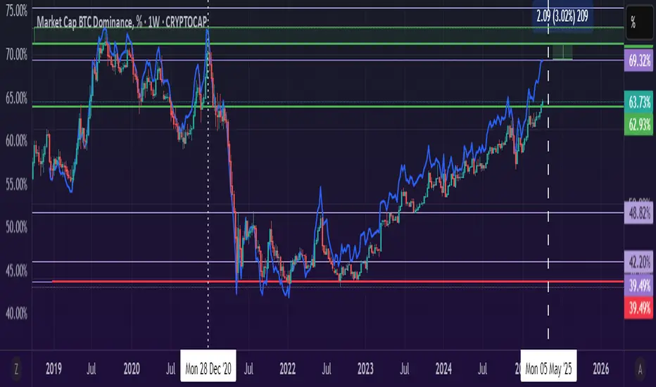
BTC Dominance Excluding StablecoinsBTC Dominance Excluding Stablecoins
Description:
The "BTC Dominance Excluding Stablecoins" indicator calculates Bitcoin's dominance as a percentage of the total cryptocurrency market capitalization, excluding the market caps of major stablecoins (USDT and USDC). Unlike the standard BTC.D ticker, which includes stablecoins in the total market cap, this indicator provides a clearer view of Bitcoin’s dominance relative to the "non-stable" crypto market. This can be useful for traders and analysts who want to assess Bitcoin’s strength without the influence of stablecoin market caps, which often skew dominance metrics during periods of high stablecoin usage.
How It Works:
Bitcoin Market Cap: Fetches Bitcoin’s market capitalization using CRYPTOCAP:BTC.
Total Market Cap: Retrieves the total cryptocurrency market cap via CRYPTOCAP:TOTAL.
Stablecoin Adjustment: Subtracts the market caps of USDT (CRYPTOCAP:USDT) and USDC (CRYPTOCAP:USDC) from the total market cap.
Dominance Calculation: Computes Bitcoin’s dominance as (BTC Market Cap / Adjusted Total Market Cap) * 100, where the adjusted total excludes stablecoins.
Output: Plots the resulting dominance percentage as a line chart.
Features:
Displays Bitcoin dominance excluding stablecoins on any timeframe.
Customizable line color and thickness for better visualization.
Provides a more accurate representation of Bitcoin’s market share in the volatile, non-stablecoin crypto ecosystem.
Usage:
Add this indicator to your TradingView chart to compare Bitcoin’s dominance against the broader altcoin market, free from stablecoin distortions. Use it alongside other indicators like BTC.D or price charts to analyze market trends, especially during periods of high stablecoin inflows or outflows.
Notes:
The indicator currently excludes USDT and USDC, the two largest stablecoins by market cap. Additional stablecoins (e.g., DAI, BUSD) can be added by modifying the script if desired.
Data is sourced from TradingView’s CRYPTOCAP symbols, which may have slight delays or variations depending on exchange data feeds.
Best used on daily or higher timeframes for smoother, more reliable results.
Author:
Created by K Du₿
Version:
Pine Script v5
PIXEL BLADE CONCEPTThe PIXEL BLADE CONCEPT indicator is designed to help traders visualize key support and resistance levels from higher timeframes directly on their charts. It displays the previous day's, week's, and month's highs and lows, making it easier to spot critical price zones that may influence market movements.
Key Features:
✅ Multi-Timeframe Levels – Track important price levels from:
Daily (PD High/Low) – Previous day’s high and low
Weekly (PW High/Low) – Previous week’s high and low
Monthly (PM High/Low) – Previous month’s high and low
✅ Customizable Appearance – Adjust colors and line styles for each level type:
Choose between solid (⎯⎯⎯), dashed (----), or dotted (····) lines
Set unique colors for daily, weekly, and monthly levels
✅ Clean & Organized Display
Lines extend 100 bars into the future for easy visibility
Right-aligned labels with exact price values
No clutter—levels are drawn only once per session
Why Use This Indicator?
Identify Key Levels: Quickly see where price might react based on historical highs/lows.
Improve Trade Decisions: Use higher timeframe levels for better confluence in your strategy.
Customizable: Adapt the visuals to match your chart style.
How to Use:
Add to Chart: Apply the indicator to any trading pair.
Configure Settings: Toggle levels on/off and adjust colors/styles as needed.
Trade with Confidence: Watch for price reactions near these levels for potential entries/exits.
Perfect for:
Day traders watching daily levels
Swing traders tracking weekly/monthly zones
Price action traders looking for confluences
Get a clearer view of the market’s structure with PIXEL BLADE CONCEPT! 🚀
(Note: Works best on TradingView’s intraday and higher timeframe charts. Adjust lookback settings if needed.)
📌 Like this script? Leave a comment & share your feedback!
🔔 Follow me for more trading tools & indicators!
(Disclaimer: This is for educational purposes only. Past performance is not indicative of future results.)

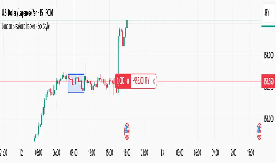
London Breakout Tracker - Box Style📊 London Breakout Tracker (Pine Script v6)
This script is designed to track the Asian session range and identify breakout opportunities when the London session begins. It highlights high-probability trade setups and helps avoid fakeouts or overly wide ranges.
🧱 1. Session Time Definitions (Adjusted for Kenyan Time)
The Asian session is defined as:
3:00 AM to 11:00 AM (Kenyan Time)
🔐 2. Asian Session High & Low
During the Asian session:
The script tracks the highest high and lowest low to define the range.
These are stored in variables: asianHigh and asianLow.
🧊 3. Box Drawing for the Asian Range
Once the Asian session ends:
A visual box is drawn around the session using box.new().
This box spans from the session start to end bars and from the high to low.
It helps visually see the range price must break out from.
🚨 4. Breakout Signals
After the Asian session:
A Long Breakout signal is generated if:
The candle closes above the Asian High.
A Short Breakout signal is generated if:
The candle closes below the Asian Low.
This corresponds to 00:00 to 08:00 UTC
These are shown with:
✅ Green up label for long breakouts
❌ Red down label for short breakouts
🧯 5. Fakeout Detection
If price breaks out but closes back inside the Asian range, it’s marked as a Fakeout:
Long Fakeout: Price breaks above high, then closes back below.
Short Fakeout: Price breaks below low, then closes back above.
These are marked with orange X-crosses above or below candles.
⚠️ 6. Wide Range Filter
If the Asian session range is too wide (e.g. > 40 pips), a gray background is drawn.
This warns you not to trade that day since breakouts from wide ranges are unreliable.
📣 7. Alert Conditions
The script can trigger alerts in TradingView when:
🔔 A Long or Short Breakout occurs
⚠️ A Fakeout is detected
You can set these up via the TradingView alert system.
🎯 Overall Purpose:
The script helps you:
Clearly see the Asian session range
Identify breakout opportunities at the London open
Avoid trading during fakeouts or wide-range sessions
Get alerted when breakout/fakeout conditions occur
ΣVOL — Z-Score Volume Heatmapⓩ ΣVOL transforms raw volume into a statistically calibrated heatmap using z-score thresholds. Unlike classic volume indicators that rely on fixed moving average comparisons, ΣVOL calculates how many standard deviations each volume bar deviates from its mean. This makes the reading adaptive across timeframes and assets, helping traders distinguish meaningful crowd behavior from random volatility.
📊 The core display is a five-zone histogram, each encoded by color and statistical depth. Optional background shading mirrors these zones across the entire pane, revealing subtle compression or structural rhythm shifts across time. By grounding the volume reading in volatility-adjusted context, ΣVOL prevents impulsive tactics by compelling the structure to dictate the signal.
🥵 Heatmap Zones:
🌚 Zone 0 (Gray): Suppressed volume — congestion, coil phases
🔹 Zone 1 (Teal): Stable flow — early trend or resting volume
🔸 Zone 2 (Orange): High activity — pressure emerging
💔 Zone 3–4 (Red): Extreme — possible climax or institutional print
A dynamic EMA ribbon overlays the histogram using 21 and 34-period EMAs. The fill between them inverts color on crossover and has adjustable opacity, providing a real-time read on tempo, expansion, or divergence between price structure and crowd effort.
💡 LTF Usage Suggestions:
• Confirm breakout legs when orange or red zones align with range exits
• Fade overextended moves when red bars appear into resistance
• Watch for rising EMAs and orange volume to front-run impulsive moves
• Combine with volatility suppression (e.g. ATR) to catch compression → expansion transitions
🔗 Ideal Pairings:
• OBV Intention Bias — to confirm directional intent behind volume shifts (not shown)
• ATR Turbulence Ribbon — to detect compression phases (not shown)
• SUPeR TReND 2.718 — for directional filters (as shown)
👥 The OBV Intention Bias adds a second dimension to ΣVOL by revealing whether crowd effort is aligning with price direction or diverging beneath the surface. While ΣVOL identifies statistical anomalies in raw volume, this complementary overlay tracks directional commitment using cumulative volume and moving average cross logic. Combine them to spot fake-outs, anticipate structure-confirmed breakouts, or time pullbacks with volume-based conviction.
🔬 ΣVOL isn’t just a volume filter — it’s a structural lens. It reveals when crowd effort is meaningful, when it's fading, and when something is about to shift. Designed for structure-aware traders who care about context, not noise.

Session Coloring Bar with ICT Macro [dani]The Session Coloring Bar is customizable Pine Script indicator designed to visually enhance your charts by applying unique colors to specific trading sessions or timeframes. This tool allows traders to easily identify and differentiate between macro sessions (e.g., 24-hour cycles) and custom-defined sessions (e.g., Session A, Session B), making it ideal for analyzing market activity during specific periods.
In the context of trading, the term "ICT Macro" , as discussed by Michael J. Huddleston (ICT), refers to specific timeframes or "windows" where market behavior often follows predictable patterns. Traders typically focus on the last 10 minutes of an hour and the first 10 minutes of the next hour (e.g., 0150-0210 , 0050-0110 , or 0950-1010 ) to identify key price movements, liquidity shifts, or market inefficiencies.
This script highlights these macro timeframes, enabling traders to visually analyze price action during these critical periods. Use this tool to support your strategy, but always combine it with your own analysis and risk management.
With this indicator, you can:
Highlight Macro Sessions : Automatically color bars based on predefined 24-hour macro sessions.
Customize Session Settings : Define up to three custom sessions (A & B) with individual start/end times, visibility toggles, and unique bar colors.
Timeframe Filtering : Hide session coloring above a specified timeframe to avoid clutter on higher timeframes.
Personal Notes : Add comments to each session for better organization and quick reference.
Dynamic Color Logic : Bars are colored based on their direction (up, down, or neutral) within the active session.
How to Use:
Enable/Disable Sessions :
Use the Show Coloring toggle to enable or disable session coloring for Macro, Session A, Session B, or Session C.
Set Session Times :
Define the start and end times for each session in the format HHMM-HHMM (e.g., 1600-0930 for an overnight session).
Choose Colors :
Assign unique colors for upward (Bar Up) and downward (Bar Down) bars within each session.
Adjust Timeframe Visibility :
Use the Hide above this TF input to specify the maximum timeframe where session coloring will be visible.
Add Notes :
Use the Comment field to add personal notes or labels for each session.
Example Use Cases:
Overnight Sessions :
Highlight overnight trading hours (e.g., 1600-0930) to analyze price action during low liquidity periods.
Asian/European/US Sessions : Define separate sessions for major trading regions to track regional market behavior.
Macro Analysis : Use the predefined 24-hour macro sessions to study hourly price movements across a full trading day.
Disclaimer:
The Session Coloring Bar is not a trading signal generator and does not predict market direction or provide buy/sell signals. Instead, it is a visualization tool designed to help you identify and analyze specific trading sessions or timeframes on your chart. By highlighting key sessions and their corresponding price movements, this indicator enables you to focus on periods of interest and make more informed trading decisions.
Thank you for choosing this indicator! I hope it becomes a valuable part of your trading toolkit. Remember, trading is a journey, and having the right tools can make all the difference. Whether you're a seasoned trader or just starting out, this indicator is designed to help you stay organized and focused on what matters most—price action. Happy trading, and may your charts be ever in your favor! 😊

USI - Ultimate Swing Indicator (Daily)swing trading for equity market momentum indicater for candel stick basis and strenght

BeSight Mega SpotBeSight Mega Spot – Zone Based Price Grid Indicator
สคริปต์นี้ถูกออกแบบมาเพื่อช่วยเทรดเดอร์มองเห็นโซนราคาสำคัญที่ราคาอาจเกิดปฏิกิริยา โดยอ้างอิงจากระดับราคาที่ลงท้ายด้วย 0 และ 5 (เช่น 1350, 1355, 1360 เป็นต้น) ซึ่งมักเป็นระดับที่มีการตั้งคำสั่งซื้อขายจำนวนมากในตลาด
BeSight Mega Spot – Zone-Based Price Grid Indicator
This indicator is designed to help traders visualize key price zones where the market often reacts, based on price levels ending with 0 or 5 (e.g., 1350, 1355, 1360). These levels are commonly used for pending orders, liquidity, or price clustering zones.
It displays horizontal grid lines at fixed step intervals (default: every 5 points), covering the entire visible price range of the chart. Each price level is labeled for better clarity and planning.
🟦 Blue lines: Price levels ending in 0
⬜ Gray lines: Price levels ending in 5
This tool is useful for identifying potential institutional behavior zones, price consolidation, accumulation/distribution areas, or psychological support/resistance levels.
🧠 Notes:
- This indicator is not a buy/sell signal tool or predictive system.
- It works best when used in conjunction with other technical tools such as Supply/Demand zones or Smart Money Concepts (SMC) analysis.
- Compatible with all instruments: stocks, futures, forex, crypto, etc.
✅ How to use:
1. Add the indicator to your chart
2. Observe how price interacts with the 0/5 grid zones
3. Use the lines to assist with breakout, retest, or reversal planning
4. Combine with price action or other indicators for higher precision
✨ Developed by BeSight – A Community Of Traders
---------------------------------------------------------------------------------------
อินดิเคเตอร์นี้จะแสดงเส้นแนวนอนแบบตาราง (Grid) ที่แบ่งช่วงราคาออกเป็นระยะ ๆ ตามค่าที่ผู้ใช้กำหนด เช่น ทุก ๆ 5 จุด และครอบคลุมช่วงราคาทั้งหมดของกราฟ โดยแสดงเป็นเส้นแบบ dotted พร้อมป้ายราคาเพื่อให้มองเห็นได้ชัดเจน
🟦 เส้นสีน้ำเงิน: แสดงระดับราคาที่ลงท้ายด้วย 0
⬜ เส้นสีเทา: แสดงระดับราคาที่ลงท้ายด้วย 5
เหมาะสำหรับผู้ที่ต้องการดูโซนราคา "หยุดพัก / เก็บของ / เปิดโพซิชัน" ซึ่งอาจสะท้อนพฤติกรรมของผู้เล่นรายใหญ่หรือสถาบันในตลาด
🧠 ข้อควรรู้:
- อินดิเคเตอร์นี้ไม่ได้บอกจุดเข้าเทรดหรือการคาดการณ์ แต่ช่วยในการวางแผนแนวรับ-แนวต้านร่วมกับเครื่องมือวิเคราะห์อื่น ๆ
- รองรับทุกสินทรัพย์ที่มีหน่วยราคาคงที่ (หุ้น, ฟิวเจอร์ส, ฟอเร็กซ์, คริปโต ฯลฯ)
✅ วิธีใช้งาน:
1. เพิ่มอินดิเคเตอร์นี้ลงบนกราฟ
2. ใช้เส้น Grid เป็นแนวประกอบในการดูพฤติกรรมราคา เช่น การหยุดลง, การเบรกแนว, การกลับตัว
3. ผสมผสานกับโซน Demand/Supply หรือโซน SMC เพื่อความแม่นยำ
✨ พัฒนาโดย BeSight – คอมมูนิตี้ของเทรดเดอร์ตัวจริง

MACD Histogram ROC with PVT FilterBelow is a detailed description of the "MACD Histogram ROC with PVT Filter" indicator based on the Pine Script v6 version, which uses the built-in `ta.pvt` function. This description assumes the latest code I provided with a single timeframe (chart-native) and the PVT filter.
---
### Indicator Description: MACD Histogram ROC with PVT Filter
The "MACD Histogram ROC with PVT Filter" is a technical analysis indicator designed for TradingView (Pine Script v6) that combines the Moving Average Convergence Divergence (MACD) Histogram, its Rate of Change (ROC), and the Price Volume Trend (PVT) to identify bullish momentum with volume confirmation. Instead of plotting lines or values directly on the chart, it uses a customizable background color (default light green) to highlight periods where specific bullish conditions are met, providing a clean and visually intuitive signal for traders.
#### How It Works
The indicator evaluates three key conditions based on the chart’s native timeframe:
1. **MACD Histogram**:
- Calculated as the difference between the MACD Line (fast EMA minus slow EMA) and the Signal Line (EMA of the MACD Line).
- A positive Histogram (above zero) indicates bullish momentum.
2. **Histogram Rate of Change (ROC)**:
- Measures the change in the MACD Histogram from the previous bar.
- A positive ROC (increasing Histogram) suggests accelerating bullish strength.
3. **Price Volume Trend (PVT) with EMA Filter**:
- PVT tracks the cumulative relationship between price changes and volume, acting as a volume-weighted momentum indicator.
- An Exponential Moving Average (EMA) is applied to the PVT (default period of 9), and the indicator checks if the PVT is above this EMA, confirming that volume supports the price trend.
When all three conditions are true—MACD Histogram > 0, Histogram ROC > 0, and PVT > PVT EMA—the chart background is highlighted with the user-defined color, signaling a potential bullish opportunity.
#### Key Features
- **Single Timeframe**: Operates on the chart’s current timeframe (e.g., 1-minute, 5-minute, daily), ensuring alignment with your viewing resolution.
- **Customizable Price Input**: Allows selection of the price type (e.g., close, open, high, low, hl2, hlc3, ohlc4) for MACD and PVT calculations.
- **Adjustable MACD Parameters**: Users can modify the fast EMA, slow EMA, and signal EMA periods (default 12, 26, 9).
- **Configurable PVT EMA**: The EMA period applied to PVT is adjustable (default 9).
- **Background Highlight**: A single, customizable background color (default light green with 90% transparency) indicates when all conditions are met, keeping the chart uncluttered.
#### Purpose
This indicator is designed for traders seeking to confirm bullish price movements with both momentum (MACD Histogram and ROC) and volume (PVT) support. The background highlight simplifies decision-making by visually marking periods of strong bullish alignment without overwhelming the chart with additional lines or plots.
---
### How to Use
1. **Adding the Indicator**:
- Open TradingView and access the Pine Editor (bottom of the chart window).
- Copy and paste the indicator code into the editor.
- Click “Add to Chart” to apply it to your current chart.
2. **Customizing Settings**:
- After adding the indicator, click its name in the chart’s indicator list and select “Settings” (gear icon).
- Adjust the following inputs:
- **Fast EMA Length**: Set the period for the fast EMA in the MACD (default 12).
- **Slow EMA Length**: Set the period for the slow EMA in the MACD (default 26).
- **Signal EMA Length**: Set the period for the signal line EMA (default 9).
- **Price Type**: Choose the price input for calculations (options: "close" , "open", "high", "low", "hl2", "hlc3", "ohlc4").
- **PVT EMA Period**: Define the EMA period for the PVT filter (default 9).
- **Background Color**: Select the highlight color and transparency (default light green, `#90EE90`, 90% transparency).
3. **Interpreting the Indicator**:
- **Green Background**: Appears when:
- The MACD Histogram is positive (bullish momentum).
- The Histogram ROC is positive (increasing momentum).
- The PVT is above its EMA (volume supports the trend).
- **No Highlight**: Indicates one or more conditions are not met, suggesting weaker or non-bullish conditions.
- Use the green highlight as a signal to consider bullish setups, such as entries or confirmation of an uptrend, depending on your trading strategy.
4. **Application**:
- Works on any timeframe (e.g., 1-minute for scalping, daily for swing trading) since it uses the chart’s native resolution.
- Combine with other indicators (e.g., support/resistance, RSI) or price action for a more robust trading system.
- Adjust the PVT EMA period to fine-tune sensitivity: a shorter period (e.g., 5) reacts faster, while a longer period (e.g., 20) smooths the filter.
---
### Notes
- **Timeframe**: The indicator reflects the chart’s current timeframe. Change your chart’s resolution (e.g., from 5-minute to 15-minute) to analyze different timeframes.
- **Transparency**: The default 90% transparency allows price action to remain visible beneath the highlight. Lower it (e.g., to 50%) for a more solid color if preferred.
- **Limitations**: This is a bullish-only signal. It won’t highlight bearish conditions (e.g., Histogram < 0). Let me know if you’d like to add bearish highlights!
This indicator is a powerful tool for traders who value momentum and volume confirmation in a minimalist format. Let me know if you’d like to tweak it further or add more features!

Green Candle with Volume > Last 5 DaysIt shows the candle with High volume compared to previous 5 days

Death Cross ReversalThis indicator tracks the recovery of the EMA20 slope after a death cross (when EMA200 crosses above EMA50). At the death cross, it records the current EMA20 slope as a baseline. As the slope improves from its negative baseline, the indicator plots sequential signals:
A Strength Signal when the slope recovers 50% of the baseline gap,
An Early Momentum Signal at 75% recovery, and
A Reversal Signal when the slope finally crosses above +50.
It also displays a histogram of the EMA20 slope (green for positive, gray for negative). Once the reversal signal fires, no further signals are generated until a golden cross resets the cycle.
